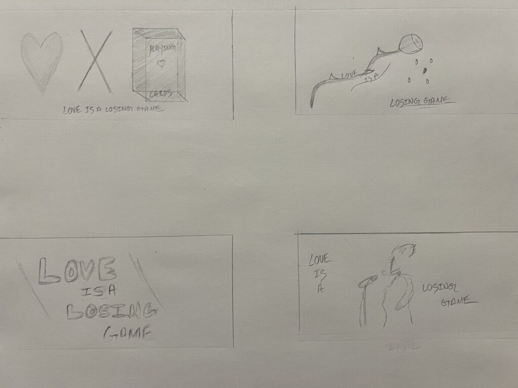
For this project, I had to pick a quote to enhance a postcard visually. Each visual had to be different from one another. The process for this project had multiple steps, from sketching our ideas on paper to then digitalizing our work into a computer. To lastly having our concepts ready for print-ready pdfs.
I chose a quote from one of my favorite Amy Winehouse songs for this project. A song called “love is a losing game” sings about her most painful moment of feeling alone and confused due to how her relationship ended, and she wasn’t able to fix it. The song is a metaphor that allusions to love being an unfair game.
Going into this project, I was unsure how I was going to go through with my concepts. Since I don’t have much experience with the adobe software. But I managed to make my digitalized concepts just as good as they were on my sketch. I honestly learned a lot about my creative process as I was going along. I’m glad that my uncertainty about adobe did not stop me from creating these postcards.
Concept 1
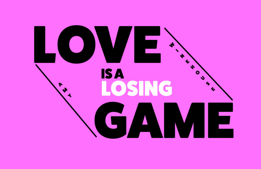

I wanted to emphasize the words “love” and “game ” for my typography concept. So I made the font size more significant than the other words, which I did on purpose because I did not want the attention to go somewhere else. I just really wanted those two words to be the focal point. The incorporation of the white text font for “losing” is to read it in another way. Such as reading it as “love is a game” or “love is a losing game. ” The input of the lines is to show a “connection” of love and game. I wanted to give it a poster-like feeling with a darkish pink background. At first, I wanted to leave the background all white, but it didn’t match the feeling; it felt quite simple and did not give that “wow.”
Concept 2
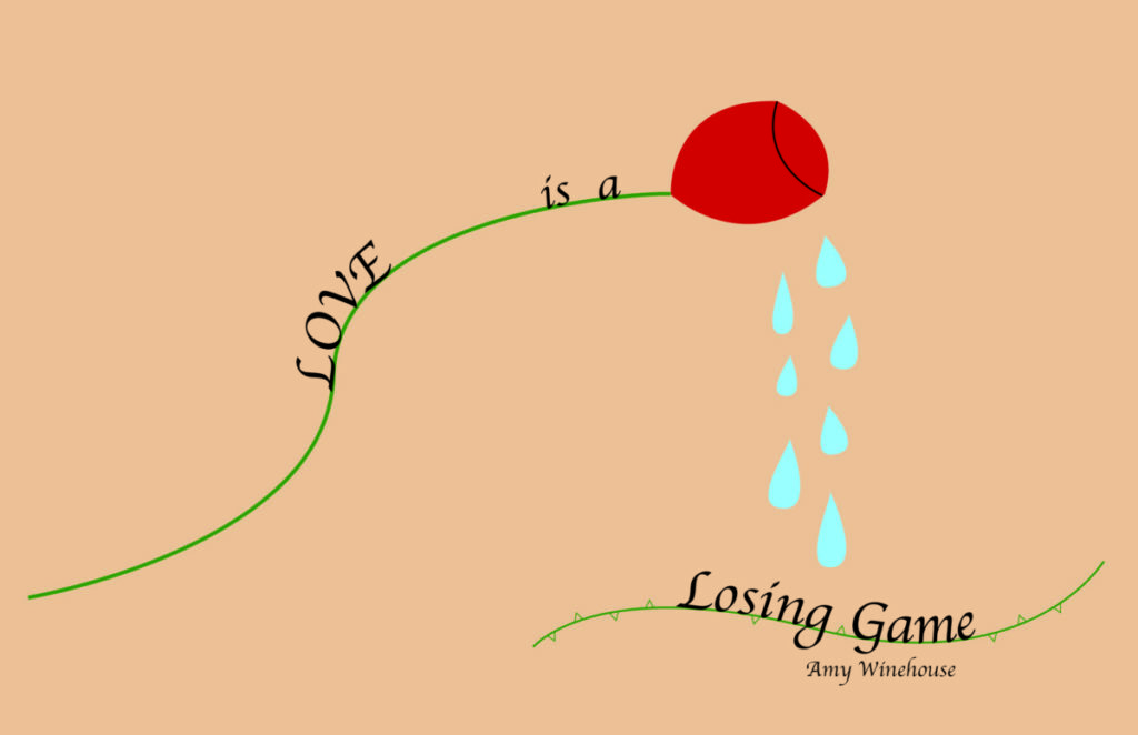
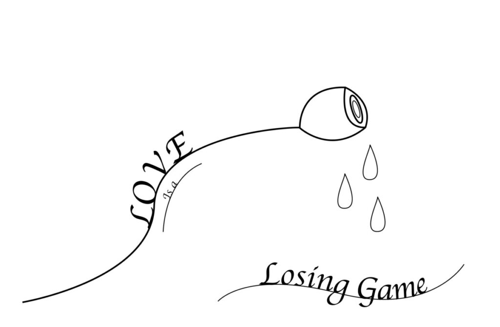
I wanted to portray some drawings for my typography with line art postcard concept. I did this because I wanted the feeling as if someone drew it by hand, but it’s just digitalized. I emphasized the words “love” and “losing game.” And also incorporated color since it was too plain in my draft. Now with the word “love is a,” I wanted to place it on the stem of the rose. The lettering is a script-typeface going towards the rose. Now the significance of the rose is to demonstrate love and how beautiful and unique it can be. When it came to the drops, I changed every size and position of every single one of them to give it emotion. The drops demonstrate droplets of tears. I wanted to show a metaphor that even the most amazing thing, a rose, can feel pain, which is why I intentionally placed “losing game” underneath the falling tears.
Concept 3
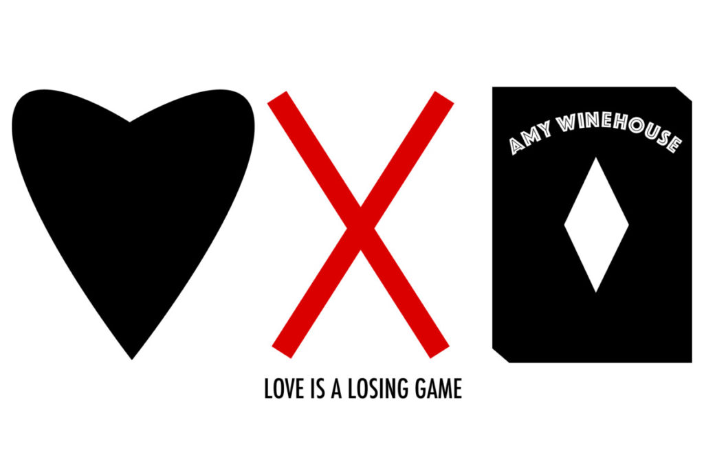
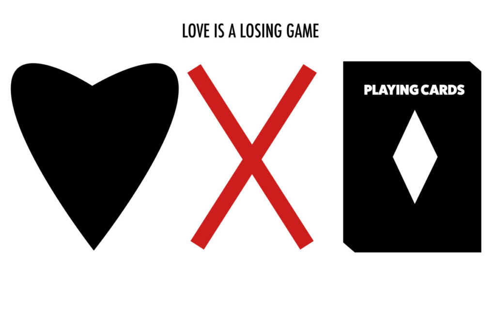
In my imagery text, I wanted to show words through symbols like a heart meaning love, the x symbol meaning losing, and the playing cards representing a game. I purposely did everything in black because I wanted to give attention to that red x symbol. I feel that it makes the whole image pop overall. This image communicates the quote’s meaning because it’s simple yet deafening. The incorporation of the symbols truly makes this stand out. The only difference between the draft and the final is the positioning of the lettering. According to my feedback, I just had to adjust my lettering in the postcard and find a creative way to incorporate Amy’s name.
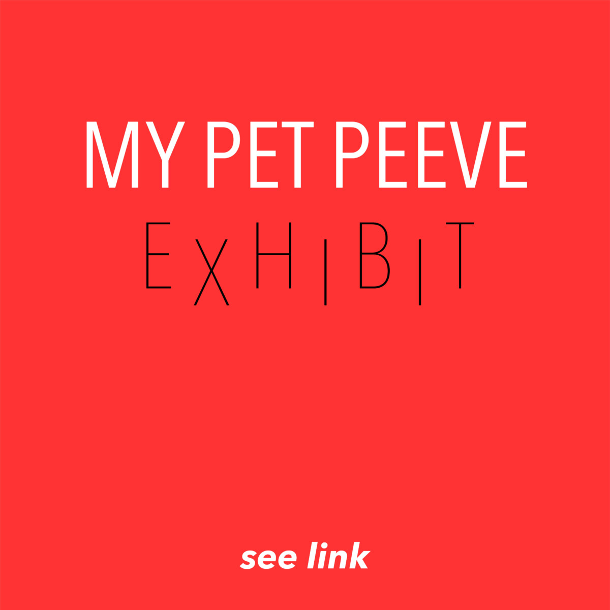
Concept 4
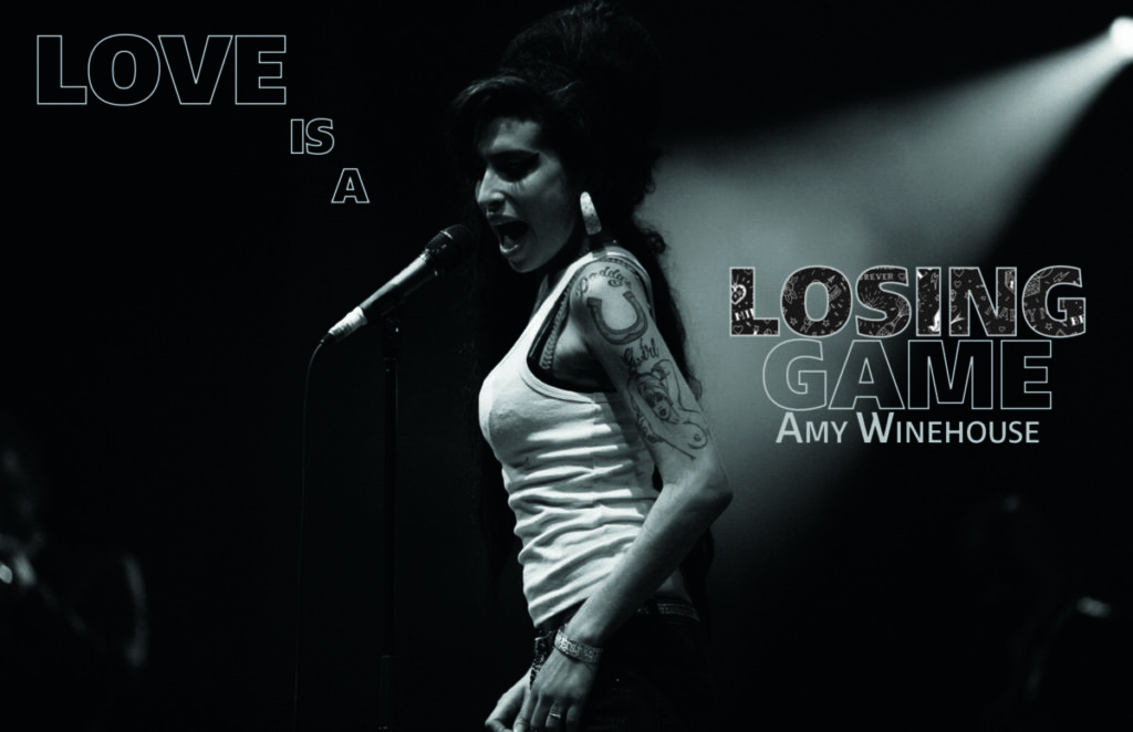
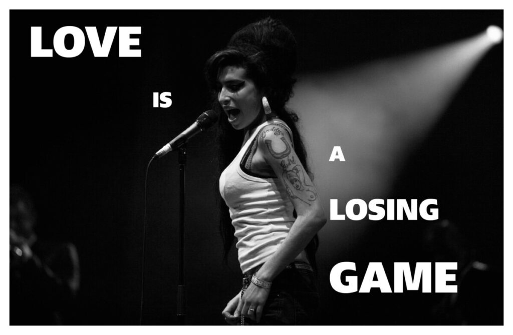
Lastly, my concept for the last postcard I wanted to have one with Amy Winehouse herself. I wanted the point of attention to be her this time—That’s why Winehouse is placed perfectly in the center of this postcard. I wanted to surround her with her quote, “love is a losing game,” without taking the attention away. I have to say that this one has to be my favorite out of all of them. It is my favorite because it’s an image of Winehouse singing into the microphone with her famous quote in the background without taking too much attention. The lettering blends into the image with just “losing,” imitating her tattoo sleeve.
Sketches