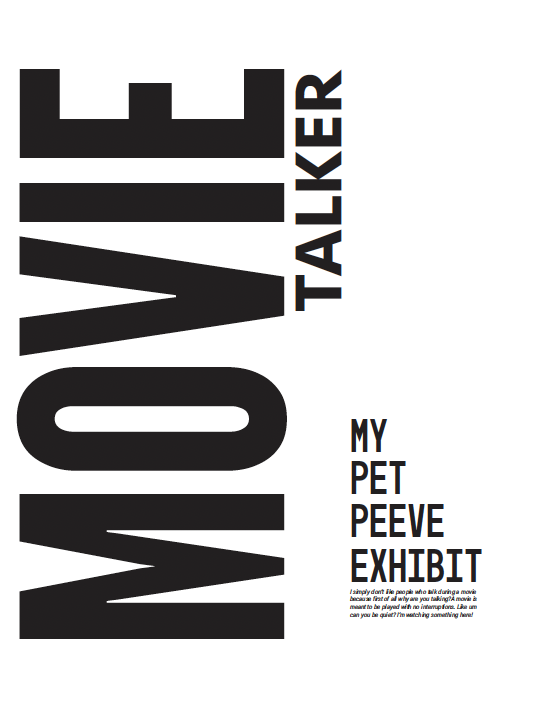
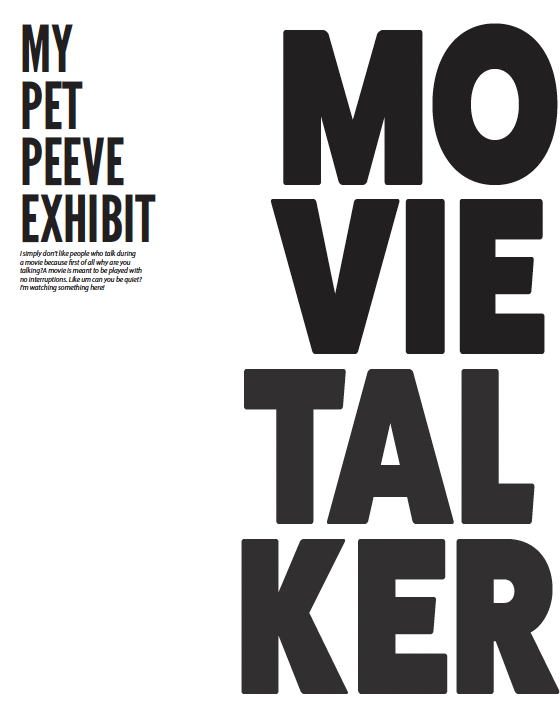
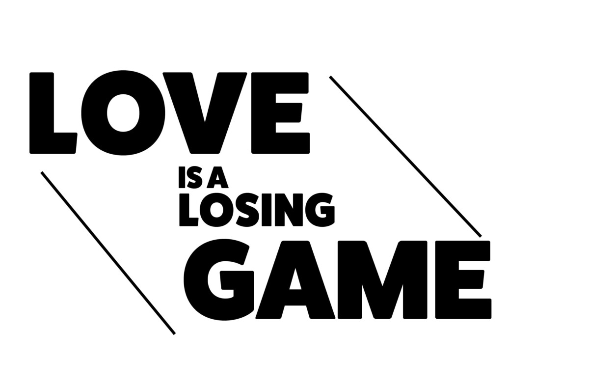
A series of posters and social media postings for a art gallery show (PET PEEVES) .
These series demonstrates the usage of a typographical grid as well as the importance of visual hierarchy. Why use a grid? Why follow a format? What are the differences between a grid and a layout?
Through visual hierarchy scale, proportion, negative space, color and legibility and other essential topics of design and typography.
- The projects contains:
- 2 all type posters which will be part of an art exhibit about PET PEEVES
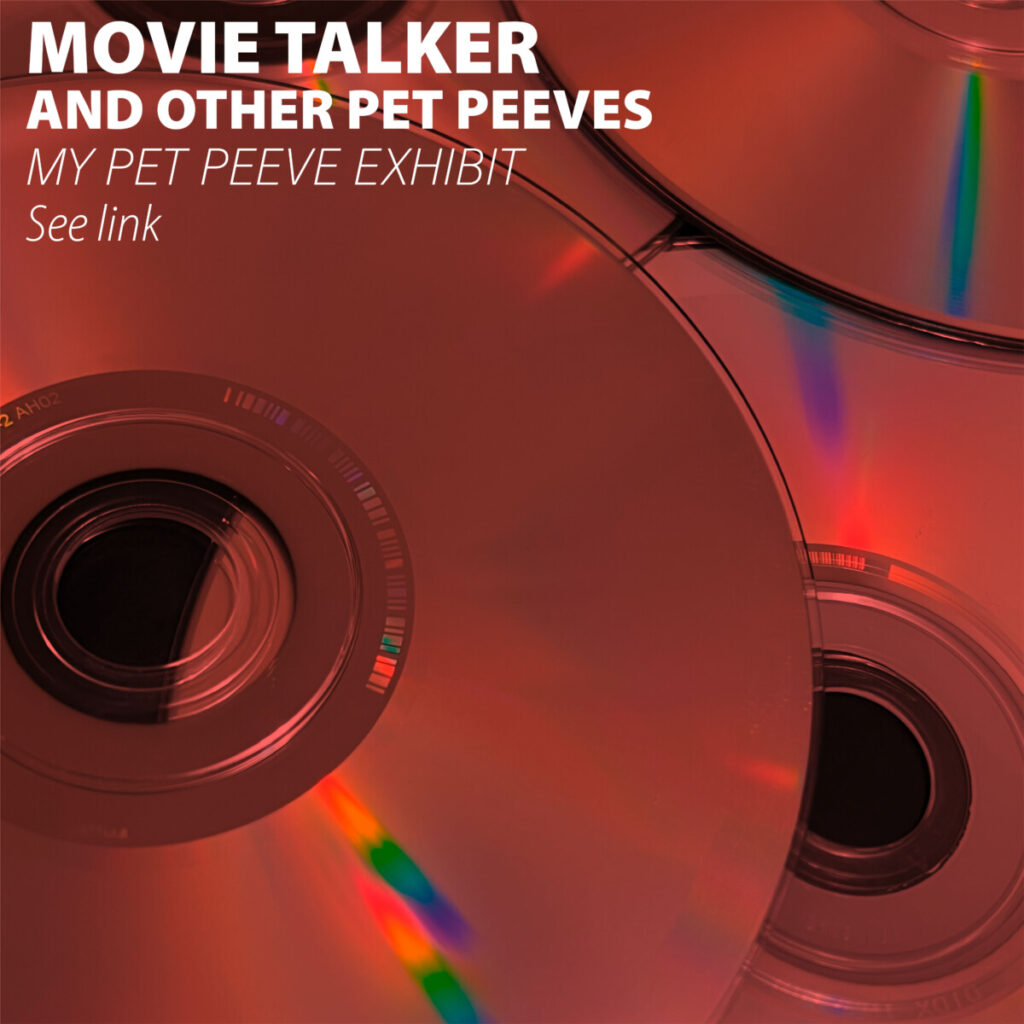
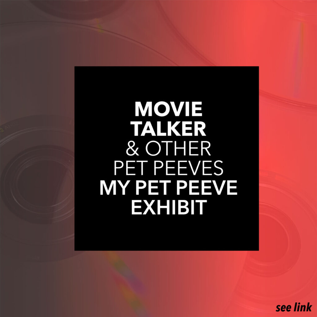
- Four Social Media Postings for same show
My chosen pet peeve is Movie Talker for the exhibit.
Social Media Posts:
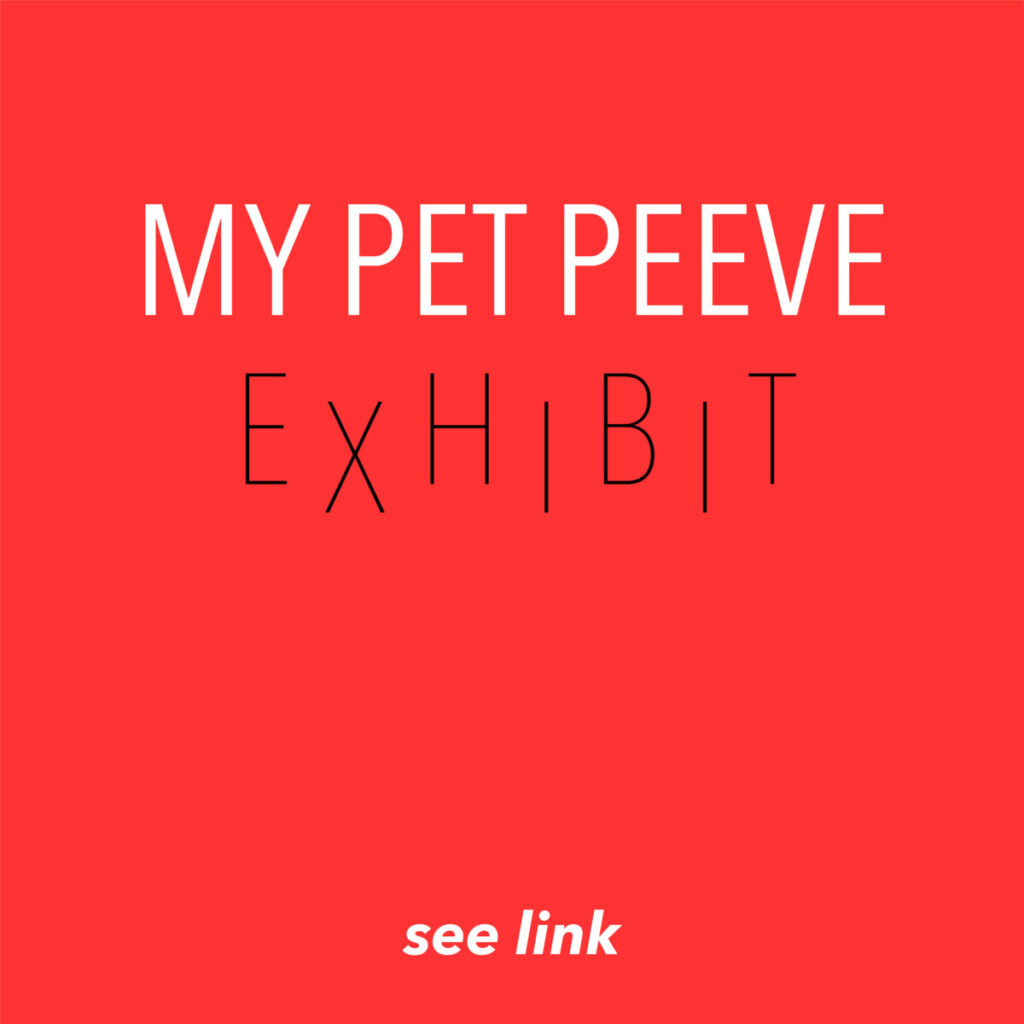
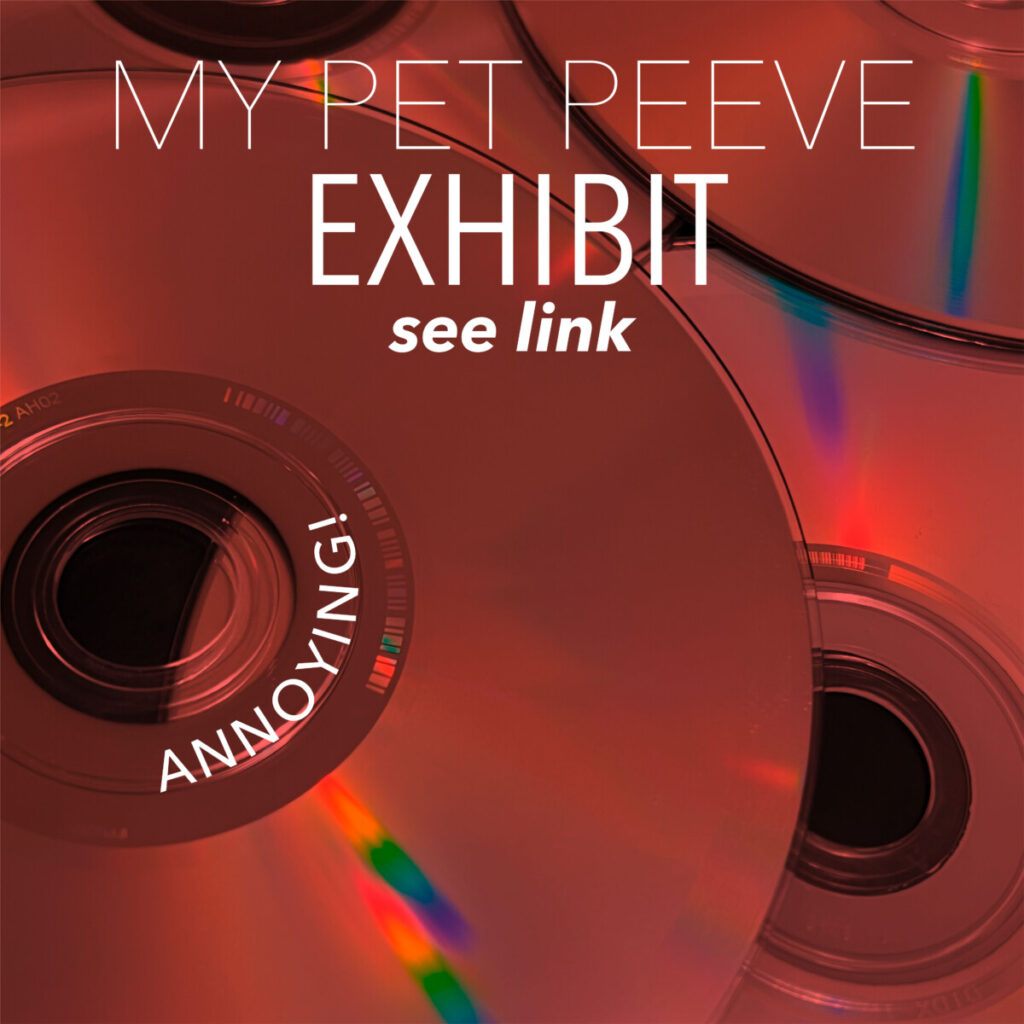
The Posters: