For this assignment we had to pick a logo and investigate the logos history. Such as the story behind the logo, who designed the logo and the changes made to the logo throughout the years. I chose GAP a really known American clothing and accessories retailer.
The clothing store Gap, formerly known as “the gap” , was founded in 1969 by Donald and Doris Fisher in San Francisco, California. It all simply began when Donald couldn’t find a pair of jeans that fit just right and the rest is history. The Gap became an instant success in the retail world through the 70s to the early 2000s. Gap was the go-to store to buy an effortless look at a fair price. This was pivotal since other retail stores were not captivating the gap’s target audience. In fact, Gap did the opposite and its brand message addressed “the Gap” between the silent generation and the baby boomers. The silent generation ranging from 1925-1945 and the baby boomer generation ranging from 1945-1964. Gap had its peak in 2001 when there were about “1,850 Gap stores around the world and the chain could be found in most U.S. shopping malls.” (Kapner, Suzanne) But like any other company Gap hasn’t always been perfect. The company has come across questionable decisions throughout the years. Today, the company is not as successful as it once was but it is still trying to keep up. But one thing for sure: Gap has left a remarkable signature logo in the business.
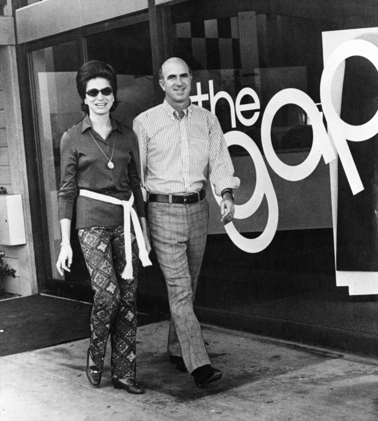
Donald and Doris Fisher open the first Gap store at 1950 Ocean Avenue in San Francisco, California 1969
Source: Gap Inc.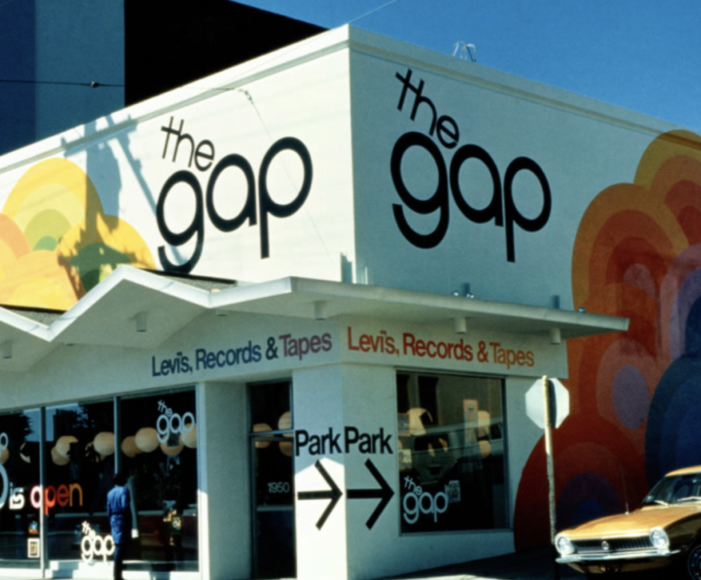
Original Gap logo on Retail Store on 1950 Ocean Avenue in San Francisco, California in 1969
Source: Gap Inc.
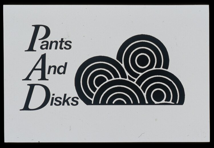
The original Gap logo was introduced in 1969 as “the gap”. The Gap logo is now a trademark used on retail apparel. Donald Fisher’s original name for the brand was scrapped due to a second opinion. That second opinion came from Art twain who worked on the Levis ad account at Honig-Cooper & Harrington an agency. Twain was appointed to work with the Fishers to help them accomplish their vision. And the rest is history. At first Donald Fisher wanted to name his brand “Pants and Discs” to target a young clientele because of what was going to be sold there. The Fishers sold levis jeans and records at their first ever shop. Which was located on Ocean Avenue in San Francisco, near a university, college, and not far from high schools. Being surrounded by the area filled with young people made it a prime location. Twain still had his doubts about the name choice and told Fisher to think it over. And Donald Fisher did, he then called Twain for him to only hear Doris Fisher shouting “the gap”. Twain expressed that one thing he liked about The Gap was it was “both space and solid at the same time. It existed as a store, yet a gap is an emptiness. I thought I could get a lot from that.” (Scherer, D.) And just like that Twain came up with some great advertising for the gap pushing it to the forefront. The gap advertisements were known to be playful and sometimes to cause some controversy.
Donald Fisher’s first concept by Art Twain 1969
Source: Scherer, D.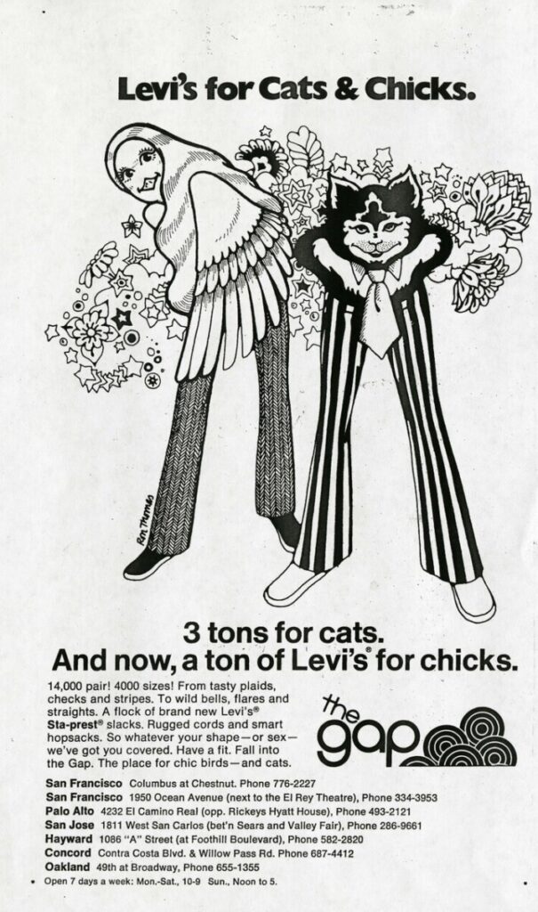
Promotion for womens Levis pants 1969
Source: Scherer, D.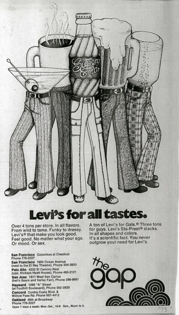
Twain demonstrating the variation of taste in Levis jeans by beverages 1969
Source: Scherer, D.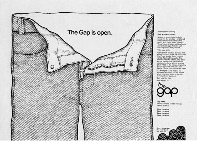
Gap portrays that how free and loose Levis jeans are this ad was considered “scandalous” by Art Twain 1969
Source: Scherer, D.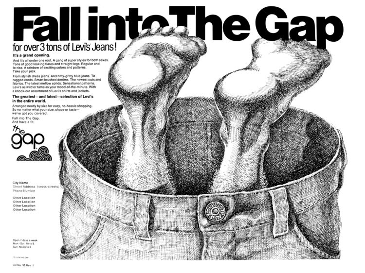
The Gap wants you to “Fall into The Gap” by Art Twain 1969
Source: Scherer, D.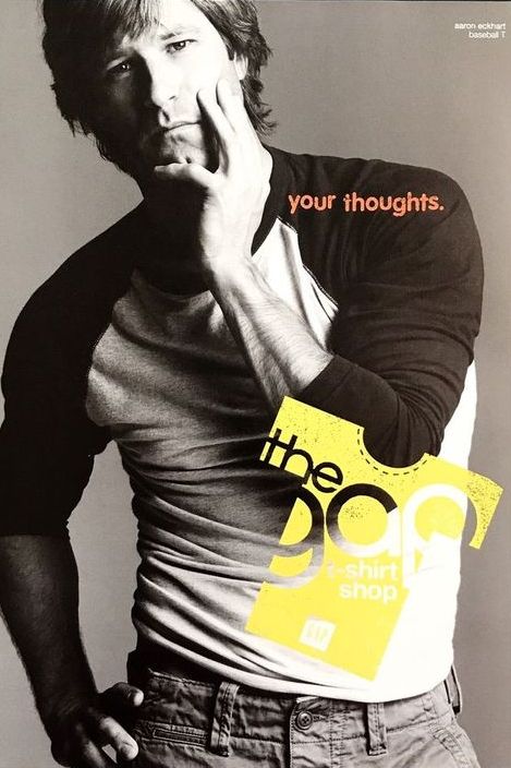
American actor Aaron Eckhart posing with 1969 gap logo
Source: CR Fashion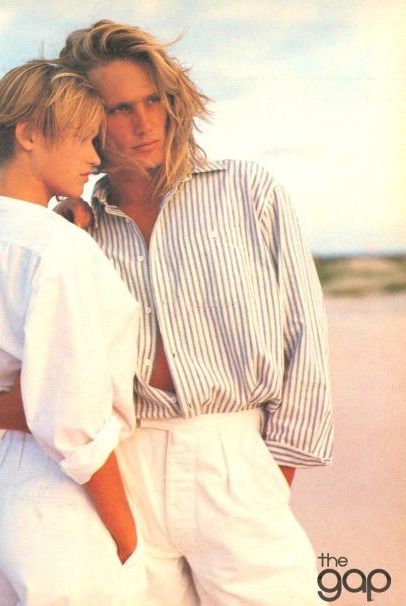
Models posing for summer campaign 1969
Source: CR Fashion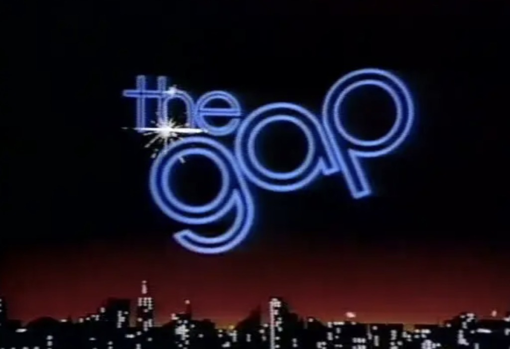
The gap 1970s TV commercials
Source: Vimeo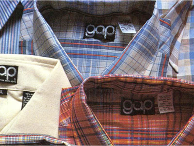
First Gap-label products appear in gap stores 1974
Source: Gap Inc.
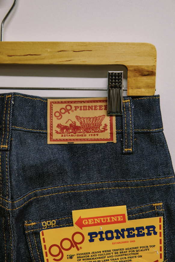
With already 186 stores being open and sales worth of 100 millions the company found even more success with the 1973 iconic gap jingle that was created “fall into the gap”. The Gap company incorporated the jingle in every end of it’s commercials. But by 1978 Gap started to roll-out its own in-house label of jeans named “Gap Fashion Pioneers”. The gap was now a thing from the past; it was now GAP . And by 1984 it was officially the last time the rounded sans serif typeface was used in the company’s logo.
Source: Highsnobiety
Source : Gap Inc.
The 1984 logo is what made the Gap stand out like never before. The logo became Gap’s signature logo, a navy blue square with Gap in a classy serif typeface in capital white letters and wide letter spacing designed by Gap Inc. The logo was balanced perfectly giving the brand the most recognizable logo up to date. By this time Gap had appointed a president for the Gap corporation. Mickey Drexler, a businessman who revamped the whole image for the Gap. Store layouts were changing and sales were rising like never before. Gap sales increased from 100 million in the 70s to 307 million by the 80s. (Joslin, R.) Gap strongly tied to the devotion of the important retail rules such as “selling a line until it stops selling, rapidly replenishing inventory, and exceeding customer expectations.” (Joslin, R.) Gap was also getting recognition from many celebrities and started to roll out new merchandise. Gap was doing so great that it decided to expand the brand further to opening Gap Kids. The Gap was truly unstoppable during this time. Everyone wanted a piece of Gap.
Gap debuts Iconic Pocket tee in 1984
Source : Gap Inc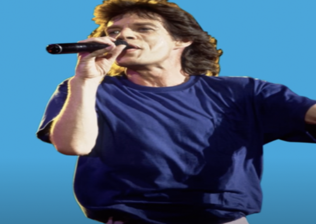
Mick Jagger wearing pocket tee at a concert in 1985
Source : CR Fashion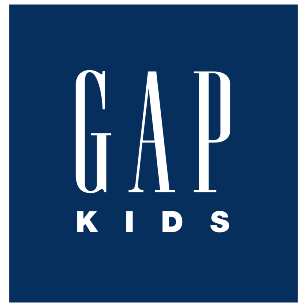
Gap debuts Gap Kids in 1986
Source: Gap Inc.
Gap was at its high peak. Sales just kept growing especially with all the campaign advertisements the company kept pushing to the public in the 90s with its many products. Gap expanded from Gap Kids to Gap baby and to Outlets. But the biggest step that the company took was ending the supply of Levi products at Gap stores.This was major since Gap began selling levis jeans. But it was time for new beginnings for the company. And that is exactly what they did and they succeeded by the end of the 90s gap sales were up to 11.6 Billion. (hands off that logo)
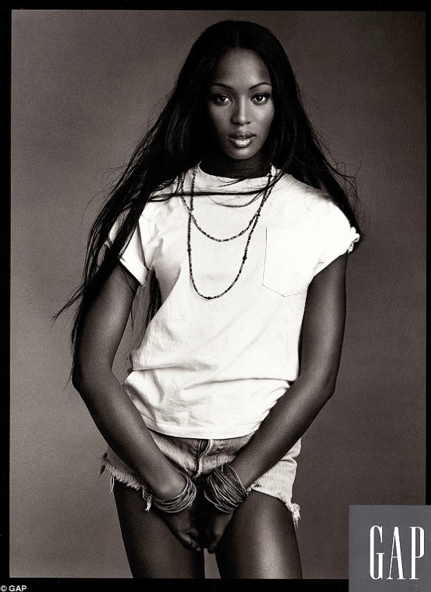
Model Naomi Campbell for Individuals of styles campaign in 1993
Source: CR Fashion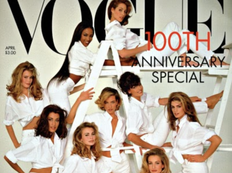
Supermodels posing for vogue cover wearing all Gap white denim and woven shirts in 1992
Source: CR Fashion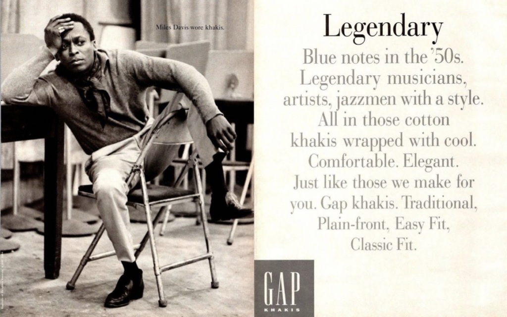
Miles Davis for who wore khakis campaign in 1993
Source: CR Fashion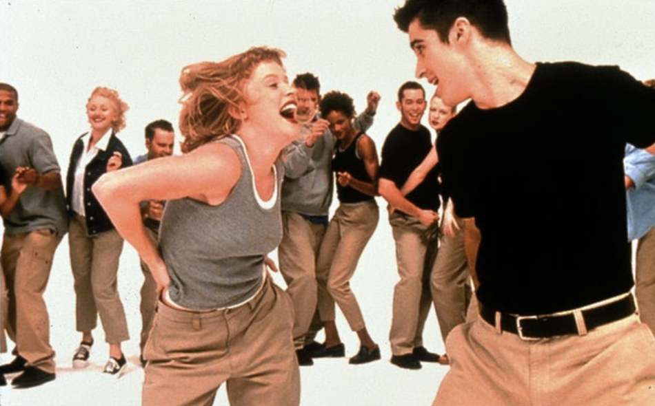
Models wearing Gap Khakis for Khaki swing campaign in 1998
Source: CR Fashion
Old Gap label tags start to fade to the 1984 logo on all merchandise
Source: Gap.com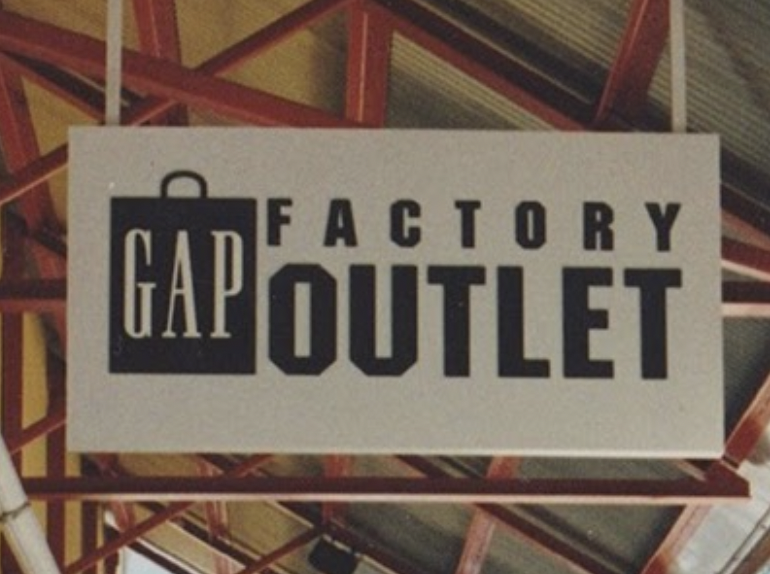
Gap outlet stores open in 1995
Source: Gap Inc.
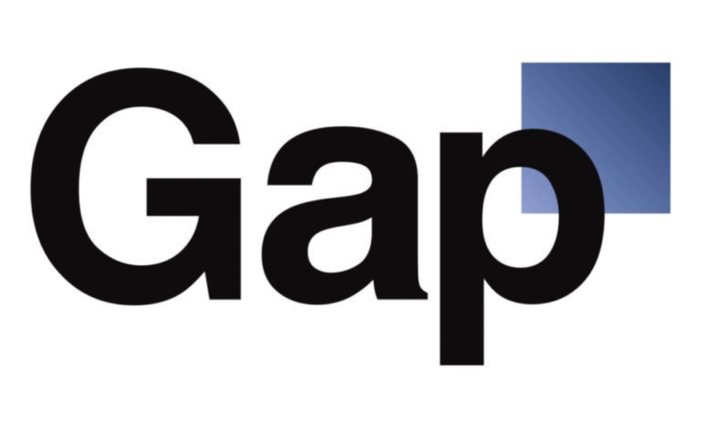
The 1984 Gap logo was a marketing success. The logo was everywhere; the company started to expand everywhere across states to then countries. Gap kept pushing their expectations. And It wasn’t till 2010 when the company decided to adjust the logo once more. The company took a risk hoping to get praise. But instead the public had a lot to say about the infamous change.
Source: Logo Life
The infamous 2010 gap logo that was a helvetica typeface with a blue square behind the section of the p designed by Laird & Partners. According to Gap, the logo was meant to give a “contemporary and current” modern expression. Placing a blue box on the right corner was to “honor our heritage while still looking forward” (rebrand or else). People were not happy at all with this decision. The public perceived the logo as a “try hard” because Gap was not doing good in sales. People shared their thoughts and opinions through social media. It was a disaster that even designers were negatively talking about this redesign. Armin Vit graphic designer and co-founder of Underconsideration stated “is completely embarrassing.. hard to understand”. Jose Santa Maria graphic designer and creative director for Typekit stated “Any designer, especially logo designer, worth their weight would not have gone down the path they went down”. Lastly Barry w. Enderwick, former brand and marketing executive for Netflix, implied that “It’s embarrassing…when I first started my speaking business, I had a similar logo. It was from a generic business card company that sold 5,000 cards for ten bucks”. (Moore, S.) It was truly offensive to the designer community. The impact it caused was one to remember since regular people even noticed that the redesign was not a smart move. It simply caused a “rise of a new kind of consumer activism: design rage” (hands off that logo). It was the worst design decision made by the Gap since its founding. The company introduced the logo, with no announcement, just before the 2010 holiday season and within 6 days the 1984 logo was back.
Gap logo 2016
Source: gap.com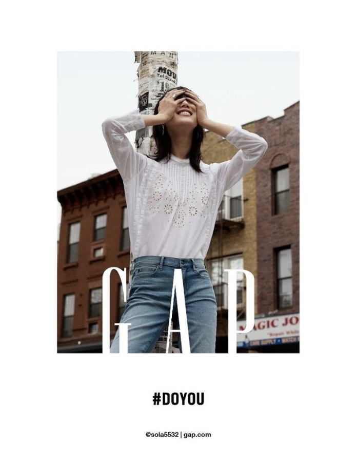
Do you gap campaign 2016
Source: gap.com
This was the moment Gap realized that the people’s voice and opinions do matter. It simply came to show that a logo really holds a lot of power on how a consumer can switch its loyalty at the snap of a finger. In 2016, Gap unveiled a logo for Gap and it was not bad at all compared to their previous attempt. The logo was simple and just modernized without the iconic blue square and the same serif typeface. People did not realize the sudden change and that’s a great thing. The company wanted a cleaner aesthetic when it comes to advertising and they succeeded.
The Gap isn’t as captivating as it once was but it is still up and running. Today, we can see that Gap is still pushing ideas forward to grab the consumer’s eye like they once did in the 90s by smart advertising. Recently, Gap announced a collaboration with a famous rapper, singer and fashion designer Kanye West to do a clothing lineup named YZYXGAP. For the collaboration, Gap is allowing West to amplify and put his own twist on the gap that we love. Gap has also been aware of what the people want from the brand. So Gap listened and by public demand Gap brought back the iconic brown logo hoodie back after 2 decades of its release. Gap now is planning to crowdsource its next hoodie color to be released with a “Gap Hoodie Color Comeback” poll . Which will allow lovers of the brand to officially select the brand’s next logo hoodie color that will be released later in fall 2021. (Yates, J. L.) Gap sales today aren’t soaring as they once were back in the day. But it is safe to say that Gap is doing pretty well with online sales growing 82% from two years prior, accounting for 40% of total revenue. But store sales were down 16% on a two-year basis, mainly because of the remaining COVID restrictions. At the end Gap has a market cap at $13.2 billion in 2021. (Thomas, Lauren) Gap who knows might have something up their sleeve for their biggest comeback than ever.
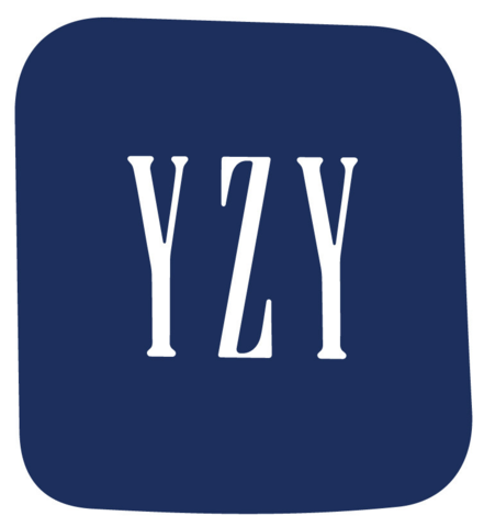
YZYXGAP collaboration logo 2021
Source: Gap.com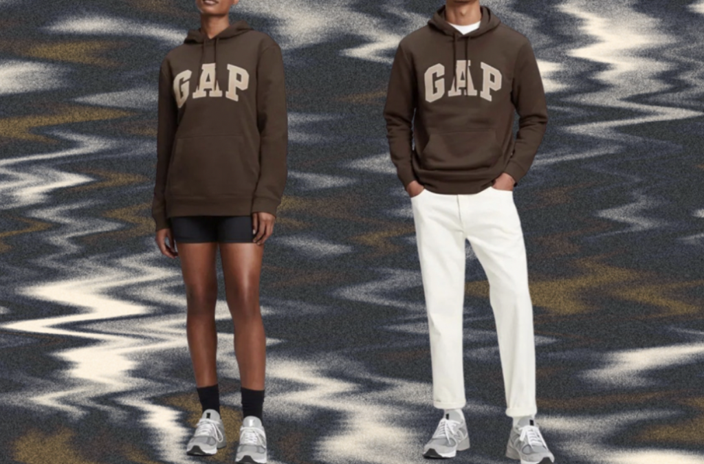
Brown logo hoodie
Source: Gap.com
WORKS CITED
“History Gap Inc.” Gap Inc, 2021, www.gapinc.com/en-us/about/history.
Joslin, R. (2008). GAP, inc.: Has the retailer lost its style? Retrieved October 1, 2021, from https://www.cengage.com/management/webtutor/ireland3e/cases/gap.pdf.
Vlugt, Ron van der. Logo Life: Life Histories of 100 Famous Logos. BIS, 2012.
“Hands off That Logo!” Fast Company, no. 179, Oct. 2013, p. 64. EBSCOhost, http://citytech.ezproxy.cuny.edu:2048/login?url=https://search.ebscohost.com/login.aspx?direct=true&db=bth&AN=90114402&site=ehost-live&scope=site
“Rebrand . . . or Else!” Print, vol. 65, no. 5, Oct. 2011, pp. 79–81. EBSCOhost,
Munk, Nina. “Gap Gets It. (Cover Story).” Fortune, vol. 138, no. 3, Aug. 1998, pp. 68–84. EBSCOhost, http://citytech.ezproxy.cuny.edu:2048/login?url=https://search.ebscohost.com/login.aspx?direct=true&db=bth&AN=845881&site=ehost-live&scope=site
Kapner, Suzanne. “Can Gap Escape the Whirlwind? New CEO Confronts Years of Decline.” Mint, 27 Oct. 2020, www.livemint.com/companies/news/can-gap-escape-the-whirlwind-new-ceo-confronts-years-of-decline-11603778400262.html.
Scherer, D. (2021, January 3). Art Twain and his work for the gap and levis. The Culture Crush. Retrieved October 1, 2021, from https://www.theculturecrush.com/feature/fall-into-the-gap.
Artis, T. (2021, February 25). The best vintage gap campaigns. CR Fashion Book. Retrieved October 1, 2021, from https://www.crfashionbook.com/fashion/g29862208/vintage-gap-campaigns-50th-anniversary/.
Gallagher, B. (2017, September 1). What is Normcore: Normcore fashion explained | Grailed. How Gap Ruled the ’90s. Retrieved October 1, 2021, from https://www.grailed.com/drycleanonly/gap-in-the-90s.
Moore, S. (2020, June 10). GAP’s million-dollar rebrand lasted 6 days. Gap’s Million-Dollar Rebrand Lasted 6 Days. Retrieved October 1, 2021, from https://bettermarketing.pub/gaps-million-dollar-rebrand-lasted-6-days-754966d3d03a.
Yates, J. L. (2021, June 24). How Tiktok brought back this iconic hoodie and made it a viral favorite. Good Morning America. Retrieved October 1, 2021, from https://www.goodmorningamerica.com/style/story/gaps-classic-brown-logo-hoodie-making-comeback-tiktok-78462713
1970s Commercials, https://vimeo.com/374676562
So, Daniel. “Gap through the Decades: Charting the Journey of an American Icon.” Highsnobiety, 2 Oct. 2019, www.highsnobiety.com/p/gap-history-through-the-decades/.
Thomas, Lauren. “Gap Sales Top Pre-Pandemic Levels as Turnaround Efforts Gain Traction, Retailer Raises 2021 Outlook.” CNBC, CNBC, 27 May 2021, www.cnbc.com/2021/05/27/gap-gps-reports-q1-2021-earnings.html.