NOTE! CLICK ON PICTURES TO OPEN ACTUAL PDF ASSIGNMENTS
Final Submition
LIBRARY PRESENTATION BOARD DOWNLOAD
HOUSE PRESENTATION BOARD DOWNLOAD
ASSIGNMENT Z (Final Portfolio Compilation)

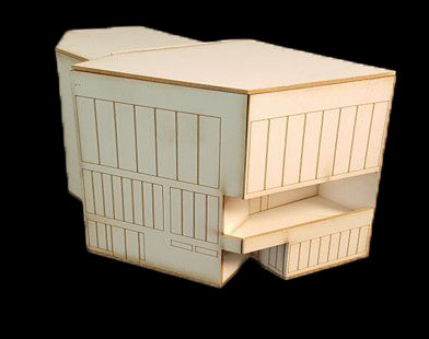
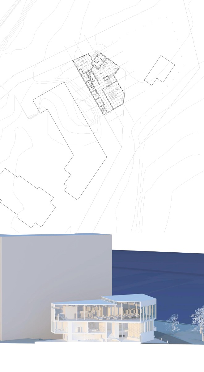
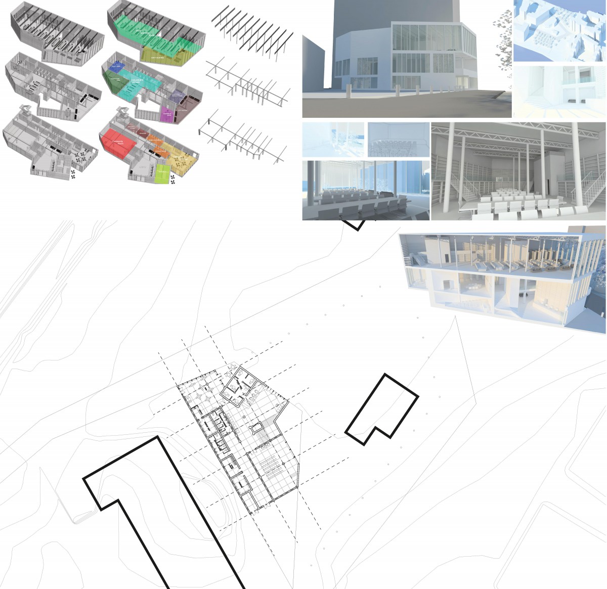
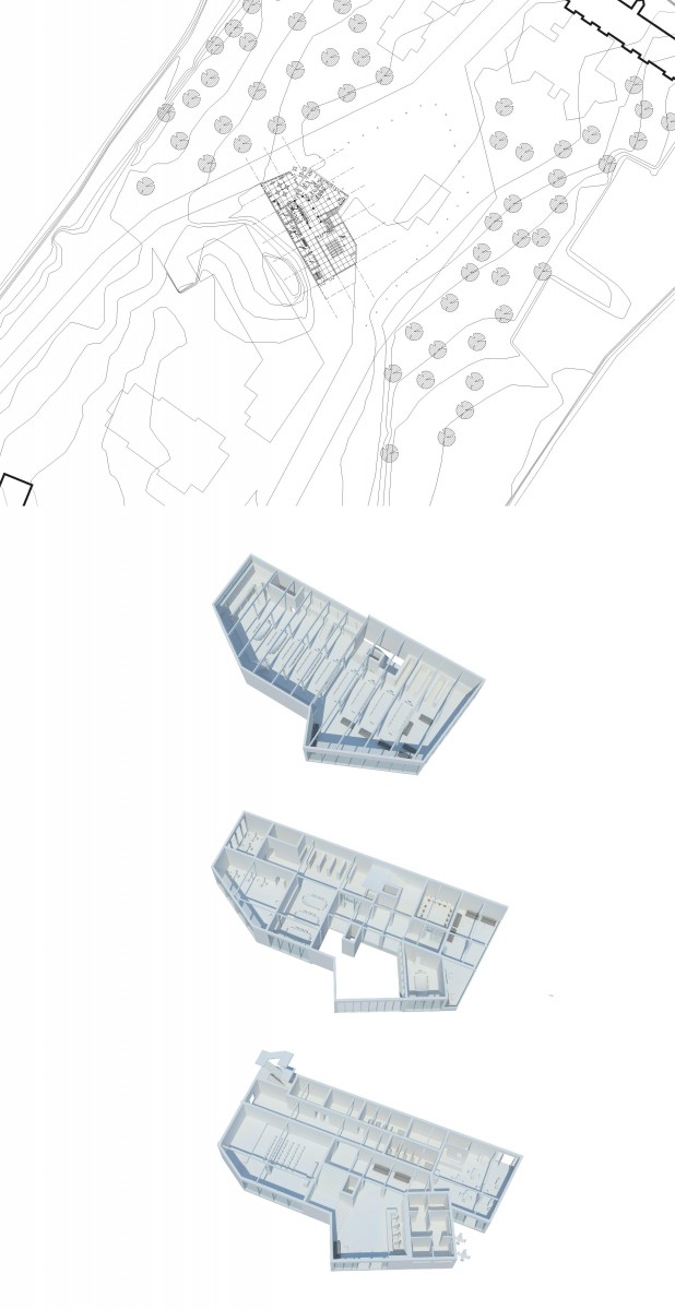
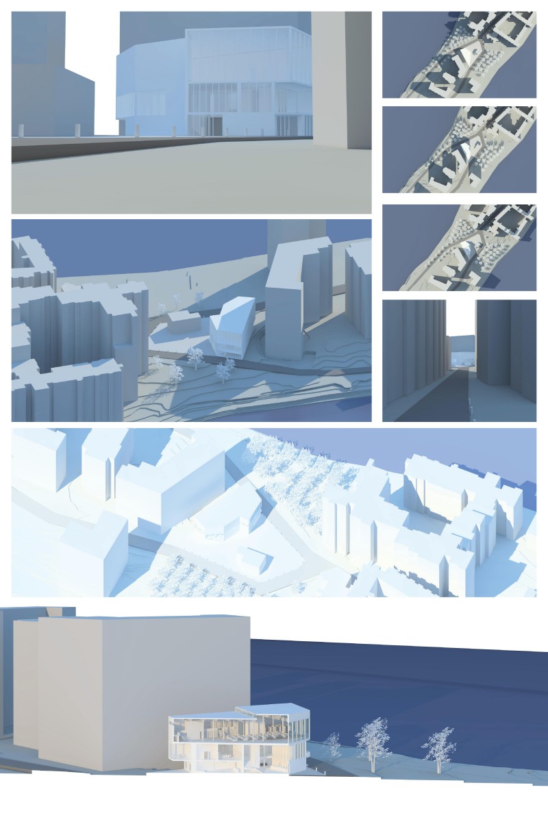
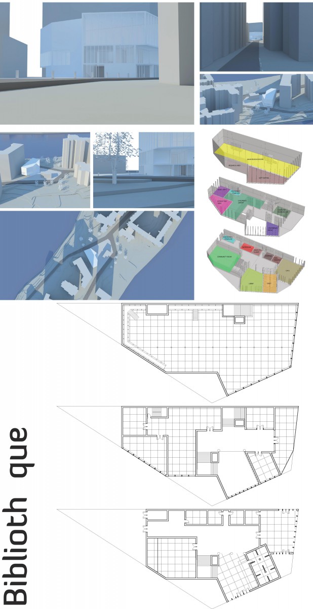
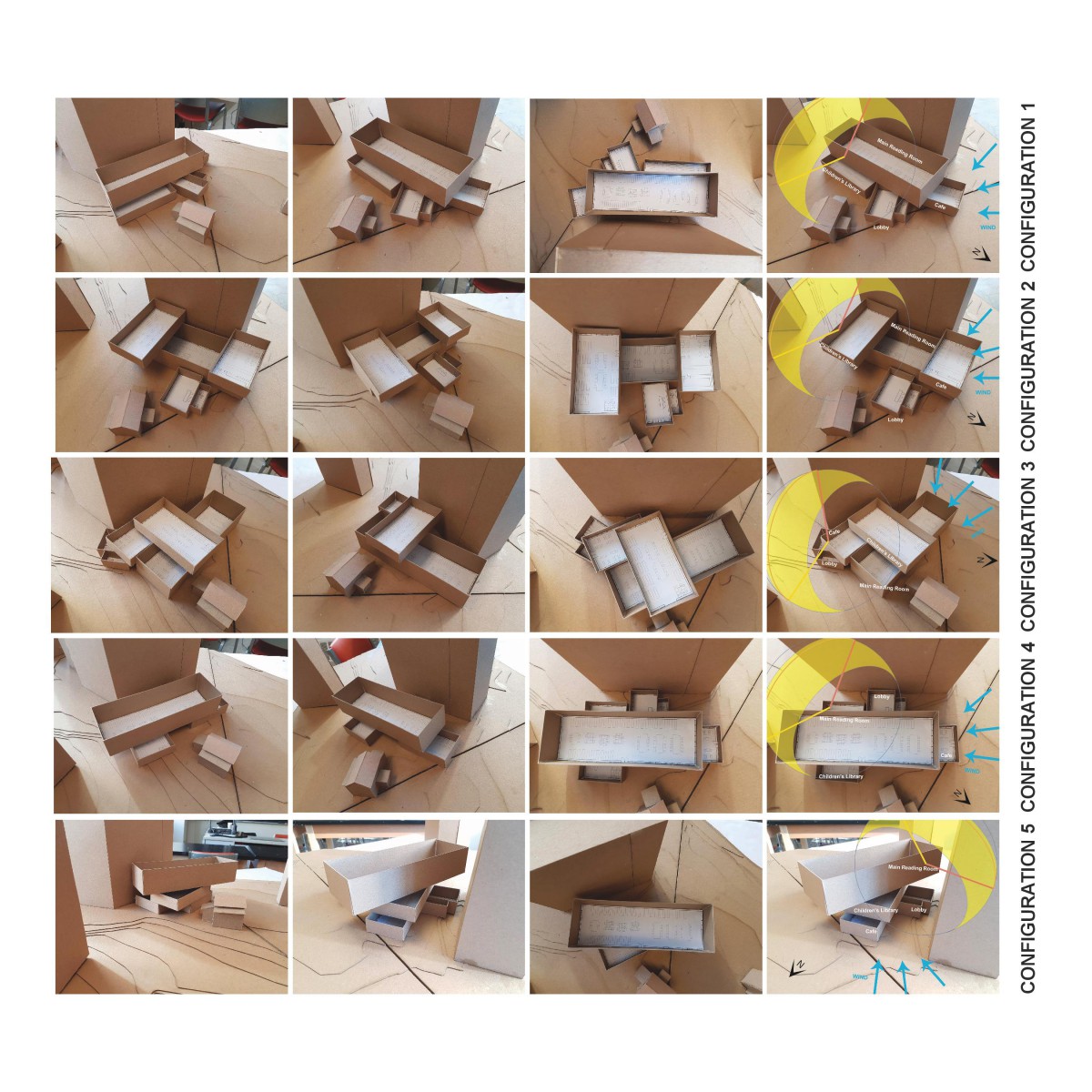
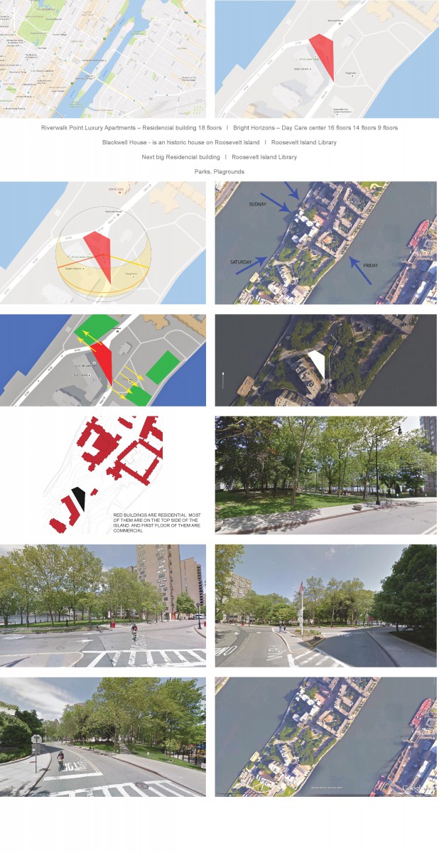
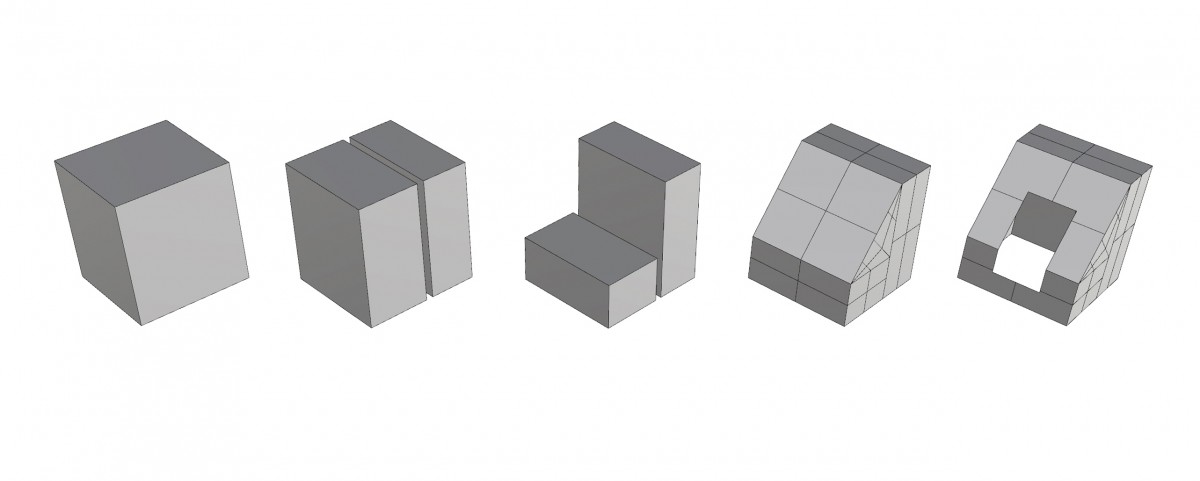
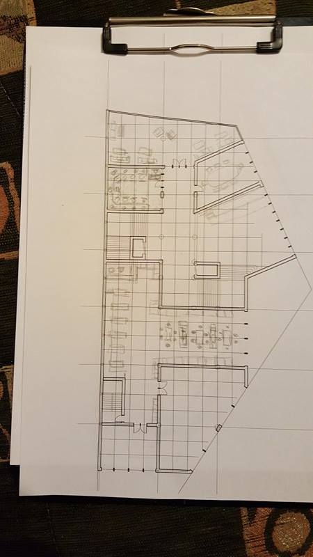
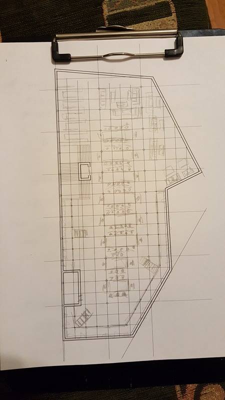
This is the final face of the Library Project. The approach here was the same as the house project. first step was site analysis. our site was Roosevelt island, very interesting site by the way, because we had 3 nice views from our site, the building behind provided shade, and blocked wind somehow. the next step was configurations, I made modules and arrange them into 5 configurations. then I chose 2 out of 5 and studied their program. and out of 2 I chose 1 and started working on it and developing it. during the development process I made a lot of changes and found out some important things in it. below you will see vertical circulation, structure and program diagrams. the most important diagram is core diagram which has its rhytm A B A A B. Rhyhm is used in many buildings in the country where I am from (GEORGIA), so I decided to apply it in my library and it worked. the core is located in the middle of the library and I can say it holds the entire building. the lobby is perpendicular to the road coming from the NE and in the lobby the entire wall behind the circulation desk is covered with books, so once you get it you already have an idea what is the building about. and from this point you see 2nd floor because lobby is 2 stories high, and staircase which leads to the 2nd floor, so you know where to go. the first floor is mostly public, I have cafe on the side where people come from train station, so they can get in and grab something on their way. and other side of the 1 st floor is presentation room. moving on the 2nd floor we have children’s library with interactive and quiet rooms built in it and on the other side, above the cafe there is conference room, soft seating on the balcony and computer workstations. next to them there is another staircase which leads you to the main reading room to the 3rd floor. the main reading room is divided into 2 parts. on the one side there are lots of books on 2 floors of stacks and other side is soft seating looking at the manhattan. the emergency staicase is at the back corner of the building. some renders of floors sections and rooms itself down here will make more sense about the library.
ASSIGNMENT Y (Final Presentation Development and Mock-Up)
ASSIGNMENT V (Final Parti Selection)
ASSIGNMENT U (Plan Drawings)
ASSIGNMENT T (Site Axon and 3D Site Section Development of Final Parti Selection)
ASSIGNMENT S (Parti Concept Refinement)
ASSIGNMENT R (Parti Concept Refinement)
ASSIGNMENT Q (Parti Development)
ASSIGNMENT P (Library Program + Modules – Digital)
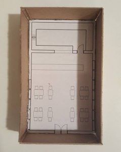
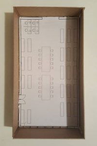
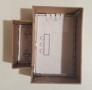
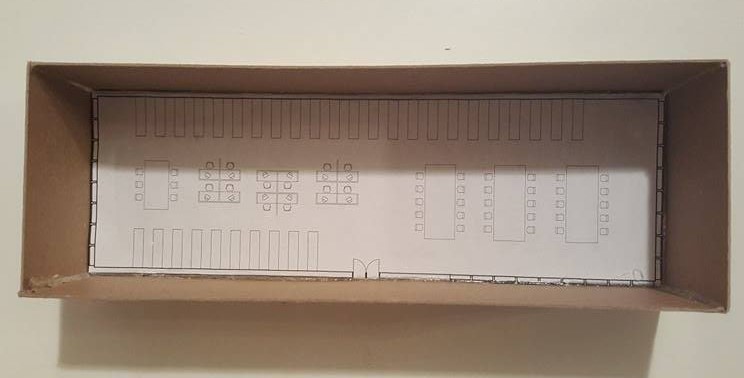
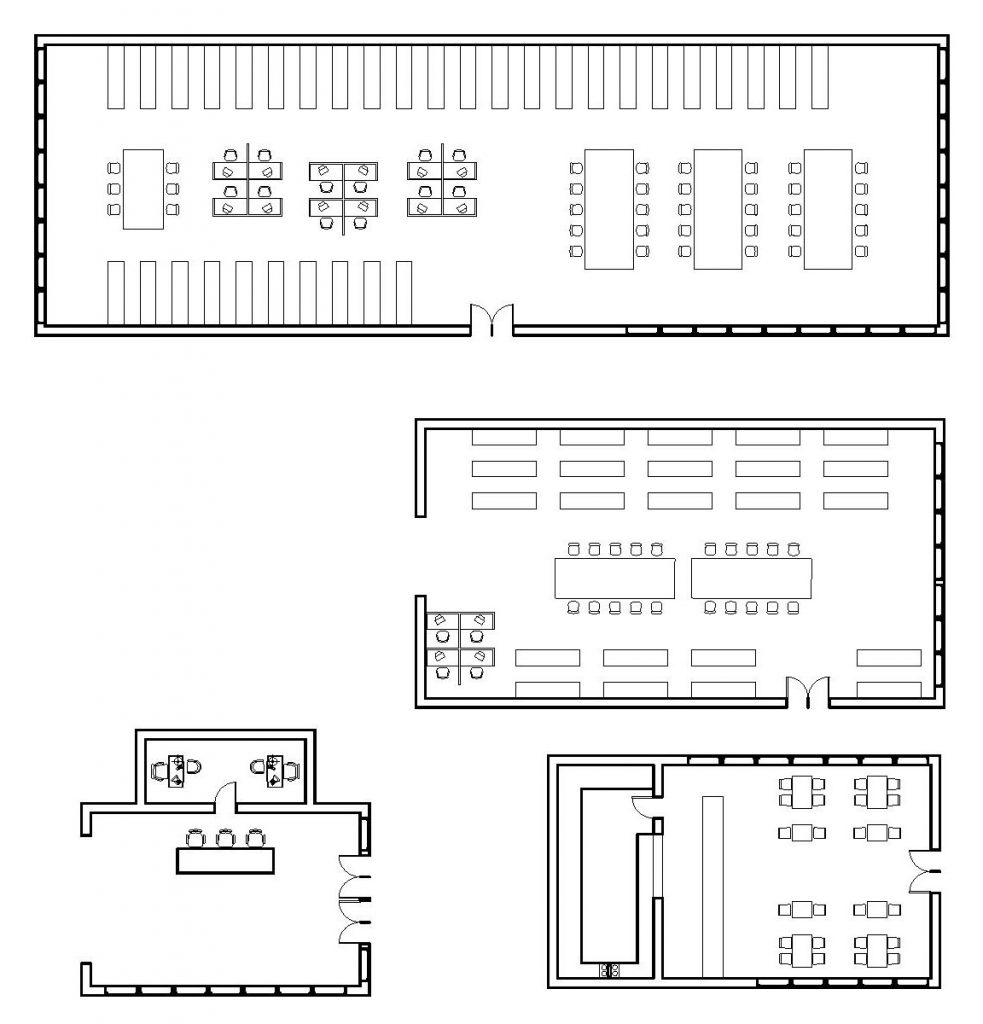
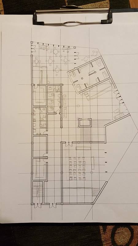
FLOOR PLAN of main reading room, children’s library, cafeteria and lobby with stuff offices.
the biggest room is main reading room with stacks in fron of the door and next to it. the wall behind stacks is solid to keep books away from the sun. half of the room is research computer station half is big 3 tables with alot of chairs around it. the entrance is in the middle of the room so once you get it, you see everything around, you get in the center of the room. glazing is from the north mostly where sun doesnot shine as much.
the room below it is childrens library with 4 computers for quick research for kids stacks in fron of the door and next to it, both sides. glazing is on the one side only which is looking at the park outside. middle of the room is filled with 2 big tables and chairs around it. also the orientation of the stacks is different from the main reading room, I made it horizontally, which looks like a puzzle, walking between the stacks.
the lobby is 2 stories high, with 4 doors from the north side where the road is coming down from. there is circulation desk right when you step in. and behind it there is 2 stuff offices. from the lobby when you look up you should be seeing the main reading room to have an idea whats on the upper floor. and once you step in the lobby you will see the staircase which gives you direction where to go.
the last room is cafeteria, which has only one entrance (for now). tables, kitchen glazing for nice view while eating.
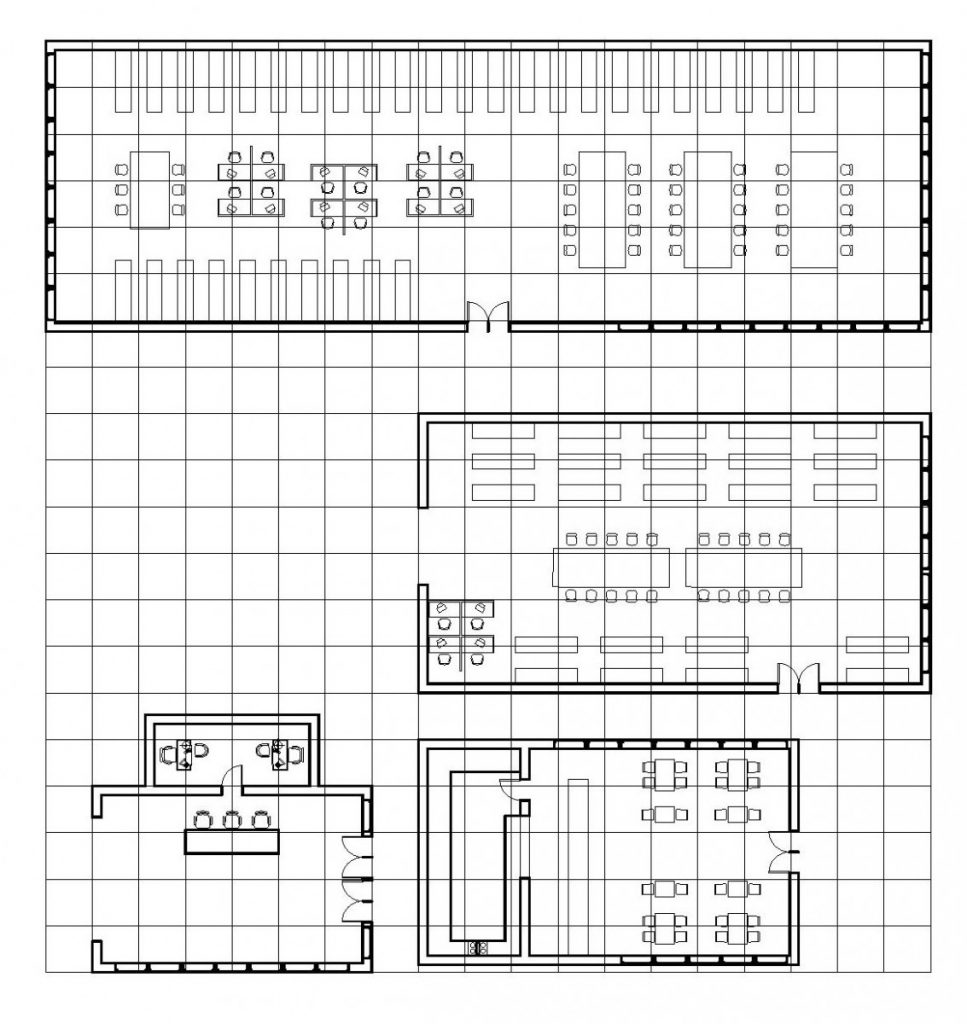
THE SAME FLOOR PLAN ON GRID
Library #1
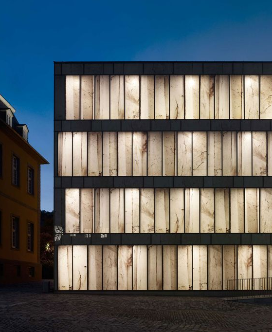
This is the library which I would definitely go in. the first look is amazing. The facade- looks like a book shelf. the crack effect gives the building old look which is close to the library, because libraries are usually full of old books. two main colors used on this building are black and white. two very opposite colors. That’s why white part of the building pops up, especially when lights are on, behind the white part of the building
Library #2
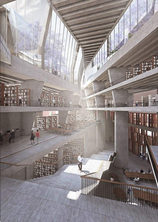
This is an interior of a library. I think the first floor is more likely place where people sit and talk, on the other side I see a lot of books, which probably means the staircase splits the floor into different programs. I see rooms too, for quiet place people to study. The long staircase connects the first to the second floor. I think it’s long because raise is low so you won’t get tired walking on it. The second floor is research I think, because I see people sitting in front of computers. Behind them I see books again going all the way down up to the end of the wall and next to stacks there are tables. the third floor is full of books too on the one side, and on the other side I think its cafeteria, because I see people sitting around small tables. and the next floor is balcony I guess since I see glazing at the edge of the wall. the library itself responds sun so well, because glazing allows the sun to shine into the side of the library where no books are located. as we know books don’t like the sun.
Library #3
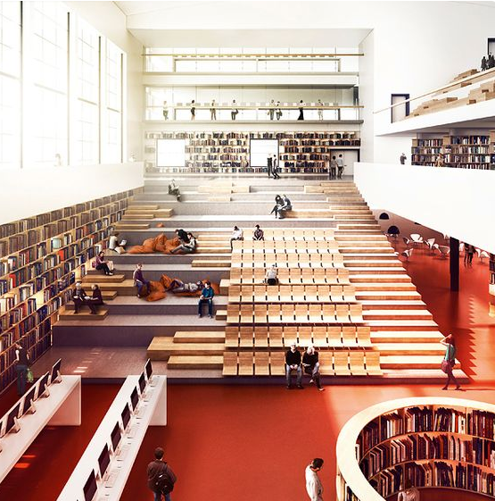
On this picture I think I see the main part of the library. Long wide staircase which has different programs on it. regular seating like in theater and soft seating next to it. at the one end of the staircase there are books, and glazing on top of it, which helps the sun light up the room and don’t touch books, while at the end of the stairs there ar ebooks which gets some light, from the glazing next to it, but the last part of the wall is solid which protect books from the sun. on the other side of the stairs there is soft seating place, probably cafeteria. at the start of the stairs there are computer workstations for research. and circle shaped stack. the shape I believe is decorative.
ASSIGNMENT O (Precedent Research)
ASSIGNMENT N (Site Analysis)
PROOF THAT ME AND GURAMI TOOK THE AUDIO TOUR IN NY PUBLIC LIBRARY
ASSIGNMENT M (Final Presentation)
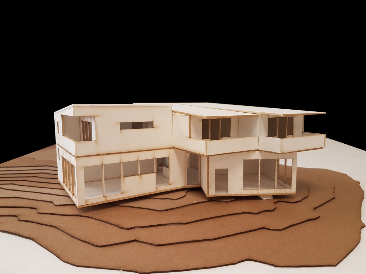
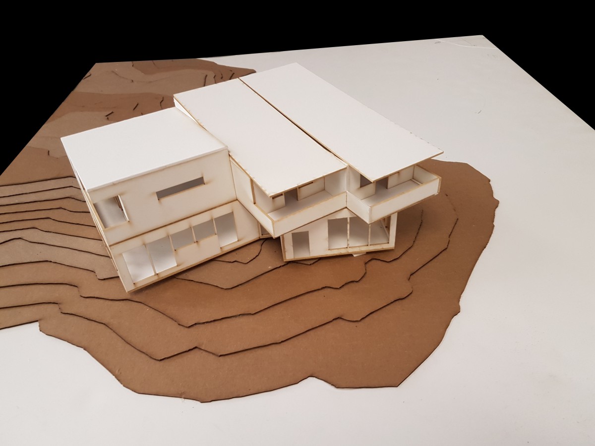
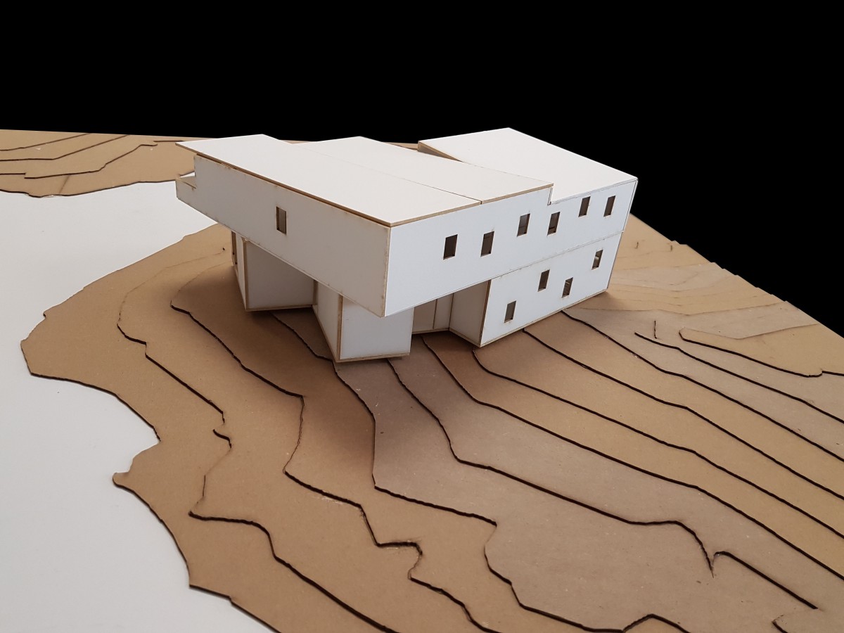
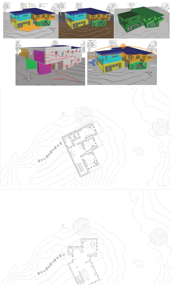
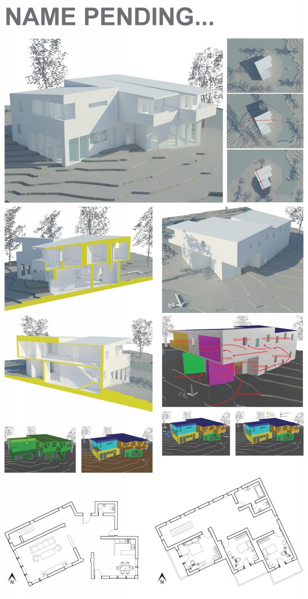
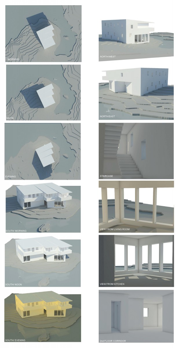
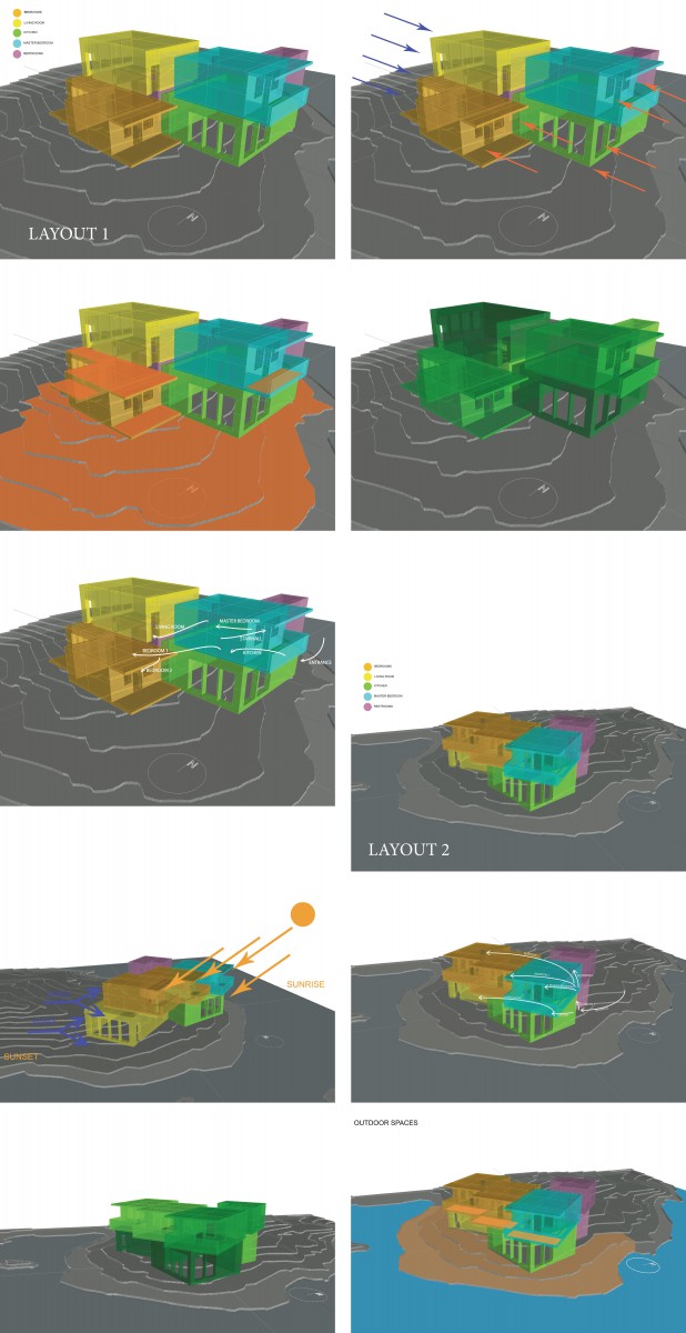
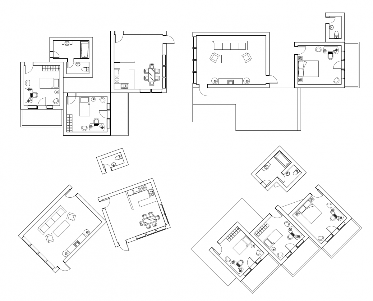
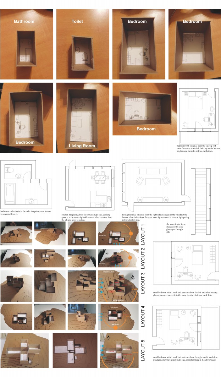
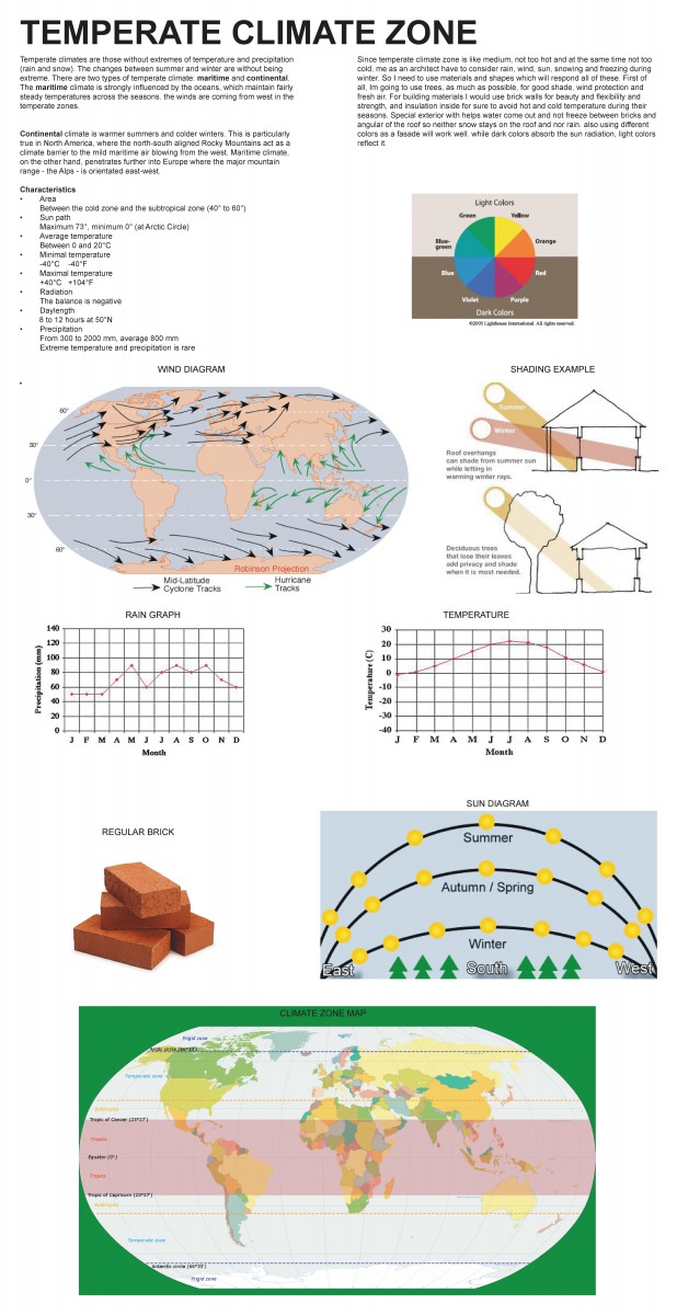
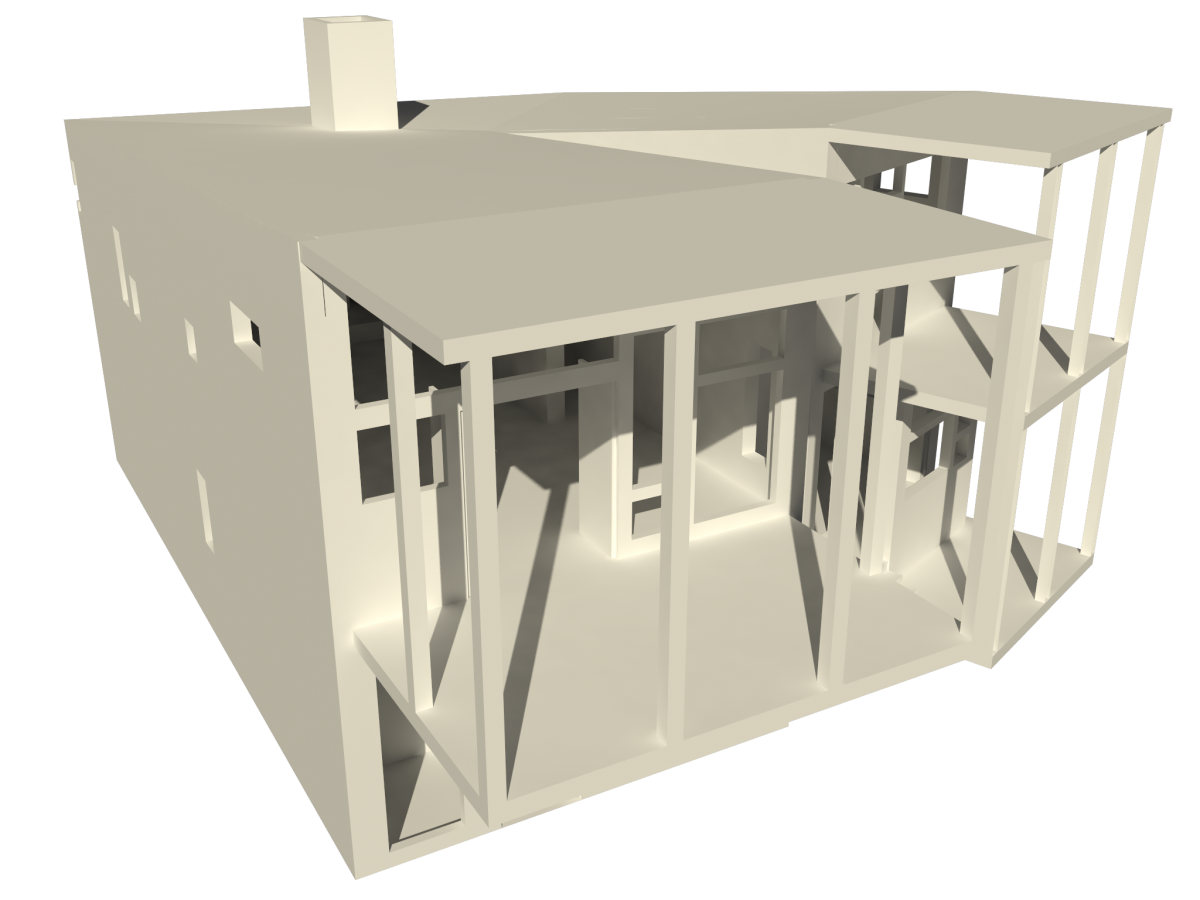
This is the final presentation board of the House project. The project started studying climate. My climate zone was temperate. The location is shown on the map below. I chose upper part of temperate climate because I was more familiar with it. The location I chose is NY. During the climate analysis I studied wind too which is coming from the west side which means I have to protect my house from it somehow. After that I built modules and did digital drawings for them. The next step was configurations. I did 5 different configuration and simple sun and wind diagrams for them to understand how each configuration works. After that we were asked to choose 2 out of five and develop them. Which is shown by different diagrams like outdoor spaces, sun, wind, massing, and circulation. After all these I chose 1 out of 2 and developed it. The final model is shown on the upper right corner below. With the top view rendered views I show how sun works different times of the day and also where I cut the section. I cut 2 section to understand the inner space more. One cut is right through the stairs, the main part of the building which controls all the vertical circulation. The diagrams on the middle of the board explains shape development and explains the design more. Since I have 2 floors, I did not want them to be alike, so on the second floor I went kind of crazy with the rotation of the bedrooms and the biggest step of my design was rotation of the west side part of the house. Since I have western winds on my climate, I had to protect glazing and I decided to rotate, so the wind would hit right in the corner and it would not push the windows much. This rotation definitely caused the rotations upstairs. The entrance of the house is from the back and garden and solid wall leads to it. Once you go in the house you have living room and stairs going up on the left side and toilet and kitchen on the right side. From the kitchen the house has access to the front, by the water and once you step out of the kitchen you are on the kind of L shape terrace which creates space. on the second floor we have a big bedroom right above the living room, then little bedroom, master bedroom with own toilet in it and separate toilet and bathroom for everyone. The glazing responds climate as much as it can. Kitchen gets morning sun and living room gets evening sun. On the 2nd floor I used overhangs for master and little bedroom to provide shade and for the big bedroom, I put solid wall facing to mid-day sun with a little window on it, for more light. All the bedrooms have balconies. The master and small bedroom has south facing balconies with shade, and the big bedroom has view to the sunset.
ASSIGNMENT L (Final Presentation Mock Up)
ASSIGNMENT K (Final House Design Development)
ASSIGNMENT J (Digital Model Development)
ASSIGNMENT I (Parti Concept Refinement)
ASSIGNMENT H (Modules for Living + Parti Diagrams)
ASSIGNMENT G (House Project SITE SECTION)
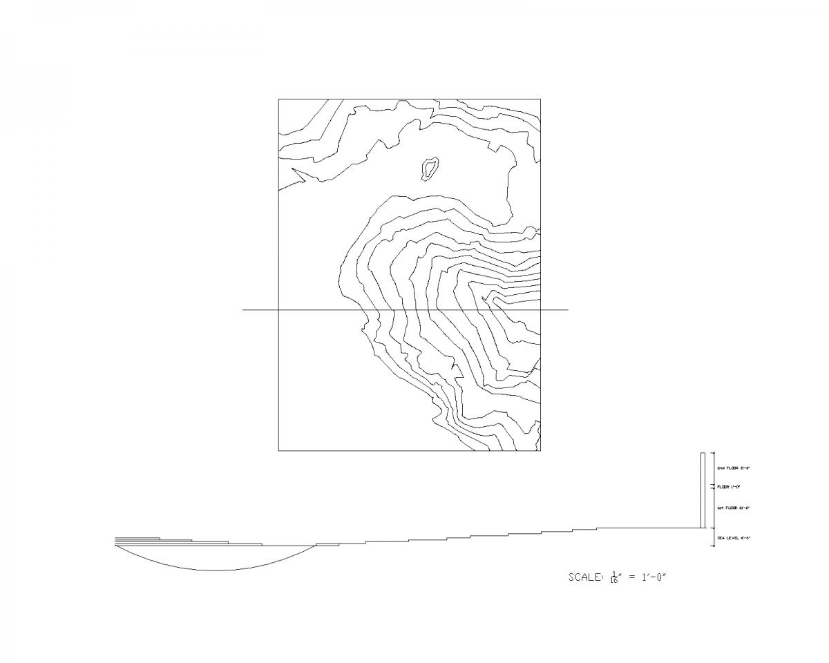 ASSIGNMENT F (House Project Climate Research)
ASSIGNMENT E (Renders of The “Y house”)
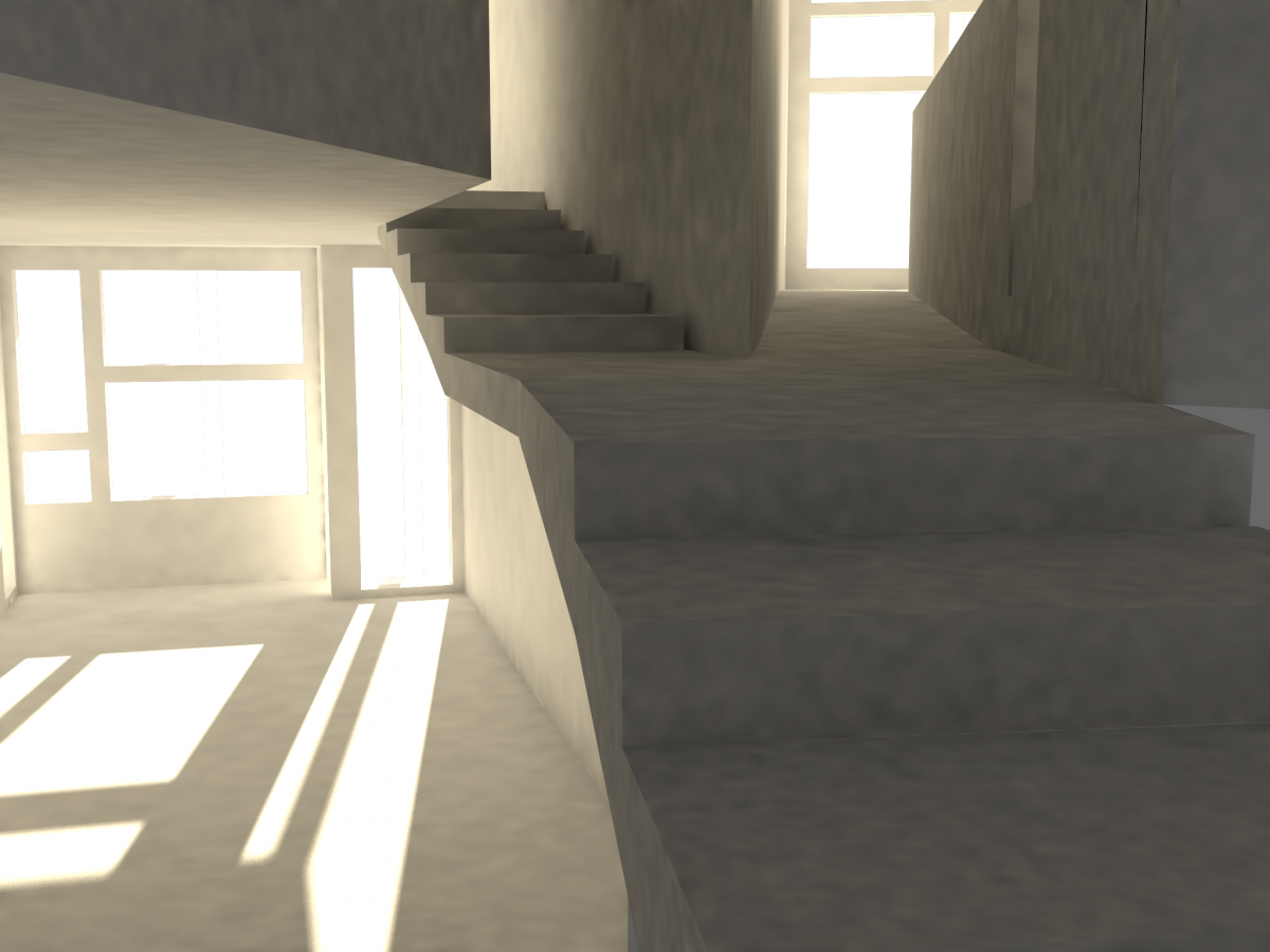
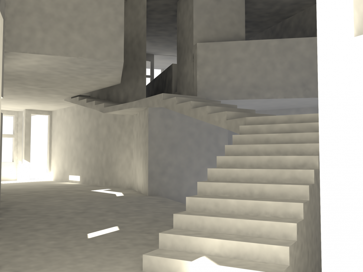
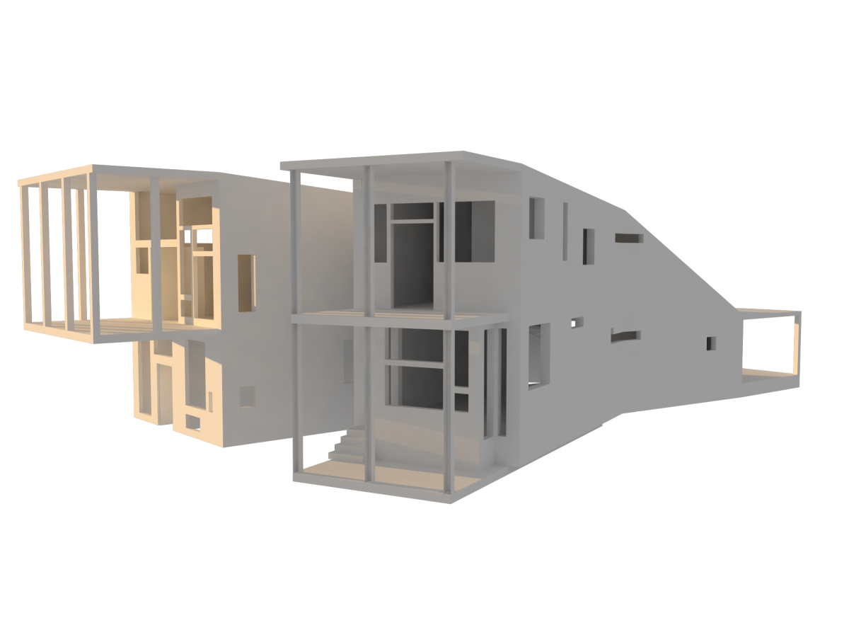
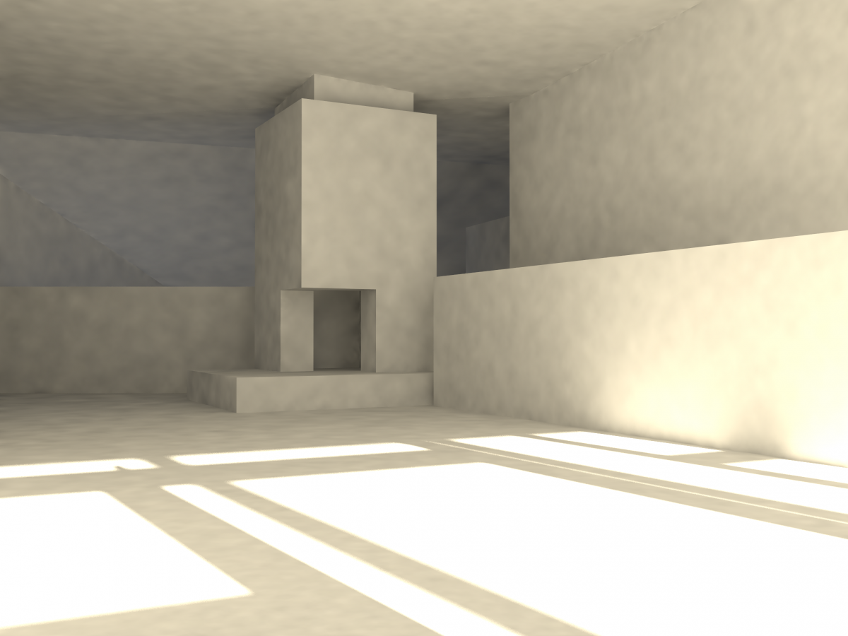
Here are some renders of The “Y” House, by Steven Hall, where he creates the shape Y and makes it work as a house. He is using cross balance between public and private spaces, while 1st floor left side is public and 2nd floor right side public to, and right side of the first floor and left side of the 2nd floor are private spaces (bedrooms). The stairs which connect the first and the 2nd floor, splits house as well.
2nd Floor, Where The Stairs Split The House
Stairs Going On The 2nd Floor
NE View
Living Room, 2nd Floor
NW View
For Plans, Section and Axonometric Drawings See Assignment C
ASSIGNMENT D (Residential Space Renderings / Physical Model Pictures
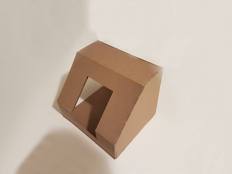
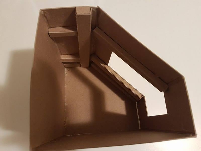
For more info, see Assignment B
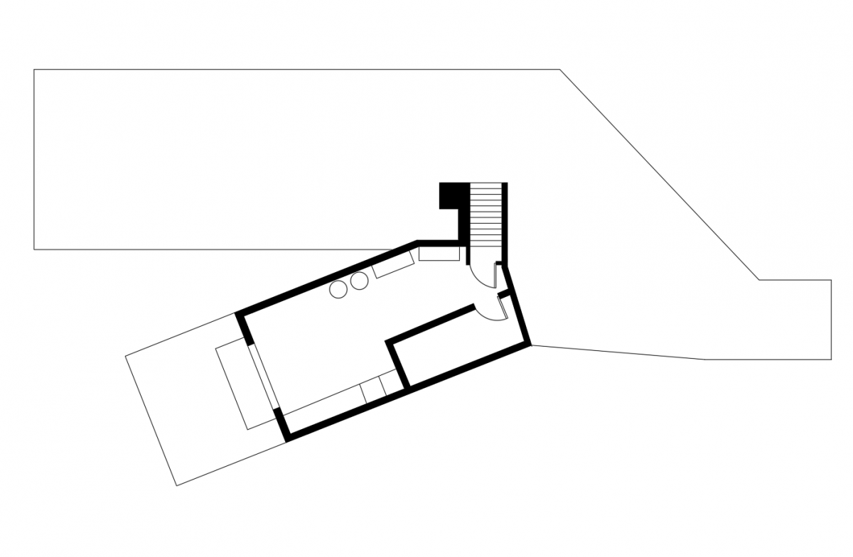
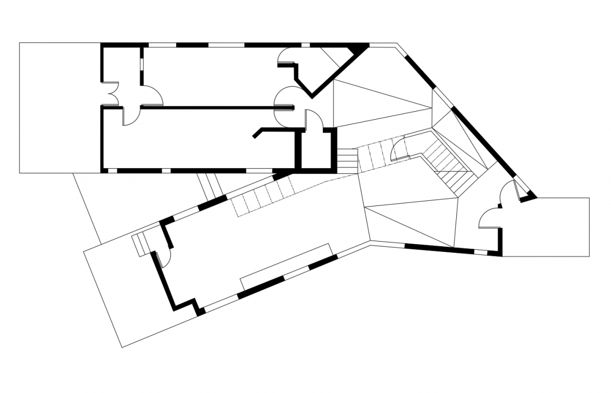
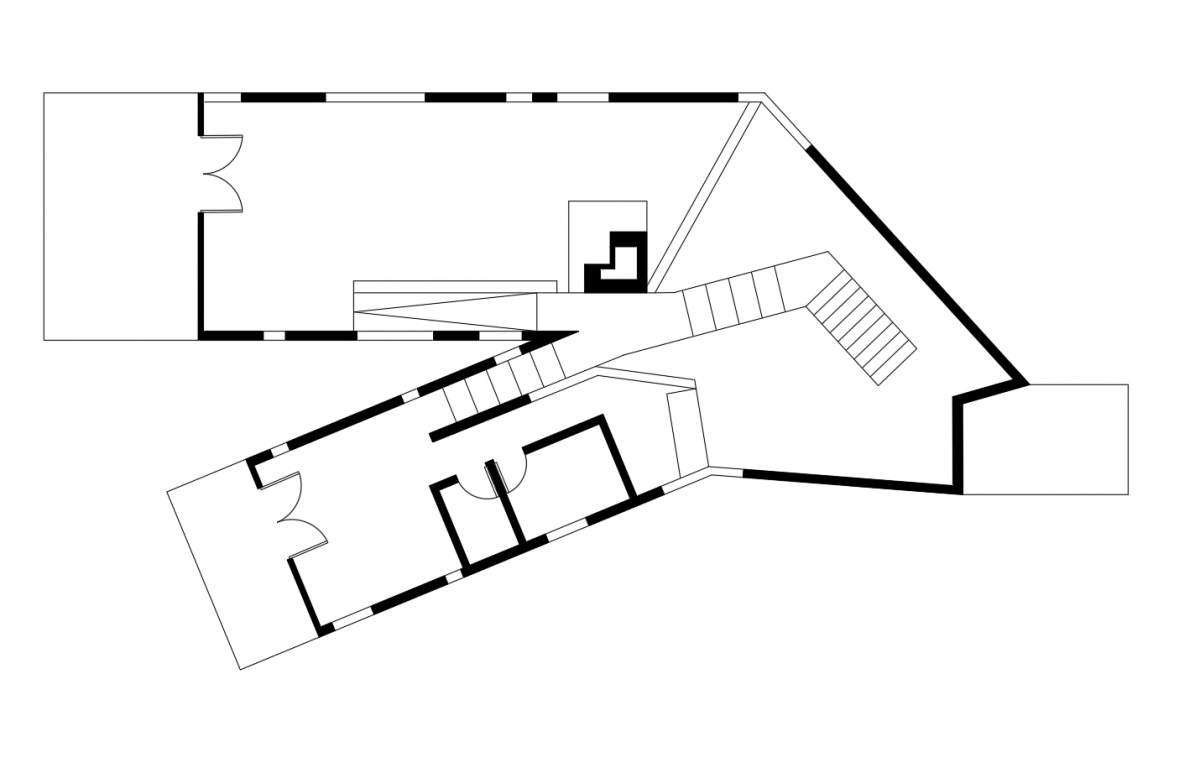
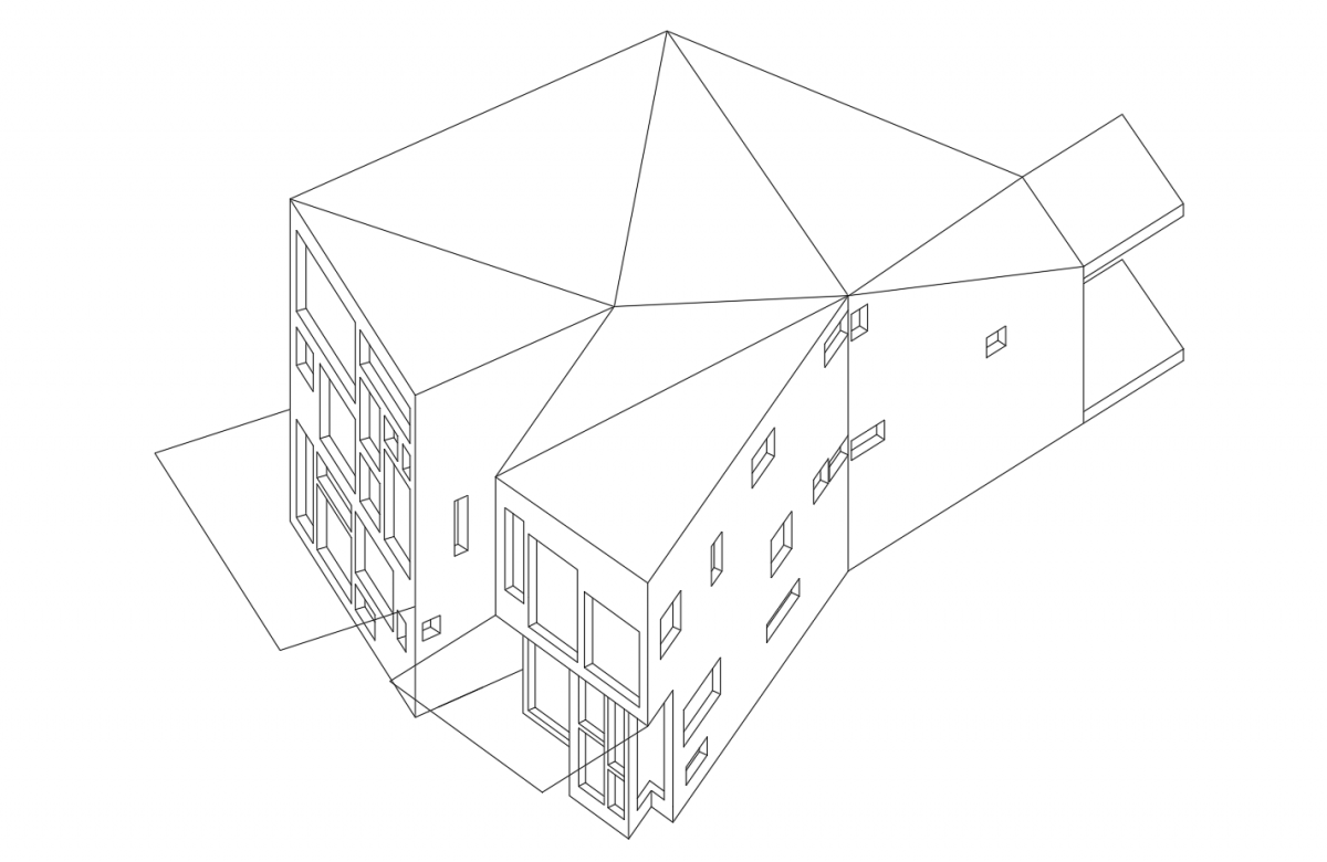
ASSIGNMENT C (House Plans, Sections, AXO)
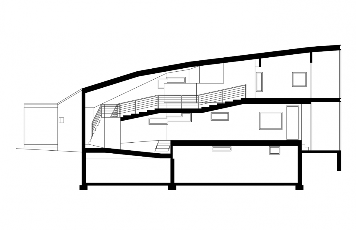
SECTION DRAWING
BASEMENT PLAN
1ST FLOOR PLAN
2ND FLOOR PLAN
AXONOMETRIC DRAWING
ASSIGNMENT B (RESIDENTIAL SPACE)
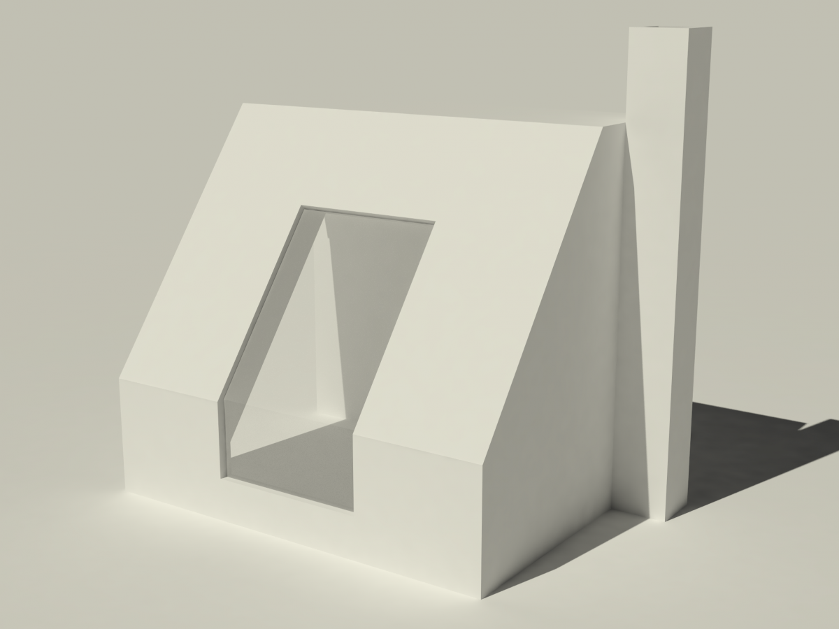
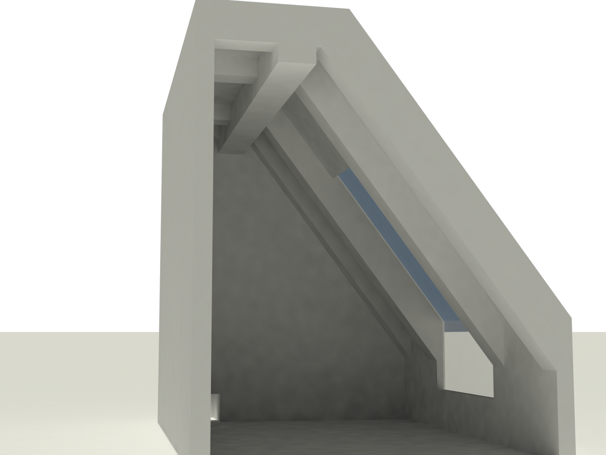
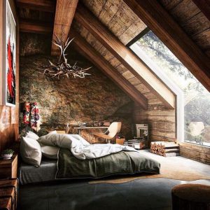
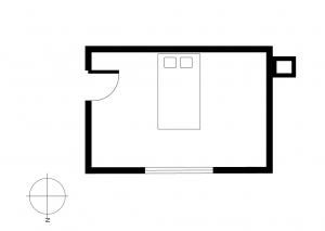
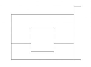
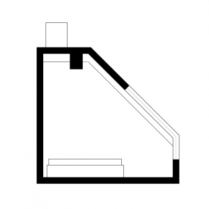
The house is located probably on a hill in a forest, cause we see trees from the window and also looks like interior have a connection to the exterior world. we really don’t see the sun shining inside the room, which means the house is rotated such a way that sun angle doesn’t bother interior during summer. But in winter when sun angle changes, it will warm up the room, which is shown on my sun diagram below. Here are plan and elevation drawings, and the last picture represents how the shape was developed. starting from 2 rectangles and covered with probably 45-degree “roof”, which is in connection with the sun to reflect unwanted light.
Plan Elevation
AXO + SUN DIAGRAM SECTION
Shape Development
ASSIGNMENT A (THE “Y” HOUSE BY STEVEN HALL)
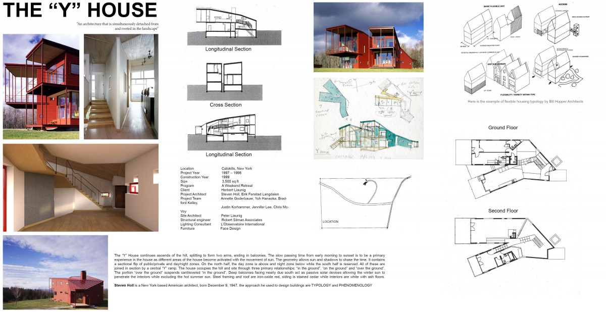
Location – Catskills, New York
Project Year – 1997 – 1998
Construction Year – 1999
Size – 3,500 sq ft
Program – A Weekend Retreat
Client – Herbert Liaunig
Project Architect – Steven Holl, Erik Fenstad Langdalen
Project Team – Annette Goderbauer, Yoh Hanaoka, Bradford Kelley,
Justin Korhammer, Jennifer Lee, Chris McVoy
Site Architect – Peter Liaunig
Structural engineer – Robert Silman Associates
Lighting Consultant – L’Observatoire International
Furniture – Face Design
The “Y” House continues ascends of the hill, splitting to form two arms, ending in balconies. The slow passing time from early morning to sunset is to be a primary experience in the house as different areas of the house become activated with the movement of sun. The geometry allows sun and shadows to chase the time. It contains a sectional flip of public/private and day/night zones. On the north half, the day zone is above and night zone below while the south half is reserved. All of these are joined in section by a central “Y” ramp. The house occupies the hill and site through three primary relationships: “in the ground”, “on the ground” and “over the ground”. The portion “over the ground” suspends cantilevered “in the ground”. Deep balconies facing nearly due south act as passive solar devices allowing the winter sun to penetrate the interiors while excluding the hot summer sun. Steel framing and roof are iron-oxide red, siding is stained cedar while interiors are white with ash floors.
Steven Holl is a New York-based American architect, born December 9, 1947. the approach he used to design buildings are TYPOLOGY and PHENOMENOLOGY

