“No Pain, No Gain”
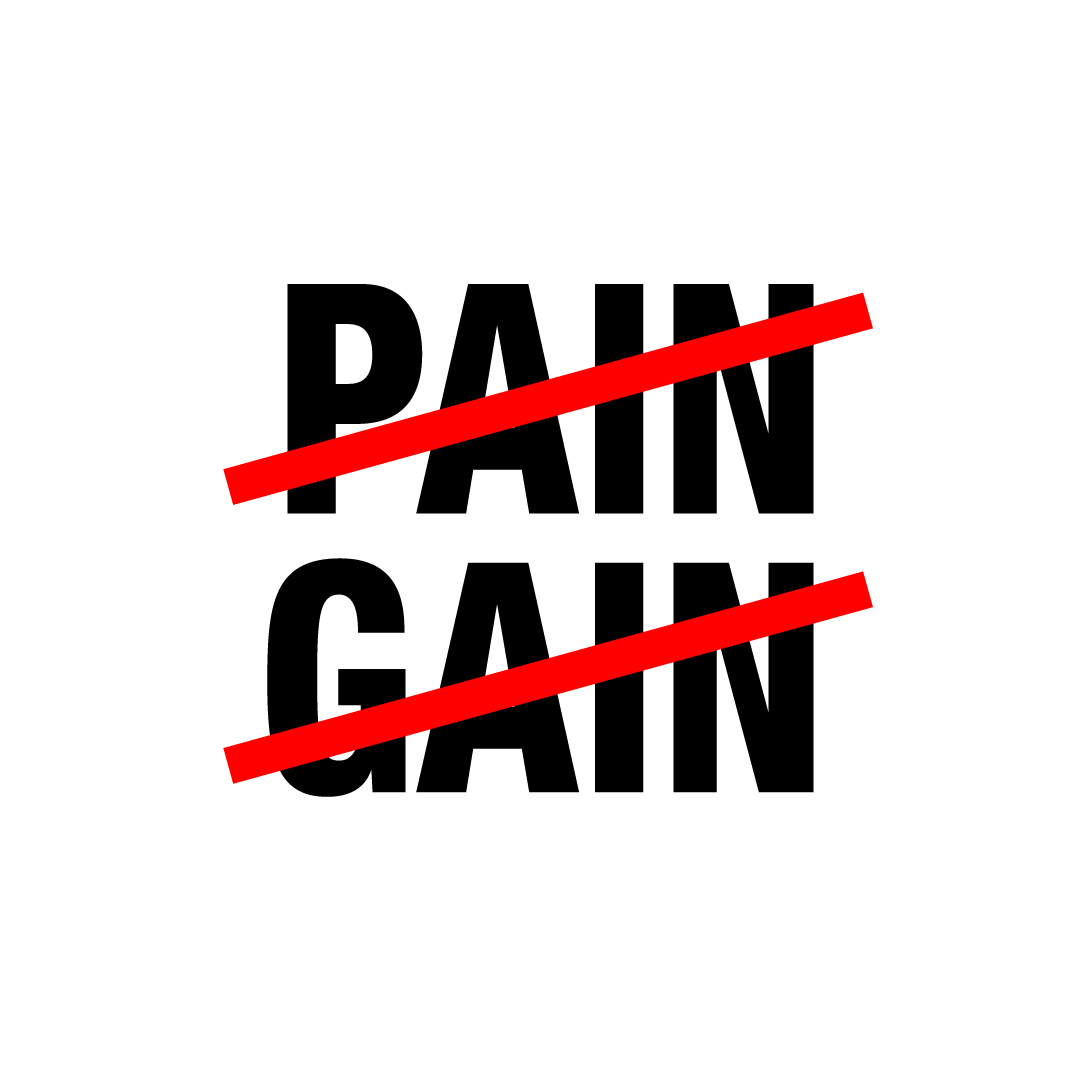
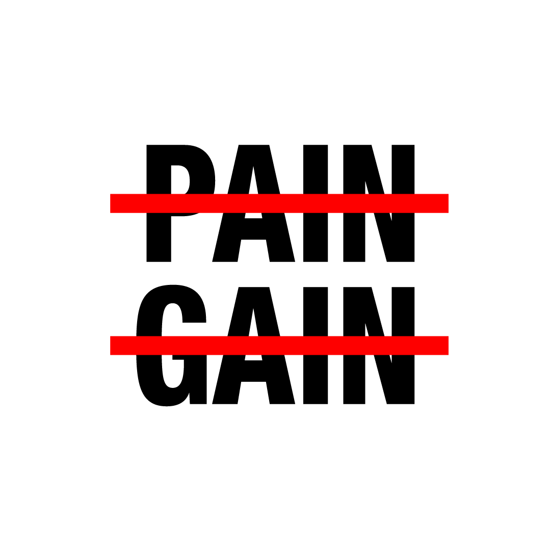
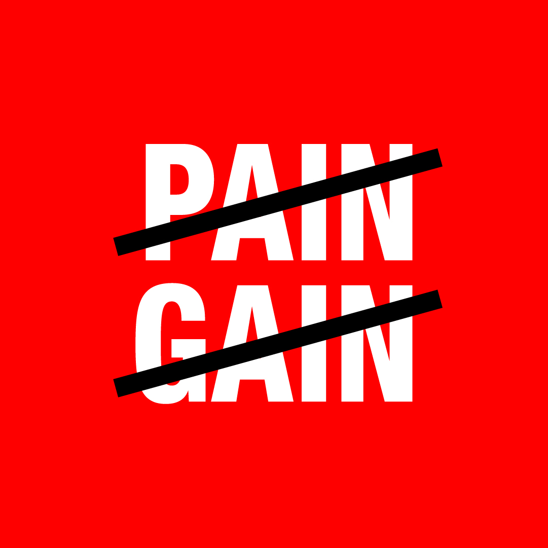
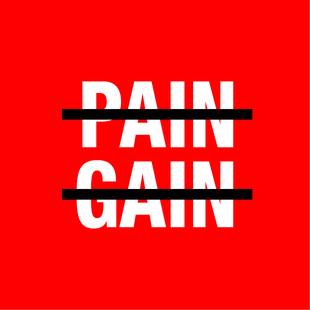
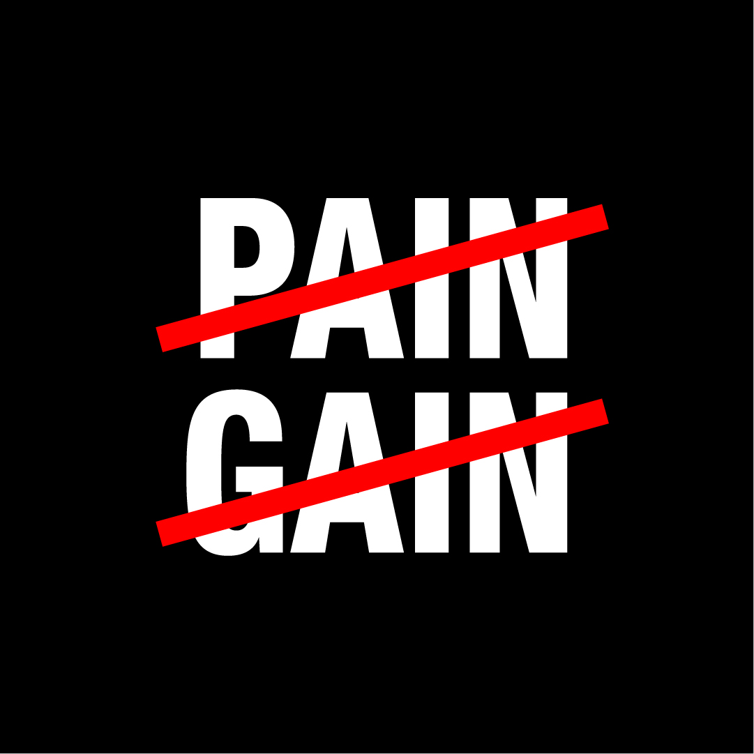
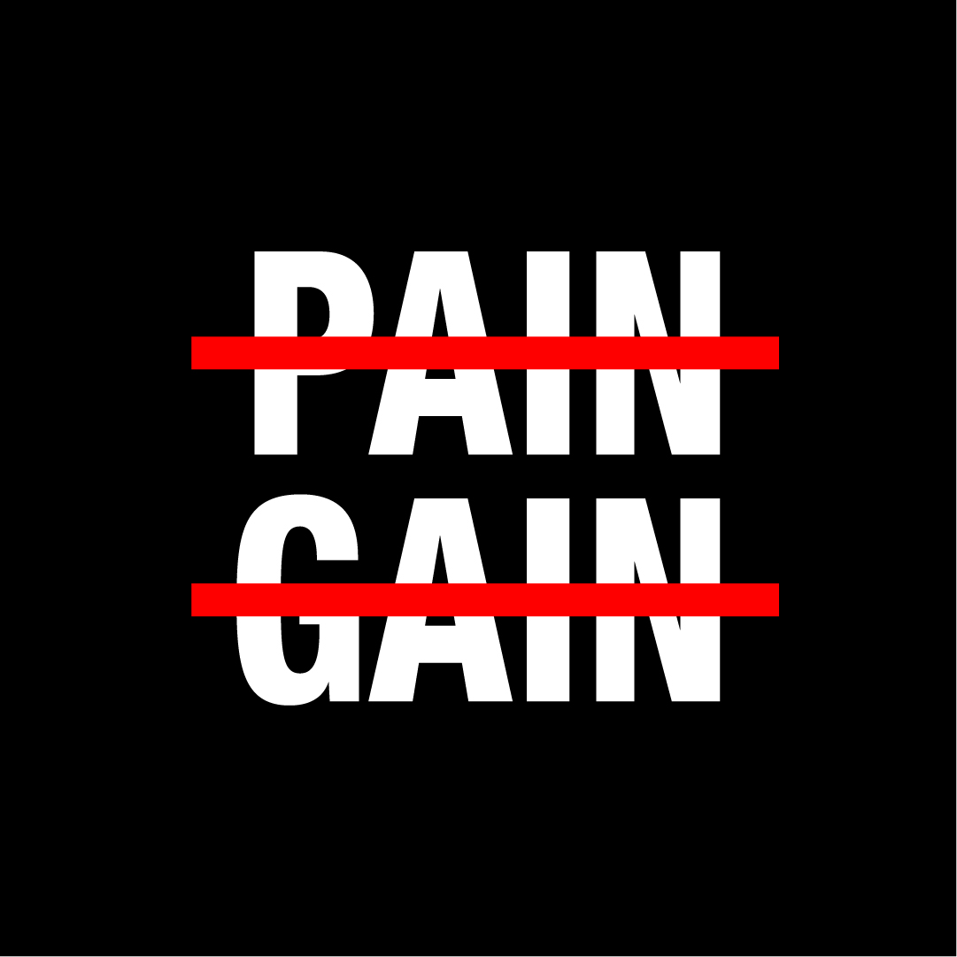
Concept 1
Inspired by the ‘Pentangram Conundrums’, I approached these in a way that would visually represent the quote/saying in a clever and minimal way. Crossing out words symbolically convey ‘No’ so I did that with both ‘Pain’ and ‘Gain’. I also chose to make the crossmarks red to further emphasize ‘No’, and then continued to do different iterations swapping colors and crossmark placement all around.
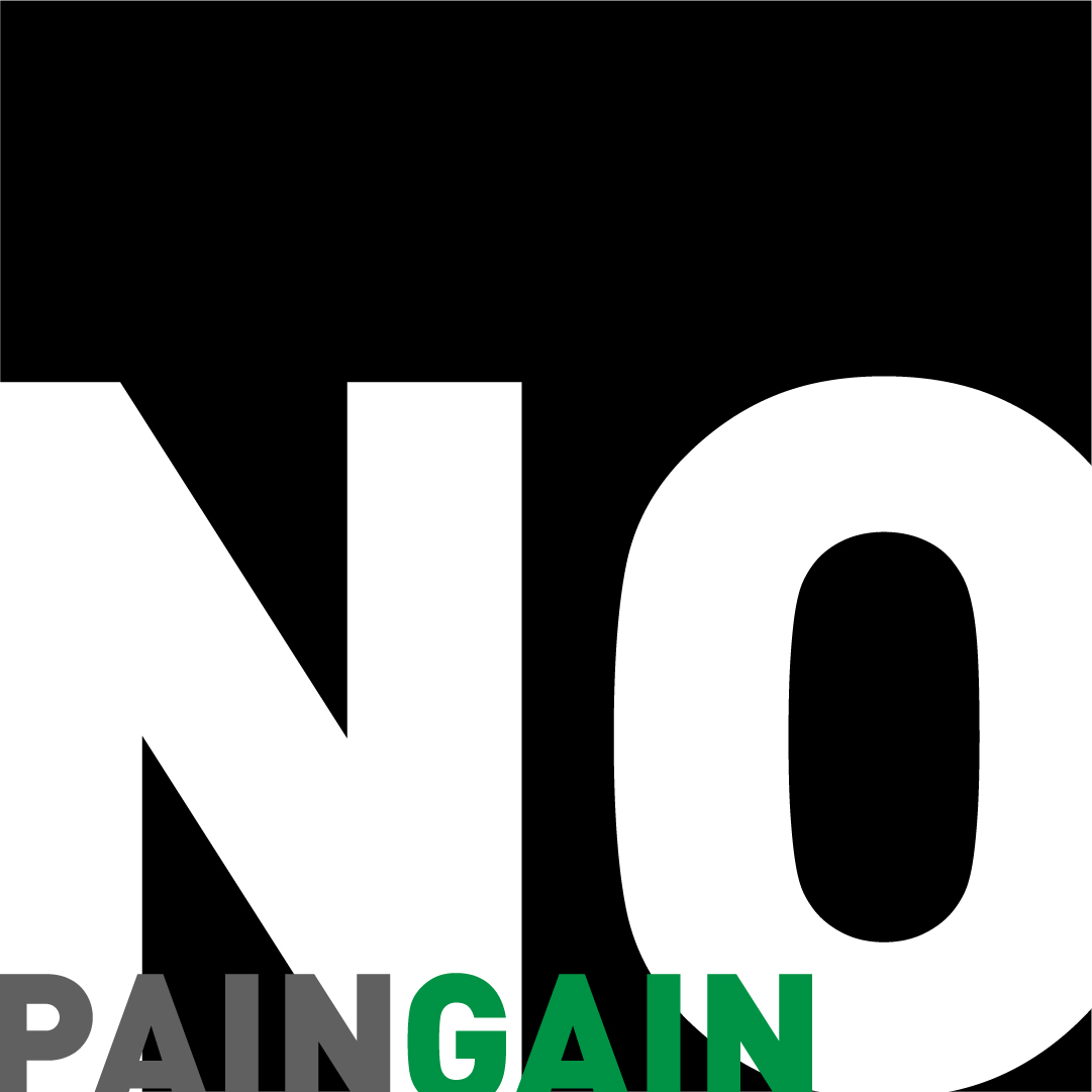
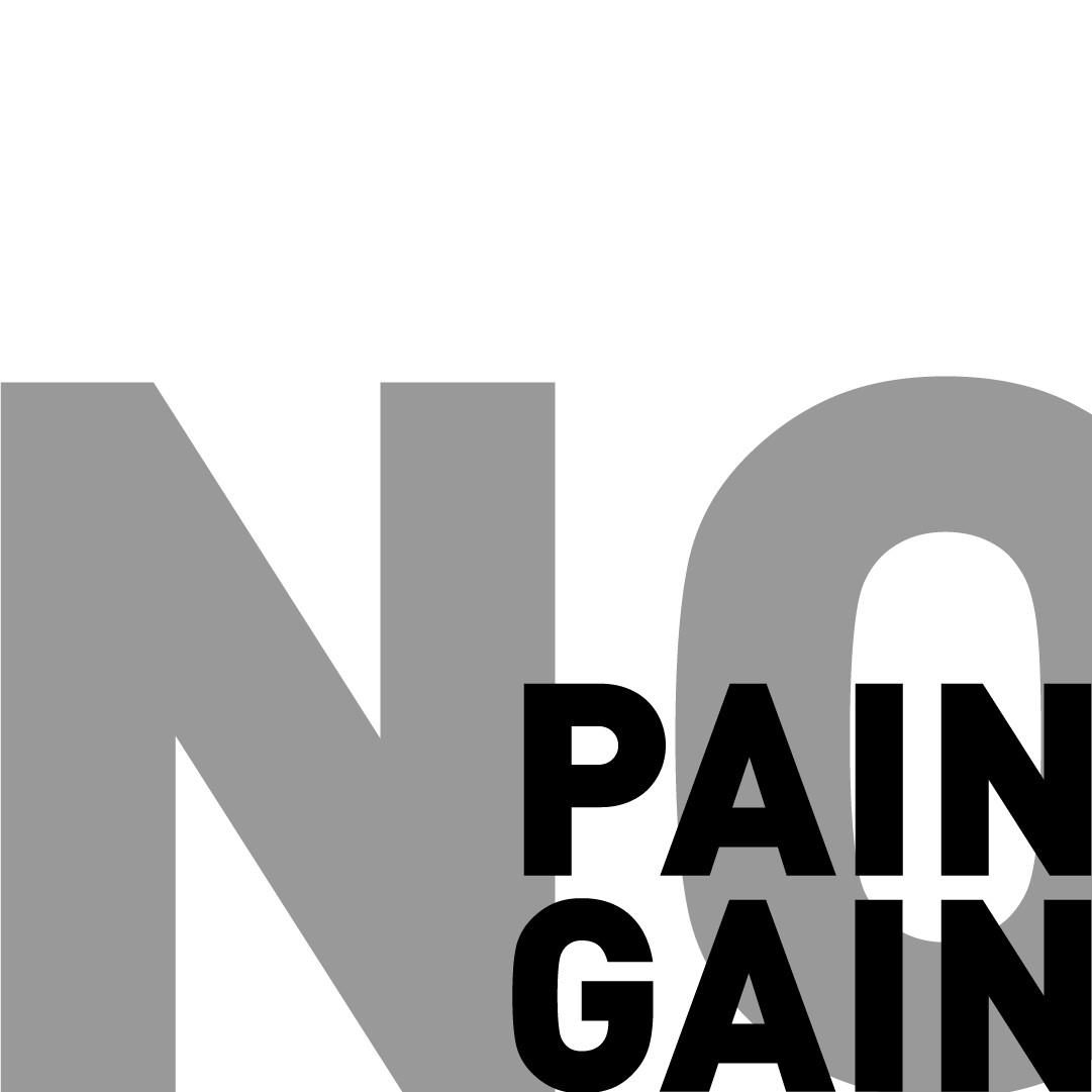
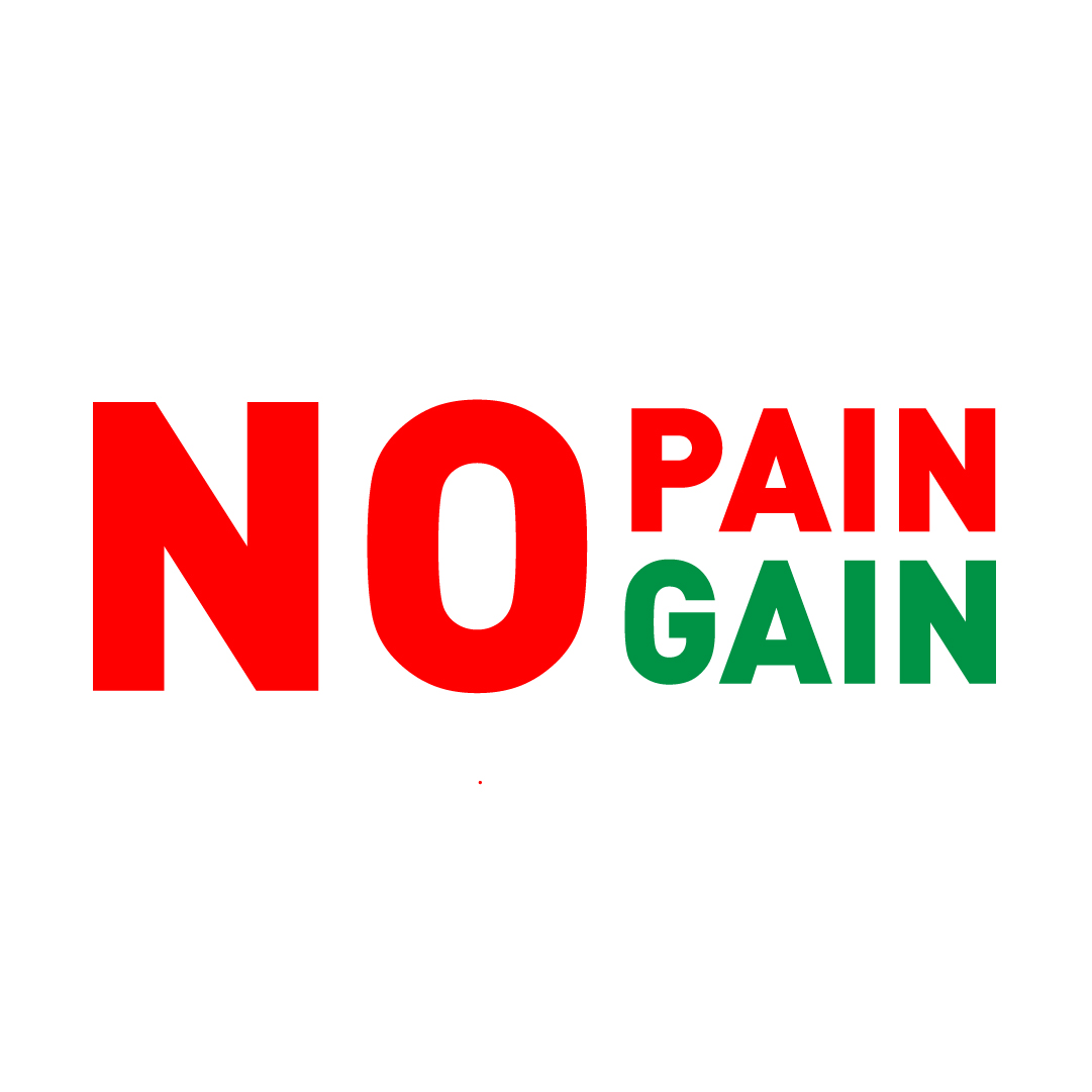
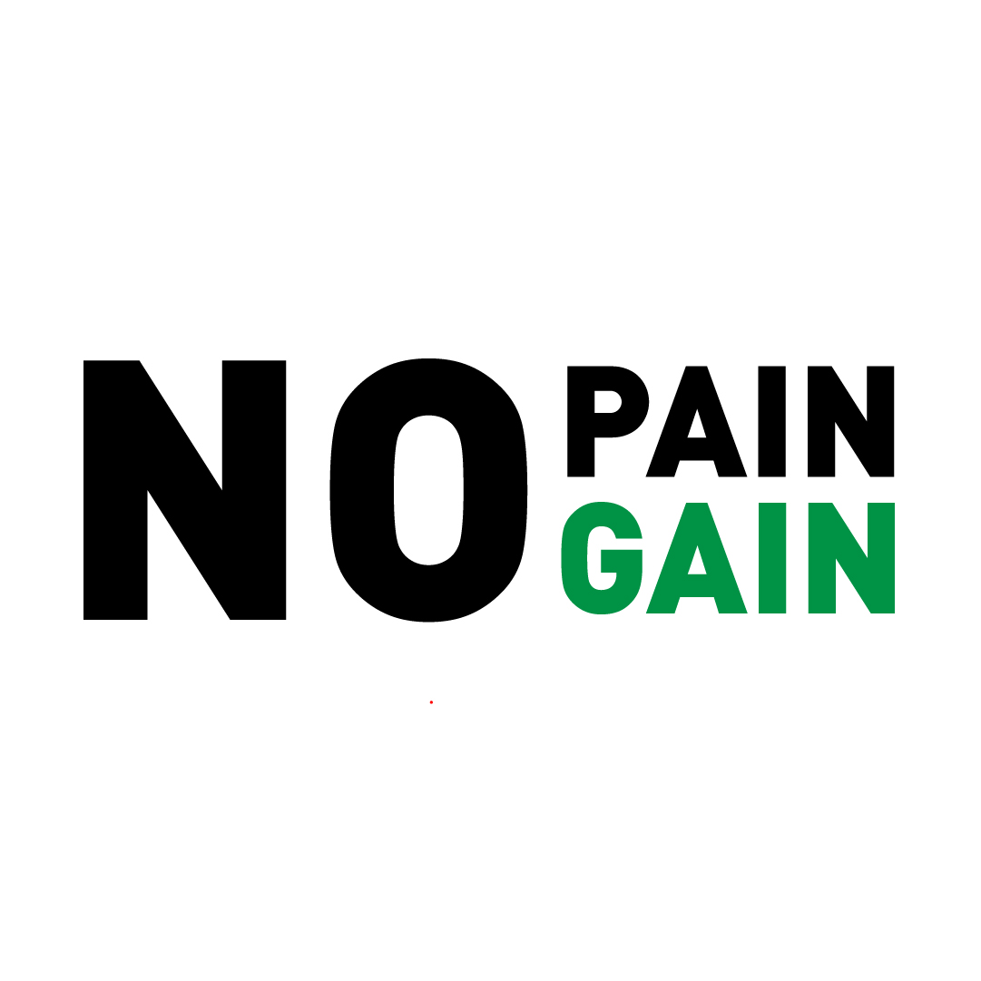
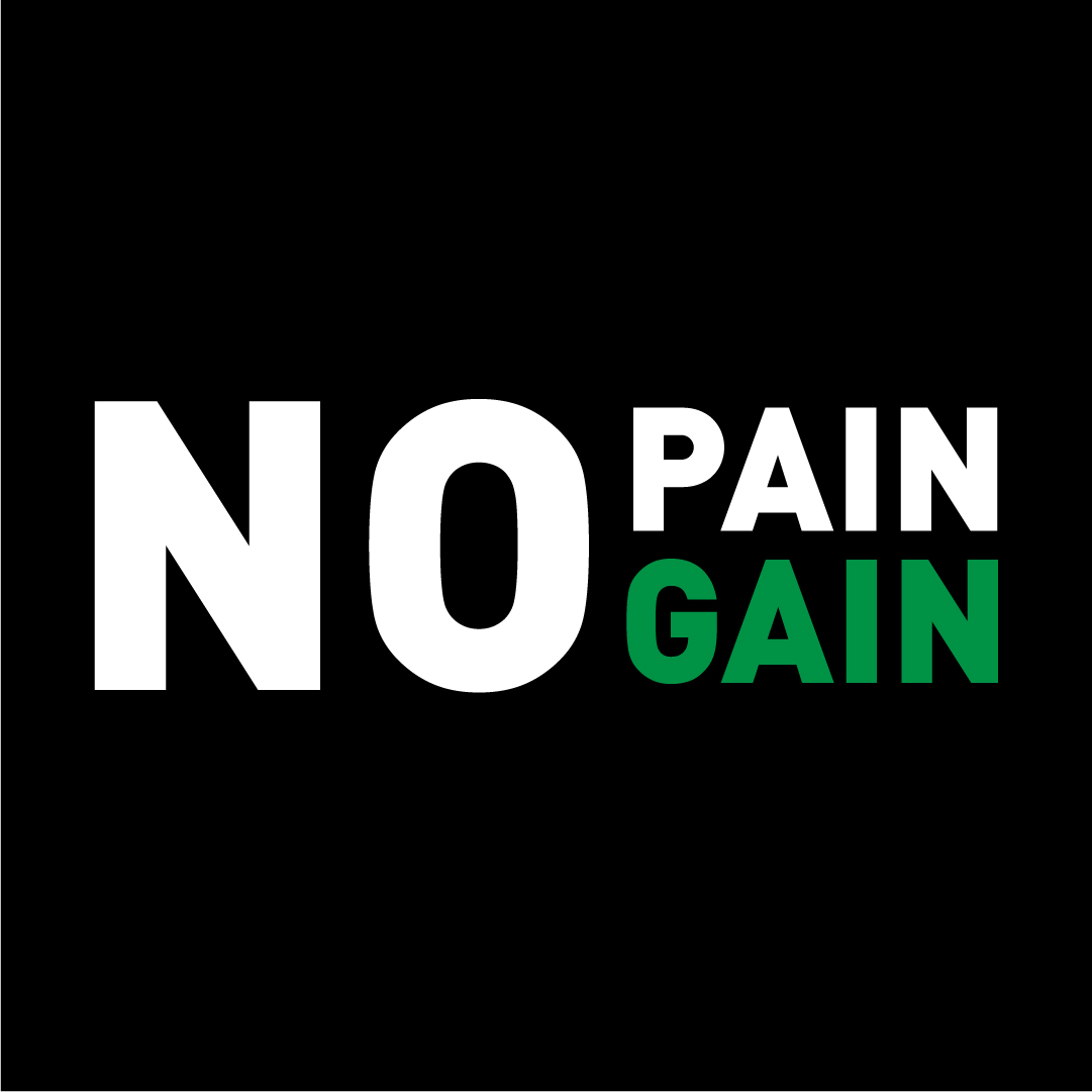
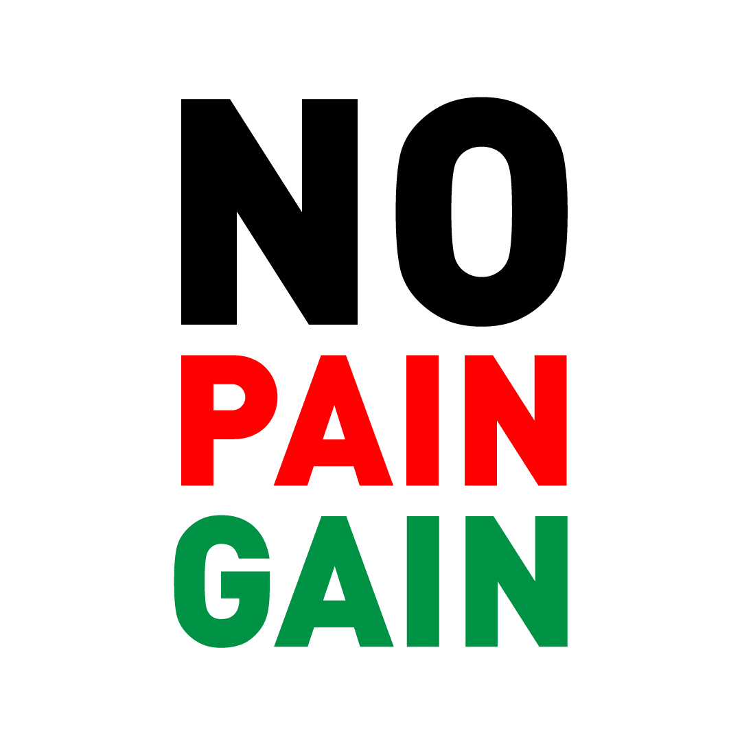
Concept 2
In this concept I use an enlarged ‘No’ next to ‘Pain’ and ‘Gain’ stacked on top of each other; Doing this makes it more minimal and allows me to visually display the quote without using it in it’s entirety. As for color choices, my first iteration uses red on ‘No’ and ‘Pain’, and then green on ‘Gain’. I decided for red to again emphasize ‘No’ but to also highlight the idea of pain being needed to eventually reach a gain, which is in green and signifies a positive result or literal gain. Ultimately I did not like the red in the end, because I thought it could be seen as completely ‘negative pain’ and that was not my intention in doing so. With that being said I moved on to just highlighting the ‘Gain’ in green; I believe it worked more effectively, and also solved my other issue with red and green coming off as Christmas colors.
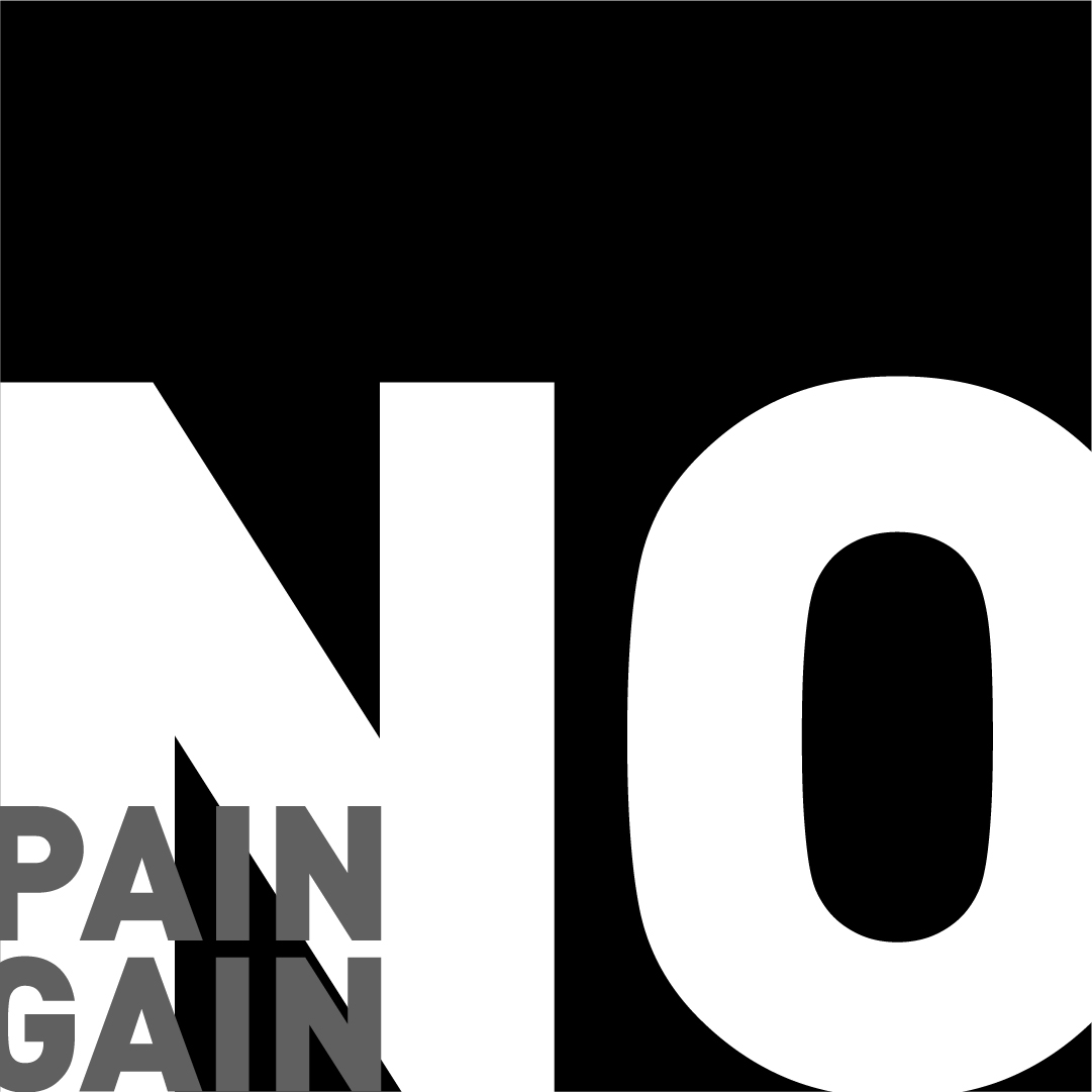
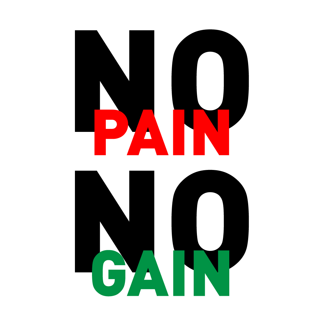
Concept 3
Very similar to concept 2, I decided to put the text vertically, and even tried a different iteration actually using ‘No’ twice, but ultimately did not feel this was as effective as concept 2.
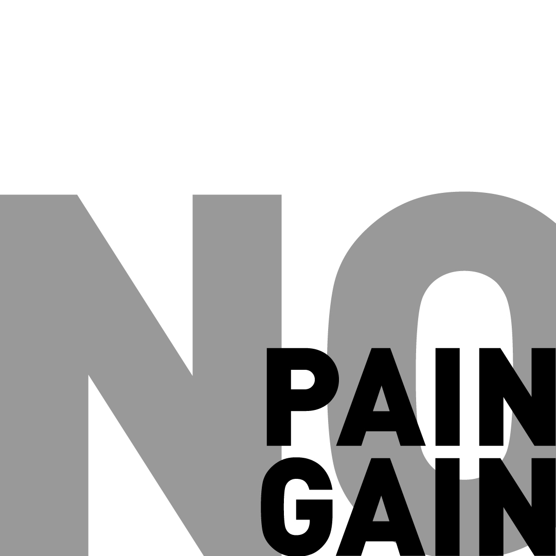
Concept 4
For my last concept I decided to go big and fill up all the space with ‘No’, putting all the emphasis on it, which I feel is important for this quote; Really highlighting that with NO pain, you end up with NO gain