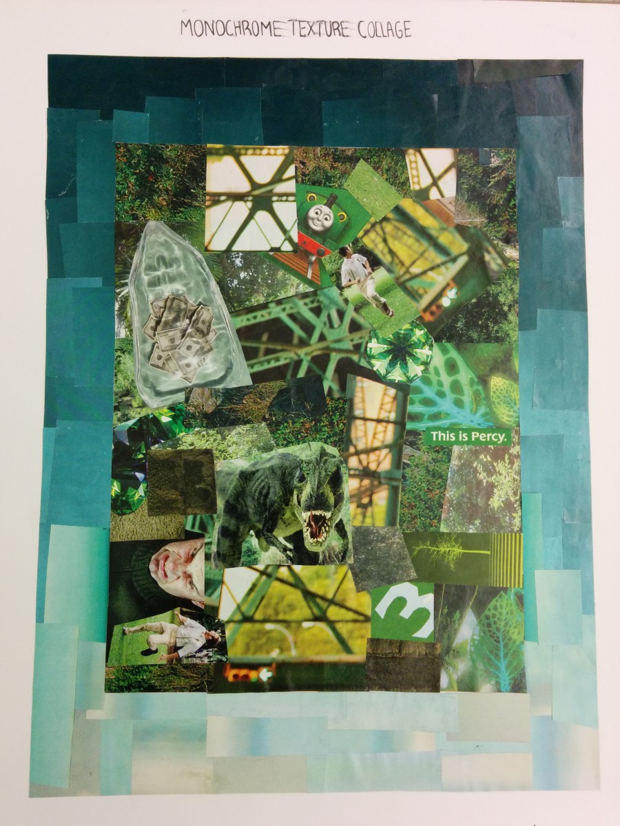
 Making this collage out of ads taken from magazines showed me the practical uses of graphic principles in the real world as I see them every day. I used only ads with the same color value of green and made a collage with the clippings. I wanted to show a gradation of the color I had chosen for the collage as a border and the blue green is gives it a nice aesthetic.
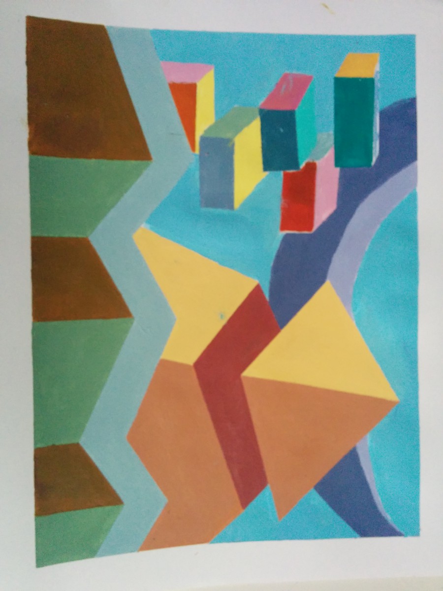
 This painting is meant to show the value of color in regards to perspective and shading to give a sense of depth and 3 dimensions The challenge with this piece was to pick a tetrad color scheme and how to apply it to the figures in the initial drawing I made. Mixing colors to create mid, light and dark tones was also a challenge that was essential to giving the figures depth and the perspective that I pictured.
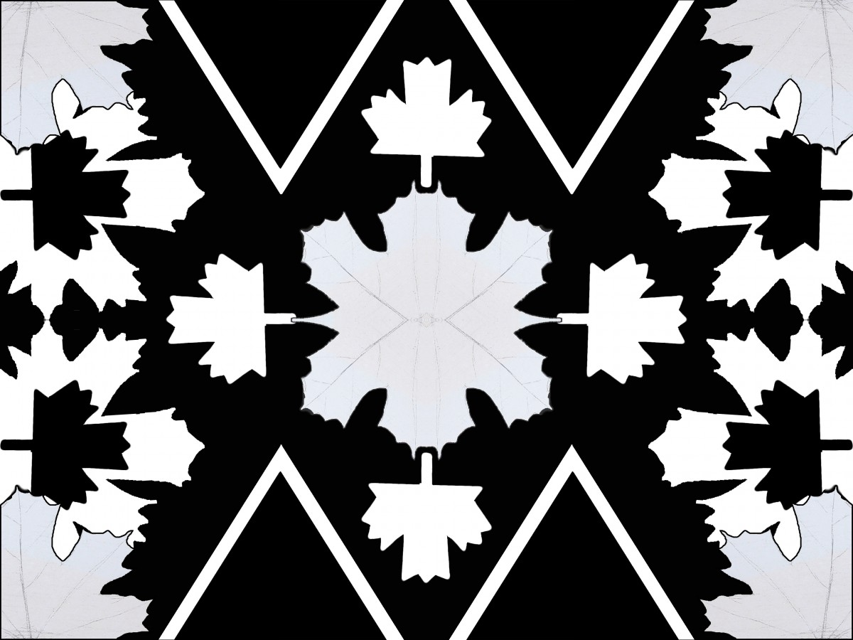
 This symmetry design project utilizes different symbols used to represent an organic object. after I made a drawing of a leaf I then made a silhouette in marker, then another simpler version of the silhouette and finally an arbitrary figure all to represent a leaf. I then scanned these drawings into photoshop and made a symmetrical design which I pictured to resemble an ink blot. All versions of the leaf symbol I made are present in this design and give a nice feel for positive and negative space. From this project I learned the potential for making a complex design from only a few shapes given and to make up simple form for an object.


