
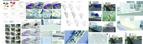
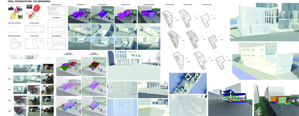
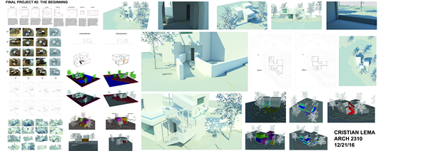
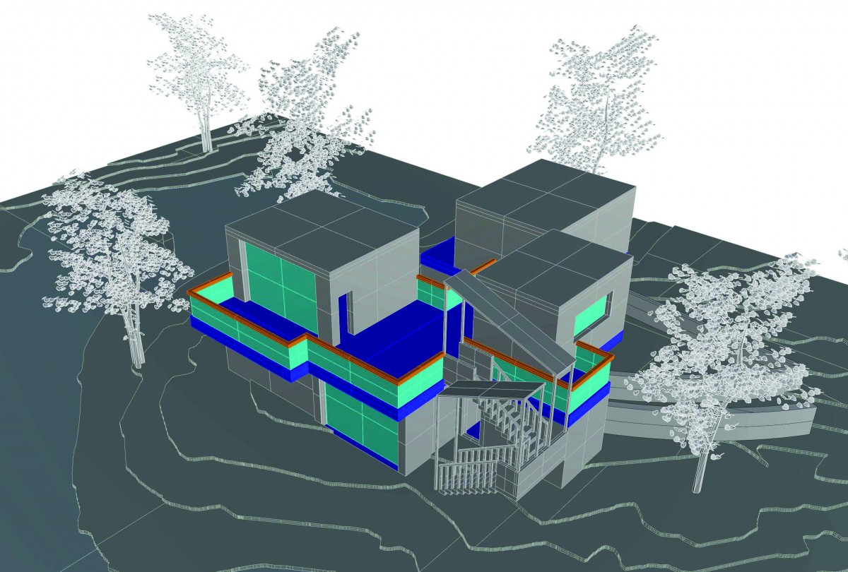
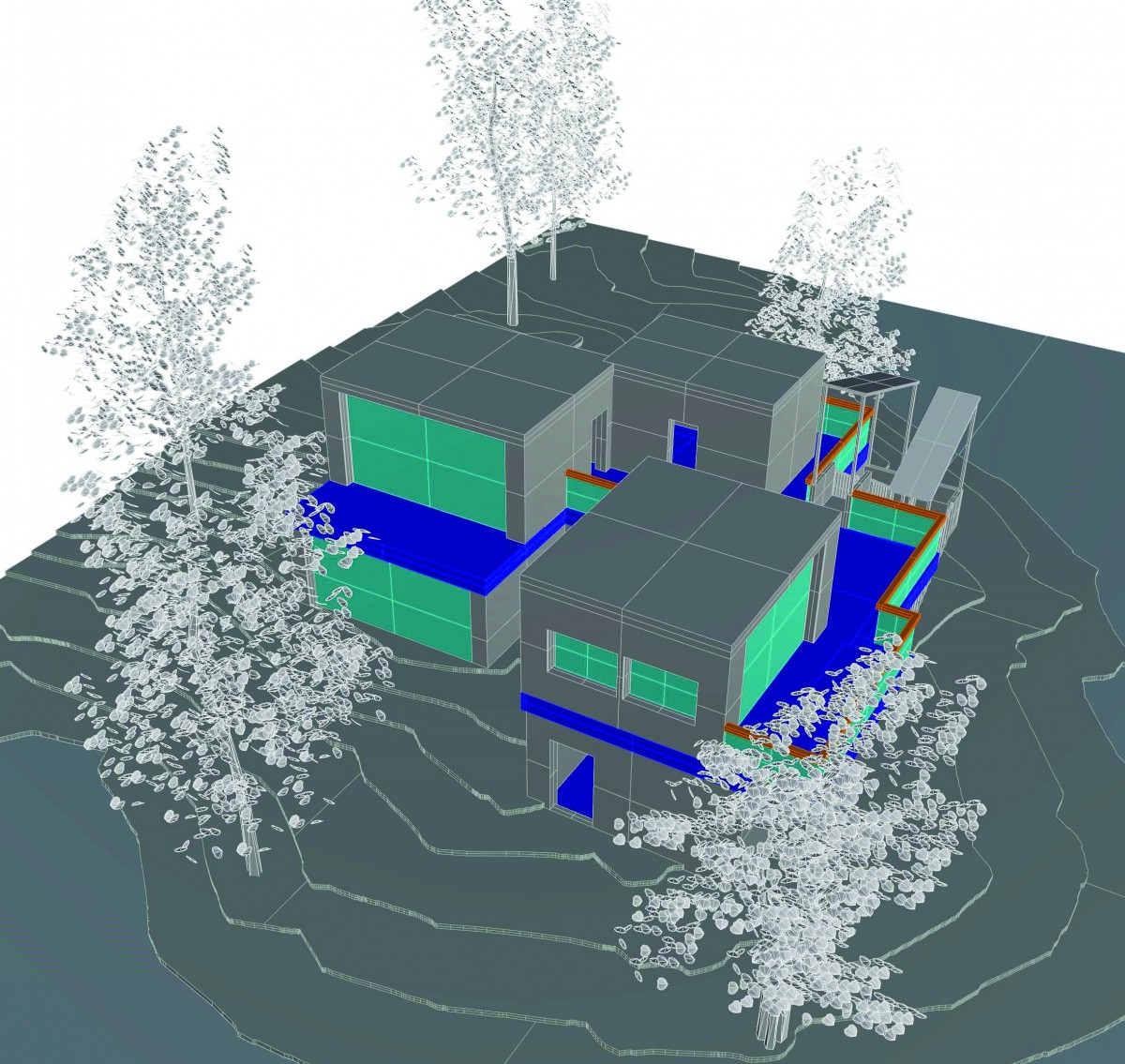
Assignment Z: Final Presentation
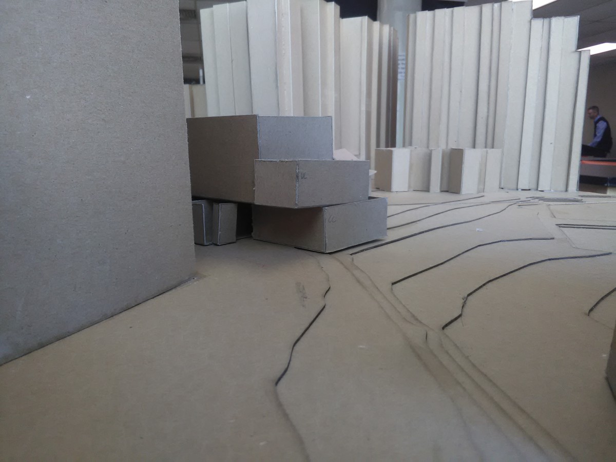
Assignment Y: Mock Up Presentation
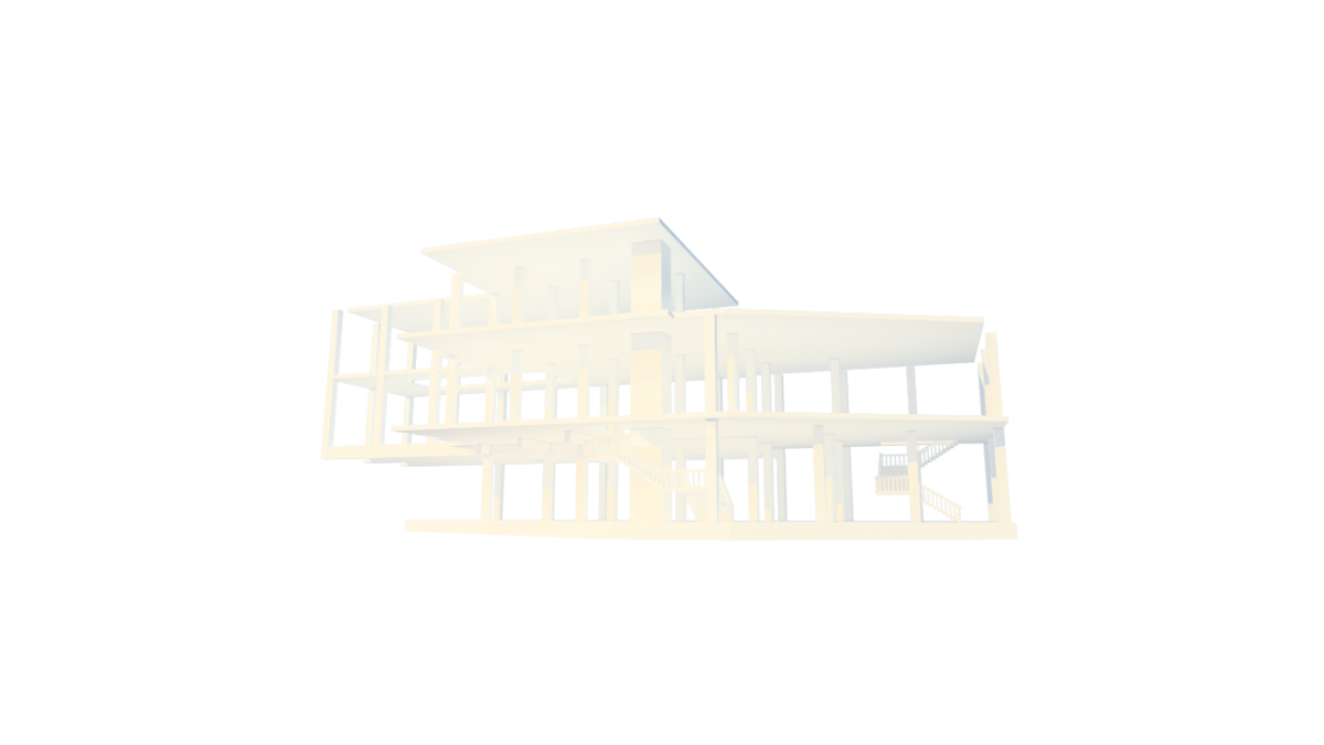
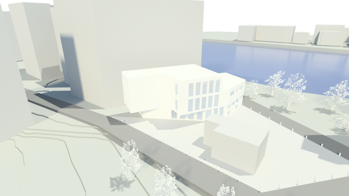
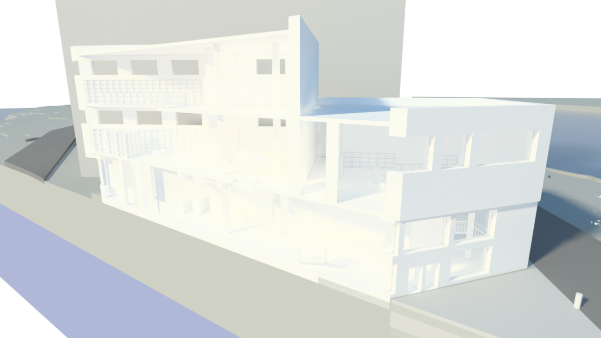
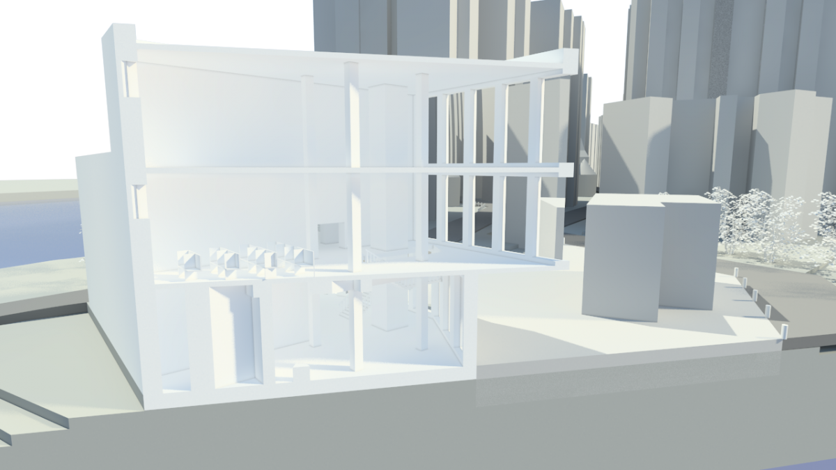
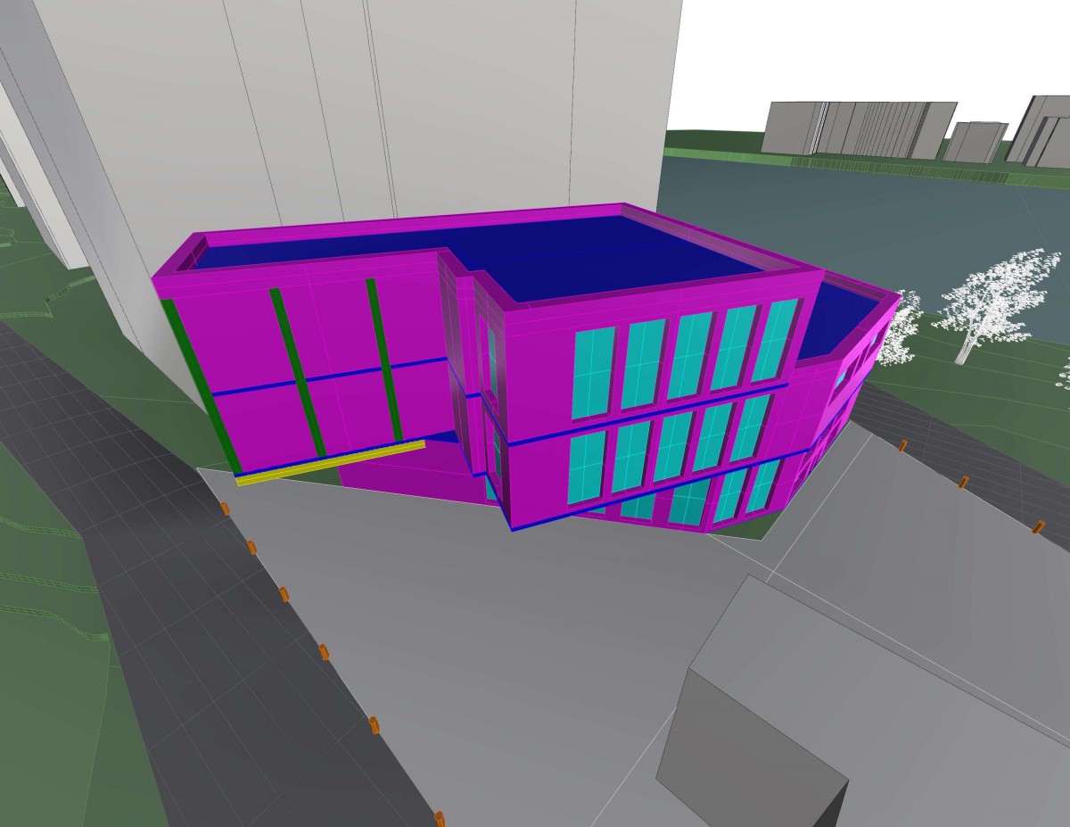
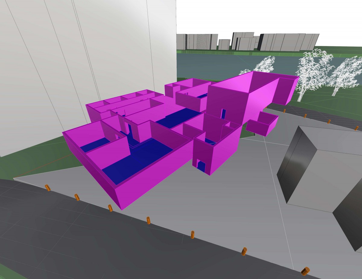
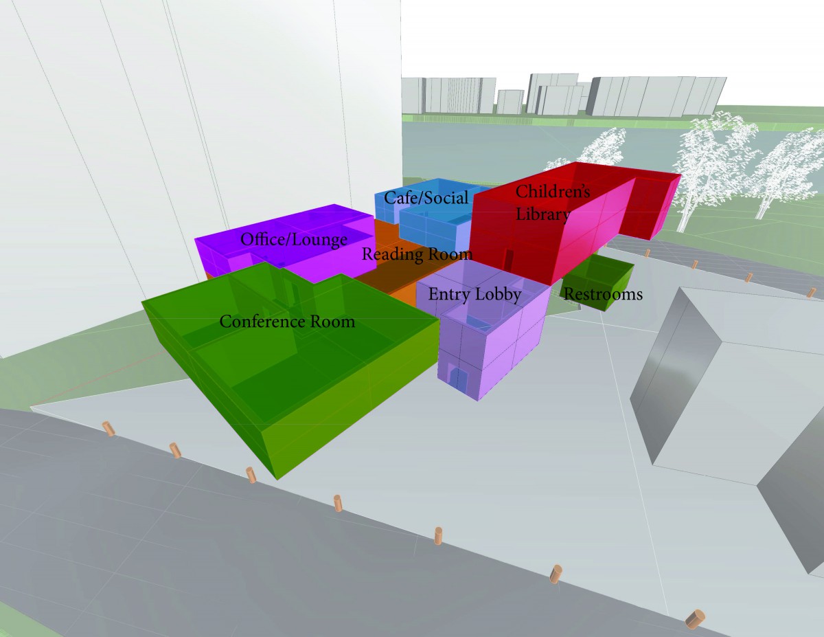
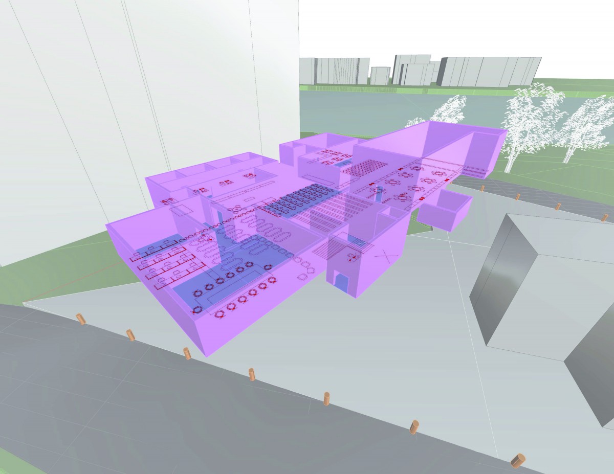
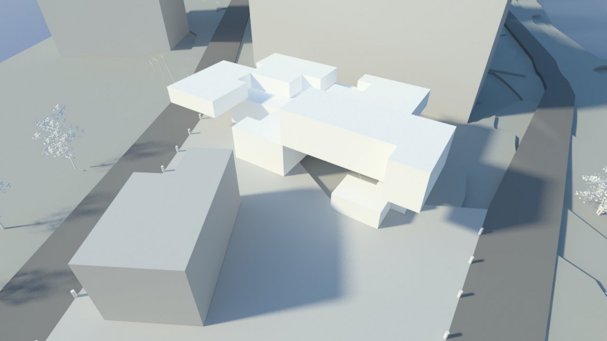
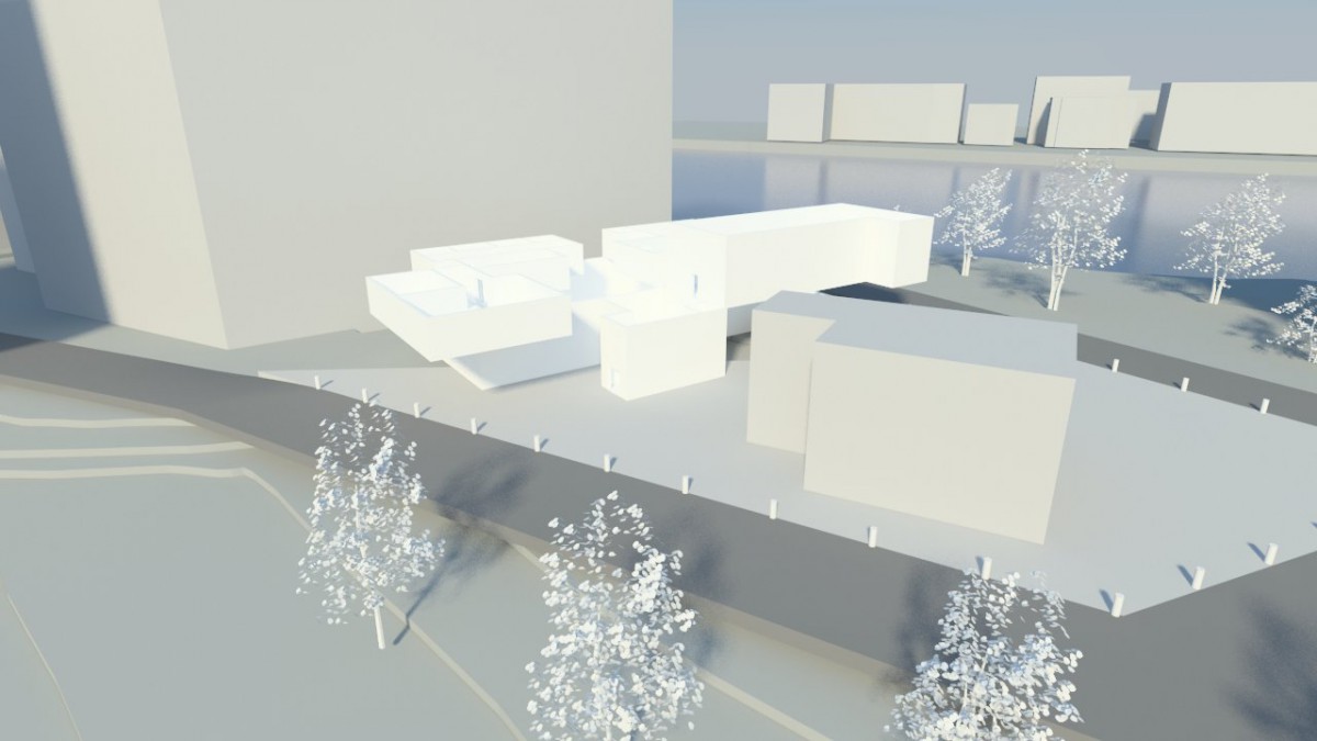
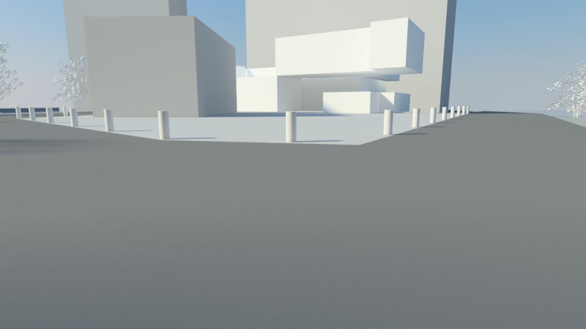
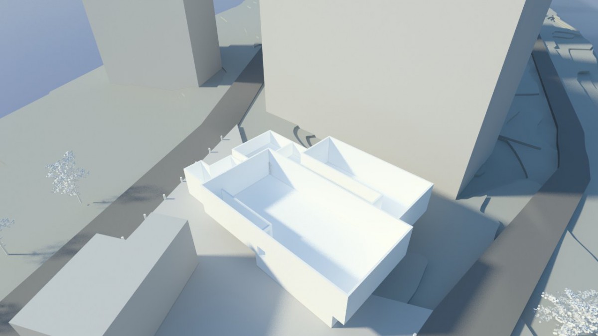
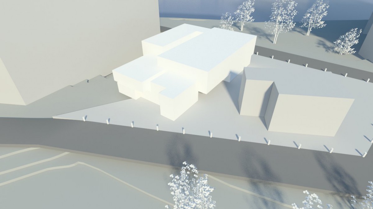
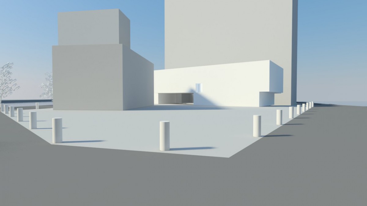
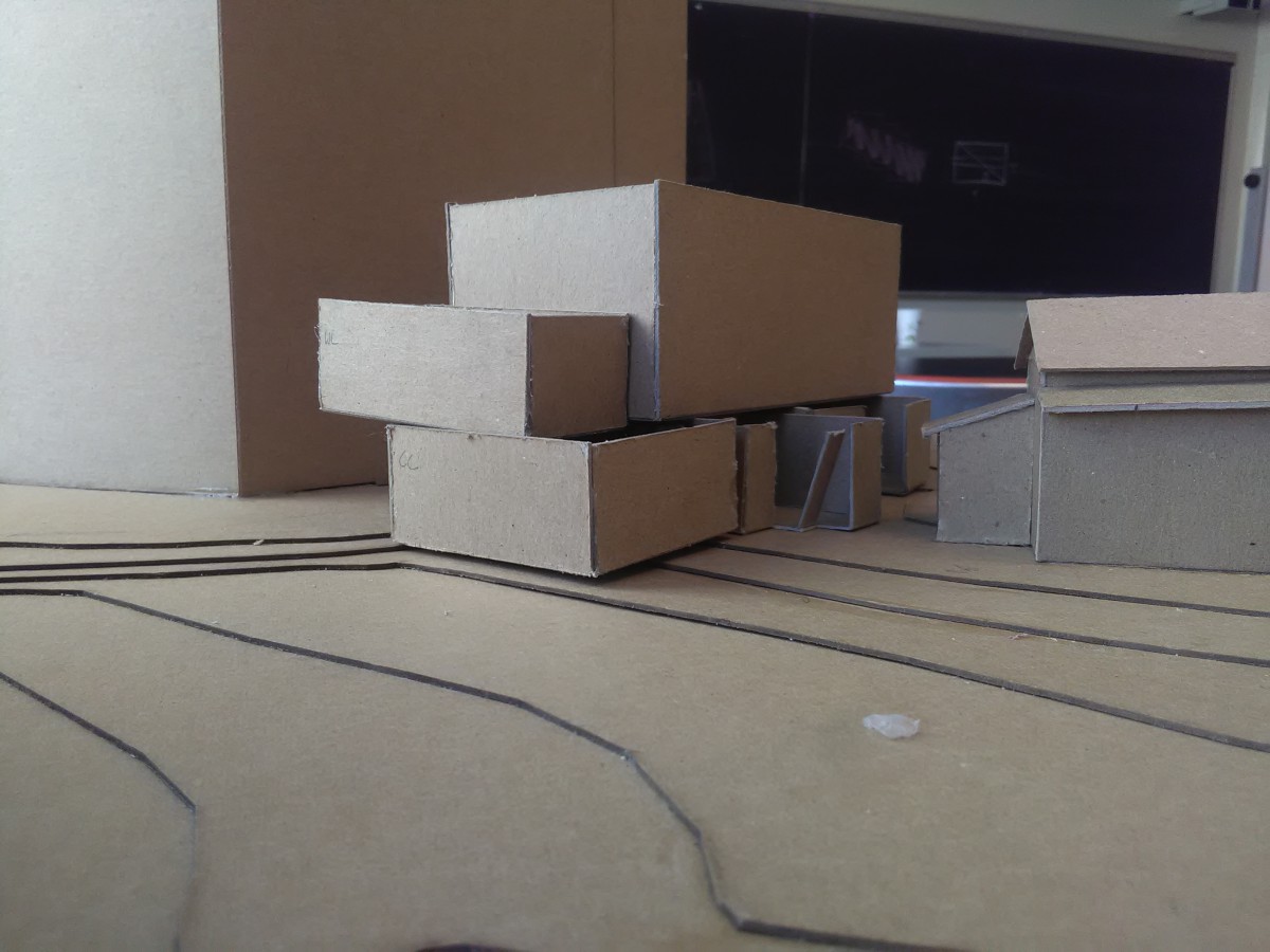
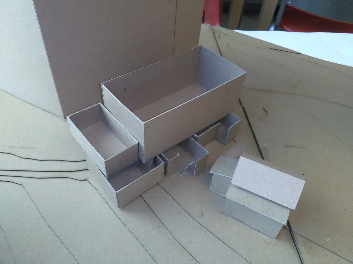
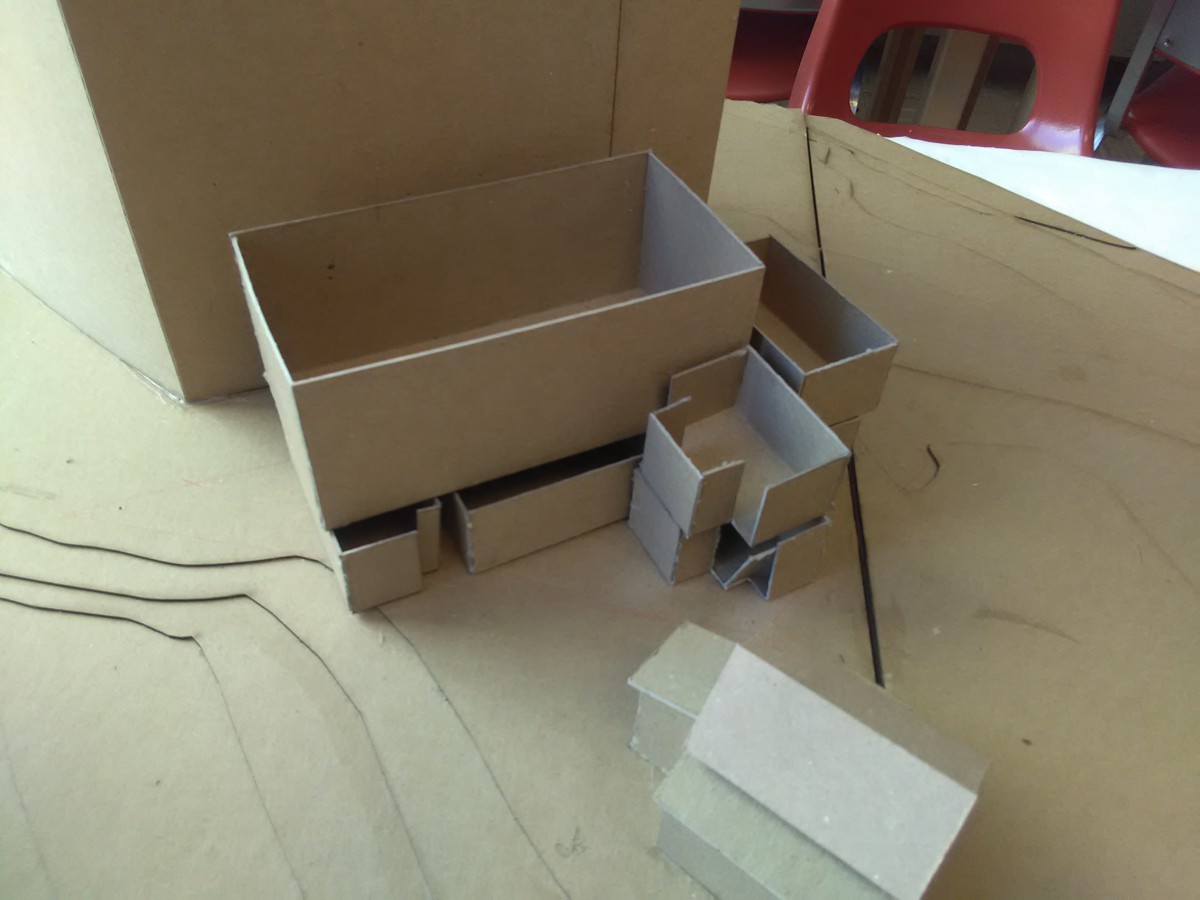
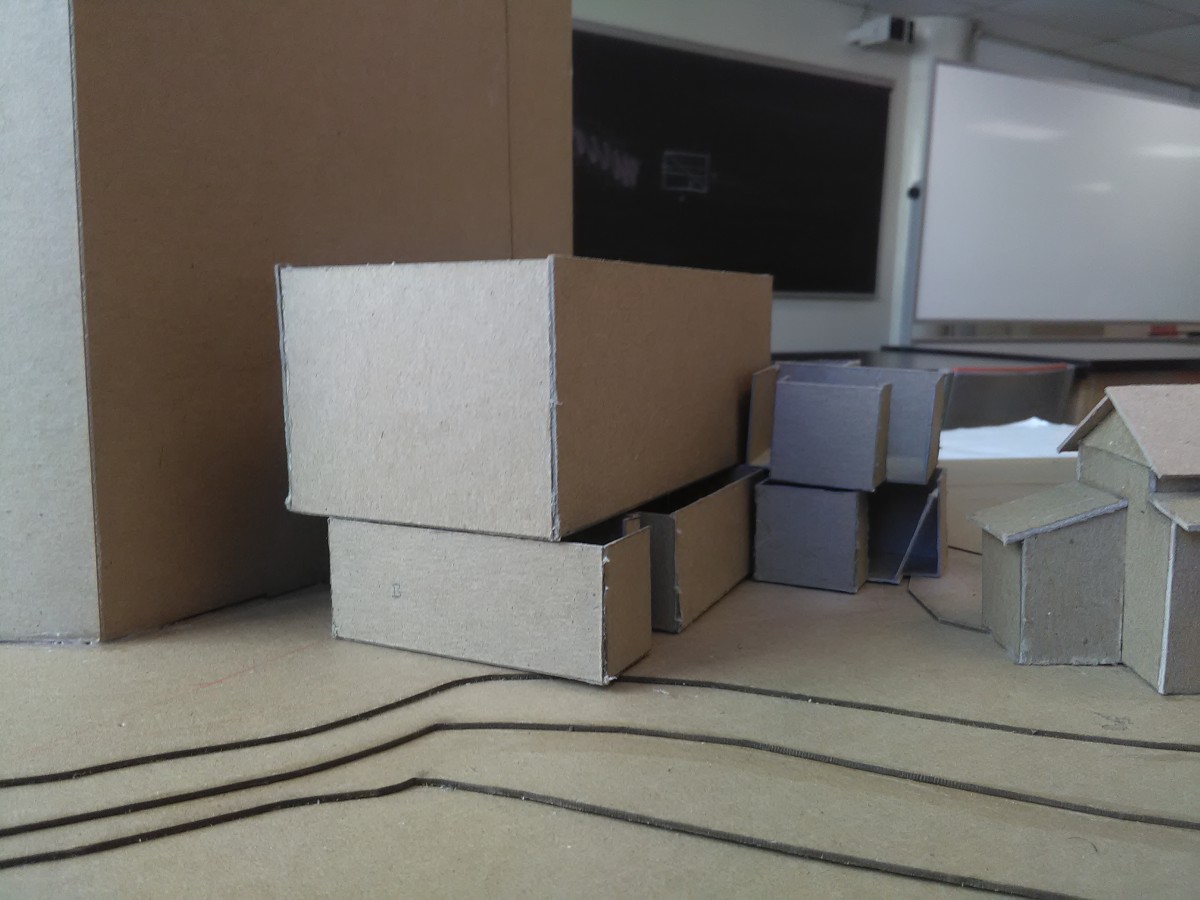
Assignment V: 3D View Development
Approach(s)
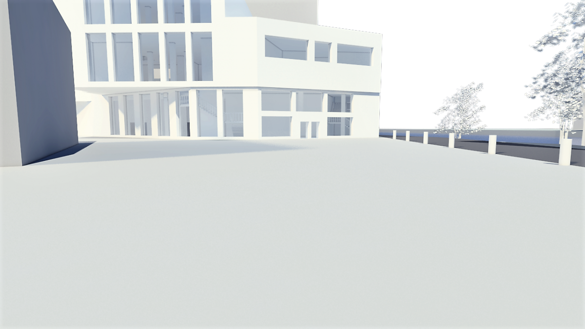
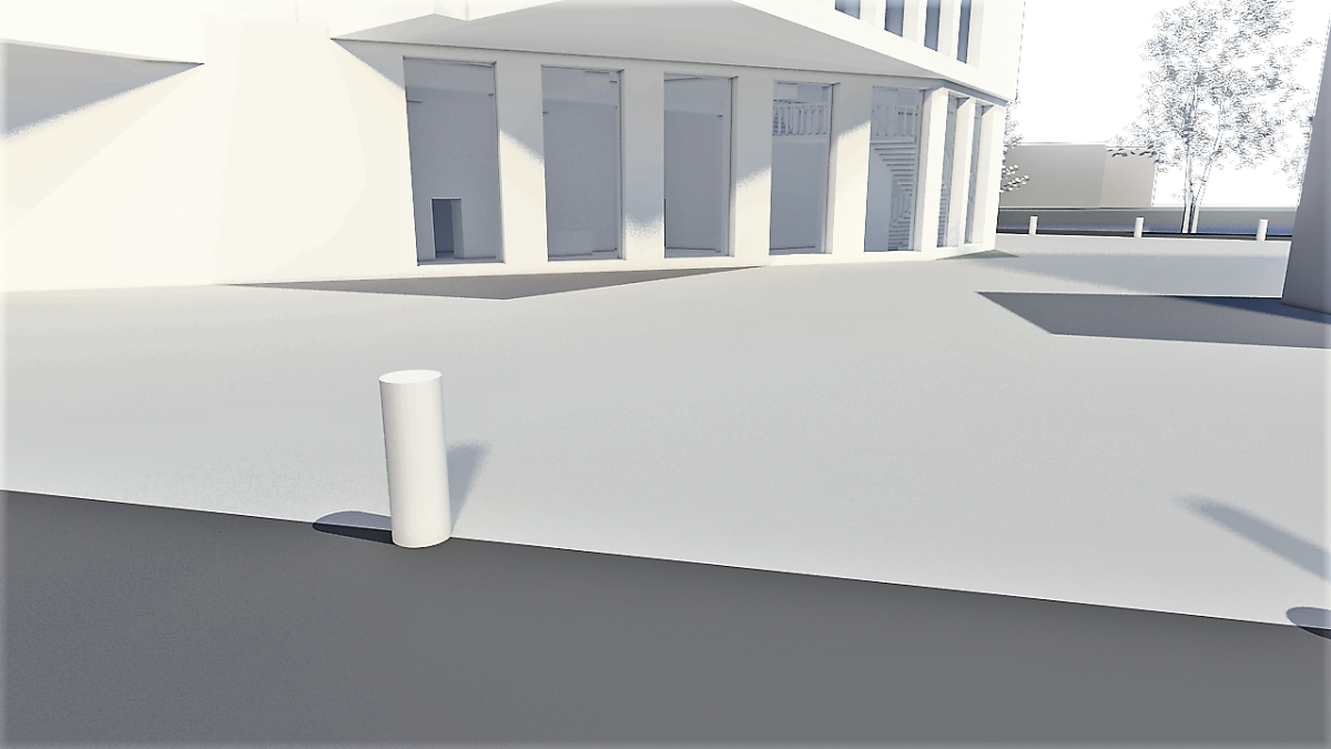
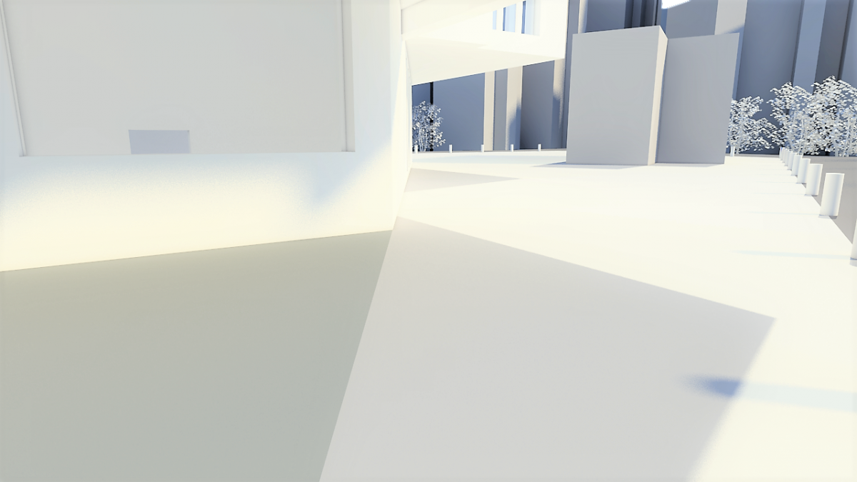
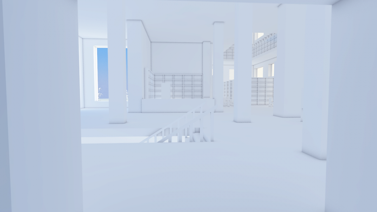
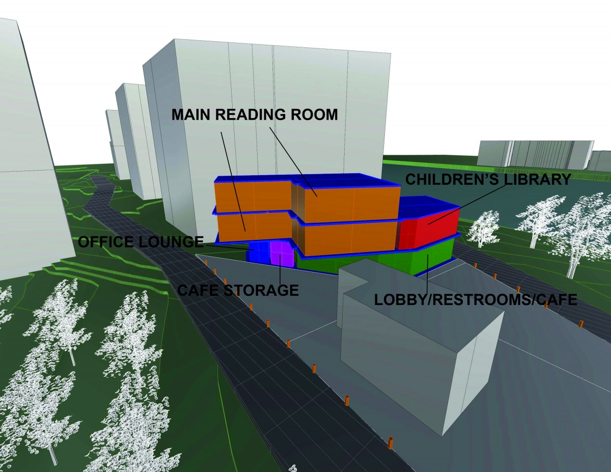
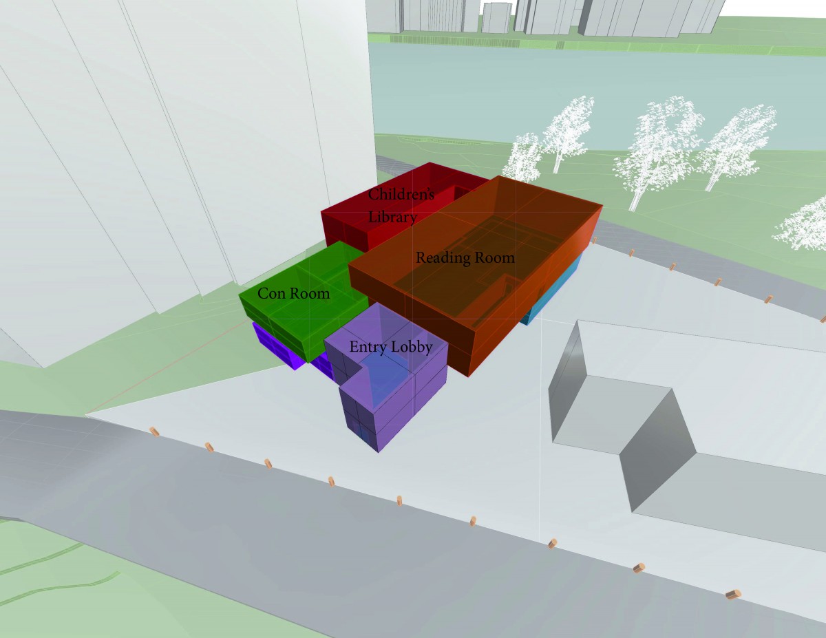
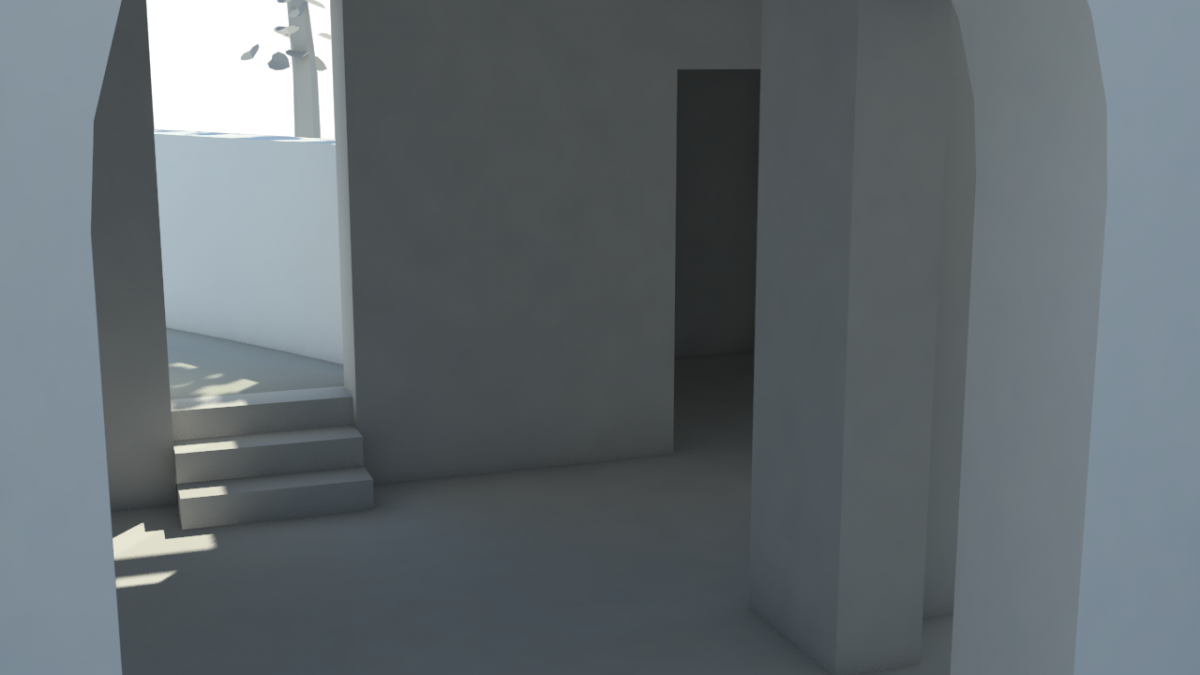
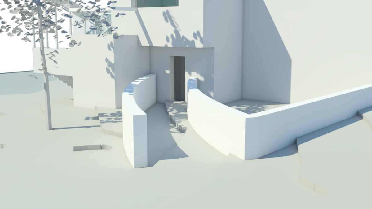
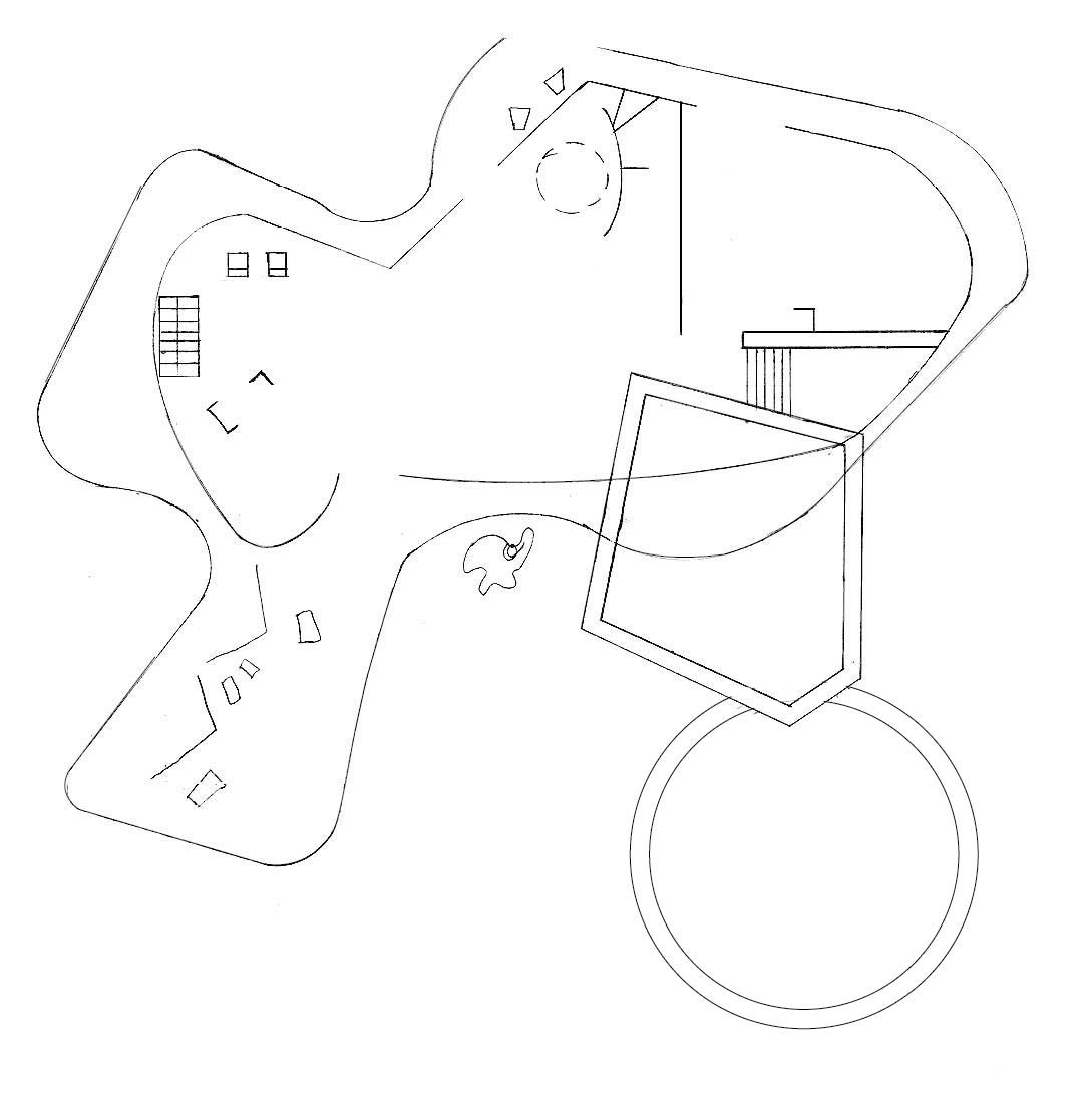
Entry/Lobby
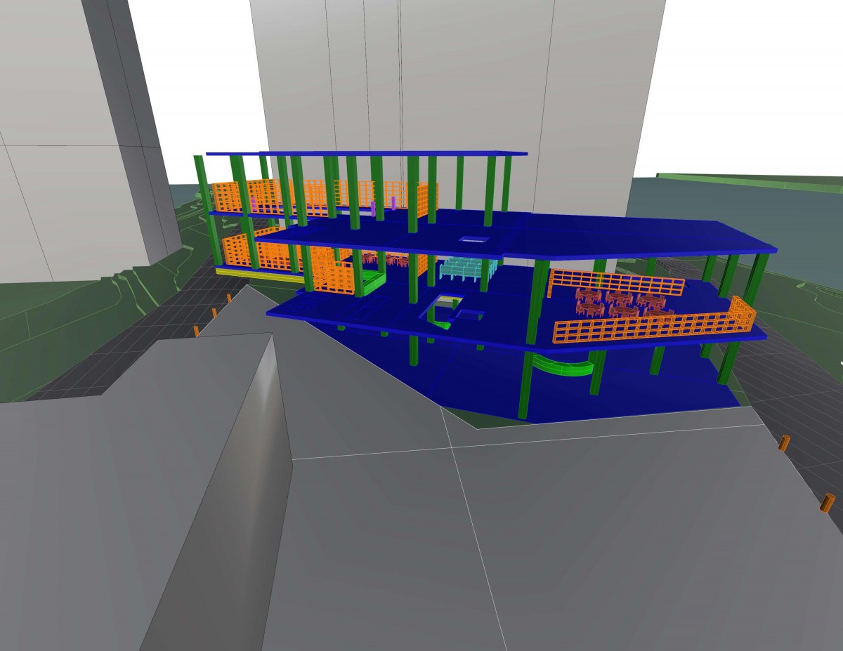
Reading Room
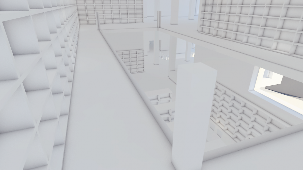
Structural 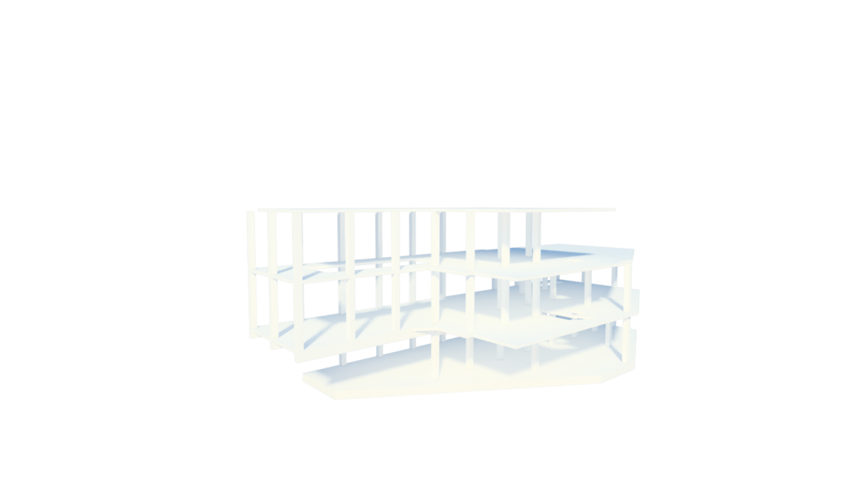
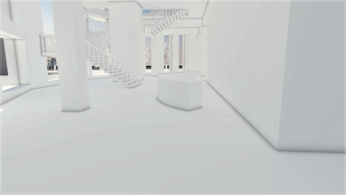
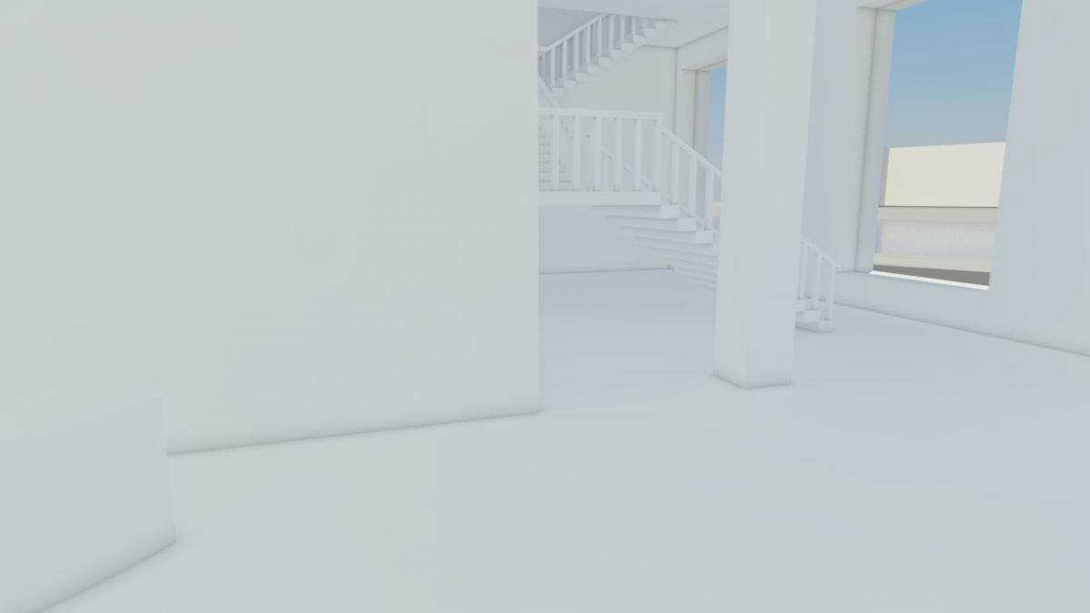
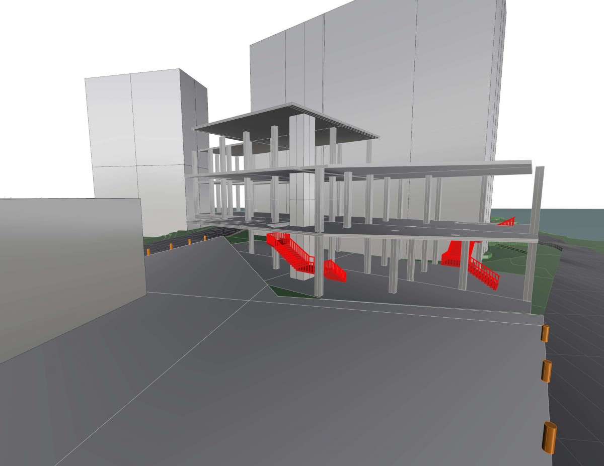
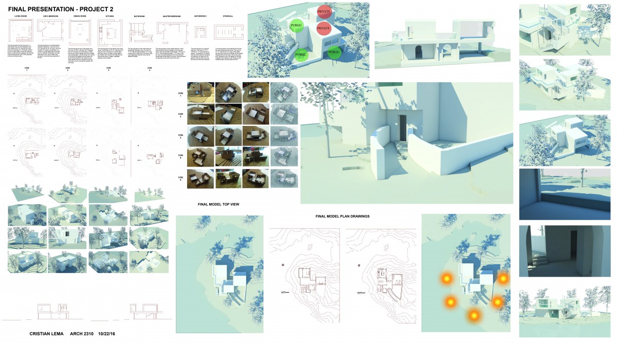
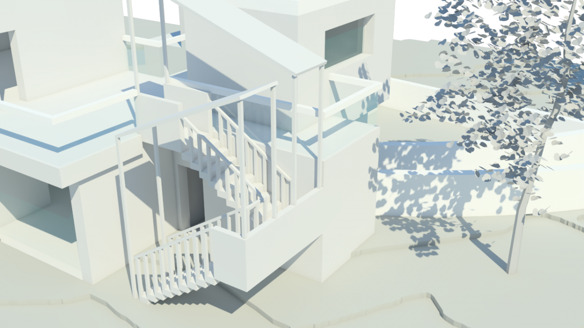
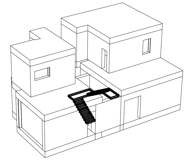
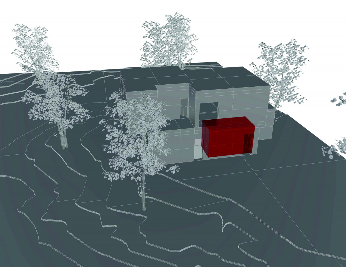
Vertical Circulation
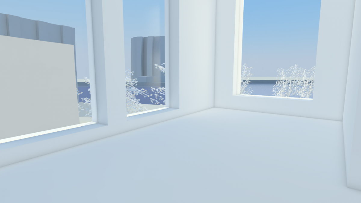
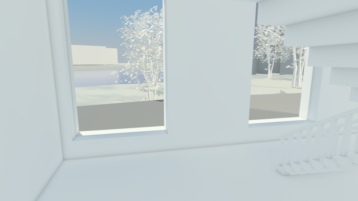
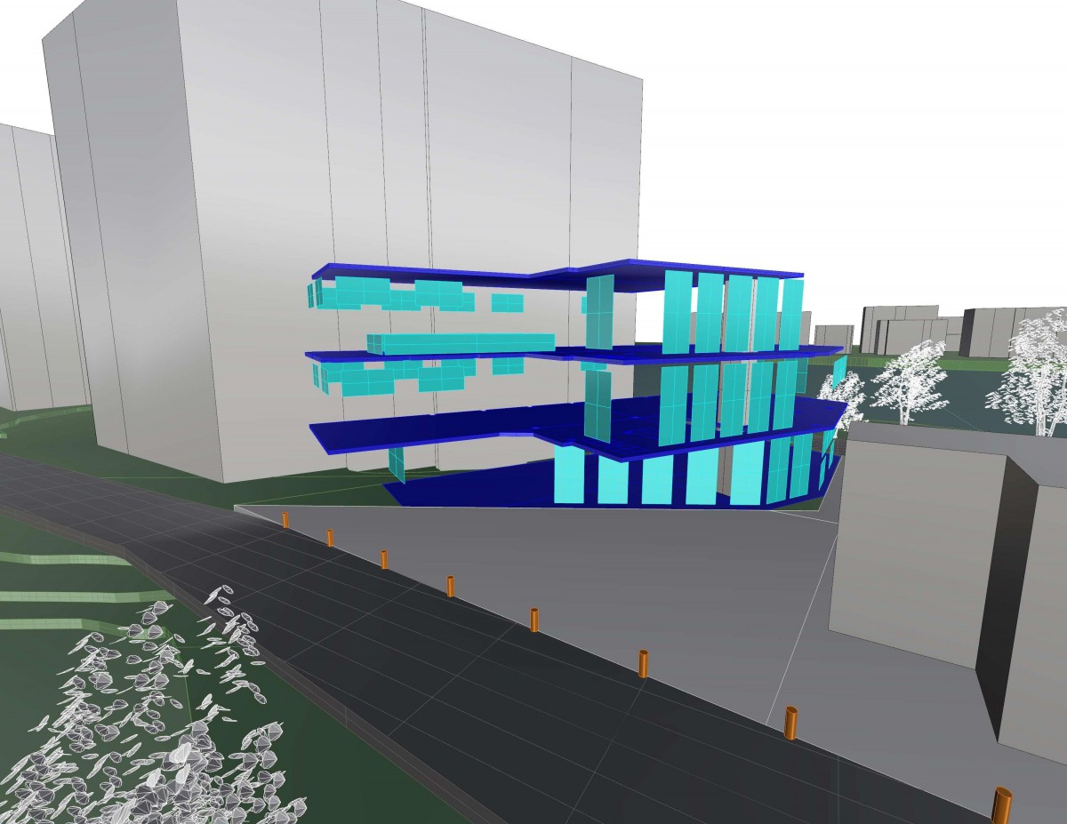
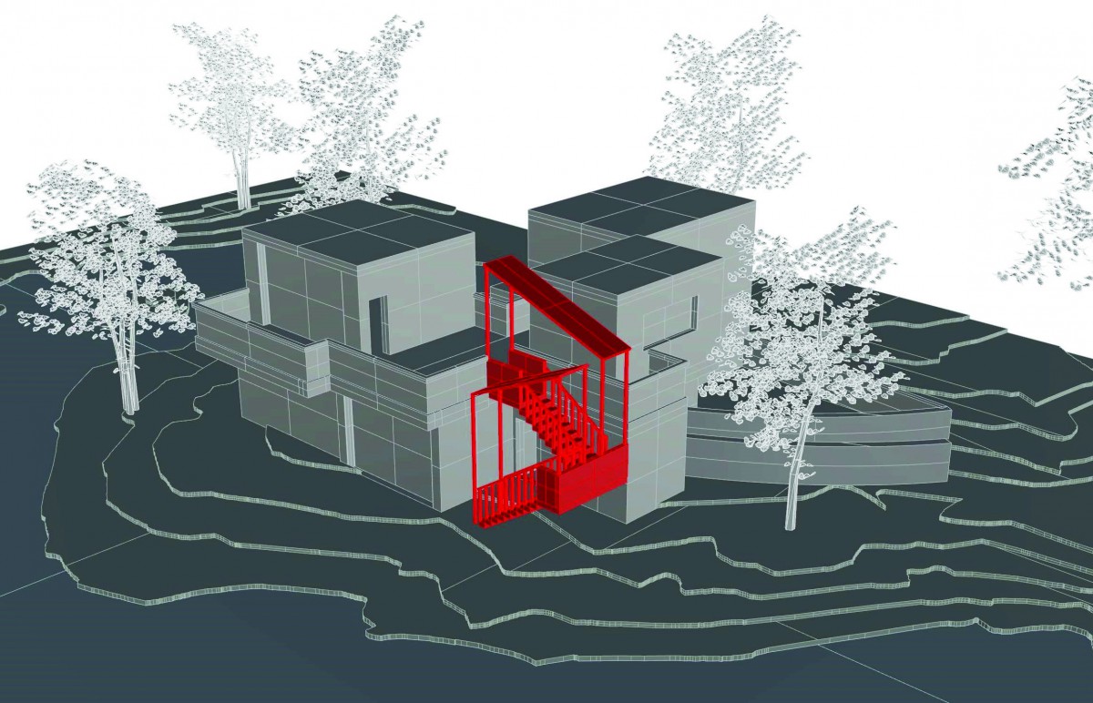
Views
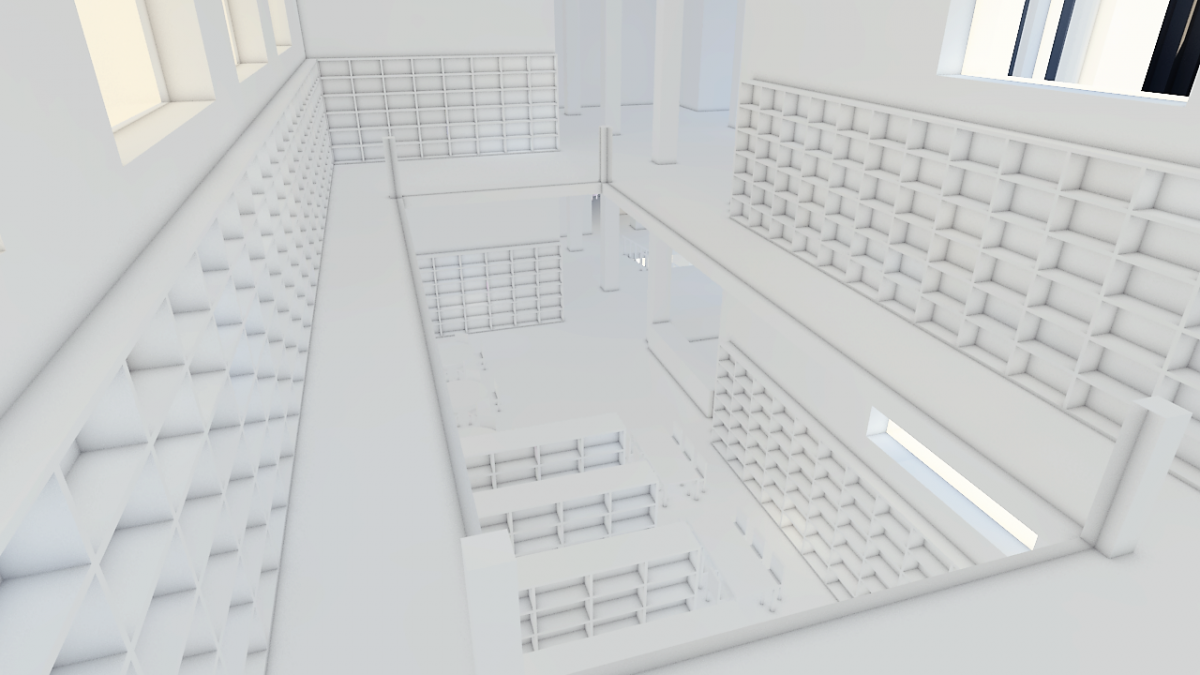
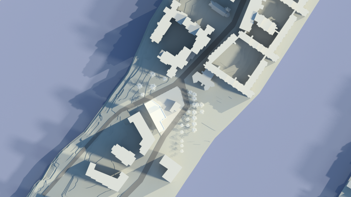
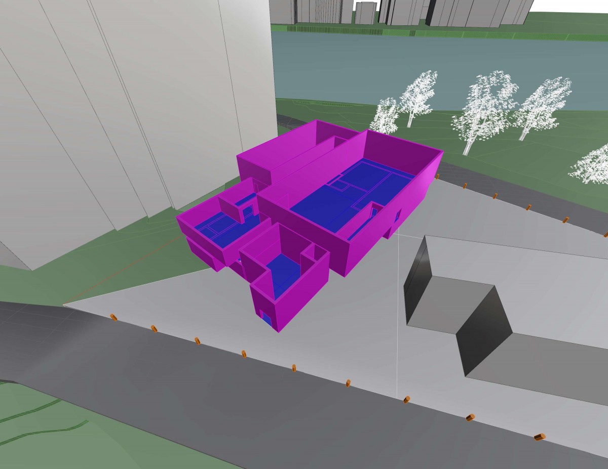
Top View
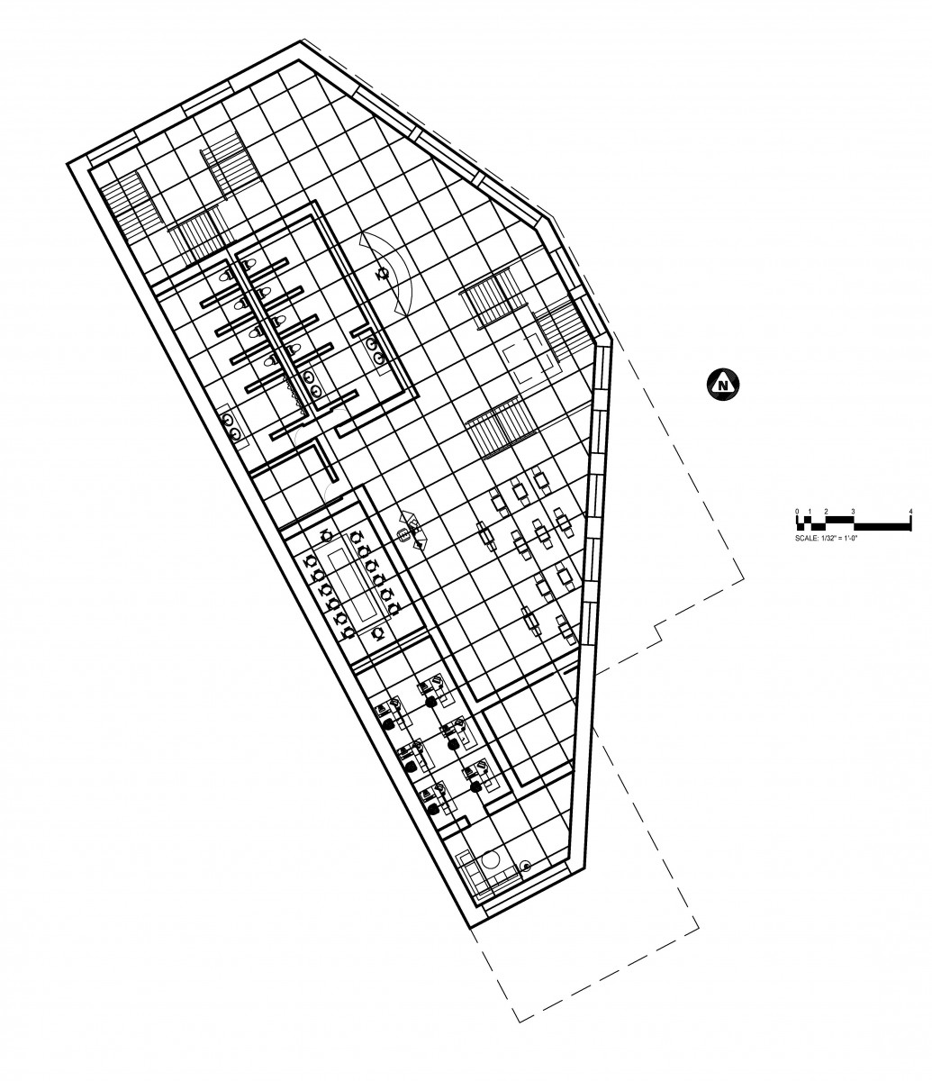
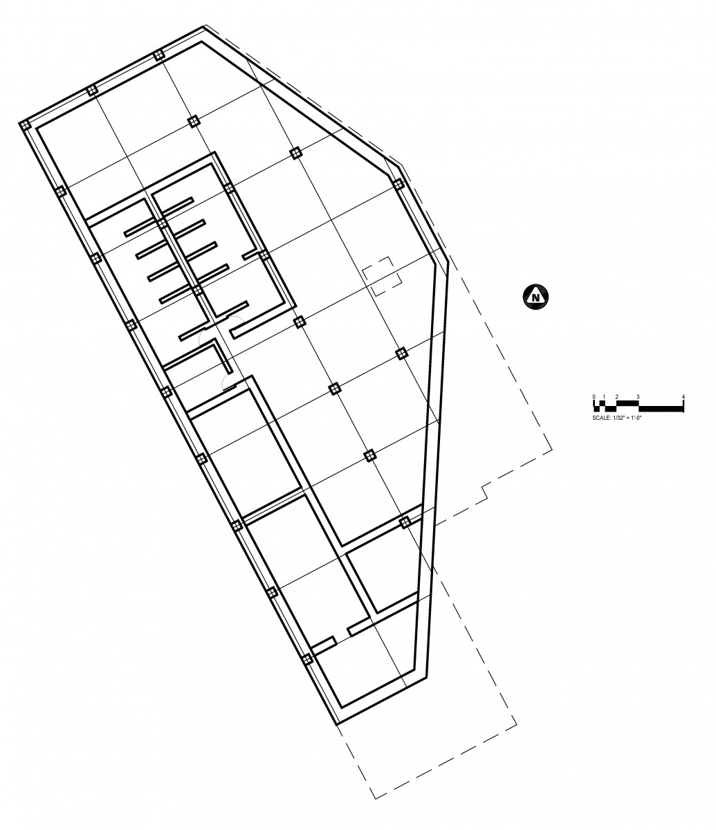
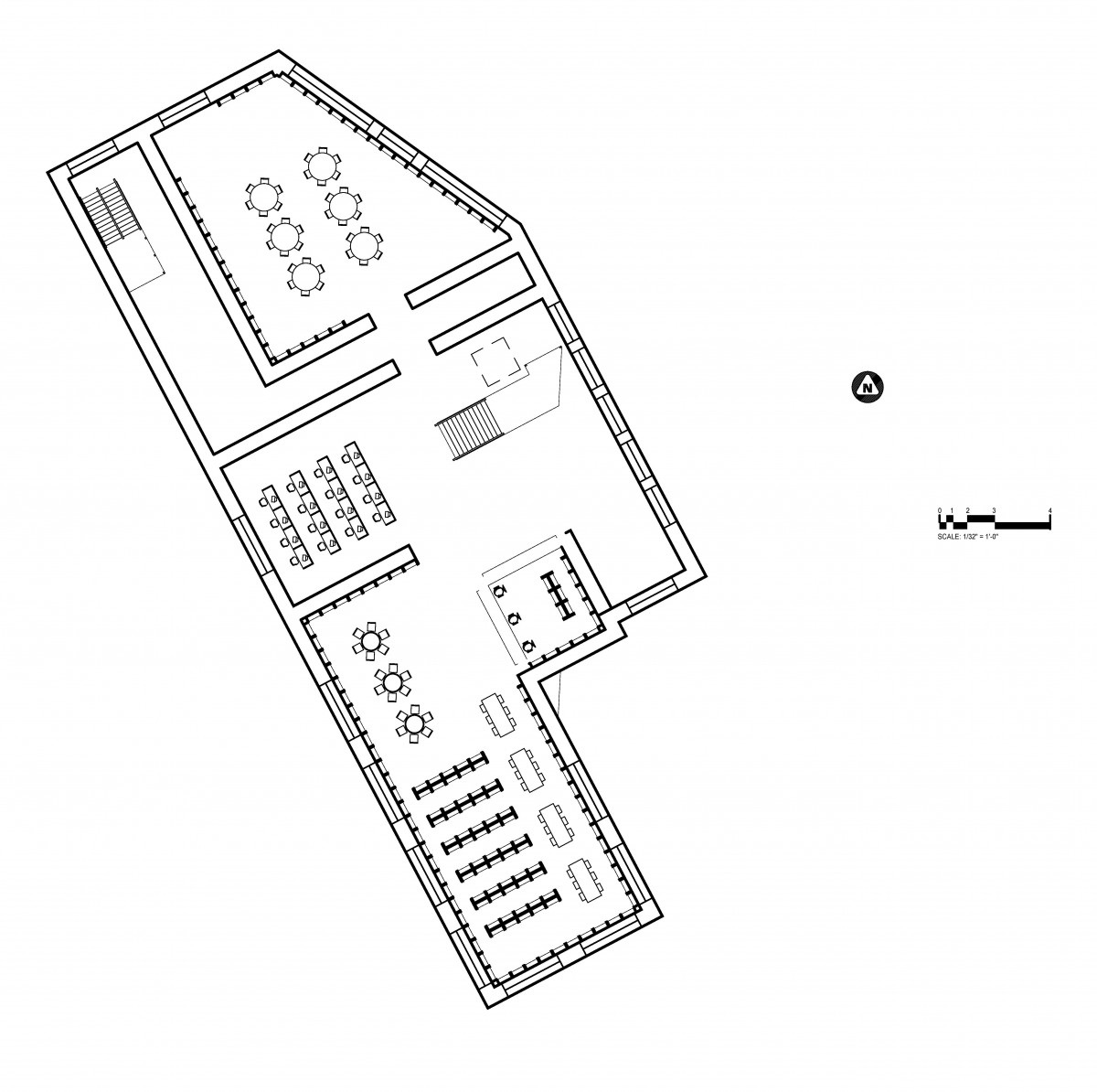
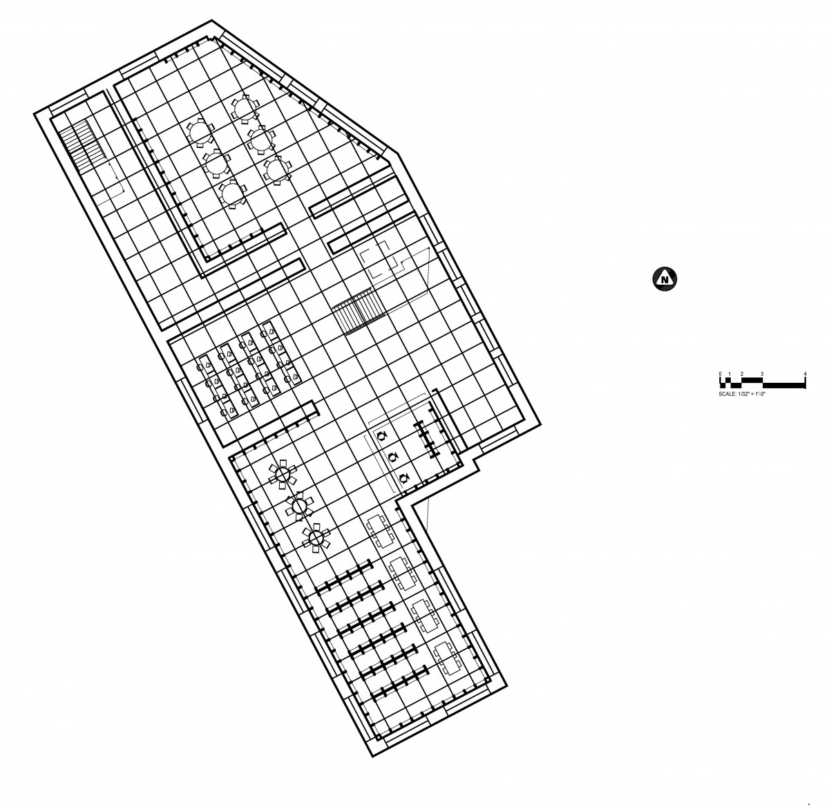
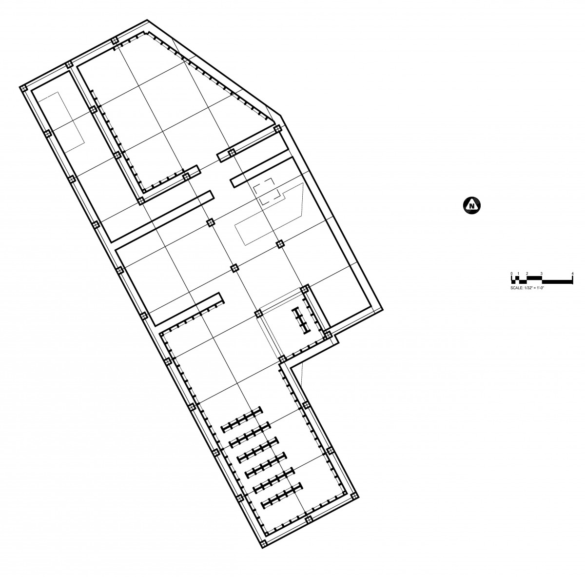
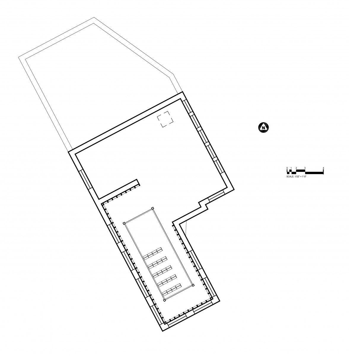
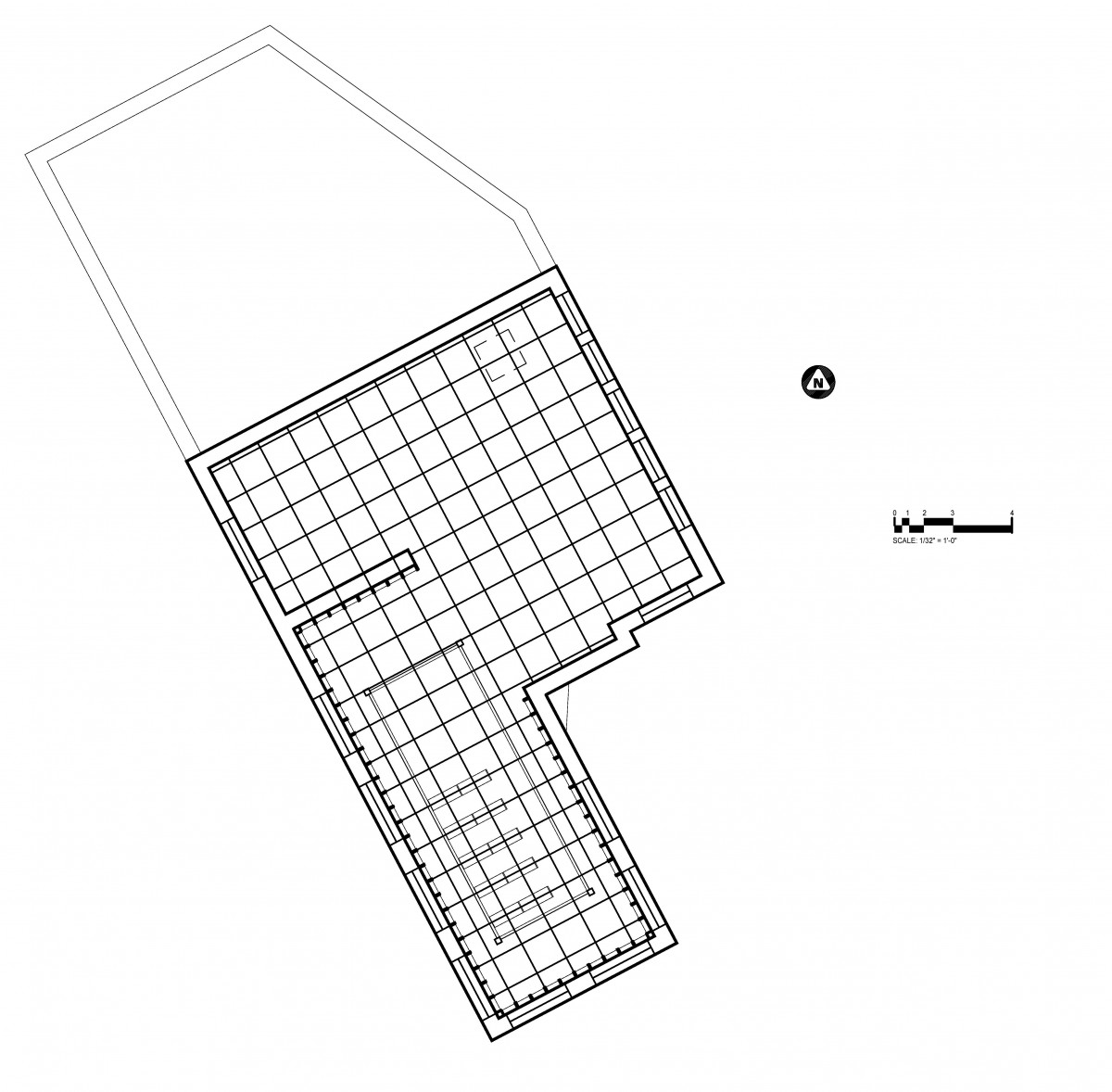
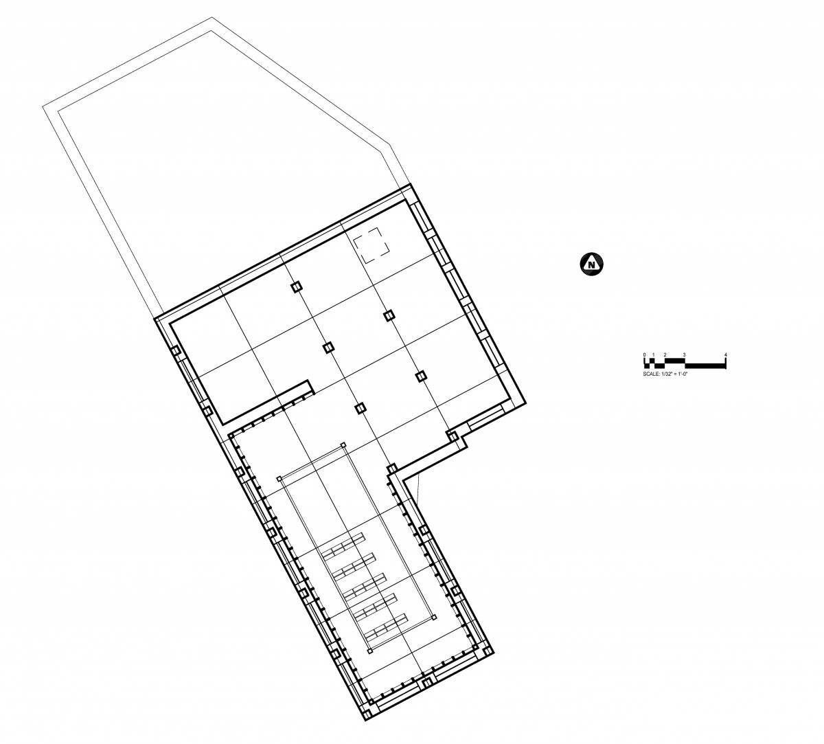
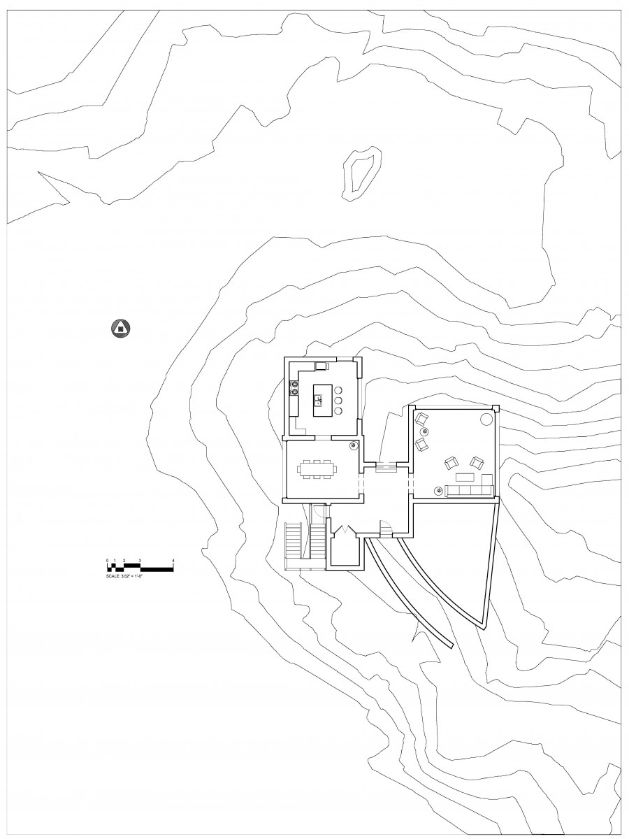
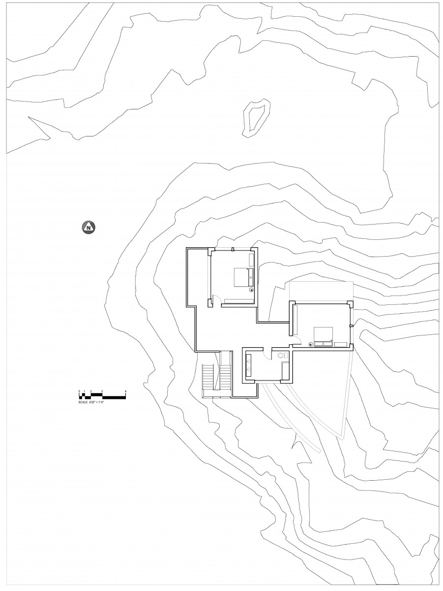
Assignment U: Plan Drawings
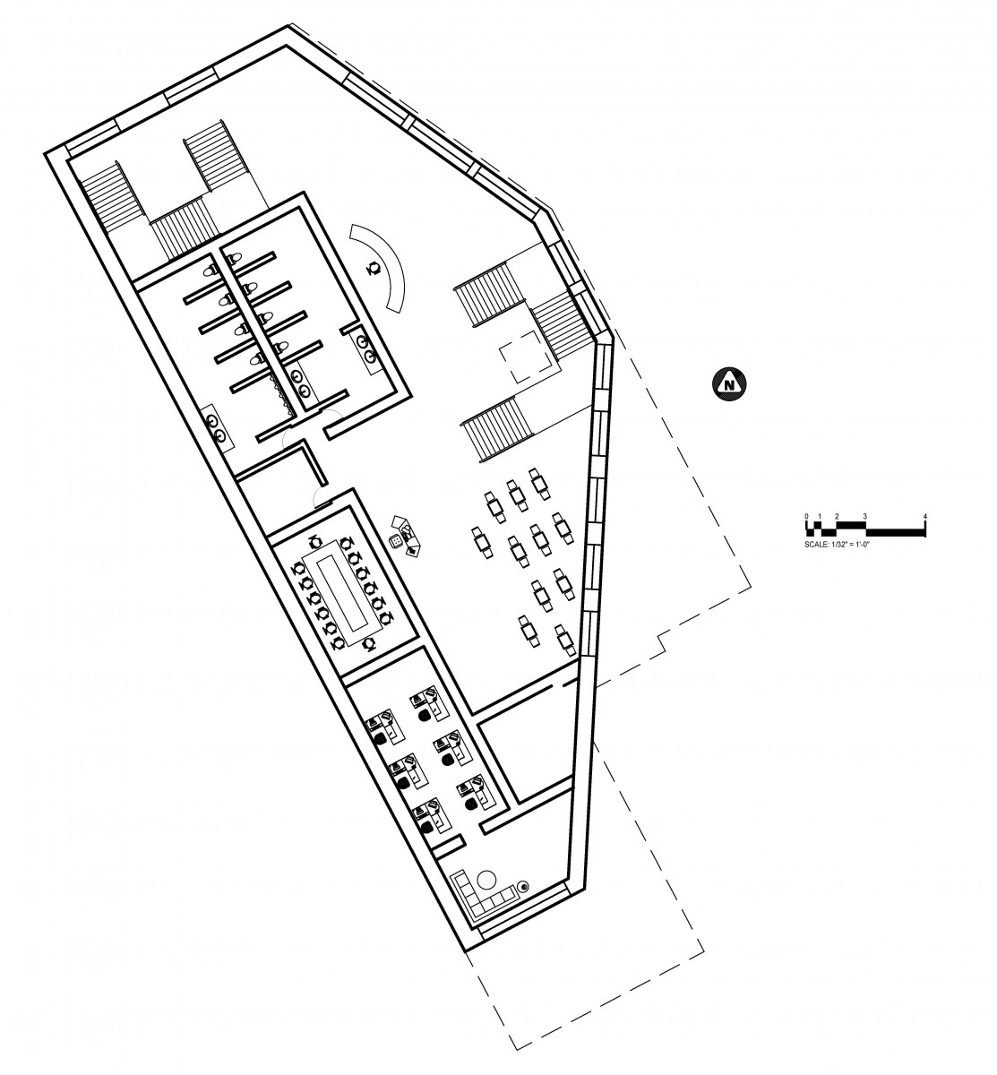
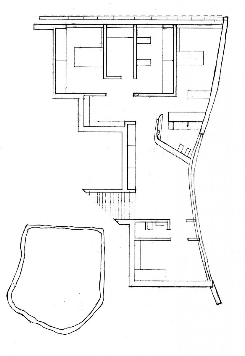
1st Floor Plans
2nd Floor Plans
3rd Floor Plans
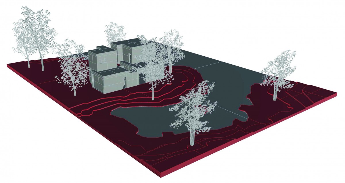
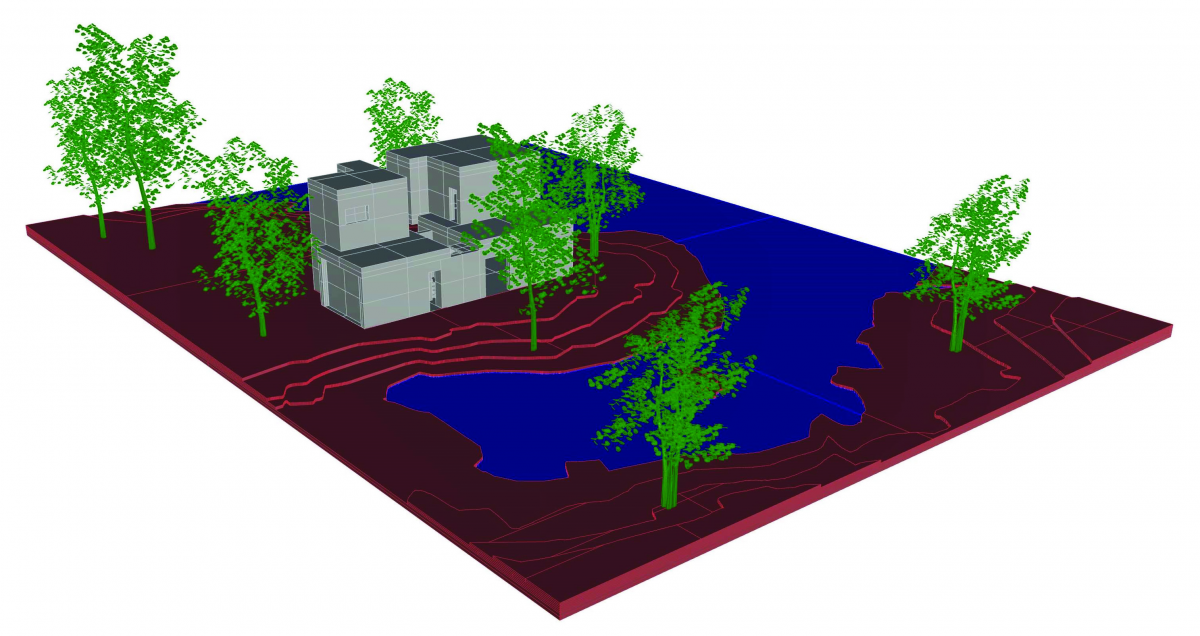
Assignment T: Site Axon and Section
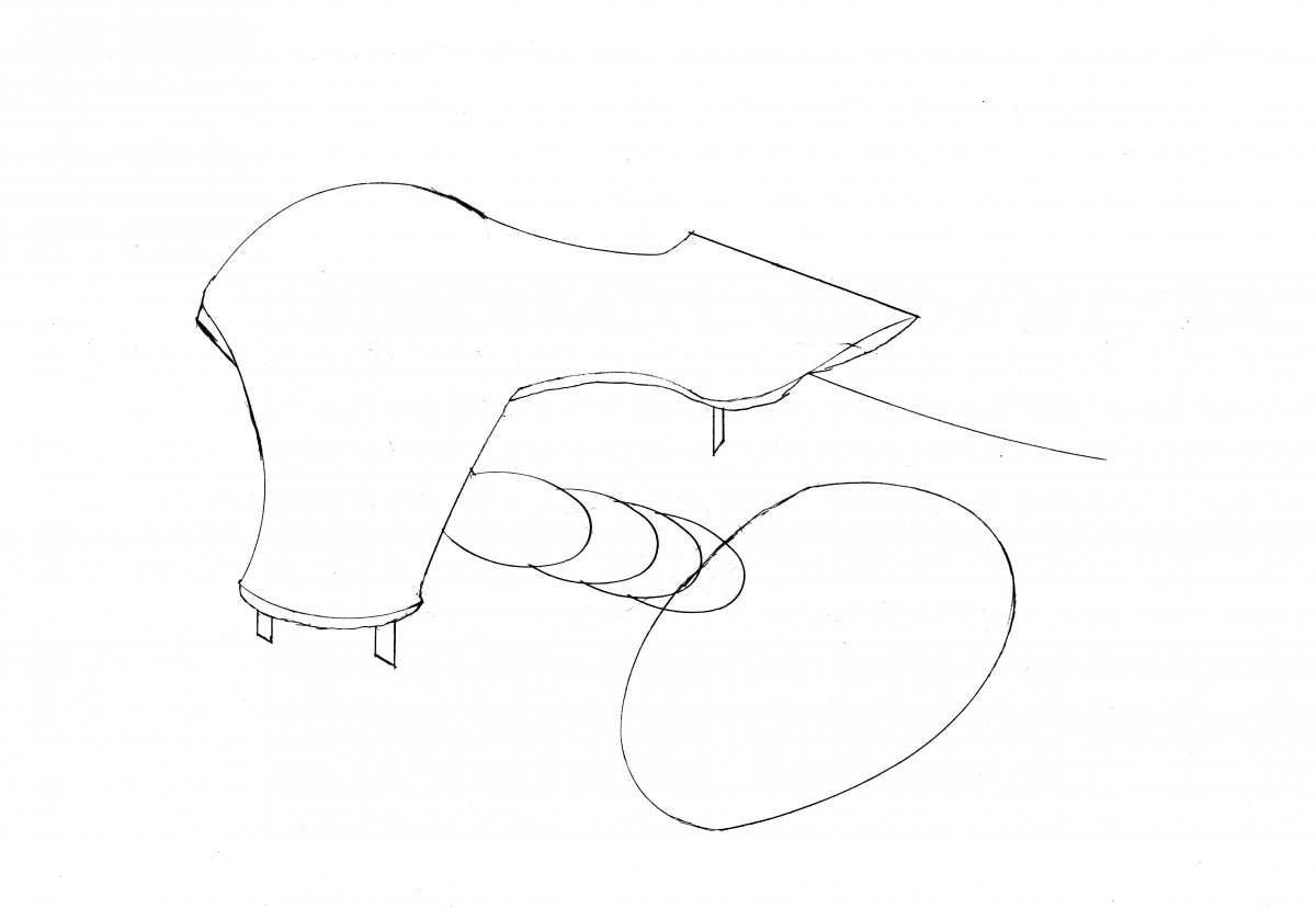
Axon
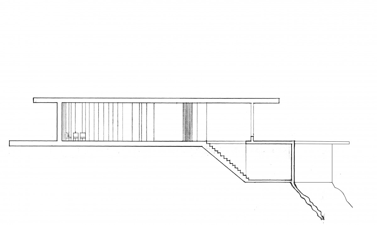
Sections
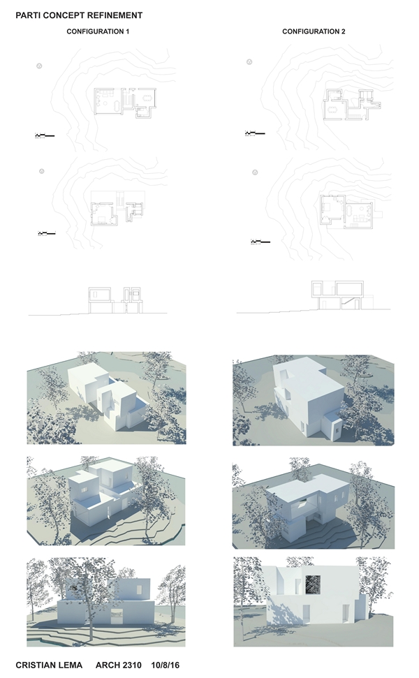
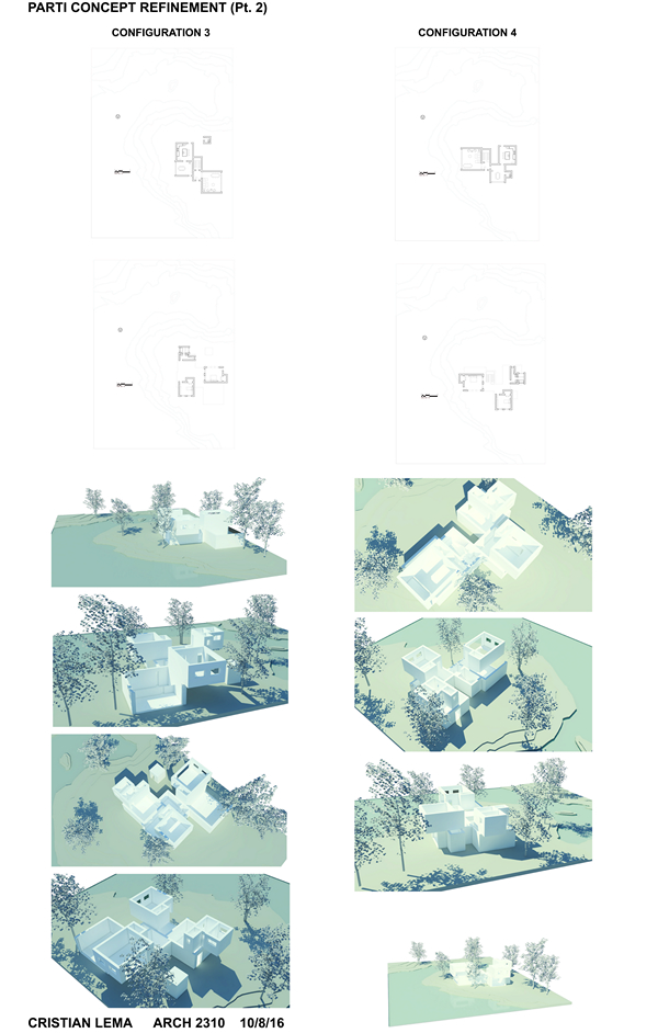
Assignment S: Parti Concept Refinement
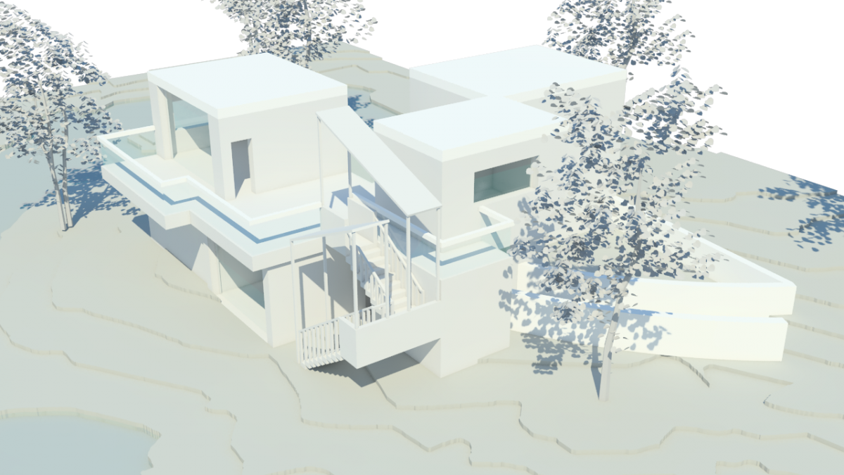
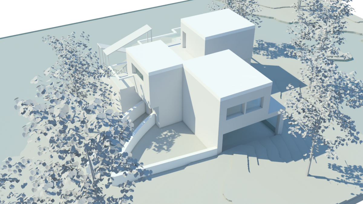
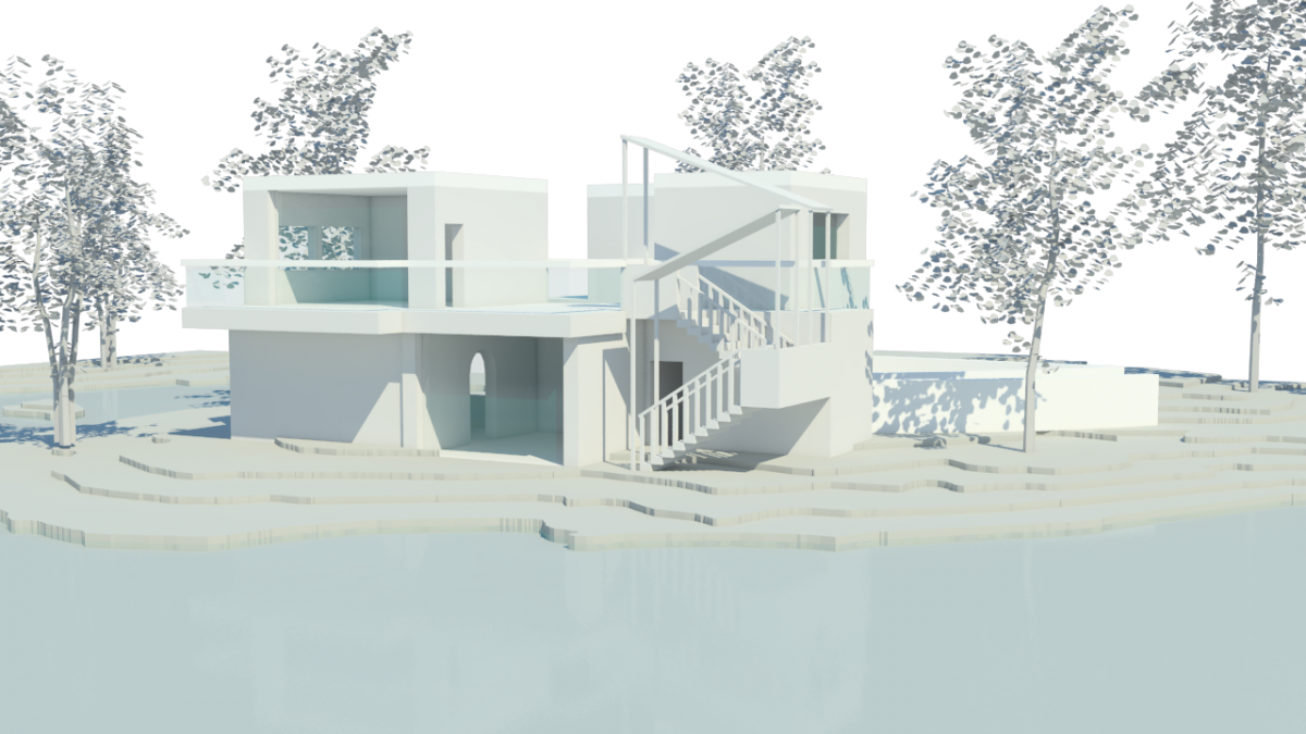
Configuration 3 (Final)
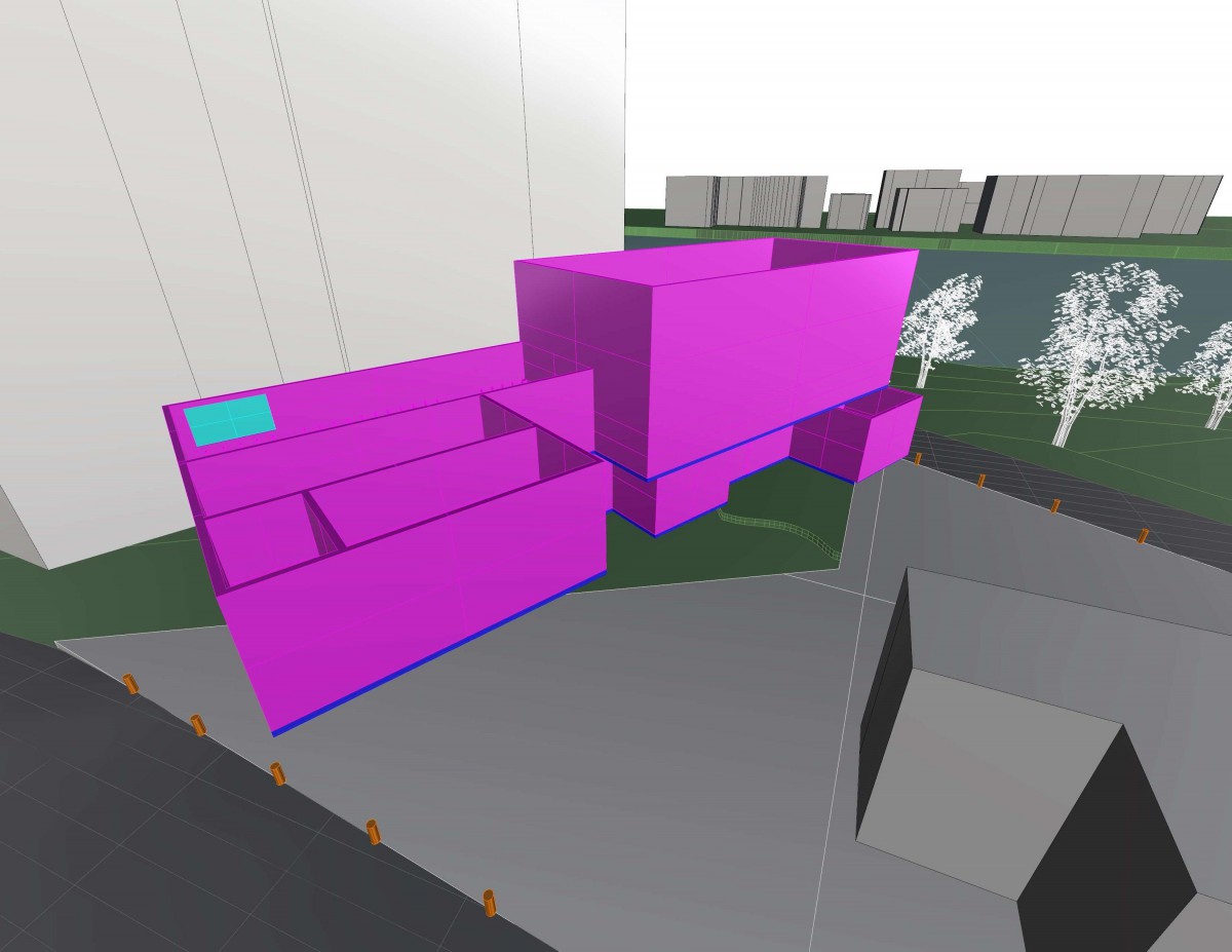
Final Model
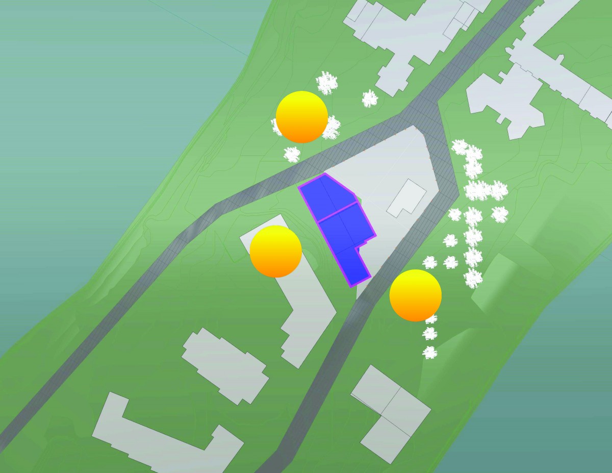
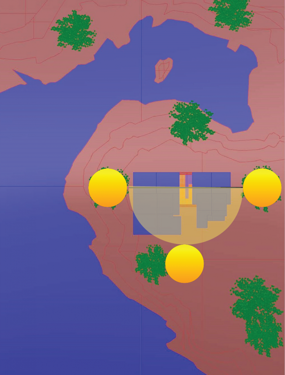
Sun Path
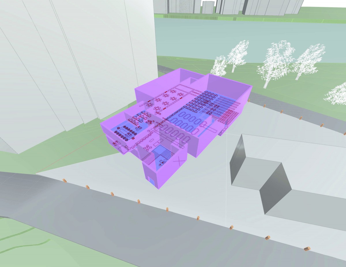
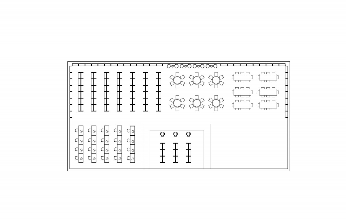
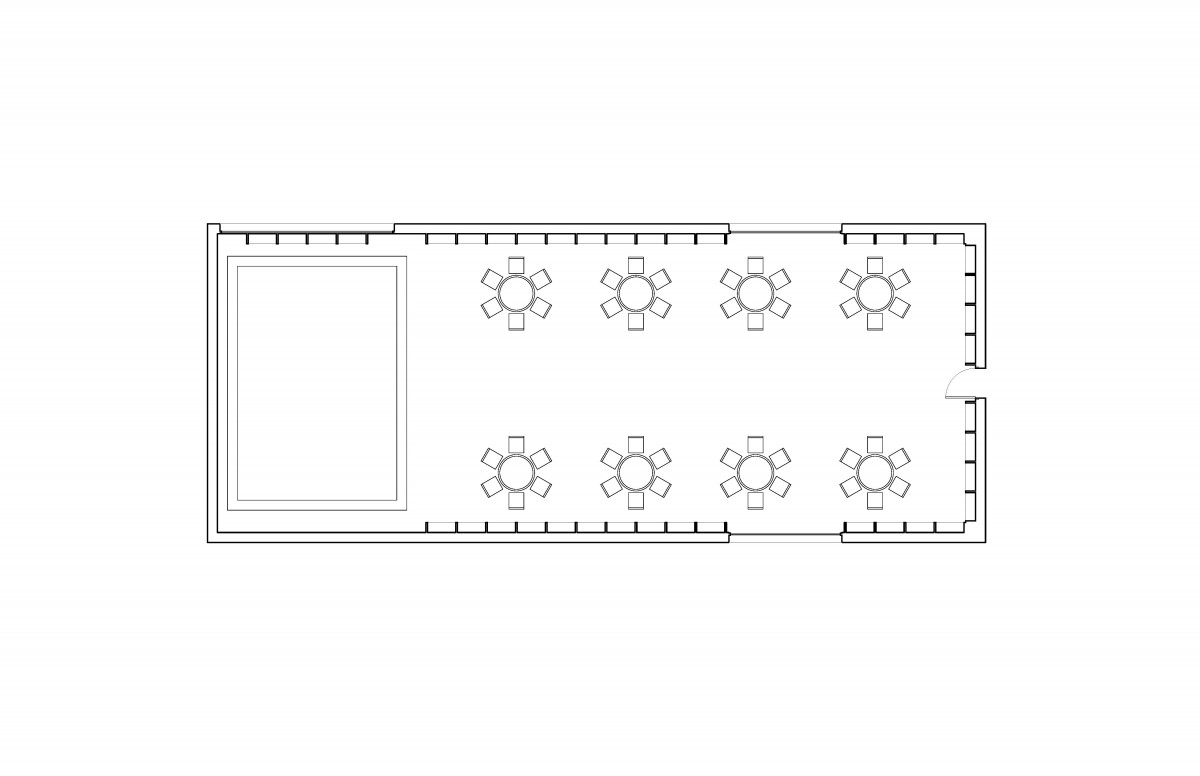
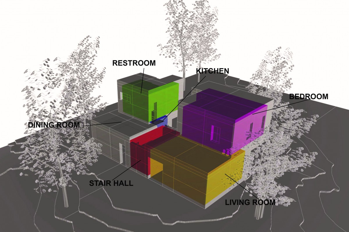
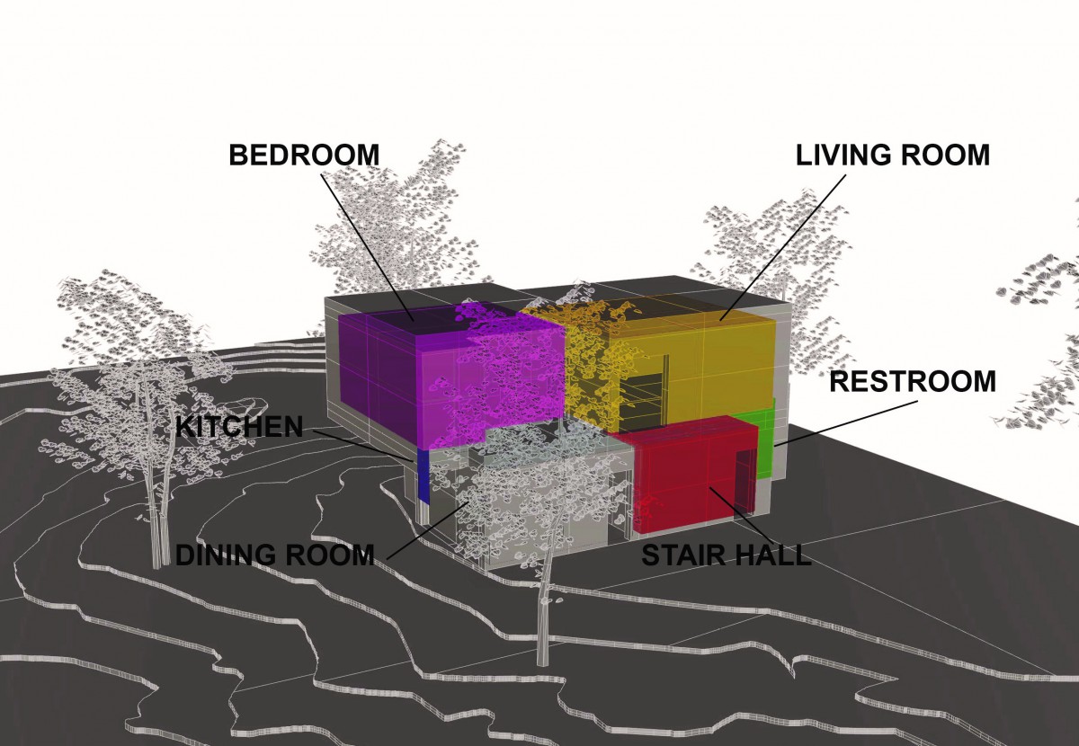
Program
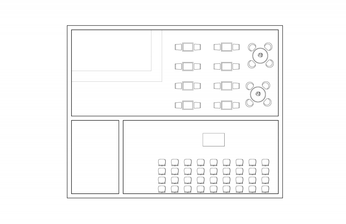
Furniture
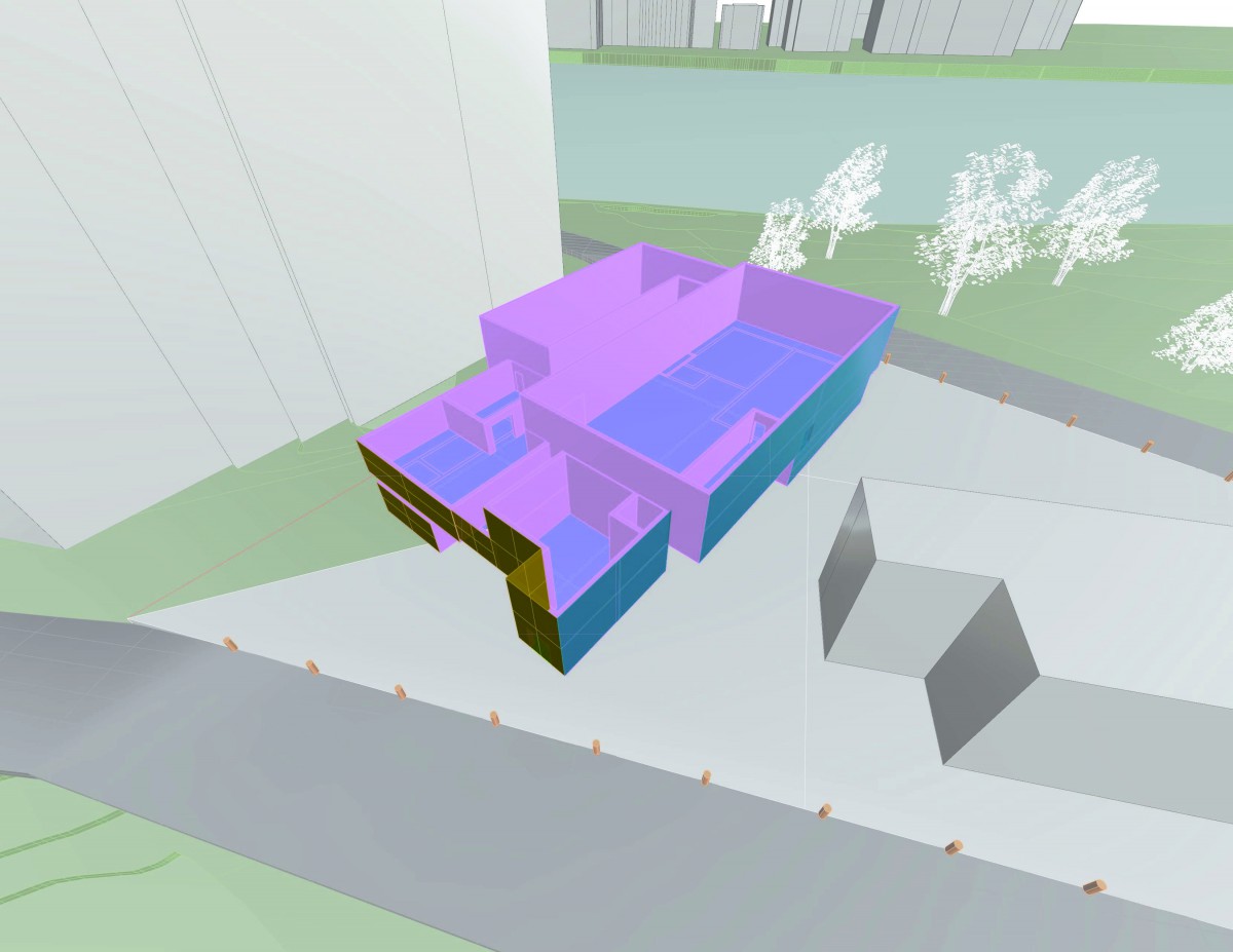
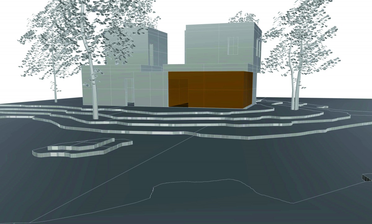
Openings/Windows
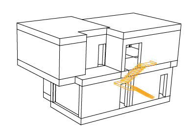
Vertical Circulation
Structure 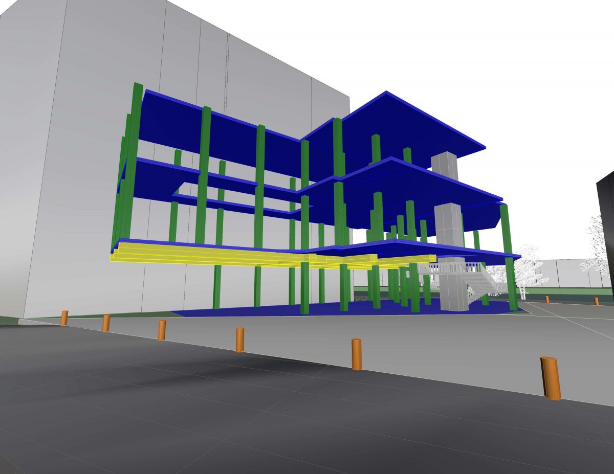
Assignment R: Parti Concept Refinement
Configuration 1
Program
Furniture
Light vs. No Light 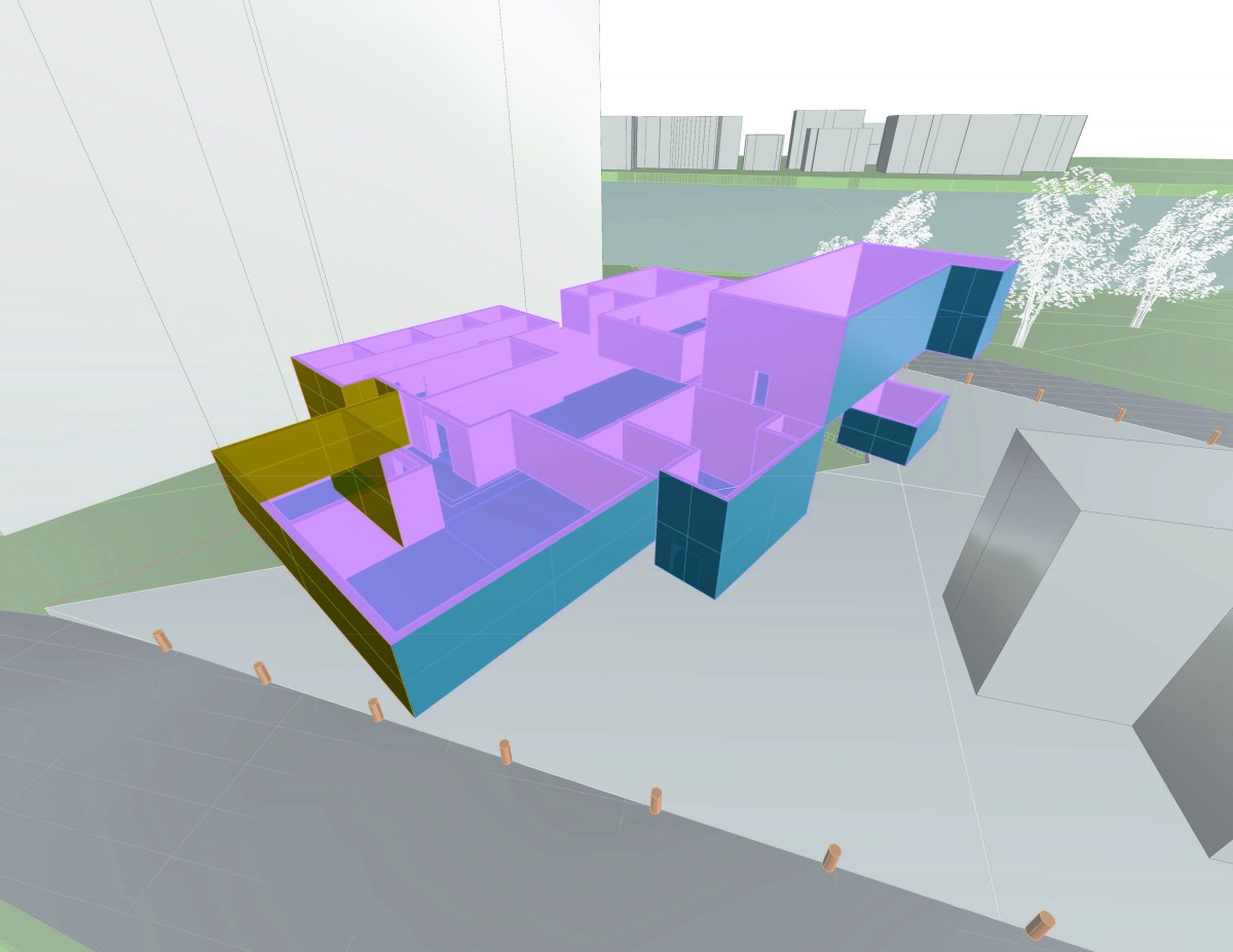
ADDED NO SLABS, BEAMS, COLUMNS, STAIRS OR ELEVATOR!
Renders
Configuration 2
Program
Furniture
Light vs. No Light
Renders
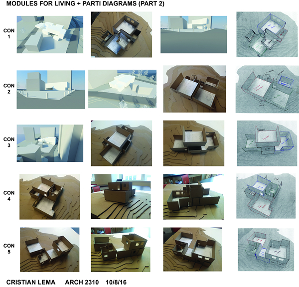
Assignment Q: Parti Development
Configuration 1
Con 2
Con 3
Con 4
Con 5
Assignment P: Library Program + Modules – Digital
Pinterest Photos:
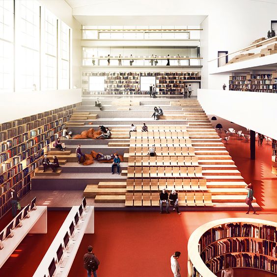
The image above was part of a design idea for a new educational building for Mälardalen University – a university college in Eskilstuna southwest of Stockholm. Essentially, the space above represents a library if not a space that represents a library. But what really caught my attention was the series of steps and the space right next to them; the designer put the steps on one side and on the other, created a space for seating and essentially, a space to relax with friends or just reading books. The designer gave each space its individuality because if the steps width were all extended to the other side, then it’ll all just be a series of steps with huge widths but by make the steps widths small and on one side, the other side is used as a space for seating/reading/studying. The rows of seats give a feeling of one being inside an auditorium because auditoriums have rows of seats which faces the main stage but in this case, there’s no stage because its a library.
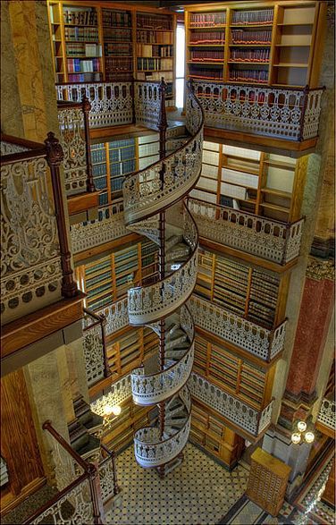
The image above shows a spiral stair inside a library; as one can see, there’s small floors in which individuals can stop on and take out a book. The stair caught my attention because, from my experience, spiral stairs aren’t common in a library. It’s interesting how the space around the stair is quite small and enclosed; meaning, there’s no room or space to just hang out and read but it seems as if the area is just meant for individuals to check out books. In addition, the stair looks quite narrow and, in other words, it looks like it’s a tight space aside from the small area for bookshelves around the stair. The design for the railing is also quite interesting and everything in the image just flows with one another and complements one another. Also, on the top floor, there’s a small pathway to another part of the library; the light right in the corner of the top bookshelf shows an opening to another section of the library which means, the stair is, in a way, a main stair.
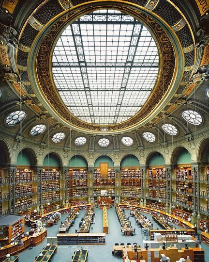
You know what they say, you got to save the best for last and indeed, I saved the best for last. The image above shows a huge portion of a located in France; one really caught my attention in this library is the enormous mass of the space and the ceiling. The ceiling right above is an oval shaped glass and on the sides, there’s round windows which are at an angle because the top space of the room is round. Its not clear by the picture, but it seems like the room is quite symmetrical; the furniture is probably not but the ceiling is in fact symmetrical as well as the bookshelves. The bookshelves are massive in height and I’m not too sure but there might be small mezzanines on each of the shelves that are too high or maybe ladders are used to reach the top shelves. It’s interesting how the space is massive compared to other libraries but then again, huge public libraries seem to be massive in space and very huge in height.
Library Module #1:
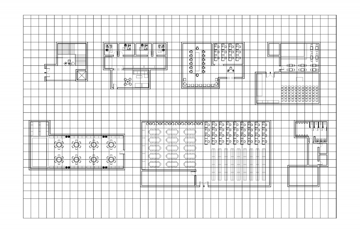
Library Module #2
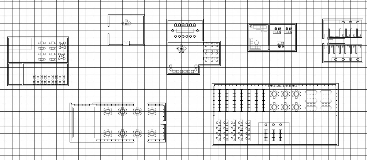
Lobby
Café/Community
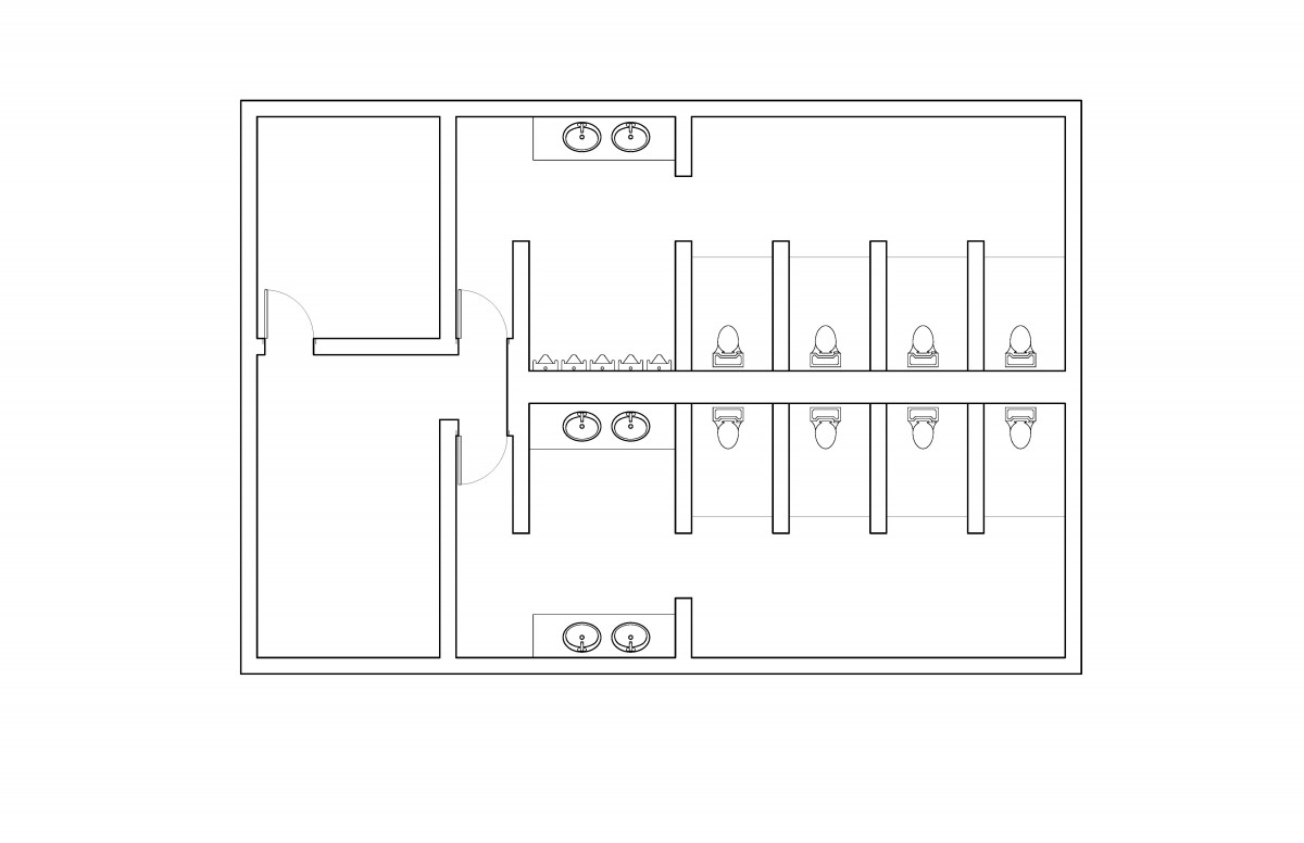
Restrooms
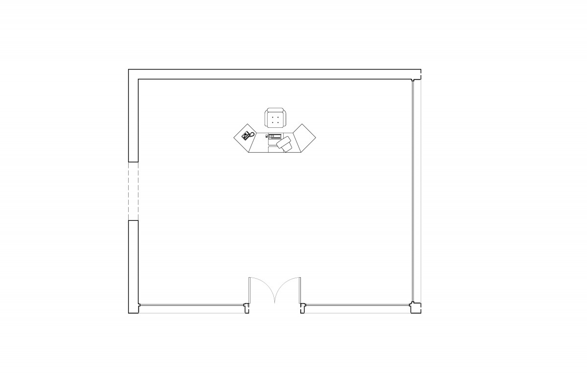
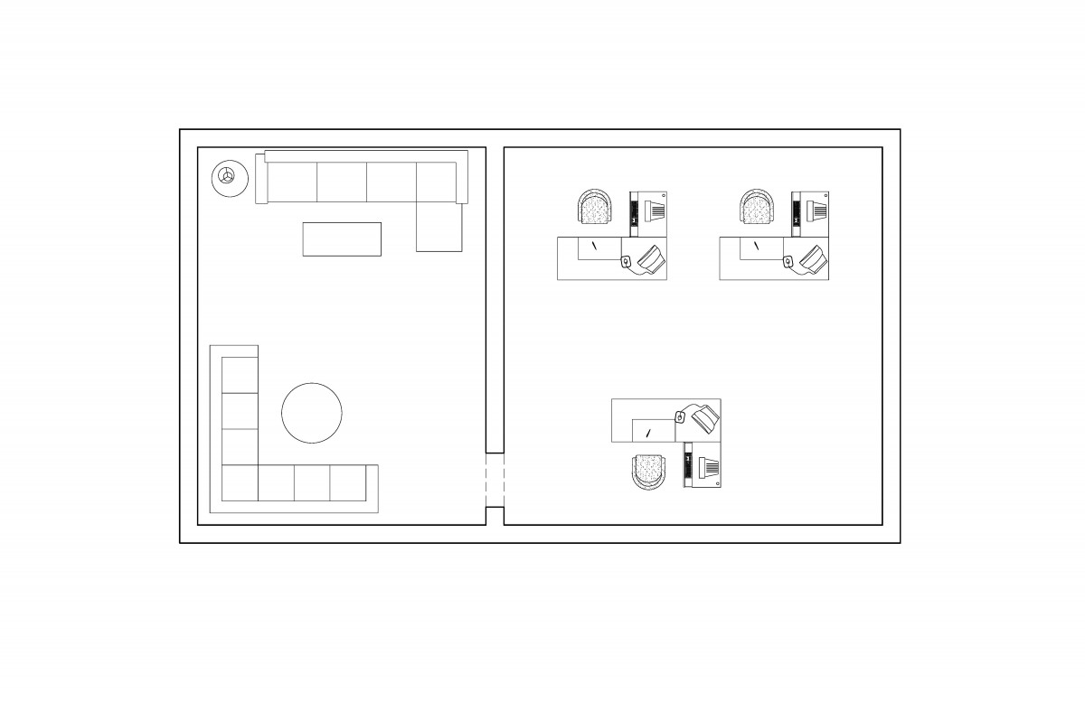
Office/Lounge
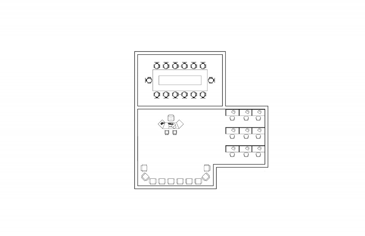
Conference Room/Information Desk
Main Reading Room
Children’s Library
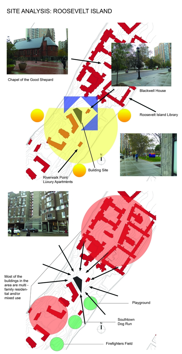
Assignment N: Site Analysis
Assignment M: Final Presentation
Assignment L: Mock-Up Presentation
Parti- Diagrams
Stairway
Entry/Approach
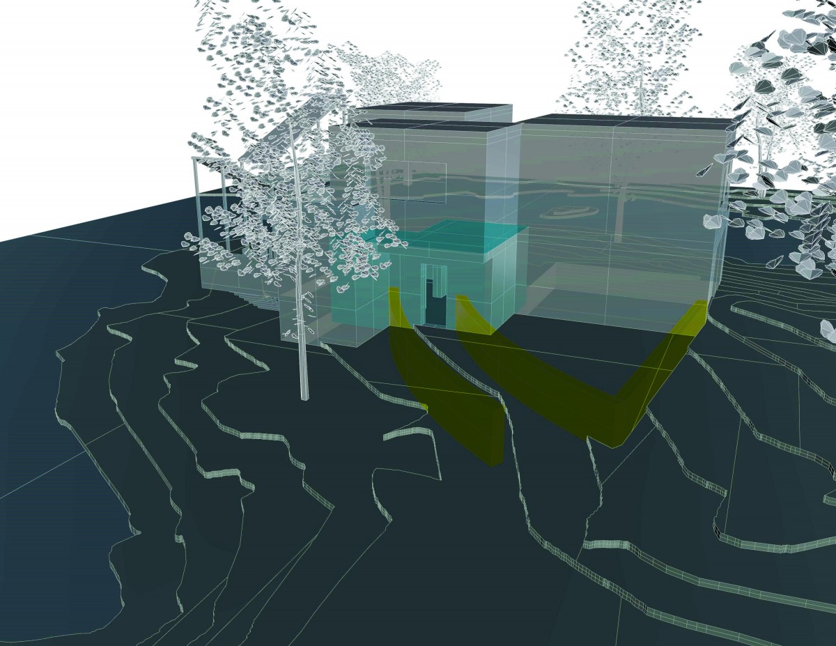
Program
Cantilevers/Terraces
Glass/Views
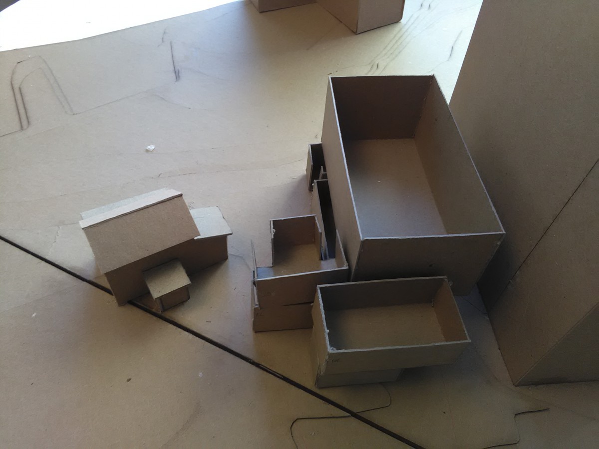
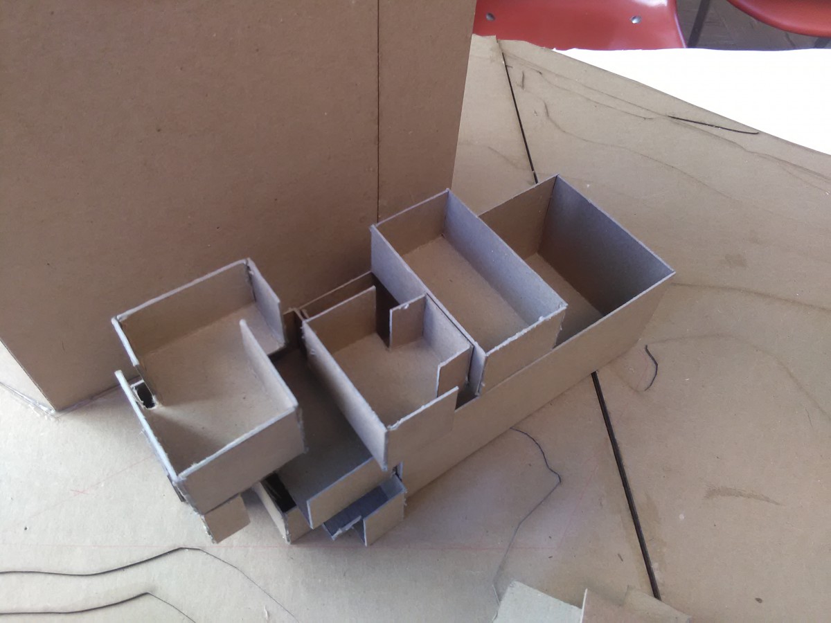
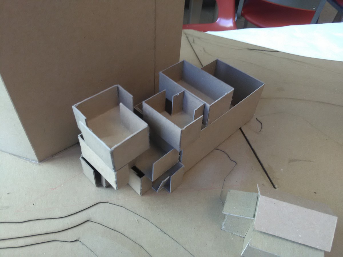
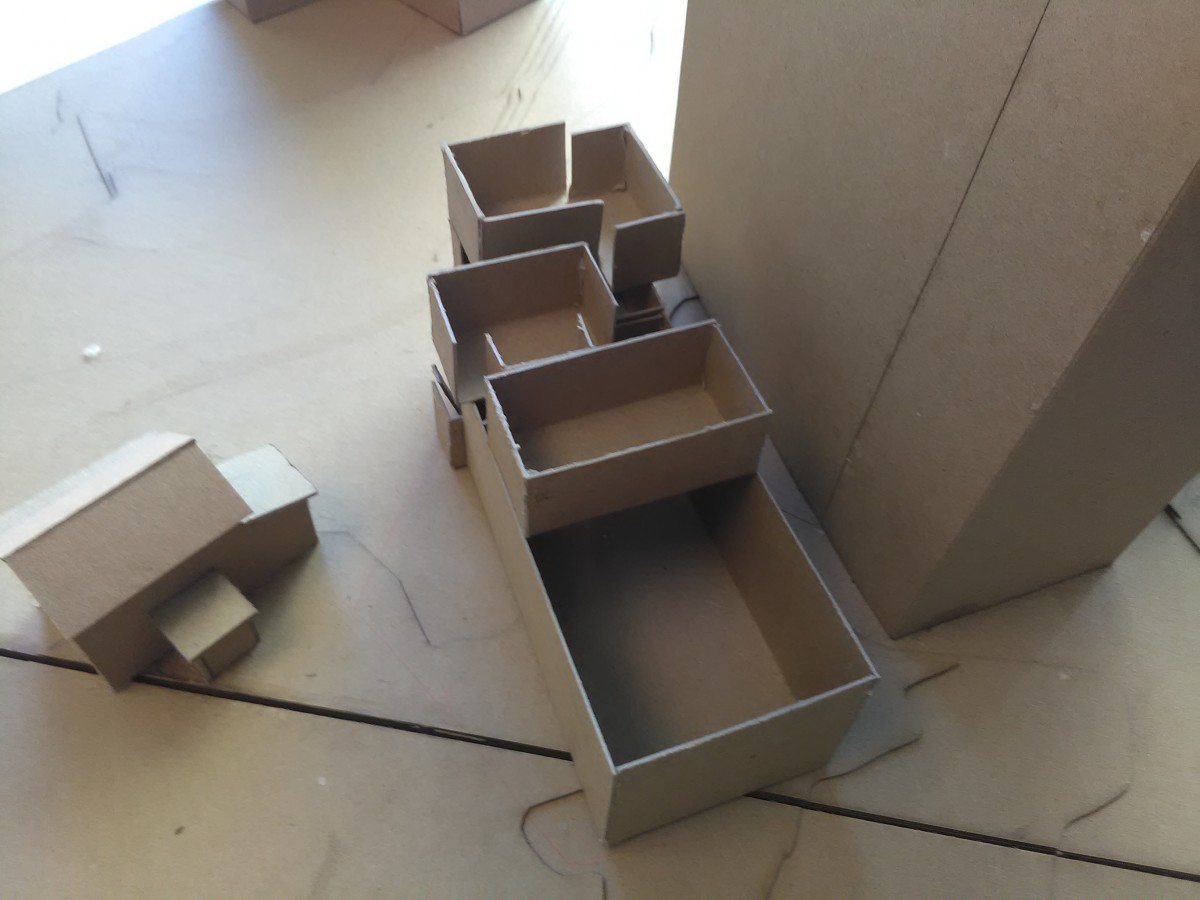
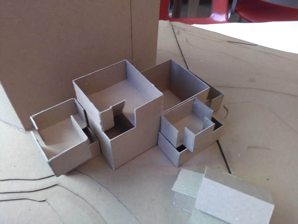
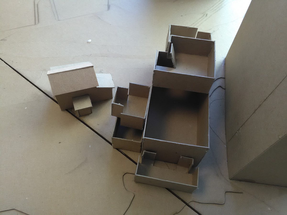
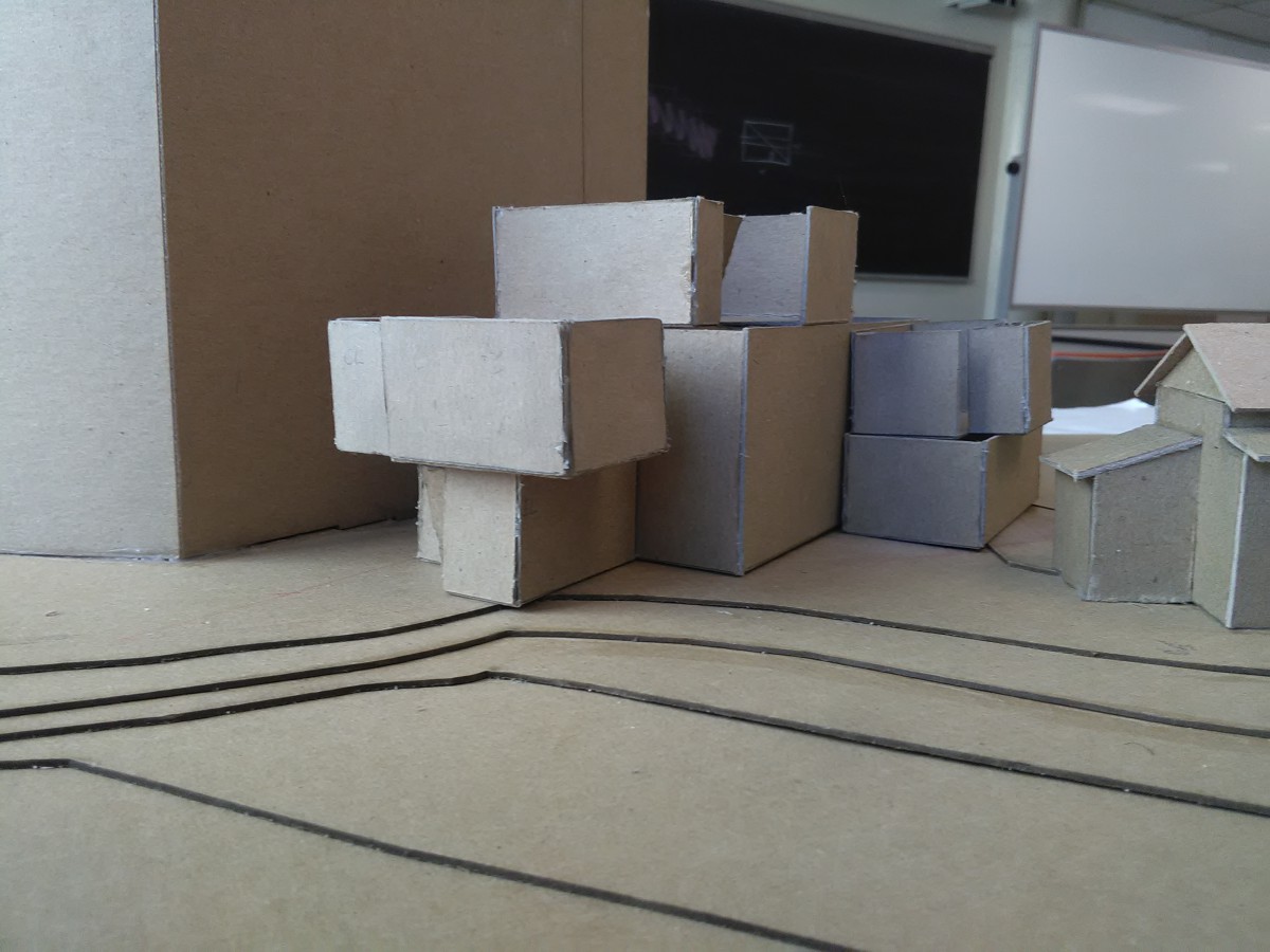
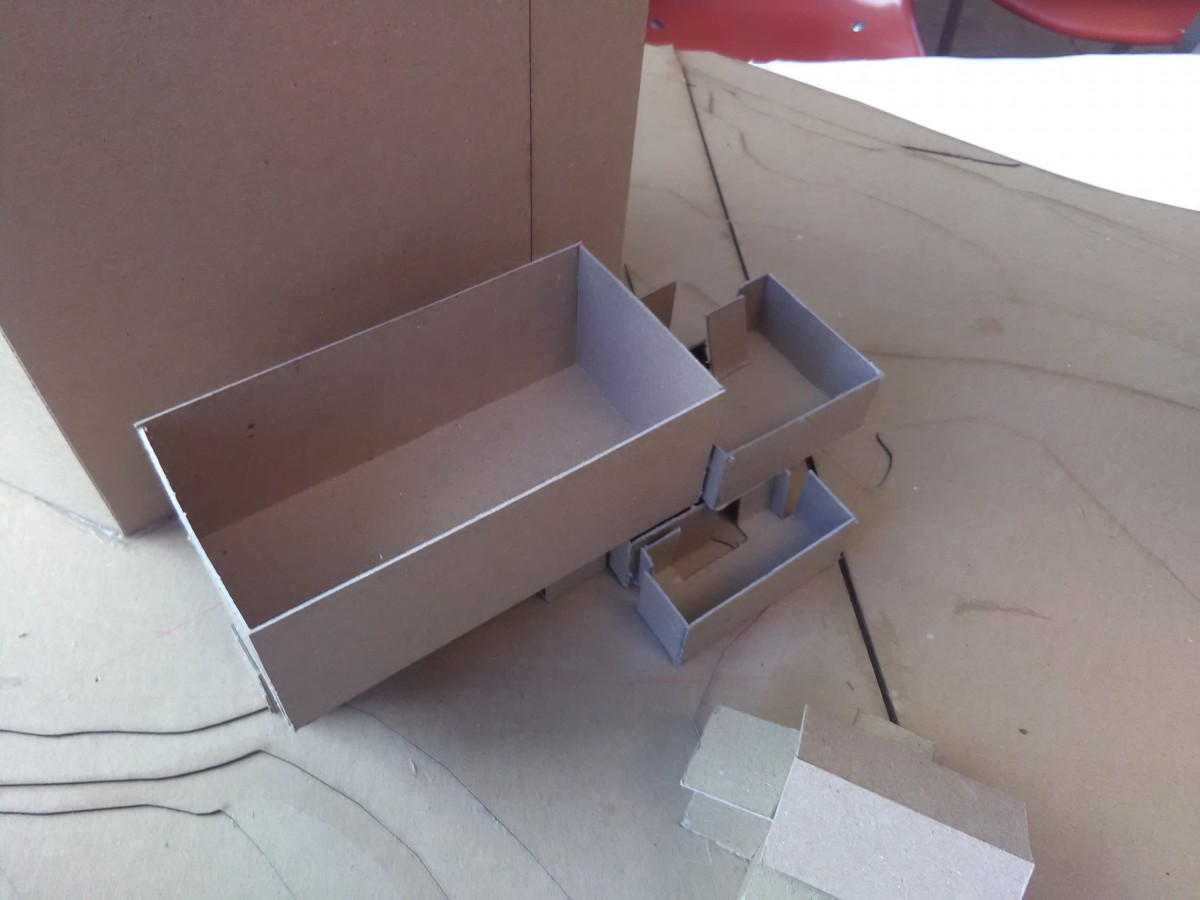
Assignment K: Final House Design Development
1st Floor Plan
2nd Floor Plan
Section
Axon
Assignment J: Digital Model Development
Top View
Interior 1
Interior 2
Axon 1
Axon 2
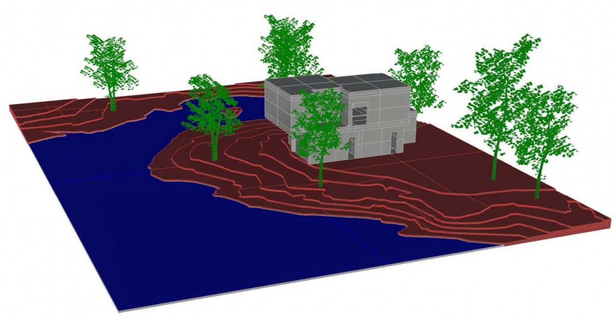
Waterside
Stairs
Approach/Entry
Assignment I: Parti Diagram Refinement
Diagrams (Con 1)
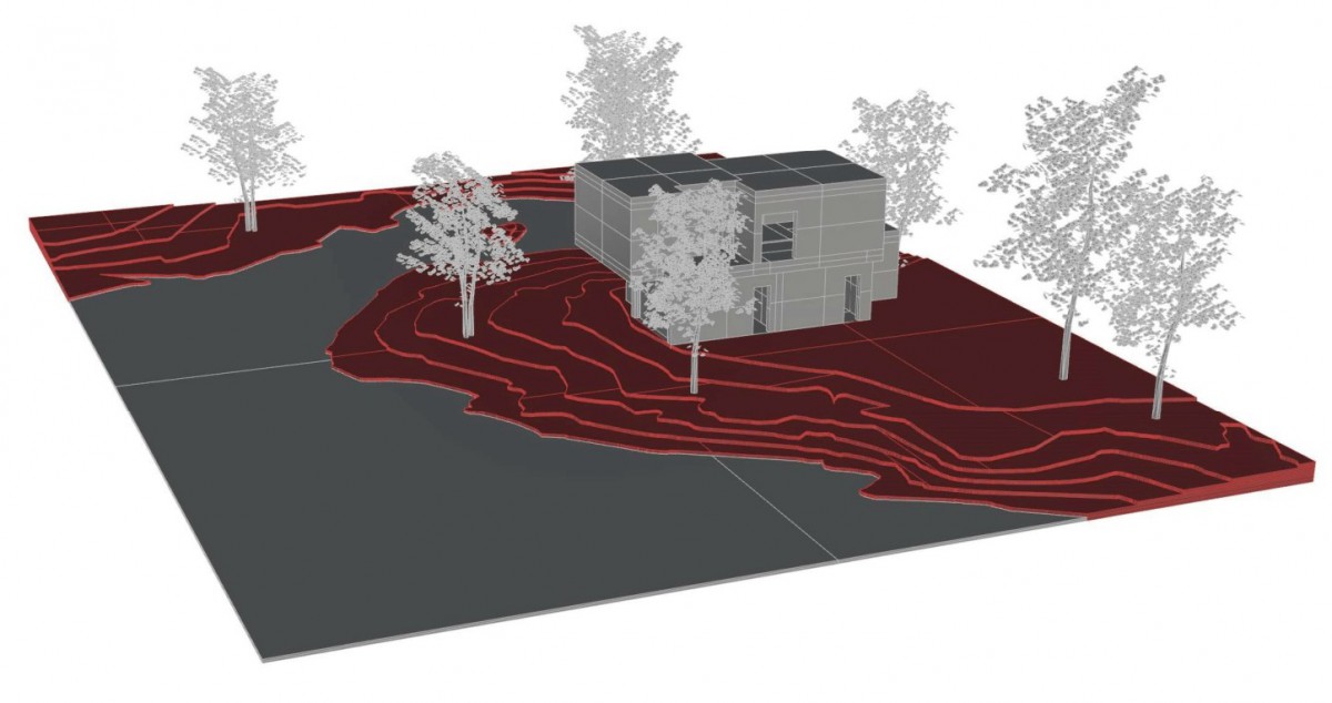
Topography
Landscape
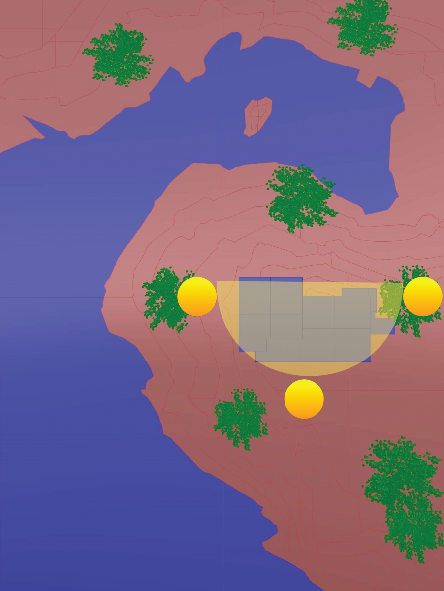
Sun Path
Approach/Entry
Mass/Program
Vertical Circulation
NO CORRIDORS OR OUTDOOR SPACES!
Diagrams (Con 2)
Topography
Landscape
Sun Path
Approach/Entry
Mass/Program
Vertical Circulation
NO CORRIDORS OR OPEN SPACES!
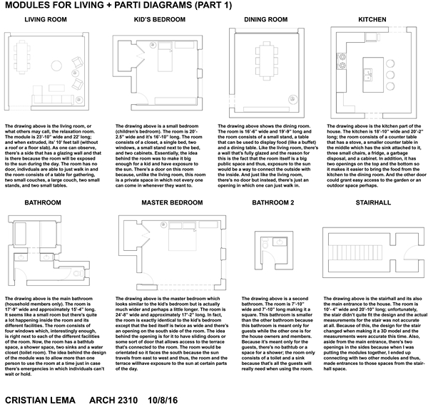
Assignment H: Modules For Living + Parti Diagram
Assignment G: Section Drawings
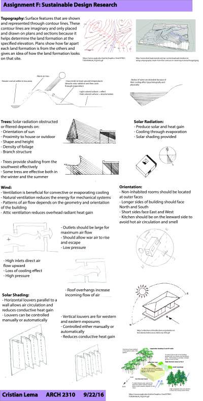
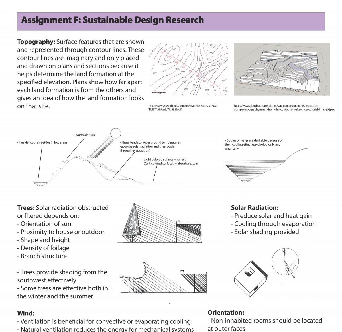
Assignment F: Sustainable Design Research
Assignment E: Final Presentation of House and Space
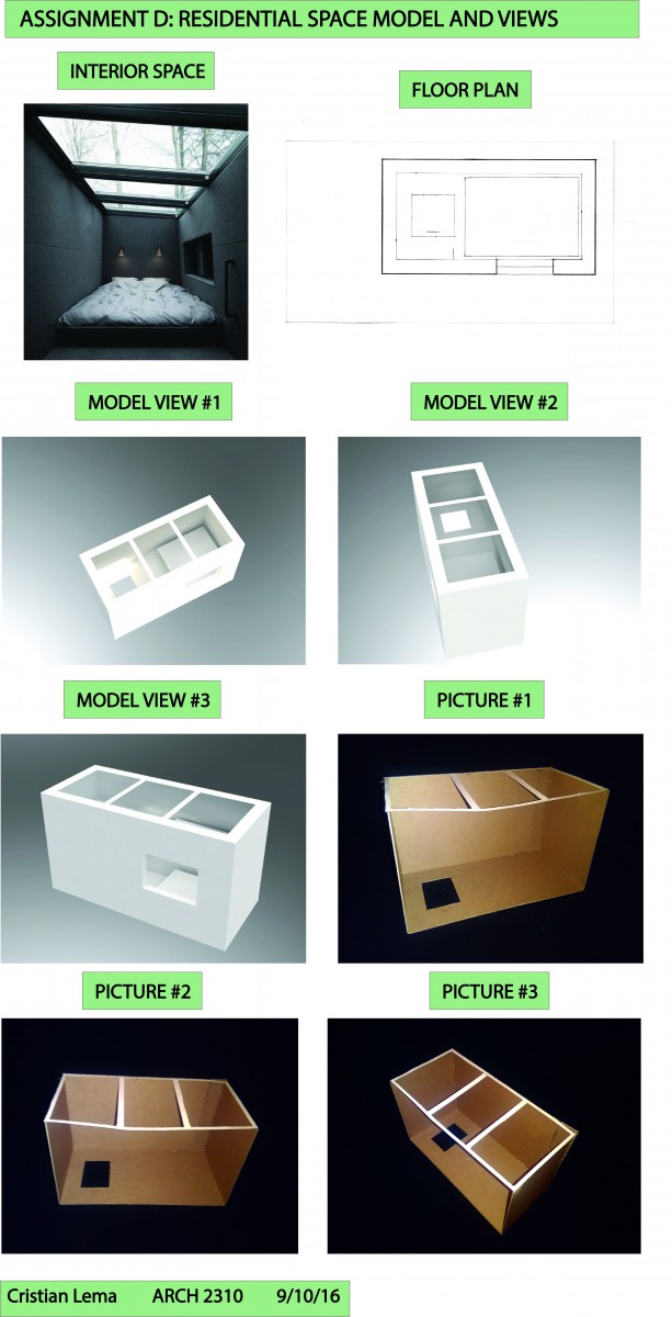
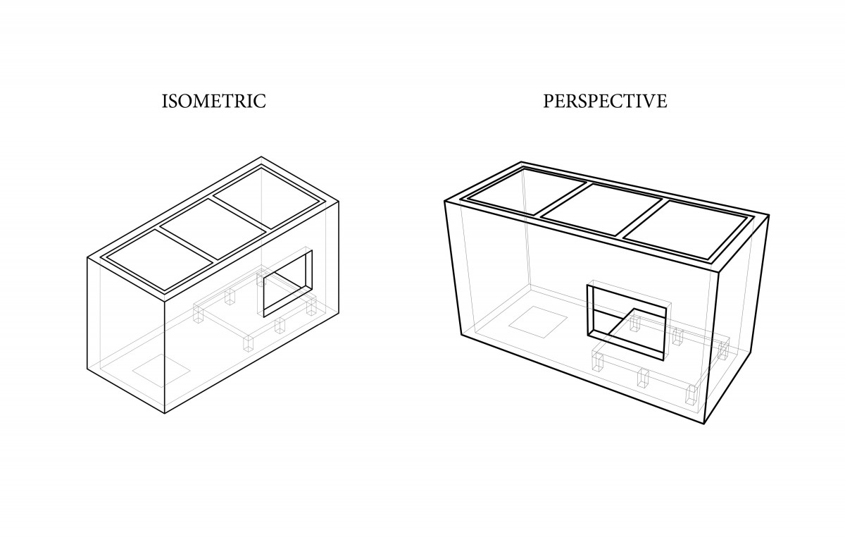
Assignment D: Residential Space Models and Views
Assignment C: House Plans, Section, Axon, DIagrams
First Floor Plan
Second Floor Plan
Section
Axon
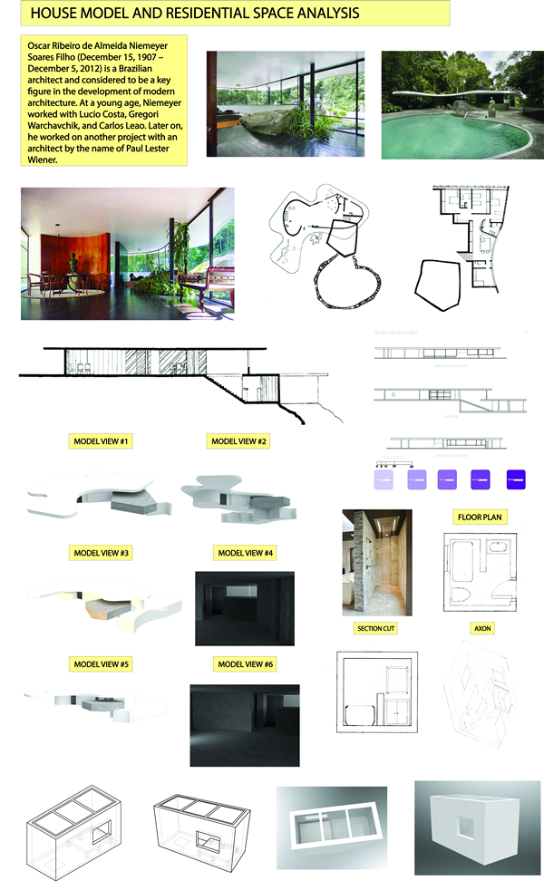
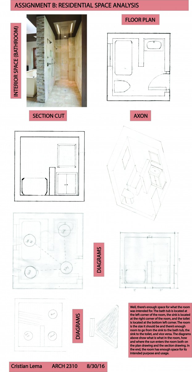
Assignment B: Residential Space Analysis
Assignment A: Architect Design Analysis
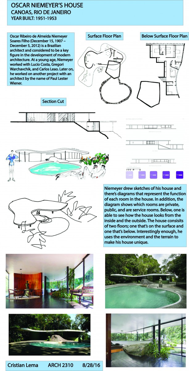
Oscar Niemeyer was a well known Brazilian architect who made houses, which included the making of his own house, and other buildings. In the early stages of his career, Niemeyer worked with other Brazilian architects; with these architects, he began to express the idea behind modern architecture. All the houses that he designed had a unique aspect, especially the house he designed in Rio de Janeiro, which turned out to be his house. The concept behind this house was for the house to connect to the landscape/environment; even though the terrain was uneven, Niemeyer decided to use it as an advantage and not let the house get lost within the surrounding environment. The house consists of two floors; one floor is located on the surface but inside of a stair going up to the second floor, there’s a stair that goes down to a floor where that is located below the surface. The first floor contains public space in which guests can interact with one another; while the floor below the surface contains rooms that are more private such as, bedrooms, bathrooms, etc.

