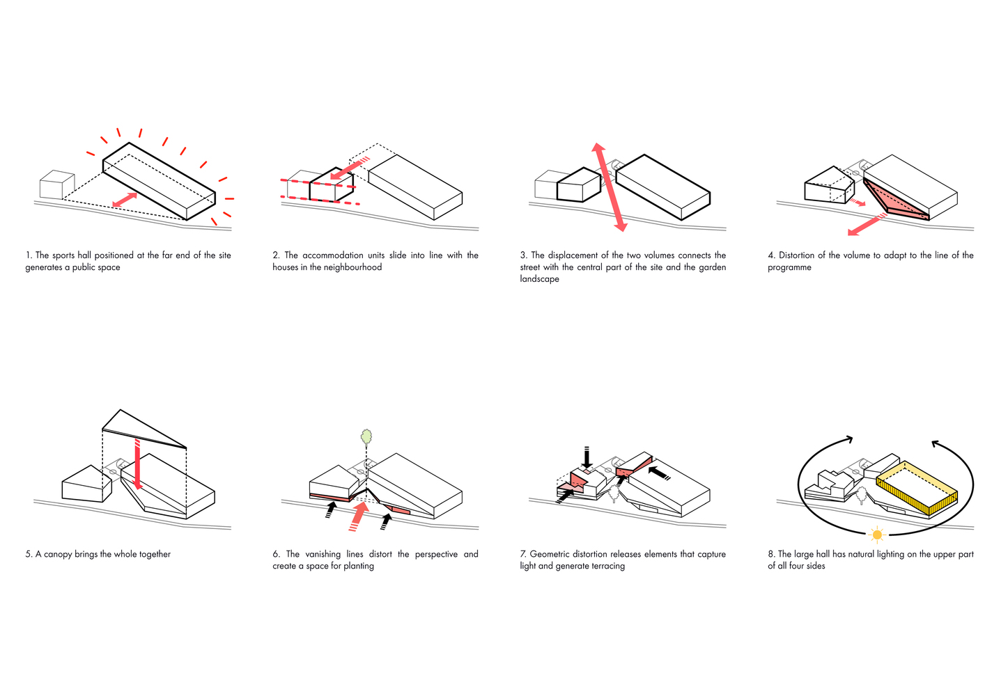
I came across this morning – it’s a perfect example of what we’ve been talking about in terms of a diagram explaining massing choices. Take a moment to look at line weights, what is shown and not shown, how changes are indicated. 
The whole project (a school in France) is here: http://www.archdaily.com/800826/les-closiaux-dominique-coulon-and-associes/58452df9e58ece9e19000756-les-closiaux-dominique-coulon-and-associes-photo


