Create a typographic composition that explains your designer to your classmates
challenge: How do you create a readable, asymmetrically balanced images with clear hierarchy?
If you HAVE NOT yet created alignments with simple hierarchy
-
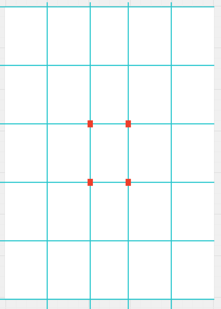
- Sketch 2 rectangular formats with 5 columns and 5 rows
- Place tracing paper over your sketch
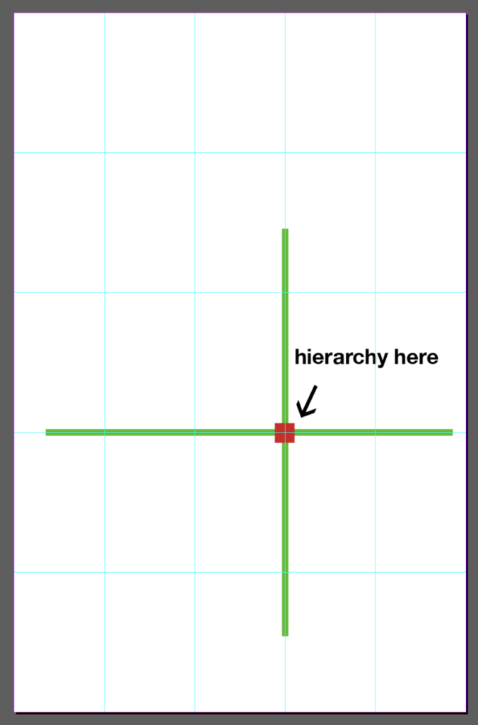
- Determine which “hot spot” you will emphasize
- Using a thick marker, sketch your layout using the format below.
- In indesign, recreate your sketches using the directions from “the original assignment” below
- post 2 sketches and 2 jpgs on Miro
example:
OR
If you HAVE created alignments with simple hierarchy
-
- Refine 2 compositions
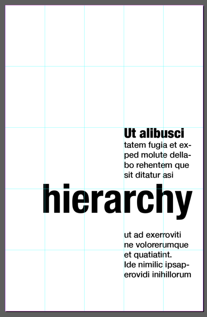
- Push your hierarchy. Increase your scale change as much as possible
- Simplify. Limit your “signals.” Minimize small size differences, italics, bold, typefaces to only those necessary.
Use just a few sizes and weights of type to express meaning and hierarchy.
Use space as an active element.
original assignment:
Typographic posters in InDesign
-
-
- that explain your designer
- in the style of your designer
- 11×17″
- 5 columns, 5 rows
- SIMPLIFY
- using proportion, position your hierarchy in a “hot spot”
- use 1 primary alignment
- emphasize hierarchy
-


- Create a composition with the primary alignment on the left side of the fourth column
- Create a composition with the primary alignment on the left side of the third column
Post all on Miro
————
1. Use the rule of thirds or the golden mean
Divide the frame into thirds or fifths, both horizontally and vertically.
Place the subject/key element at the intersection points of the lines.
Use your designer’s typefaces
2: Show clear hierarchy
Draw the viewer’s eye to the most important elements of the composition.
Your quote is the “hero,” which words should you highlight?
Keep all variations to a minimum. If you make a change for emphasis, make it dramatic.
for an example, see: Plain Typography
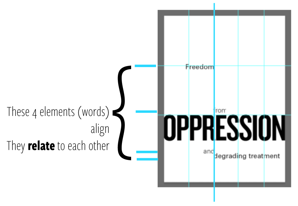
3. Use alignment to tie elements together
Emphasize your quote
Add your designer’s
-
-
-
- quote (the hero)
- designer’s name
- general location and or/date of the quote
-
-
In the 1950s, designers in Switzerland reduced typography to minimal ingredients.
Josef Müller-Brockmann, Emil Ruder, and others used just a few sizes and weights of type to express meaning and hierarchy. They used space as an active element.
This Swiss methodology is still helpful today. Start a project with a single typeface.
4. Check for Legibility and Readability
-
-
- Legibility: can you see it? Can you recognize the characters quickly and easily?
- Readability: is it comfortable and enjoyable to read a longer text for an extended period?
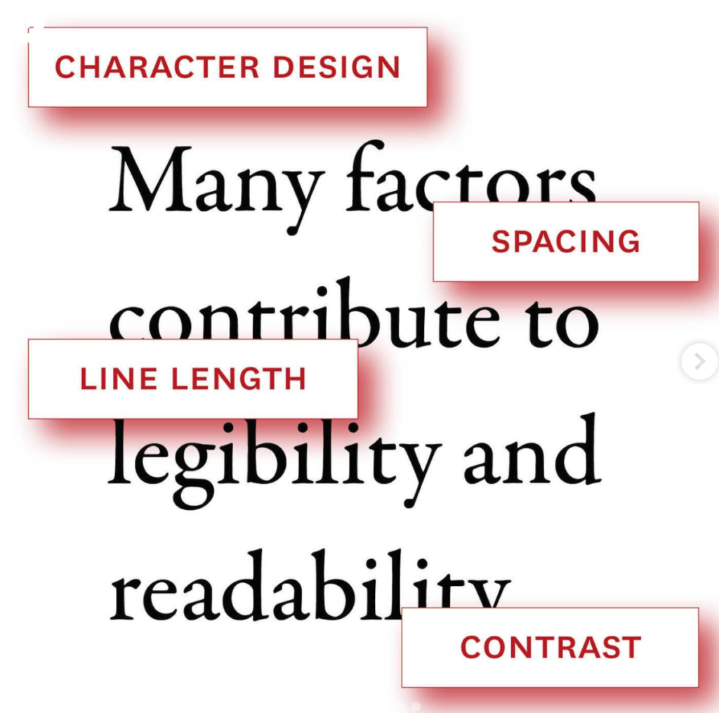
Many factors affect legibility and readability, including context, lighting, distance, and design features such as contrast, spacing, line length, character design, and the size of characters. - Big type is more legible than small type (it is easier to see it).
- Condensed typefaces are less legible that normal widths, but because condensed type uses less space, the type can presented larger on a sign or other constrained space.
- Fonts that use many similar shapes, such as Helvetica, are considered less legible than fonts that have very distinct shapes, such as Atkinson Hyperlegible.
- Our age, abilities, and background drive our preferences and reading comfort.
Like many binaries, the opposition between legibility and readability dissolves under pressure. - A text that is enjoyable to read is also legible, but pages in a book don’t have the same criteria for legibility as signs in an airport.
- Designers often subvert legibility to tell a story with a headline or invite readers to question an idea or follow different paths through a narrative.
- Individual preferences play a role in both legibility and readability.
- Familiarity, physical and mental abilities, and context all affect optical performance (legibility) and the pleasures and comforts of reading (readability).
-
4. Add your sketches as jpgs to Miro
Reference:
Use alignment to tie the elements together
Use grids to make wide and narrow columns
follow this if you want to mix fonts


