Class Info
This Week’s has been outlined in detail to give a clear vision of the overall course.
Course Goals: Introduce the field of graphic design including its basic working methods and theory. This class will focus on communication through form, the visible shape or configuration.
Critique
Lecture
It is seeing which establishes our place in the surrounding world;
we explain that world with words, but words can never undo the fact that we are surrounded by it. The relation between what we see and what we know is never settled.
John Berger, Ways of Seeing
Design Fundamentals
how we see: visual perception
gestalt principles of design:
-
-
-
negative space logo letter begin 1 min; illustrator tips: 5:00; letter and symbol: 7:05
-
-
In music, are the separations between notes less important than the notes themselves? Malcolm Grear
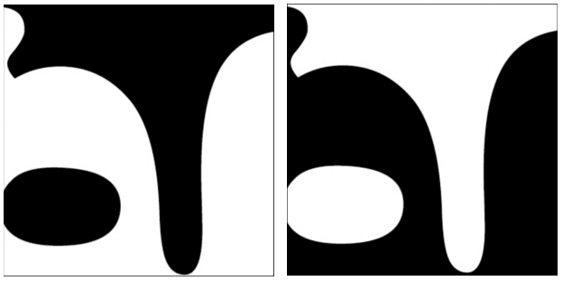
A figure (form) is always seen in relation to what surrounds it (background)—letters to a page, a building to its site, or a sculpture to the space around it.
A black shape on a black field is not visible; without separation and contrast, form disappears.
The ability to create and evaluate effective figure/ground tension is an essential skill for graphic designers.
Train your eye to carve out white space as you compose with forms.
Learn to massage the positive and negative areas as you adjust the scale of images and typography. Even subtle ambiguity can invigorate the end result and shift its direction and impact.
design details: Papyrus
Review: sketches
figure/ground icon
Create an icon from a “recognizable” object
The form of an object is not more important than the form of the space surrounding it All things exist in interaction with other things.
Use a “recognizable” object
-
- Icons should quickly communicate an object, idea, or action.

Screenshot
Screenshot
![]()
Video: negative space logo design
rubric for final icon
![]()
Homework
Due: 10/7; 8:30 am on Miro
goal: figure ground icon
To Do
-
- create your icon in illustrator.
- upload letterform for grading
—————————–
1 Create your icon in illustrator
Sketch and create that version in illustrator Criteria
5 inch square surrounded by a 1 point black rule
The object and negative space must be the opposite color of the letter.
Work with large shapes – do NOT use LINE
Carve an icon out of your letterform
Make sure you are not turning the letter into an illustration
Post your sketch and illustrator icon to Miro
Resources:

Use negative space in logo design; https://www.youtube.com/watch?v=wzvJWWLTuEM
—————————–
2 Finalize: your letterform
Save your final as a jpg, correctly name it, and upload to the Google Drive
Finalize letterform checklist:
-
-
-
-
- square format?
- does the design use shape or line?
- does it have an equal amount of black and white?
- does it demonstrate a figure-ground principle? (does the eye shift back and forth between
-
-
-
Process:
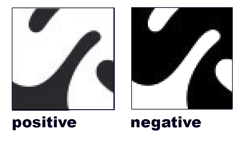
1 Create a negative and a positive version. (both versions are 5 inch squares)
(the negative version is exactly the same as the positive, except that it uses the opposite color)
-
-
- What was black will be white, what was white will be black.
- The positive and negative versions MUST be exactly alike except it reverses color
-
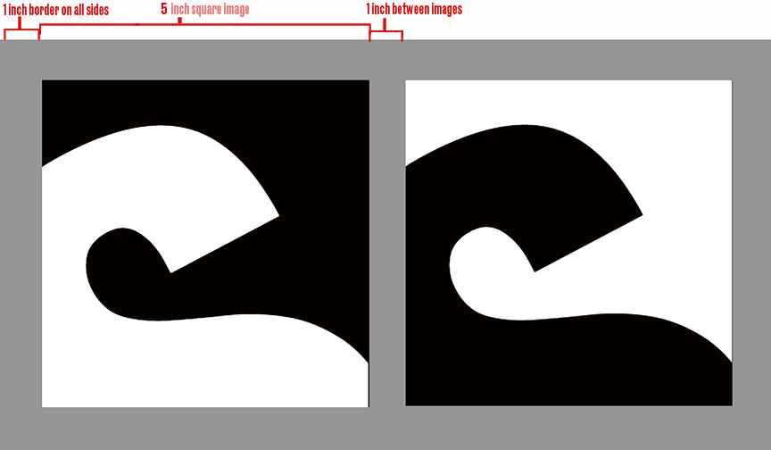
2. In illustrator, create a 7 x13″ rectangle filled with 50% black
Place both 5 inch square versions on the grey background
Position with a 1 inch border on all sides and 1 inch between squares (see diagram below)
Save as a layered pdf, (in case you want to make changes later)
3 Save as a png
Name your file
“comd1200_f24_letterform_first name last name”
example: comd1200_f24_letterform_alex smith
4 Upload your correctly named jpg to the Google Drive
example:
Print this page

