Lecture
alignment & proportion & meaning demonstrations
Hierarchy too many signals
Activity: class 2
Alignment Workshop: align dummy type to the grid
grids, proportion, and hierarchy
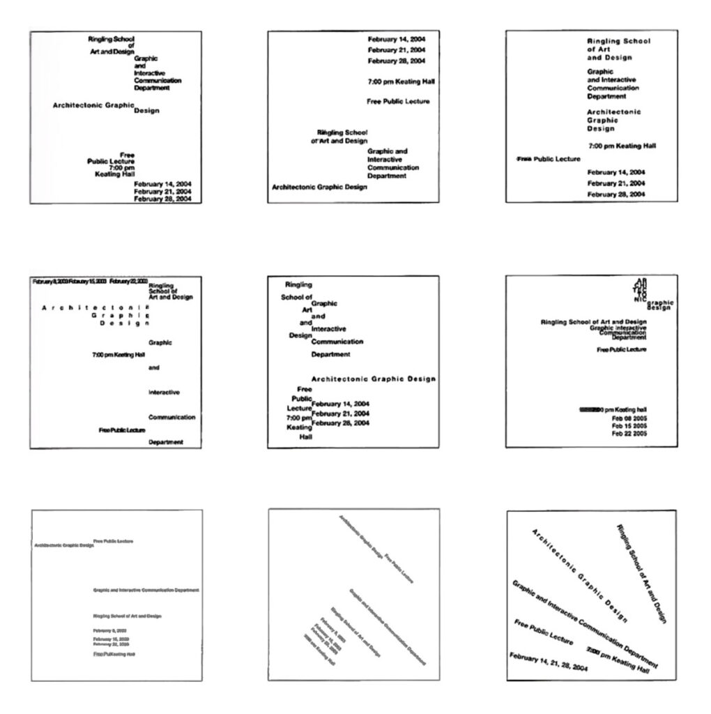
Align to the grid
Proportion
1 Use a grid, 5- or 3-column
-
-
-
-
-
- golden ratio proportion (your 5-column grid) (image below)
- rule of thirds proportion (your 3-column grid)
-
-
-
-
2 Add dummy type to emphasize the grid we should have a sense of the grid, even when it is not showing
3 Use hierarchy to create a composition based on each proportion system • use at least 3 levels of hierarchy • where do you place hierarchy to emphasize the grid?
![]()
Use alignment
Make sure your text is not centered check that you do not have the same space above and below
Mass your white space make sure you have a large group of white space
Review & critiques homework
Next week:
Preparation for hierarchy
How we see:
How we see: visual attention science. start at 2:50 – 9:30
https://www.linkedin.com/video/live/urn:li:ugcPost:6821094794379501568/
start at 3 minutes – 9.30 minutes
Homework
Due: 8:30, Monday
goal: refine your composition
To Do
-
- refine your letter
- choose and object
- watch
1 Finalize: your letterform
-
- Refine your letterforms
Criteria
-
-
-
-
-
- square format?
- does the design use shape or line?
- does it have an equal amount of black and white?
- does it demonstrate a figure-ground principle? (does the eye shift back and forth between
-
-
-
-
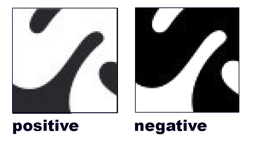
2. Once completed, create a negative version.
A negative version is exactly the same except that it uses the opposite color.
-
-
-
-
-
- What was black will be white, what was white will be black.
- The positive and negative versions MUST be exactly alike except it reverses color
- One way to do this is to “invert” your letterform in photoshop
- Select object > Image > Invert
-
-
-
-
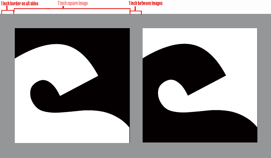
3. In illustrator, create a 8 x15″
fill with 50% black
place both versions of the 6×6 inch exact positive and negative on the grey background
Use a 1 inch border and 1 inch between squares
Save as a jpg
Create a jpg and post on Miro
2 choose: an object
In our next project, we will create an icon from an object that you can hold in your hands
-
- Choose 3 objects that have distinct identifiable qualities that define them.
Choose an object that everyone in the class is familiar with. to make your icon identifiable
For example, if your object is in the shape of a square without any discernible marks, your icon may be interpreted as a square and not your object
Our icon will work be black and white. do not use color as an identifying mark
2. Bring 3 objects or pictures to class on Thursday.
4 watch: how do we see
How to affect what we see.
-
- Watch: How optical illusions trick your brain (5 minutes)
https://www.ted.com/talks/nathan_s_jacobs_how_optical_illusions_trick_your_brain
be ready to answer: What is the brain’s function in vision?
Due: 8:30, Monday
goal: refine your composition
To Do
-
- refine your letter
- choose and object
- watch
1 Finalize: your letterform
-
- Refine your letterforms
Criteria
-
-
-
-
-
- square format?
- does the design use shape or line?
- does it have an equal amount of black and white?
- does it demonstrate a figure-ground principle? (does the eye shift back and forth between
-
-
-
-
2. Once completed, create a negative version.
A negative version is exactly the same except that it uses the opposite color.
-
-
-
-
-
- What was black will be white, what was white will be black.
- The positive and negative versions MUST be exactly alike except it reverses color
- One way to do this is to “invert” your letterform in photoshop
- Select object > Image > Invert
-
-
-
-
3. In illustrator, create a 7 x17″
fill with 50% black
place both versions on the grey
Use a 1 inch border and 1 inch between squares
Save as a pdf
Create a jpg and post on Miro
2 choose: an object
In our next project, we will create an icon from an object that you can hold in your hands
-
- Choose 3 objects that have distinct identifiable qualities that define them.
Choose an object that everyone in the class is familiar with. to make your icon identifiable
For example, if your object is in the shape of a square without any discernible marks, your icon may be interpreted as a square and not your object
Our icon will work be black and white. do not use color as an identifying mark
2. Bring 3 objects or pictures to class on Thursday.
4 watch: how do we see
How to affect what we see.
-
- Watch: How optical illusions trick your brain (5 minutes)
https://www.ted.com/talks/nathan_s_jacobs_how_optical_illusions_trick_your_brain
What is the brain’s function in vision?

