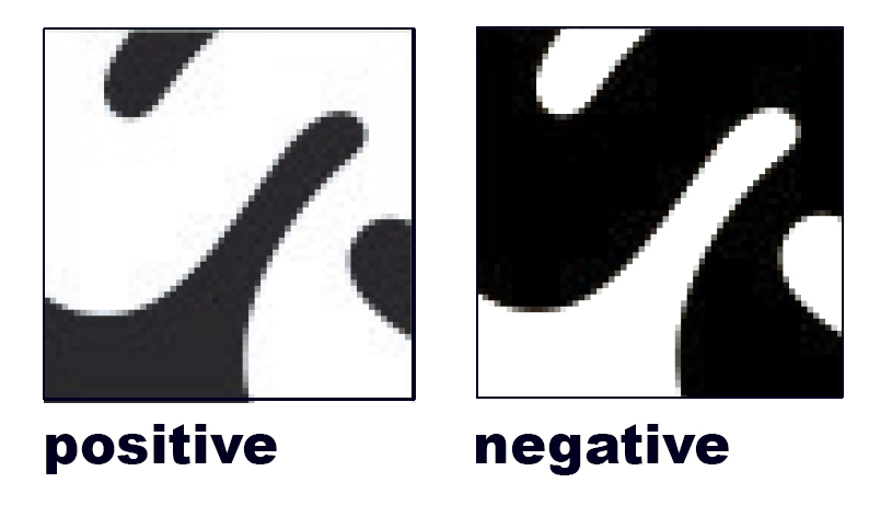
1 figure ground icon
2. research due on Monday
1. Finalize your icon
Criteria
-
-
-
- square format?
- does the design use shape or line?
- does it have an equal amount of black and white?
- does it demonstrate a figure-ground principle? (does the eye shift back and forth
- do both the letter and the icon communicate equally?
-
-
2. Once completed, create a negative version.
A negative version is exactly the same except that it uses the opposite color.
-
-
-
-
- What was black will be white, what was white will be black.
- The positive and negative versions MUST be exactly alike, except it reverses color
-
-
-
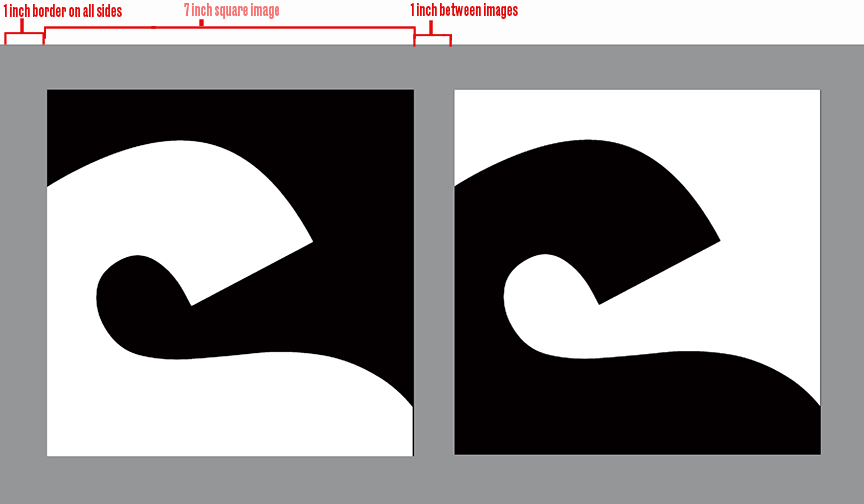
3. Follow the same format as for the letterform:
In illustrator, create a 7 x13″
fill with 50% black
place both versions on the grey
Use a 1 inch border and 1 inch between squares
Save as a pdf
Create a jpg and post on Miro
2. Due Monday, October 21
1 Choose a designer from this list: Designer List COMD1200_D054_Fa2024_Design_Influencer_List
Each student must have a different designer
Add your name to the right column to reserve your designer for yourself
2. Research your designer
Choose images your designer created, include typography
3. Create a 2-minute PowerPoint presentation
Present your research to the class
Presentation must be 2-minutes
Include
-
-
- images
- information about your designer
- a quote
- location,
- schools they attended,
- influences,
- places they worked
- why you chose them
-
Next step:
Look at design through your eyes.
What influences you?
1 Investigate how designers use typography.
Typography is the art and technique of arranging type to make written language legible, readable and appealing when displayed. The arrangement of type involves selecting typefaces, point sizes, line lengths, line spacing, letter spacing, and spaces between pairs of letters.
It involves font style, appearance, and structure, which aims to elicit certain emotions and convey specific messages. In short, typography is what brings the text to life.
Good typography will establish a strong visual hierarchy, provide a graphic balance to the website, and set the product’s overall tone. Typography should guide and inform your users, optimize readability and accessibility, and ensure an excellent user experience.
A typeface is a design style that comprises a myriad of characters of varying sizes and weight, whereas a font is a graphical representation of a text character.
3. create a quote For each designer:
-
-
- hierarchy is on the quote
- designer name
- year, time, context of quote
-
So much is missing from this list, please send additional sources as you find hem so I can add them here!!
Websites
The Peoples Graphic Design Resource: An archive build by everyone for everyone. A favorite!!
BIPOC Design History: This originated as a workshop by my advisor Silas Munro.
Graphic Designers in Latin America
Across Borders: A Look at the Work of Latinx Designers
Some of today’s most influential Chinese designers
The genius of Iranian graphic design
Mumbai’s Growing Creative Scene is Luring in Graphic Designers
Video
The art of Arabic calligraphy | Mona Mahmood
Ingenuity and elegance in ancient African alphabets Saki Mafundikwa
The Politics of Arabic Type Design | Nadine Chahine

