
Class Info: Week 2
This Week’s has been outlined in detail to give a clear vision of the overall course.
-
- Course Goals: Introduce the field of graphic design including its basic working methods and theory. This class will focus on communication through form, the visible shape or configuration.
To-Do Before Class
It is seeing which establishes our place in the surrounding world;
we explain that world with words, but words can never undo the fact that we are surrounded by it. The relation between what we see and what we know is never settled.
John Berger, Ways of Seeing
Contracts completed?
gdp2 sp24. GDP2 grade contract.pdf
download and complete as pdf or with pen
once finished, upload it to :completed grade contracts”
New:
review: perception: https://edex.adobe.com/teaching-resources/-ISjYYUpG/preview
“Don’t think of it as failure, think of it as designing experiments through which you’re going to learn.”
embrace ambiguity: https://www.designkit.org/mindsets/5
Lecture
What is design?
Graphic design is qualitative rather than quantitative. There are no ‘correct’ solutions to problems but there will be solutions that feel highly compelling, original, and appropriate to you (and hopefully your client). As a creative process, good design is not by nature efficient.
Strong solutions are sometimes arrived at quickly but more often slowly and progressively. The development of a rigorous creative process will help add rationality and consistency to your work.
Design Fundamentals
-
-
- gestalt principles of design: https://www.youtube.com/watch?v=dk7cXdjX2Ys
-
Figure ground
The form of an object is not more important than the form of the space surrounding it All things exist in interaction with other things.
In music, are the separations between notes less important than the notes themselves? Malcolm Grear
A figure (form) is always seen in relation to what surrounds it (ground, or background)—letters to a page, a building to its site, a sculpture to the space within it and around it, the subject of a photograph to its setting, and so on.
People are accustomed to seeing the background as passive and unimportant in relation to a dominant subject. Yet visual artists quickly become attuned to the spaces around and between elements, discovering their power to shape experience and become active forms in their own right.
Recognizing the potency of the ground, designers strive to reveal its constructive necessity. Working with figure/ground relationships gives designers the power to create-and destroy-form.
Homework
1. Photograph your sketch (keep it as straight as possible
Are your borders are square and parallel
2. Digitize your letterform
-
-
- Start with the font that you used for your sketch
- Crop it to create a digital version of your sketch
- 5″ square
-
3. Create 2 versions and post to Miro
________________________________________________________________________________
You can try this method:
Open a new 5-inch square document in Illustrator
Do you need an illustrator refresher: Illustrator Tools Tutorial?
A. Add your photographed sketch to your base layer
(open layer palette from ” window”>in layer palette
click the “hamburger in the palette’s top right corner to create a new layer)
Once the size and position are correct,
Lock it in place. (object>selection>lock selection)
B. Add a second layer
-
-
-
-
-
- On your second layer, use the “type tool” to add the letter that you used for reference.
- Position the letter on top of your sketch
- Adjust size and angle to match your sketch.
-
-
-
-
Save as a layered pdf
C. Fill the positive areas with black and the negative areas with white.
D. Refine your composition
Adjust it (twist, resize, but do NOT change the original proportion!!!)
-
-
-
-
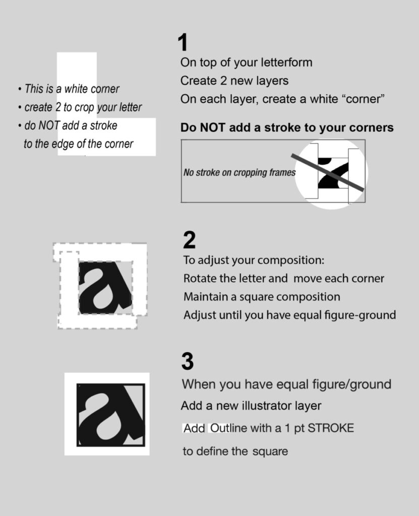
- Trick: remember how we used white rectangles to crop our compositions?
Create white horizontal and vertical rectangles.
Use “cropping frames” to refine your composition and create a figure/ground study. - ****see diagram at the bottom of this page
- Trick: remember how we used white rectangles to crop our compositions?
-
-
-
E. When your composition is refined
make a 5″ square with a 1 point outline to frame your composition
Again, save this composition as a layered pdf
F. Save your final composition as a jpg
Save your layered pdf as “version 2”
G. Make a copy of your original PDF (“Save As” name it version. 2 or version B)
Use the same process to create a second composition
Save that pdf, then export as a jpg
Post both jpgs to Miro
QUIZ
-
-
- Use the text tool to add the project criteria to your frame
- QUIZ: Does your solutions fit the criteria?
if, not, why?
-
Diagram:
using white rectangles in illustrator to crop your compositions
examples:
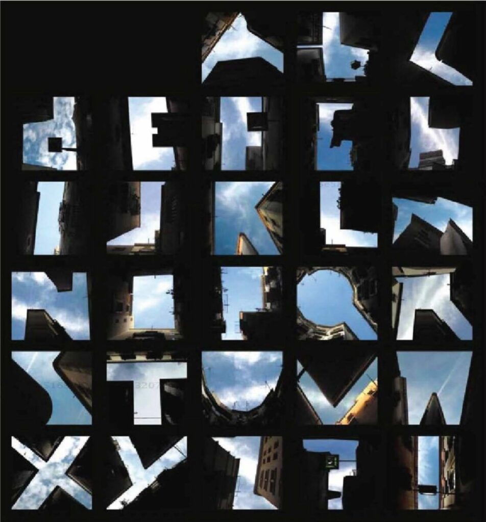
Figure Sky: These photographs use urban buildings to frame letterforms. The empty sky becomes the dominant figure, and the buildings become the back-ground that makes them visible.
These photographs use cut paper to frame letterforms. 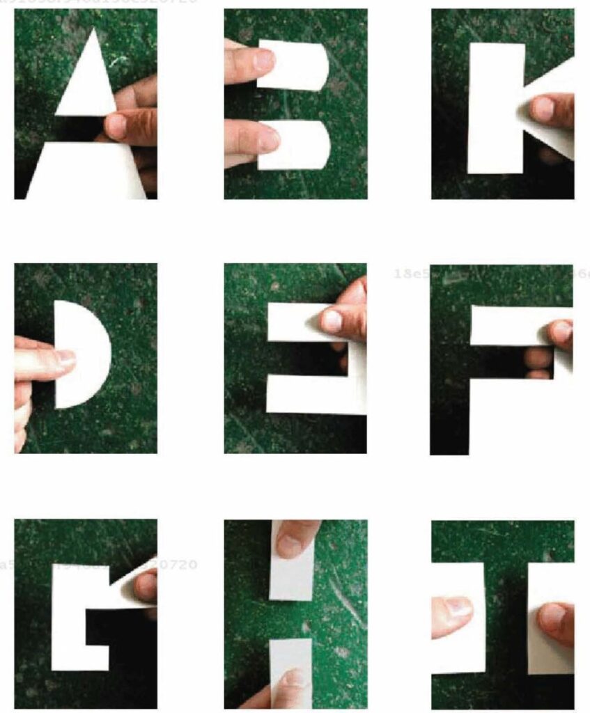
Print this page

