On November 15th, 2011 I was fortunate enough to attend the annual AIGA gallery for best communication design. Upon arrival I was slightly bewildered for I did not exactly know what to expect. I had pictured that there would only be posters lined up on wall that each contained a different advertisement. However, to my surprise the gallery contained much more than that. Not only where there poster advertisements, but also different packaging, books, and Magazines. Each exhibit was supposed to effectively communicate to the audience through design. I found that there where three exhibits in particular that did this the most.
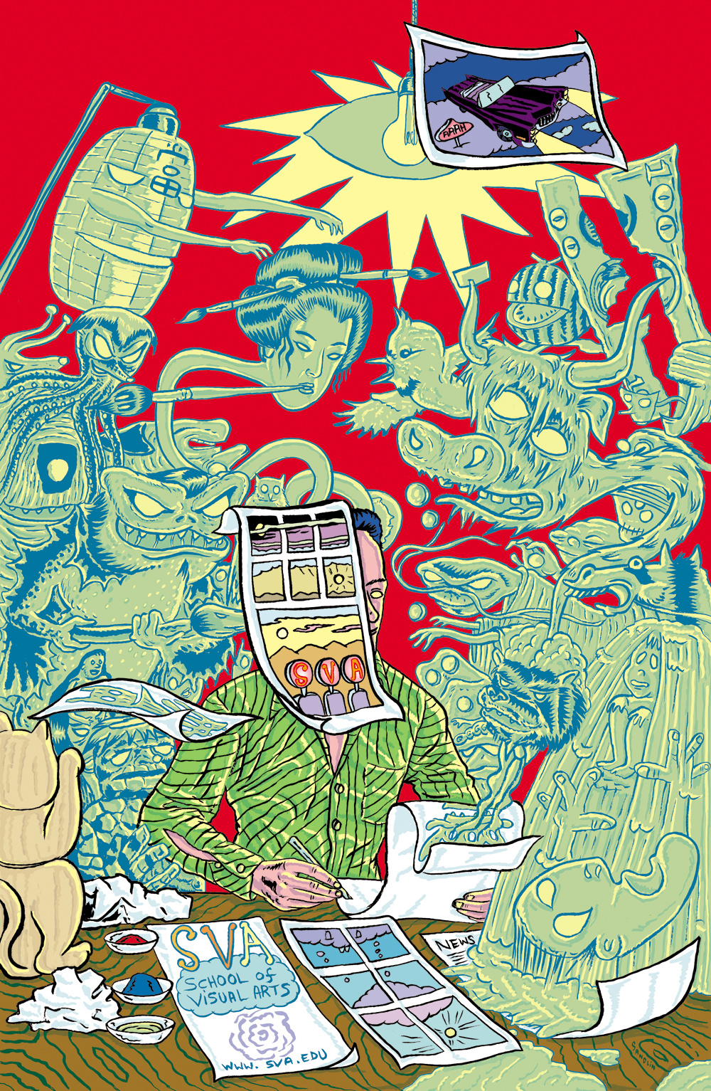
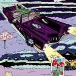
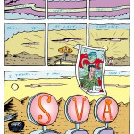
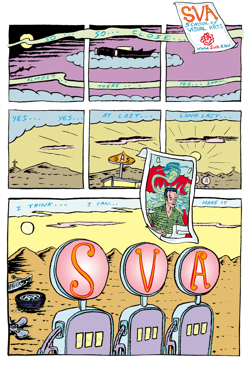
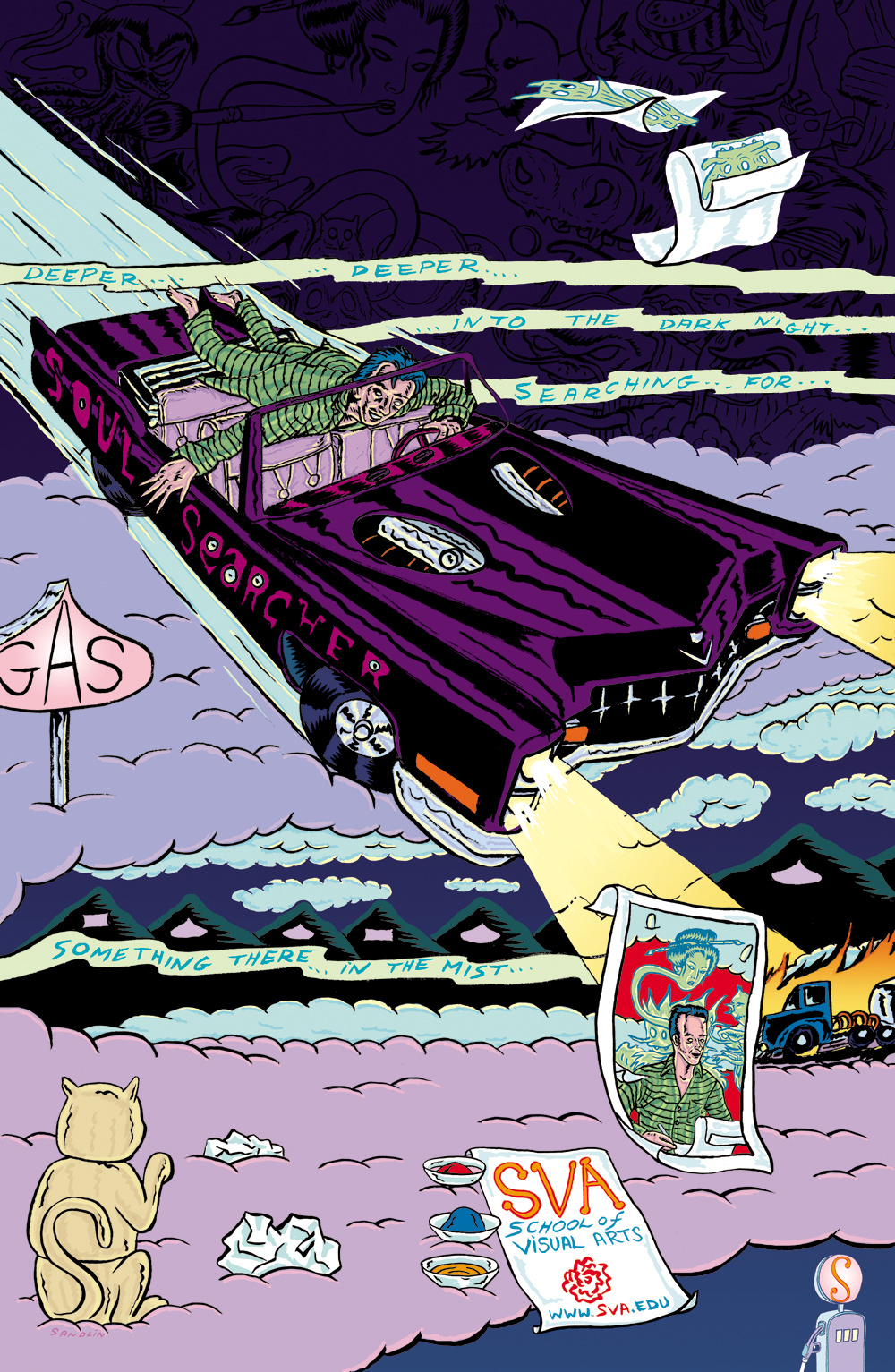
The first of these exhibits was the SVA Subway posters. These Posters where designed by Davis Sandlin, and where all hung around the subways of NYC “to arttract perospective students of the school” (designarchives.aiga.org). He designed the posters to look un-worldly, as if they where in another universe. this is one of the main things that caught my eye. He used objects that people could relate to, and then put them into an environment to the likes of which could only be possible inside of someone’s imagination. All of the poster use very bright and vibrant colors, and they tell a story of what appears to be a cartoonist trapped in the world of a comic he is trying to create.
 Credits
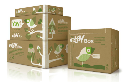
The second exhibit that I found to be very captivating was eBay shipping box. eBay designed this box to be reused by its clients in an effort to promote going green. “Each eBay box is made with 100 percent recycled content”(designarchives.aiga.org), they were also created in such a fashion that only one strip of tape would really need to be used. I found this design to be effective because of simple it was. The box did require any assembly and the instructions where put on the box using watercolor ink, which contrasted well with the brown cardboard box color. Not only is this design simple and effective, but it is also environmentally friendly which makes it all the better. I would give the designers of this innovation (Rob Alexander and Richard Perez) two thumbs up.
Credits
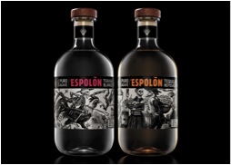
The third and final design that I found to be most effective was Espolon Tequila Bottle. This bottle, designed by Anastasia Laksmi and Tony Rastatter was new and refreshing to me. Each bottles label was different, but not in the sense that it just showed which flavor of alcohol was in the bottle, but different because each bottle had a unique illustration on it. The goal of the designer was to create a tequila bottle that had a more authentic Mexican feel to it “each bottle was inspired by the original Posada engravings that told real stories of the struggles and social injustices in Mexico”(designarchives.aiga.org). What’s makes this bottle so different from most is that there is a cartoon illustration of an actual scene in history, rather then a fictional character made up by the liquor companies.
Credits

