A LOGO ABOUT ME
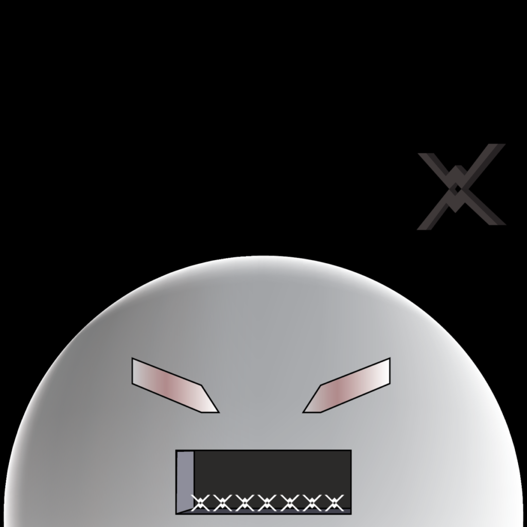
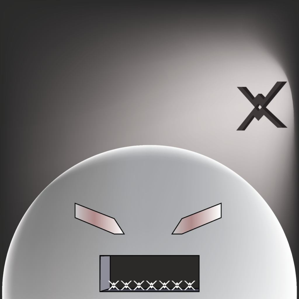
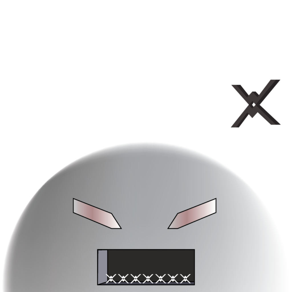
For this logos design, since it was about me I put a couple of things in there. It seems mysterious at a first glance because I understand it the best.
The ship is actually 2 W’s and the bottom one is flipped so it can mirror the top one. And it reminds me a of the Star Wars Tie Fighter. Why the W ? It’s the first initial of the school club I’m running. Wizz Wonders and it’s been a responsibility and a big part of my life for the past year. It made me realize how much I can do and gave me more confidence to be a leader.
The big robotic spaceship head. I’m a Batman fan since I was a kid, I didn’t draw the bat ears because it would be too obvious and wouldn’t make sense for a spaceship but I added the eyes. I wouldn’t call it Batman’s head but it certainly took inspiration. Also, I’ve been trying to draw this character lately for our club poster for the club fair coming up and it kind of reminded me of the android logo. I was thinking of this character/machine because it is just techy and it’s just what I like. I like tech. It’s the reason why it’s all objects on the logo.
UPDATE 2: Getting more personal, more simple, more minimal 🙂
Version 2


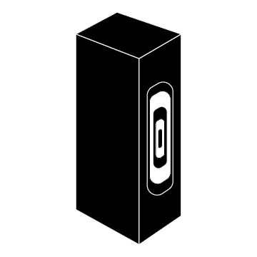

Version 3


