5B24DBD0-FB65-49F3-A982-15699FAB7C35
This is a video I made of my friends and I taking a trip up to Smith College. I recorded this on my iPhone and used the apps Splice and Video Leap to edit it.
5B24DBD0-FB65-49F3-A982-15699FAB7C35
This is a video I made of my friends and I taking a trip up to Smith College. I recorded this on my iPhone and used the apps Splice and Video Leap to edit it.
I plan to make an animation of a robot running and flying off the ground
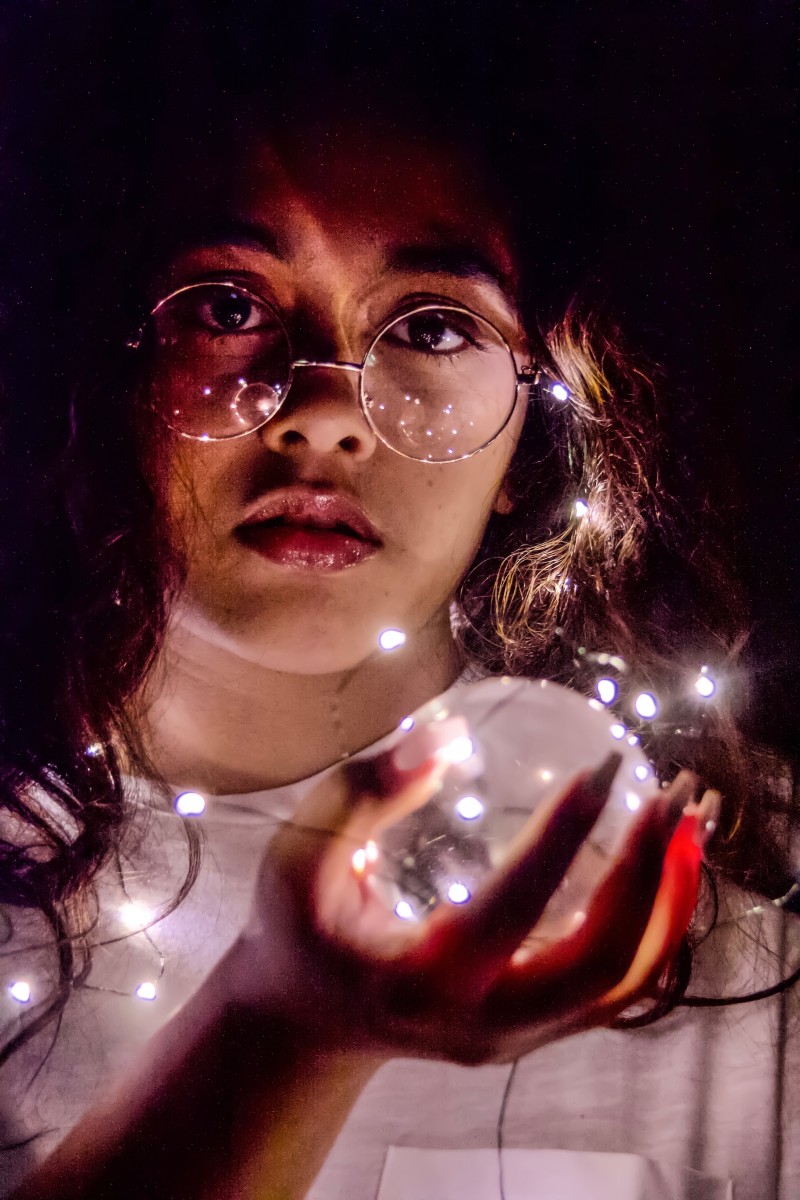
In class we discussed how colors can change the way we perceive a photo. We were asked to test this out by choosing one image, then surrounding it in three different colors and to note how the colors surrounding the image shape the way we see it.
The photo I chose for this activity was:
I then chose purple, brown and red as my surrounding colors for this experiment. I accompanied the purple and red backgrounds with yellow text, and the brown with white text.
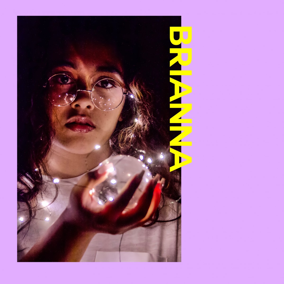
The purple gives the photo a calming, yet playful tone. It brings the attention to the lights surrounding the subject of the photo. And although purple and yellow are complementary colors, the yellow text does not stand out against the purple background.
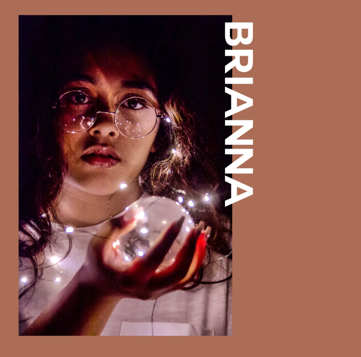
This shade of brown complements the photo. The light brown brings to the person in the photo, highlighting the underlying tones. The white text also stands out against the background.

The red brings out the shadows of the photo. I also chose yellow for the text because it is an analogous color to red. The text definitely stands out.
The OpenLab is an open-source, digital platform designed to support teaching and learning at City Tech (New York City College of Technology), and to promote student and faculty engagement in the intellectual and social life of the college community.

