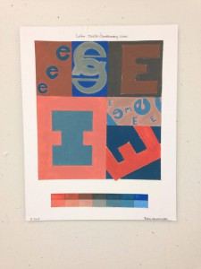
This is one of my favorite peaces, it is a letter design, this peace basically requires the elements of shape, color, line, complimentary colors, and negative images. The colors, light orange and dark blue are complimentary. There is also shape, and negative images in my peace, the way the letters are drawn creates other shapes in the back rounds. This project has taught me a lot about complimentary colors and how I can use different elements into creating an image that seems as if its something that its not, for example in one of the boxes it looks as if i drew the letter I.
- Write a brief paragraph to introduce yourself to your visitors and explain what they will find on this site. Be sure to add more developed content to your About Me page. (Edit this paragraph in Dashboard > Widgets > Text)
Learning Blog Archives
-
Recent Posts
Categories
Tags


