
My expectations for Graphic Design Principles I turned out to not be what I expected. I thought that we were going to jump onto computers to learn beginner skills of Photoshop, Illustrator, etc. As a Sophomore, I was blown away by our first class when I realized I had to draw and use my eyes to really examine all the elements of design. I thought that I would get off easy because of my knowledge of Adobe programs. After a couple weeks I learned the proper ways to stand and speak while presenting my work equating it to displaying professionalism in the future by showing confidence and hard work. This has really opened my eyes.
Our very first project was to draw a square. I thought that this would definitely be a breeze because who cannot draw a square right? Wrong. Margins, straight edges, and using markers to make the square look just right all came into effect. After not being successful on the first draft, I realized what was really being asked for in this class was focus. During the critique I understood that I needed to pay more attention to my margins to make everything equal and make sure my draughtsmanship was as close to perfection as possible. After going through several projects, I am much more attentive to detail. My eyes have gotten stronger noticing if something is off by 1/32 or 1/16th of an inch. Practice makes perfect and this class showed me exactly what this cliche saying means. We as students may have a lot of classes to handle on top of Graphic Design Principles I , but we just need to push through all the hard work because it will pay off for internships, future jobs etc.
This has been a wonderful experience. I have learned so many techniques and I cannot wait to use them in other areas of Graphic Design. After putting our work on the board, it was time to get our creativity flowing. We looked through magazine ads to see if advertisements were successful or to see how we could have improved them. We also looked at advertisements to get ideas of controlling the space with images and color. I never would have expected to get hands on training in this class nor would I have expected to create designs where a square, a shape or even color can control one single sheet of Bristol.
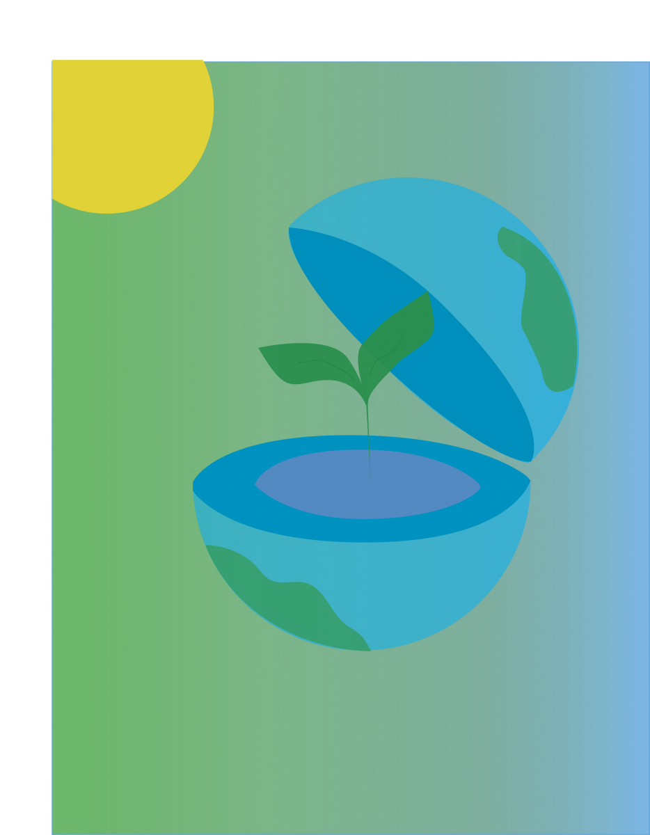
Our last project had a theme of “Going Green”. We needed to use images in a way that convey the message of saving energy. We needed to use flat shapes for the design. The final project really allowed everyone to tune into their creativity to create so many different “Going Green” theme design.
Going through so many drafts to perfect a project has really taught me that I need tons of patience to continue to learn and or develop a project. The one technique that stuck with me the most had to be Bauhaus, the “less is more” way of thinking. Bauhaus was an art school in Germany. The objective for this school was to teach visual clarity and that simplicity really goes a long way. I like this way of thinking because it helps one understand that you do not need to put everything on one page in order for your design to be great. You can have a simple shape or a simple color that can make your art a very successful design.
Author Archives: Bridgette Babb
Going Green Final Project
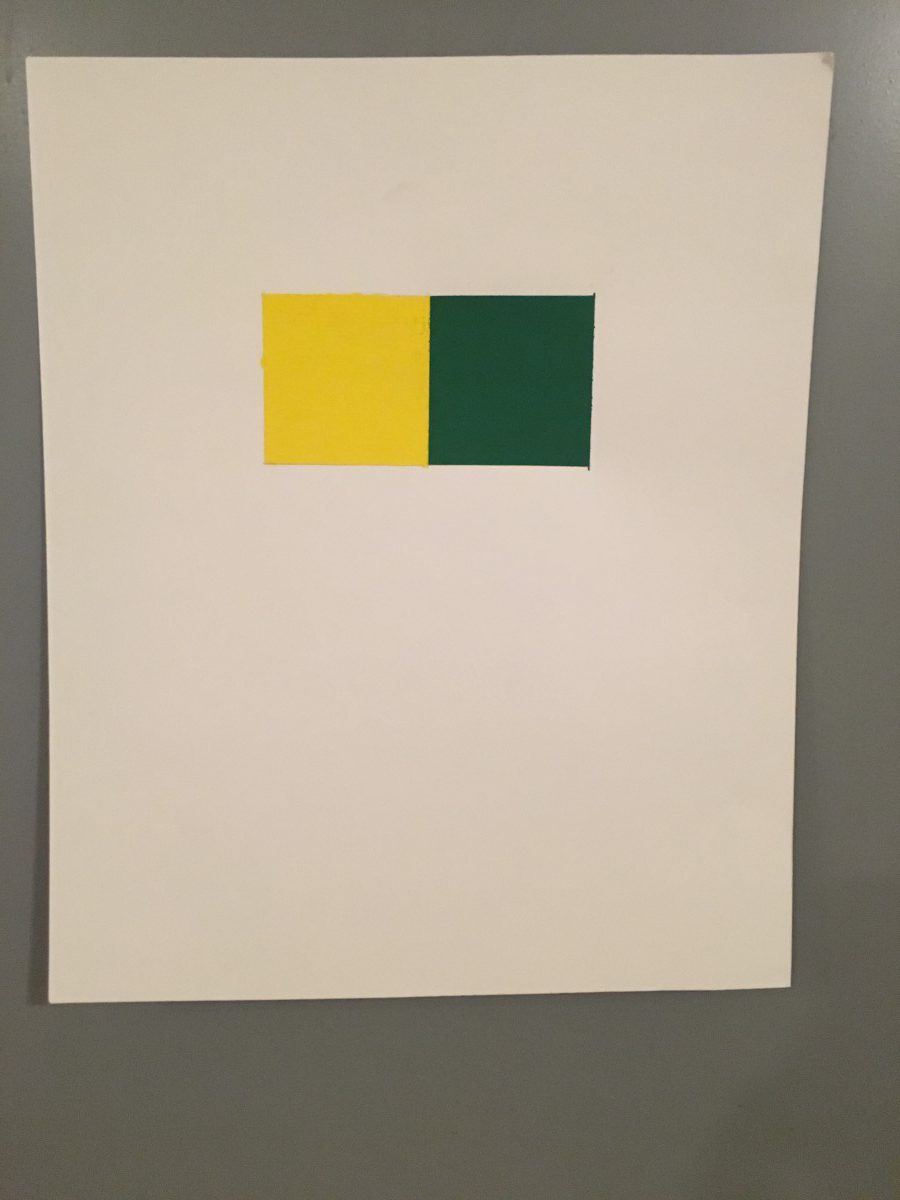
Full Color
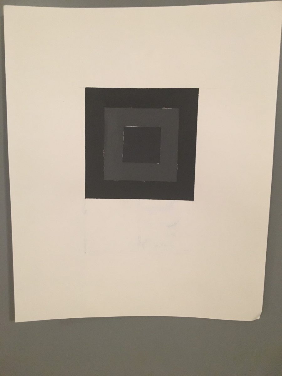
Monochrome

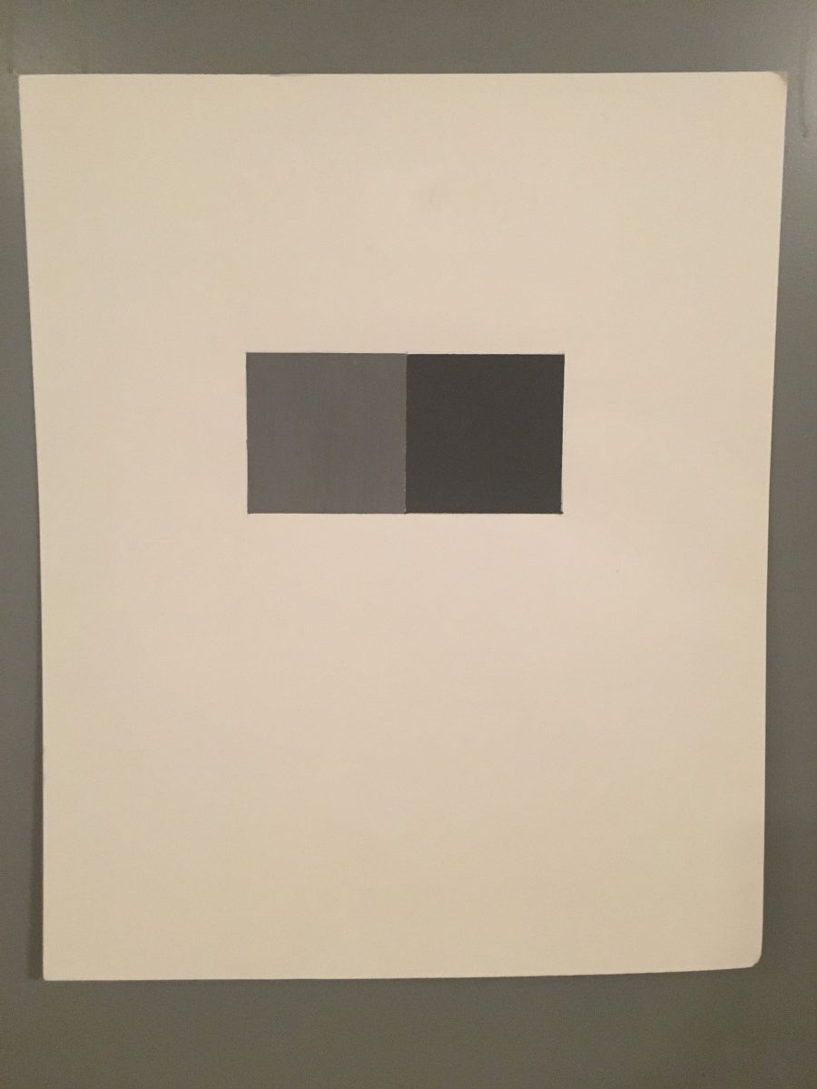
Grey Tone
Grey Tone
Pictorial Balance of a pattern

Pictorial Balance of a rectangle

Pictorial Balance of a shape

Pictorial Balance


