At AIGA, the American Institute of Graphic Arts, they have different exhibits every year. Fortunately, I was able to visit the exhibit 50 Books/50 Covers. Of all the books, three covers caught my attention the most:
 Credits:
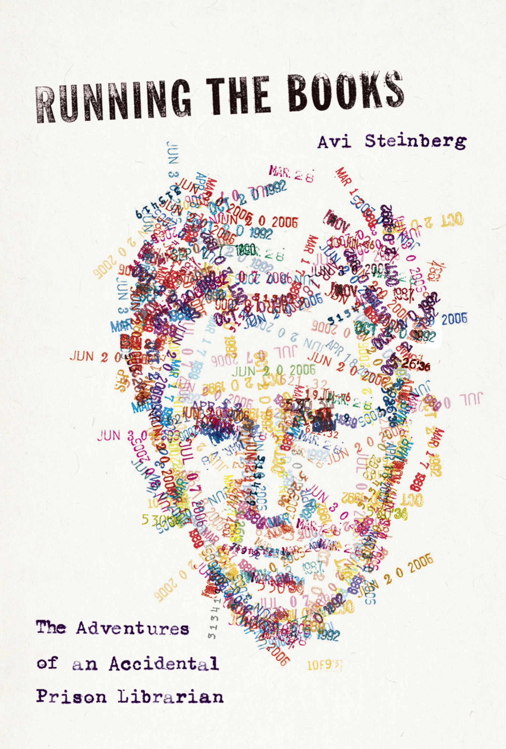
Design Firm: Random House
art Director: Emily Mahon
Illustrator and Designer: Ben Wiseman
Publisher: Nun A. Talese/ Doubleday
This was one of the very first books that caught my attention. The typography used consists of serif and sans serif. The main title of the book is in sans serif. Everything else is in serif. the first thing that grabs a person’s attention is the face, but as the eye looks at it awhile longer, it is made up of stamped dates. the effectiveness of the cover id very strong because a person will automatically look at it and see how they made the face, and draw their eyes down to the bottom left side which says “The Adventures of and Accidental Prison Librarian.” This makes even more sense because the face is made up of stamped date that you would usually find in a library book, which usually shows dates to return the book. The cover will make people want to know who the person is and how he became an “Accidental Librarian.”
 Credits:
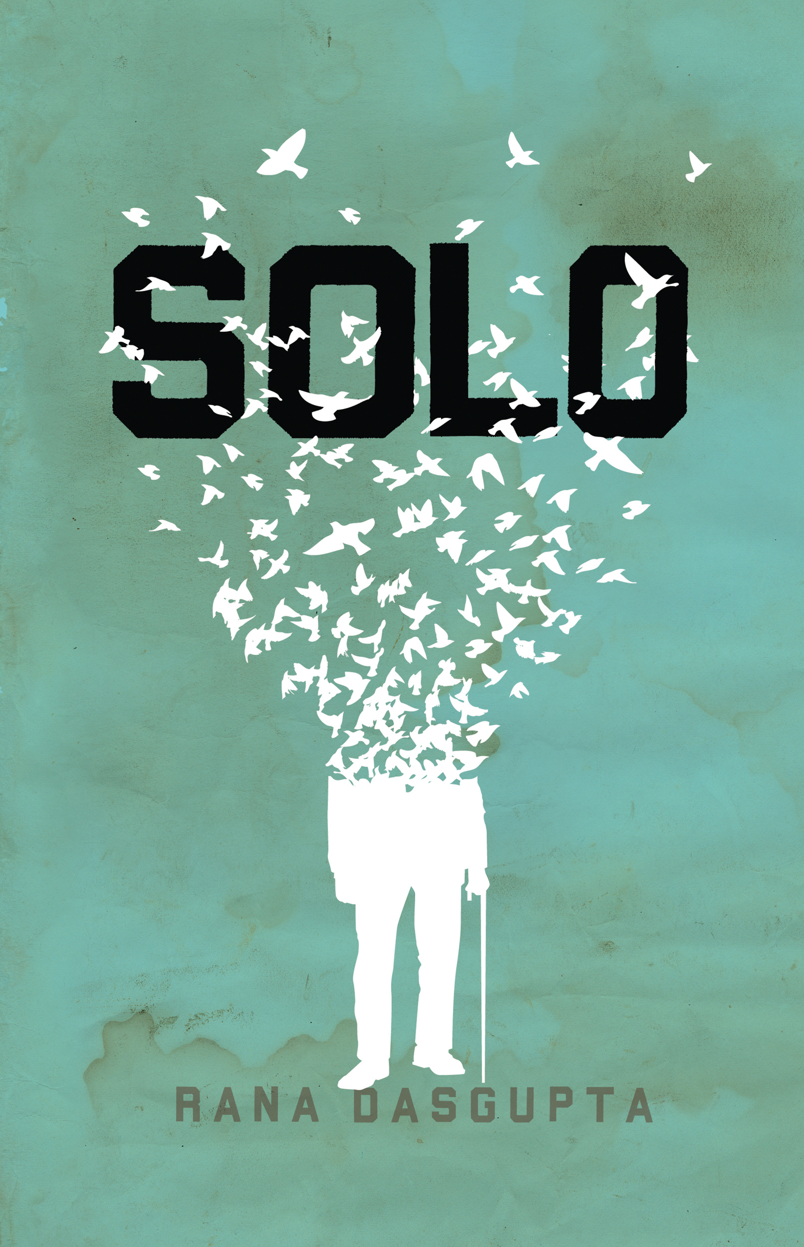
Design Firm: The Heads of State
Art Director: Marta Kennedy
This book cover caught my attention because of the silhouette that flows out into a flock of birds flying in different directions. To me, the shape of the birds form a heart. But what catches the eye first is the bold sans serif font that reads “SOLO,” then some of the birds flow around it to drag a person’s eyes down to the silhouette. The silhouette stands above the the author’s name, which is also in a sans serif font. Although it is a plain cover, it is very effective because of the bold font that makes it stand out.
 Credits:
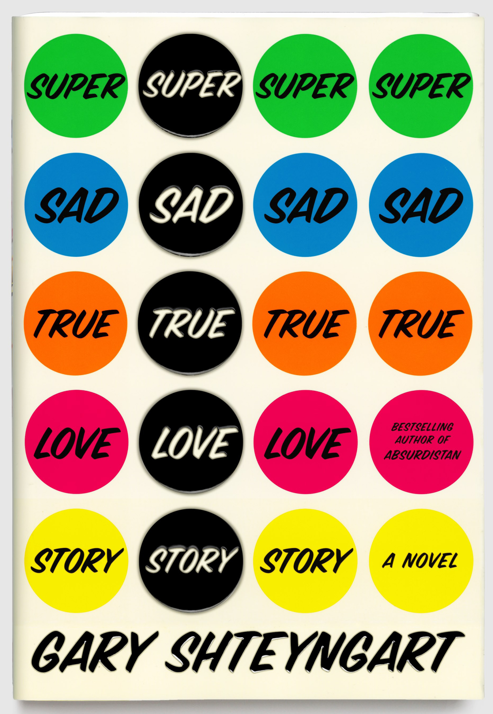
Design Firm: Rodrigo Corral Design
Art Director: Paoto Pepe
This book cover will definitely catch a person’s attention. It has bold italic sans serif font in dots which are in different colors. The book cover is covered with the title, which makes the eyes wander around the cover. The colors used seem to express the emotion in the words of the title, such as the blue dots for “SAD,” and the pink for “LOVE.” The cover uses bright green, blue, orange, pink, and yellow dots with a word from the title filled in each dot, so the person’s eyes wander around until figuring out that the second column of black dots with the bold white text shows the title of the book.

