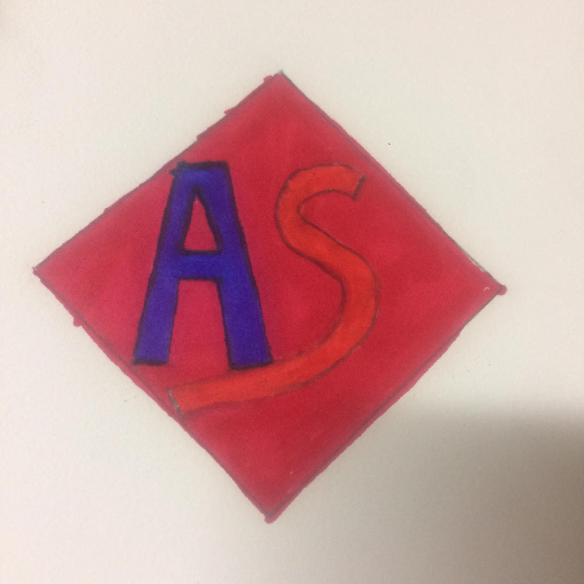
For the final design I went way off from my original two. Seeing the difference it would be hard to believe the first two inspired me to make such a drastic change. First I shifted the square 90 degrees to make a rhombus. The reason I did this was because it would give more space for the type and so the diagonal end of the “A” would be close to parallel than perpendicular. From the design 1 and 2 I wanted to make a mix of both by making the type close yet far apart simultaneously. So I extended the “S” to sit under the “A” but separated the 2 letters in the middle so the type would look more easy on the eyes. Lastly, I went away from the plain black and wait and used the colors of my heritage which is Armenian consisting of the red, blue and orange on the flag.

