Presentation1Hello everyone,
If anyone is unclear or a little lost with what’s going on in this blog, Here’s a PowerPoint presentation explaining alot of what’s to come and whats happening now.

Presentation1Hello everyone,
If anyone is unclear or a little lost with what’s going on in this blog, Here’s a PowerPoint presentation explaining alot of what’s to come and whats happening now.
arth essay 
 Please take a moment and see the link by these two great pieces of work, there you can find an extensive research paper I have written in high detail, involving the origins and differences and simililarties of each painting, giving you the reader the most i can offer, thank you.
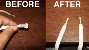
 Ok, this right here is a very very under appreciated design. This small plastic atop of the lace is a great design in my opinion. Without that small plastic wrapping, the lace will never, ever, ever, work. Shit just wont fit. What im trying to express here is that we take little things for granted. Not all great art/design pieces have to start off big and flashy, everything starts off small anyways, right?
Hello everyone,
I will be creating an art series where i upload images of what i believe is good, bad, and ugly design, with my description of why i think so. Each image will be everyday objects which anyone can relate and comment on, with their own thoughts. The goal is to have a plethora of images, where we can then ultimately learn what makes a design good and what makes it bad, and on some cases real ugly. I hope you guys enjoy
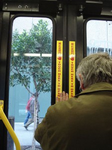
 Aw man, the dreaded “back door”. Ever since i was little these doors have gave me big problems. From the stiff hard to push open, to the mis timing of pushing the tape at the same time, or the embarrassment of yelling “BACK DOOR” throughout the bus, so that the driver heard your cries and opened them for you. Either way, this thing was harder to escape from, and easier to get you stuck in. So i ask you, did you ever hate the back doors too? GOOD vs BAD
Sharing and contributing, are major aspects of learning and growing. Becoming wiser through friends and strangers is a great way to connect to the world. Like Chris Brogan, (a high level blogger or professional blogger), knowing that sharing is key to success, he proves this by blogging information which will help contribute to his followers, something that will linger with them, even days after reading the post.
The reason i chose “Sharing and contributing” out of 100 other topics provided by Chris Brogan, is because these are two great harmonious words. Even in my blog, i want people to learn by sharing and contributing as a community. This way we can all learn together about art at a neutral pace, where no one is ahead of no one else.
Hello and welcome to my first post on this new site. Art: The good, bad and the ugly, will mainly focus on art which gathers attention through good, bad, or ugly design. Then when enough art is posted. Designers will get a chance to contrast from three major aspects of design. Such as, whats a good design? whats a bad design? or what’s just a plain ole ugly design? Now this isn’t just about seeing different types of pieces of art within these categorizes and ranting, i want people to learn and help one another view art/design in a more innovative way, rather then just pick a design ambiguously. Hope everyone enjoys thanks.