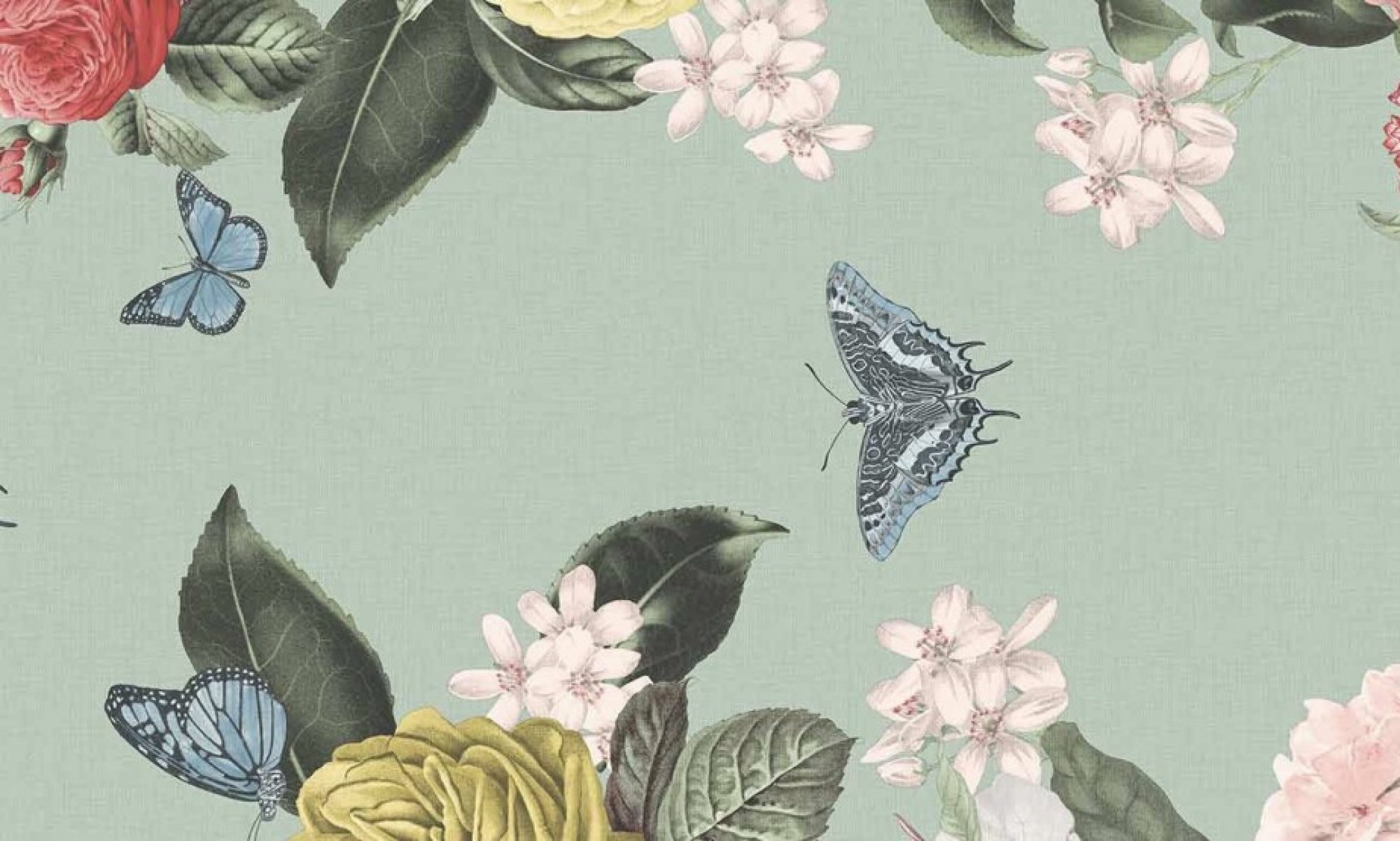
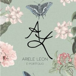
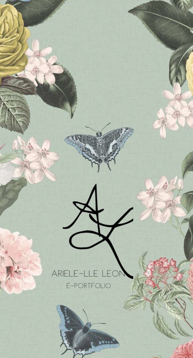
 The reason Ariele has chosen the pastel green detailed with butterflies is because she felt as if it represent her. Butterflies are typically presented to show endurance, change, hope and life. Ariele, myself has gone through such changes from the first semester in College to my last semester. She has endured what it means to be independent as has learned nothing will be done for her, she has to go out there and get it done herself, in addition no one is suppose to help her, she must help herself. Ariele has experienced hope in terms of understanding if something doesn’t work out on way she should not worry, she should have hope that it will be accomplish one way or the other. Finally life, Ariele has experienced enough in life that has given her enough wisdom to know what maybe a better route for her to take. In addition to the color choice of green and purple, green is said represent to growth and harmony while purple is said to represent wisdom, creativity and devotion.
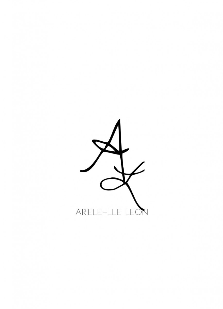
The reason Ariele decided on these fonts for the logo was because she believed it related to her as an individual. The font style used for the capital A and L is called Dawning New Day and the reason Ariele picked this style is because of the free flowing penmanship of the style. It could almost represent ones signature. The font style used for my brand name “Ariele-lle Leon” is Denver. The reason she picked this style is because she wanted viewers to clearly see her brand name without any confusion, while still having it’s uniqueness.

