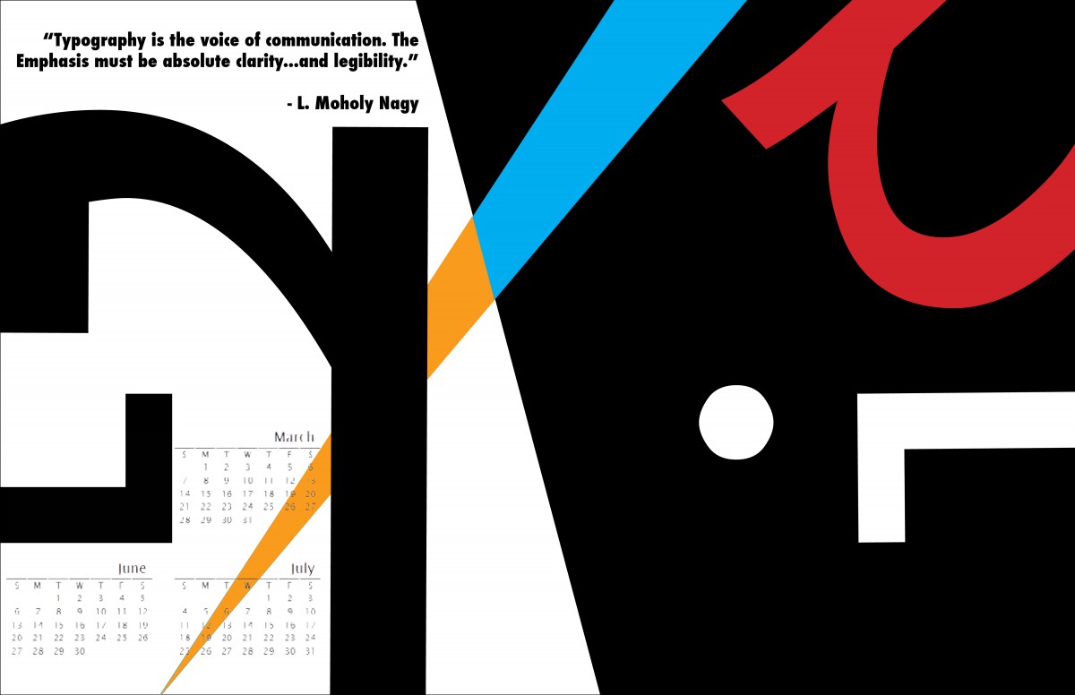
I feel that the contrast and geometric shapes that are present is the strongest part of this work, it was my intention to have it that, I wanted to play around with the typefaces that I used and have colors that had high contrast, because the human eye is immediately pulled toward interesting gemometric shapes and contrasting colors. The most difficult part was deciding where to put the calandar dates, I didn’t want to distract the viewer from the shapes and contrast, I wanted the calandar to be subtle and work it’s way into the viewer’s eyes once they looked at everything else on the piece.
Student’s Choice: