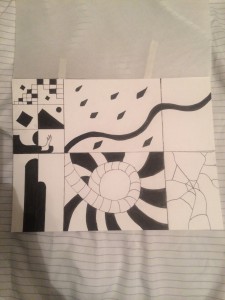
I actually really like this work of art, the different patterns interest me and are very unique in there own way. What I would want to change is the amount of borders I have created. The image would look better with more squares in different areas than most of the focus directing itself to the left side where lay out of place squares.


