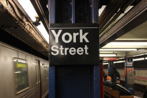
This beautiful sign uses the magnificent sans serif(Helvetica) font. I can tell by the absence of serifs and the balanced weight distribution throughout the lettering. Easily legible.
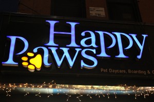
The storefront of this restaurant I believe is using a transitional font. There is a bit of contrast between the thin and thick strokes. The serifs are sharp as all hell.
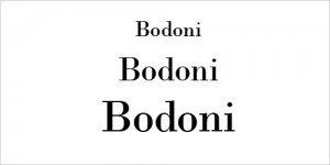
This image uses a modern font. There is extreme contrast between stokes and hairlines. All brackets are visually eliminated.
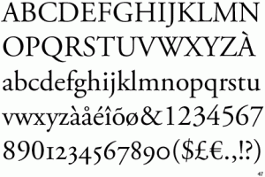
This image uses old style font. It has have rather thick strokes and heavily bracketed or curved serifs. It was meant to emulate classical calligraphy.
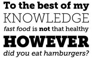
This image uses slabs serif fonts. I can see this by the obese serifs and the small contrast between thin and thick strokes of the lettering.
