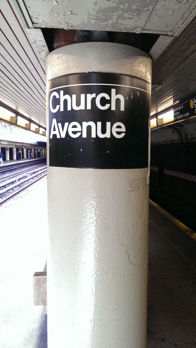
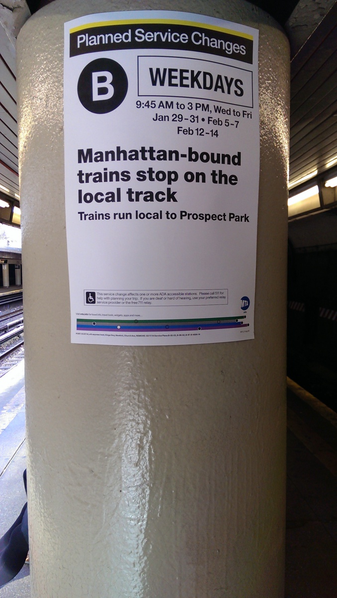
I chose these pictures to show just how boring my neighborhood is. The MTA subway signage uses the almighty Helvetica font on it. The MTA has used other fonts but finally decided to adopt it as the official font in 1989. What the typography means in these photos is stunningly obvious. While the “art” isn’t visually amazing, its short, sweet and gets the job done.

