Type & Media Zine Prototype

I have a few ideas I want to do my zine on. I was thinking I do something related to the gaming community. I don’t have enough respect for Microsoft to do anything that isn’t a smear campaign for them. Probably the Playstation family or just the Sony conglomerate in general. OH!! Or maybe even one about all of my favorite  video game protagonist’s.

This is the whole PLAYSTATION family. From the bumbling old dad PS1 to the Tech savvy eager to please PS4 and everything in between. Even the PSX is here, a bit of a disappointment to the family though.

I am even considering a zine on all my favorite video games in general. In order of oldest to most recent.

This sexy human being goes by the name of Delsin Rowe. He is one of my more recent beloved protagonists.

Another idea I am toying around with is something marvel related. Probably a collection of what I believe to be the best super heroes they ever did produce, with Spiderman OBVIOUSLY being in there. In order to most badass to more mild mannered.
Type & Media HW #3

IMG_0263

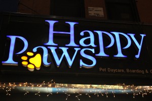
This beautiful sign uses the magnificent sans serif(Helvetica) font. I can tell by the absence of serifs and the balanced weight distribution throughout the lettering. Easily legible.

IMG_0275

The storefront of this restaurant I believe is using a transitional font. There is a bit of contrast between the thin and thick strokes. The serifs are sharp as all hell.

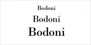
bodoni1

This image uses a modern font. There is extreme contrast between stokes and hairlines. All brackets are visually eliminated.

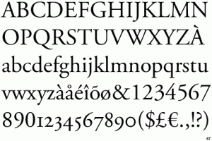
AdobeGaramondPro

This image uses old style font. It has have rather thick strokes and heavily bracketed or curved serifs. It was meant to emulate classical calligraphy.

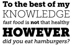
01_slab_serif_fonts_museoslab

This image uses slabs serif fonts. I can see this by the obese serifs and the small contrast between thin and thick strokes of the lettering.

Type and Media HW #1

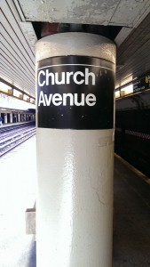
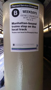
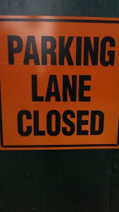
IMAG0086 IMAG0087 IMAG0089

I chose these pictures to show just how boring my neighborhood is. The MTA subway signage uses the almighty Helvetica font on it. The MTA has used other fonts but finally decided to adopt it as the official font in 1989. What the typography means in these photos is stunningly obvious. While the “art” isn’t visually amazing, its short, sweet and gets the job done.

Hello world!

This is the first post on your ePortfolio Learning Blog. Edit or delete it, then start blogging!

Create Posts for class assignments, internship experiences, failures, successes, or anything that informs your academic career at City Tech and beyond.

NOTE: Remember to add appropriate Category and Tags to your posts. This will help your professors and other visitors find the content they are looking for. The Category “Coursework” and the Tags “OpenLab” and “City Tech” have already been applied to this post. Feel free to make changes!