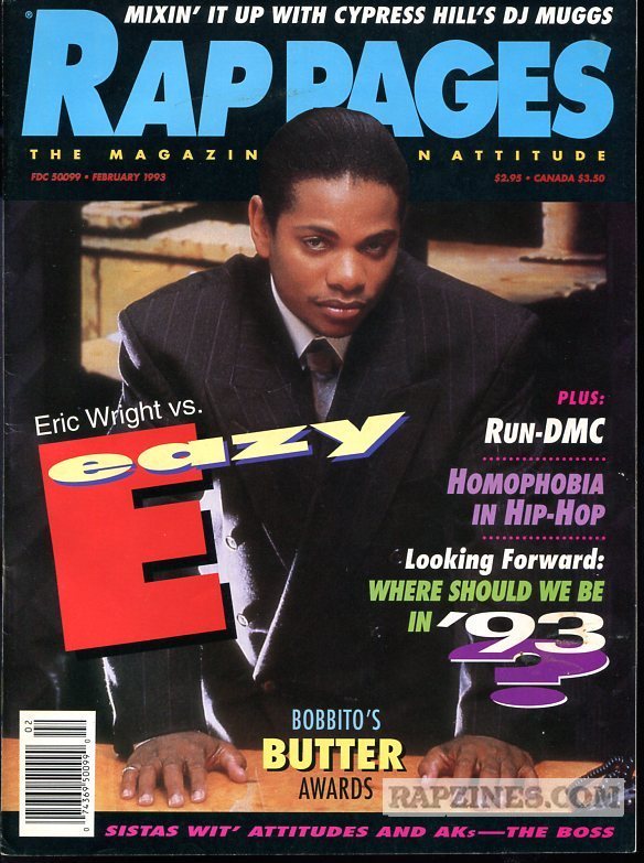
 One of the main things that inspired me to major in graphic design was not only my creativity but magazine covers like the one above. Technology and ingenuity may have increased drastically since the 90s, but there is a certain emptiness that a feel when I look at many of todays publications related to hip hop. There is so much to be said about the cover above that it can be hard to find a place to start.
One of the most unique characteristics of 90s graphic design, especially in the hip hop world, is the vibrant use of colors. While this may be one of the more tame examples of color, there is a certain beauty to it. The drab, dark background and the simple black suit Eazy is wearing is the perfect contrast to the multicolored text. What’s better is that the text stands out, but isn’t an eyesore either. This most likely is a result of the shades of yellow, violet, and green being a lower hue.
When I look at this cover it evokes bittersweet feelings which are due to several factors. The first one is that Eazy would go on to die of AIDS two years later which was unfortunate since he was such a pioneer in not just hip hop, but the whole music world. Although there are many theories that he was injected with AIDS due to his development of symptoms so quickly, I will not get into that as conspiracy theories are not the focus of this blog.
Once I get I past his death, the cover almost feels like a time machine sucking my imagination into a better time. The headlines especially the one about homophobia intrigue me since it this was magazine was published over 20 years ago and homophobia is STILL an issue being tackled by the hip hop world. The title “Eric Wright vs Eazy E” is clever since they are both the same person and it makes me wonder about the demons or internal battled he must have faced on a daily basis as a musician.
Additional information:
http://www.mtv.com/artists/eazy-e/biography/
http://www.bet.com/news/music/2011/08/18/eazy-e-associate-claims-he-was-murdered.html


