Category Archives: Uncategorized
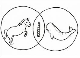
Venn Diagram
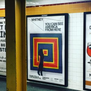
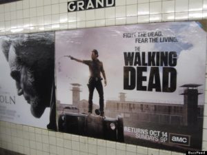
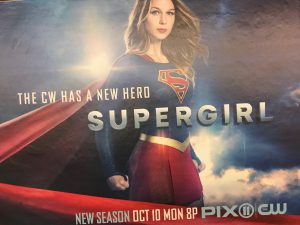
subway posters
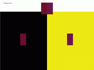
Rhythm / movement
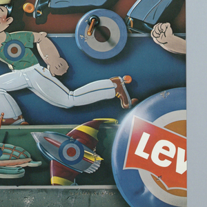
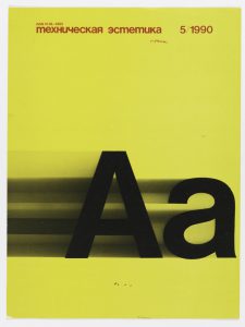
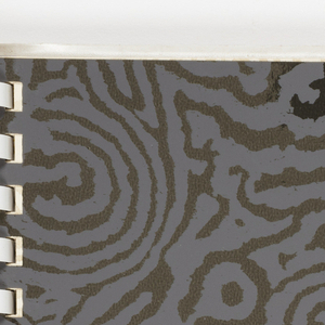 In the first image the use of positioning the people a certain way, allows for creations of movement. In the second image the use of fading behind the letter A creates motion which is also allowing for rhythm to become active. In the last image the use a path allows for your eyes to follow which creates movement.
Student perk
one of my favorite student perks is the huge discount for Adobe creative cloud. $19.99 a month compared to regular price is a huge saving.
Art Vs. Design
Art and Design both can be very similar to each other but contain different qualities. Art is a form of expressing ones feelings through a painting, drawing, music, etc. Typically there is no restrictions when creating a piece of art because it is something you do freely that creates an emotional power for the viewer. This allows for the artist to express themselves in any form of media, without needing to explain why they created it a certain way. The viewer can have their own perspective on the piece while others may differ.
On the other hand, Design has to do with rules and clear messages. When designing you have more planing involved than you would in just creating a drawing,etc. You have to be able to have a sense of what color combinations work well together and what objects you can use to catch the viewers attention. Designer are limited to several things because they receive a brief which is what is to be included in the design, restrictions. When designing, you need need to convey a clear message to the audience so that all receive the same one.
Many people can argue that art and design are both the same. Design is included to create art and art is included to create design, but in the professional fields it can rather differ. Take for example, a portrait painter and a graphic designer. 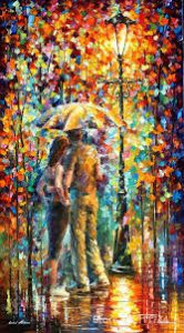
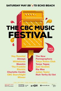
Currently enjoying a former classmates creations. I enjoy his work a lot because of knowing him on a personal level he is really passionate for what he creates. Not only is he a photographer but also graphic designer.
Check out his site ! http://stephenvelastegui.com/
Figure ground can be compared to notes and rests in music. The space between the notes would be considered the negative space in comparison to figure ground. We have the foreground and the background. They both stand out on the background.
New York Times article
This article engages the reader through a picture of a flag that was created and displayed infront for everyone to see. The flag reads ” A MAN WAS LYNCHED BY A POLICE YESTERDAY”. It was designed for everyone to catch a reaction and get informed of what happened to Alton Sterling. The designer did this through the use of typography, this showed emphasis by using only text and it being all uppercase. As you read you become more informed of what the situation was and how many people began to design all kinds of art. The purpose being was to get their message across of their thoughts about what happened to Sterling.
Posters were created and design all through typography. As stated ” The work of Mr. Smith and other artists seems to come from a place of empathy, and wanting to evoke it in others.” Everyone was creating all these forms of art just so they can be informed and hopefully influenced by it. I think this was a smart way to get the job done. Especially through the use of only typography was one of the best ideas to do, it emphases on the big picture.

