For the Visual Quote Project we had to pick a quote and tell the audience -the class- what the quote was saying through creative designs that are modeled after postcards on an 8.5 by 5.5 canvas or paper or however you want to call it being the space we had to work with, My quote is “Time waits for no one”.

During the sketch phase I wanted to add clocks and a bus of sorts as when someone thinks of time rushing by it can be one of many things but to me it was between aging and buses and I had no clue to represent aging through letters and shapes so that was scrapped basically at once.
Concept 1
Using the bus motif I decided to attempt to create the quote while making the word time appear as a bus.
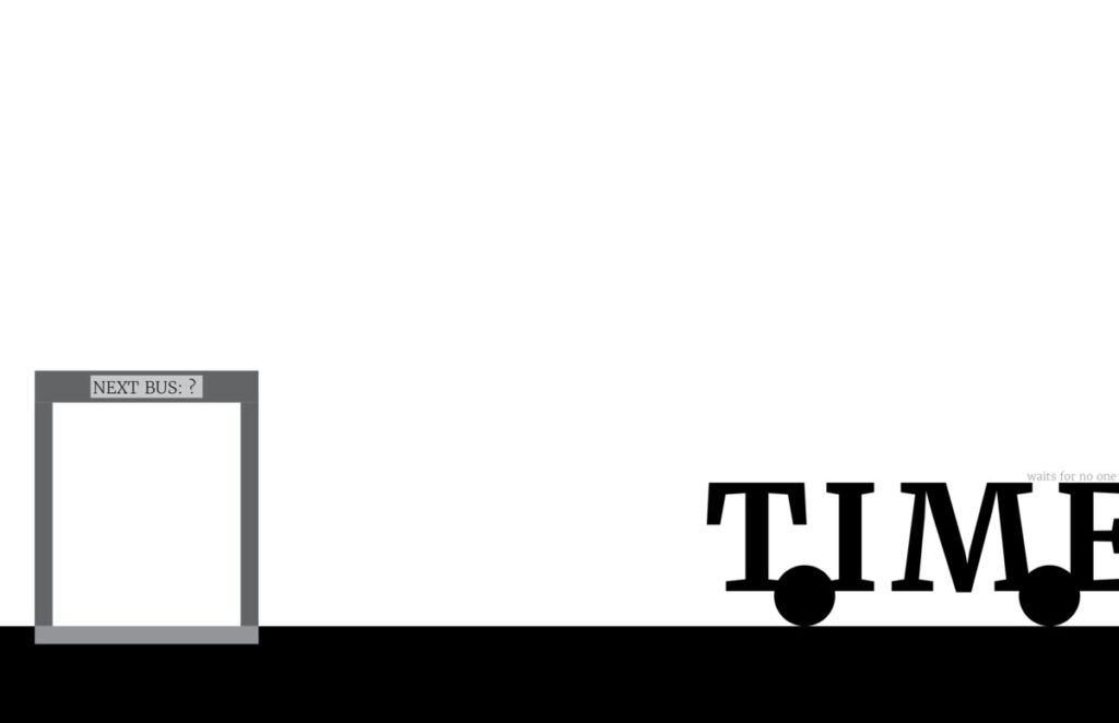
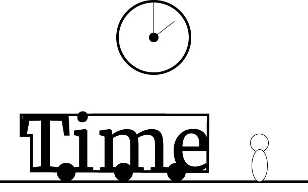
As one could see the concept went in a different direction as I thought that having the person and the clock in the same design was a bad idea, The clock comes back though. Nevertheless I wanted to use the word time so I put time on wheels and well the first image happened, I also added a sort of bus station however it is empty. The reason for this was to show that time waits for no one, leaving the bus stop with no one and taking off thus the reason for the E getting cut off slightly. Personally I feel I hit a wall with this one and did not know how to apply the criticism from class discussions. Hence why I feel it doesn’t reach it’s full potential.
Concept 2
Now then I will be honest. The next two concepts have not been shown in class and have never been discussed so they will not be as ‘good’ as the first one, That being said I am happy with the way they look like.
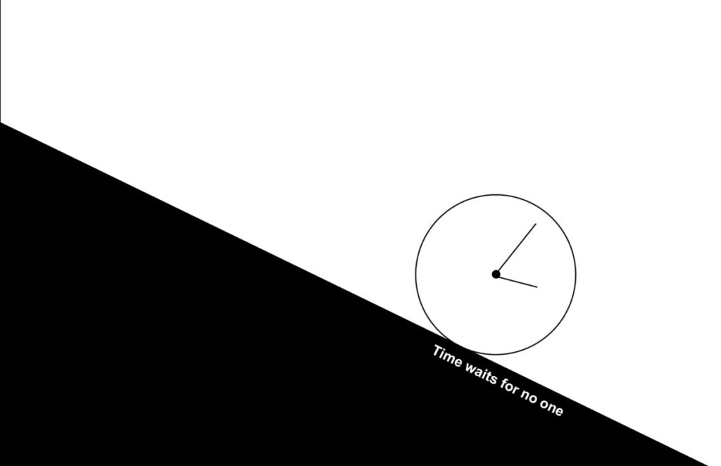
See with this concept I managed to bring to life one of my sketches, The top left one where the clock is rolling past a stop sign, I am extremely glad I was able to bring it to life, It was difficult making the triangle because of how Indesign is but once I got it in the rest of the design practically placed itself. I tried to portray movement by having the clock already a way down the incline with the quote being present almost like the lines on a road and while it may not seem like it that is where I got the inspiration to set the quote down. This concept has barely seen a discussion because I will be honest I have not uploaded it to the open lab site due mainly to my own lack of time management truly ironic. I did mention it but only briefly however out of the three this was the most infuriating to work with simply because the incline took forever to figure out.
Concept 3
This one much like Concept 2 has not been seen, However I never mentioned it, not even once, simply due to my lack of time management.
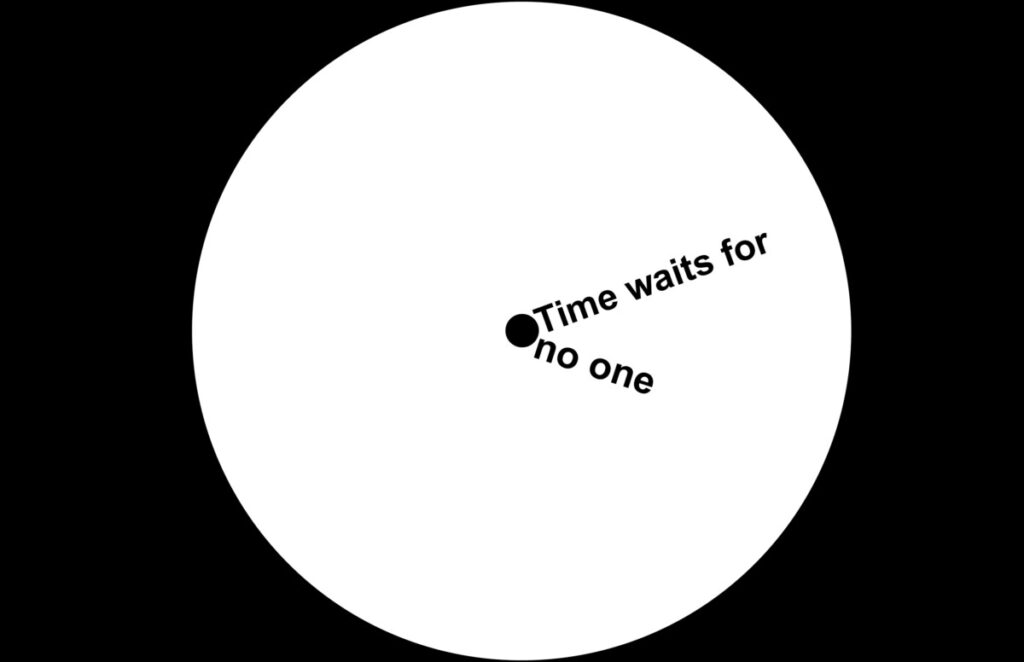
This has to be by far one of the best designs I could’ve come up with on my own, This takes the final sketch and brings it to life well minus the person in front of it, It takes inspiration from the sketch and the concept of sundials. How? Well I think only I can really see the inspiration since the third sketch was meant to be based of one but ultimately never had one, The quote being the clock hands was my way of showing that time truly waits for no one, not me nor anyone, It gives that sense of repetition like its all in your face but not actually repeating.

