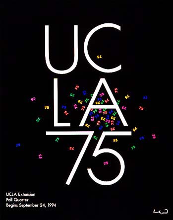
Each poster uses contrast differently, The 1994 cover uses mainly a black background while having the 75 be flung around in a sort of a explosion type of deal in a large variety of colors with the main cover letters being a sleek san serif typeface in white large letters, Meanwhile his 1997 spring cover is in a way the opposite as it has a white background with the colors incasing the letters and turning them white in a similar typeface as his previous cover.
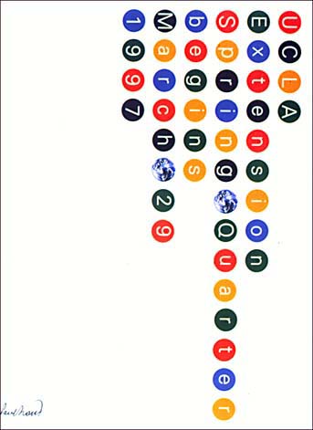
Alignment can be very annoying and tedious as it can make or break the design, In his 1994 cover he aligned the main letters in a vertical way to read up and down, however in his 1997 he once again does the opposite as it aligns all of them horizontally and causes the reader to look at the cover while turning their heads causing more held attention for the magazine.
Each element in both covers have a very small yet greatly chosen leading as it doesn’t make it hard to read and lets the elements feel more organized.


