For this video project I used some of my favorite photographs I’ve taken in my Photography I (COMD 1340) course. Some of the things I learned from this assignment is how to edit and compose a video together. Some challenges I faced while doing this project was that I didn’t know how to use iMovie on my desktop, but it was easily fixed because I watched a few videos on YouTube and was able to come up with my on video.The overall experience was fun, I had fun putting my work together in a video with music. I can totally see myself doing this again very soon.
We had the opportunity to be part of a virtual tour of the Poster House Museum, it was awesome to view a poster about “Blaxploitation” movies, from the first museum dedicated to posters in the US. The overall experience was amazing we had a blast learning about the posters and how they connect with sound; because throughout the whole exhibit the woman who gave us the tour was providing us different music with each poster. It was really cool, and I would love to go in person to see if the experience could be even better.
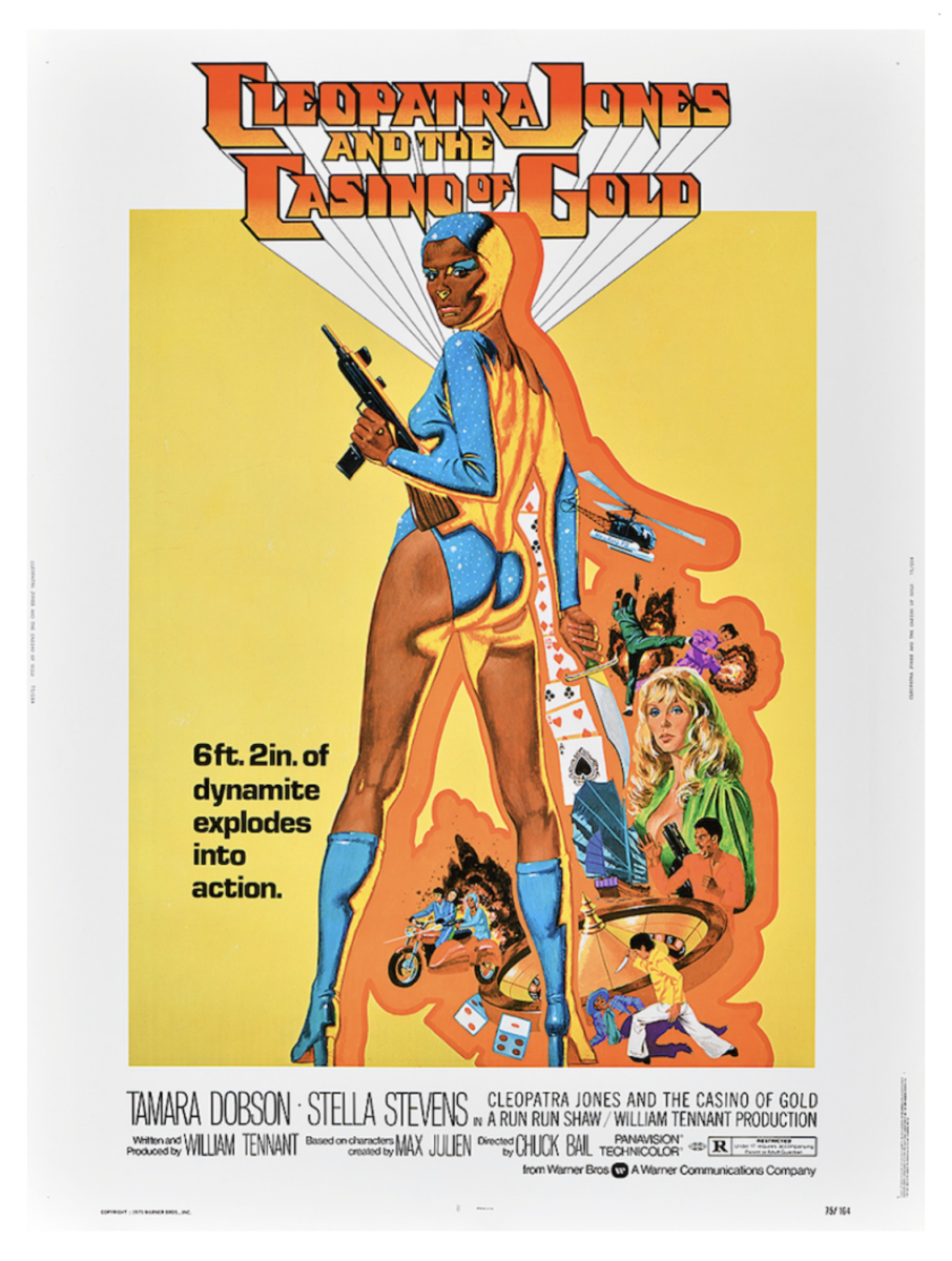
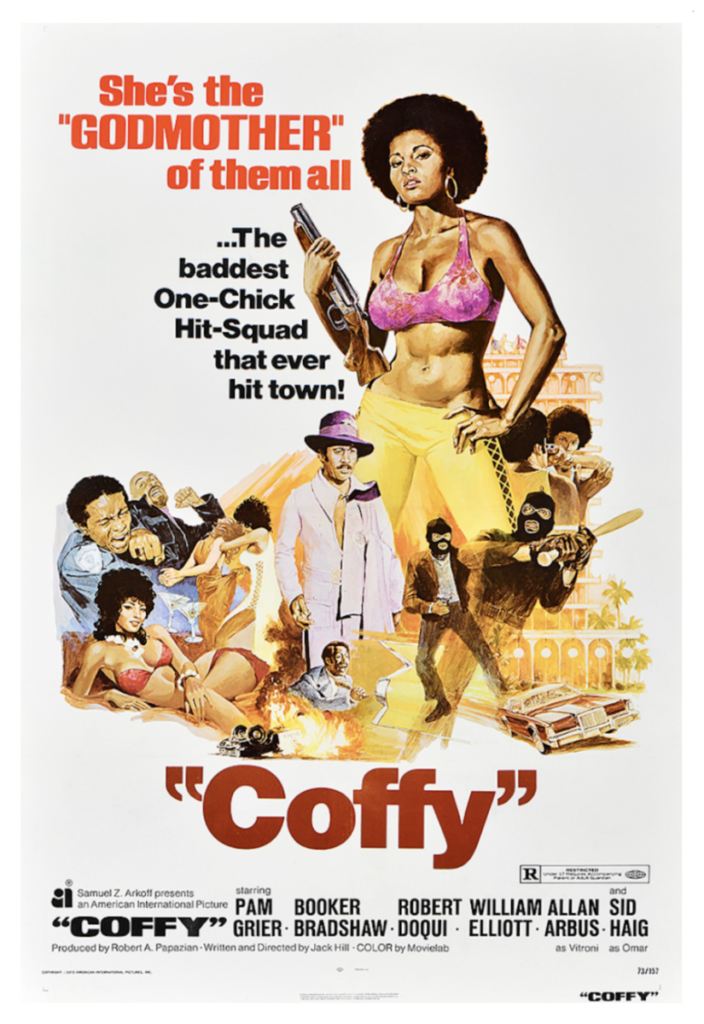
Discussion: 3 posters from the You Won’t Bleed Me: How Blaxploitation Posters Defined Cool & Delivered Profits Exhibition
Poster 1Poster 2Poster 3
Poster 1: Coffy, 1973 created by George Akimoto
Poster 2: The Mack, 1973 created by Fred Pfeiffer
For this poster I loved the contrast between the orange background with the black bold typeface and the man with white coat and hat. I really liked the warm tones throughout the poster. Something else I notice is the tiny gold car behind the figures. Something else I also like is that the figures are standing in the center of the poster, because you only focus on the figures and forget about everything else.
Poster 3: Slaughter, 1972 created by George Akimoto
This poster is very graphic like the first poster, it has a lot of action/movement going on, which is one of the reason why I like it. I liked how the red bold typefaces stand out from the rest of the poster. I also like the yellowish/orangish colors in the poster against the white background, I feel like if that yellow/orange tint wasn’t in the poster, the poster wouldn’t be as intense/dramatic as it is.
My name is Yarlin Peralta, my major is Communication Design. I go to the school of New York City College of Technology. Something that helped me choose my major was a few art history lectures I took when I first started to school. The fact that I could learn so many ways to satisfy all of my artistic habilities was breathtaking to me.
I love that I get to do art for the rest of my life because art in general makes me really happy since, one day I am planning to be a freelance graphic designer.
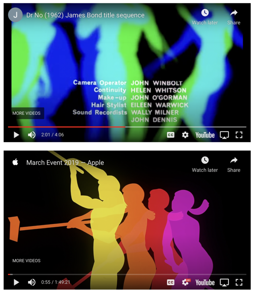
After watching these two videos, some of the common themes that I saw in the use of color were that they started with cool tone colors such as black, white and grey. They both start slow and quiet and then a few seconds into the film they both start to get a bit faster. The color in the film of Dr. No Credits start with neutral/cool tone colors then it starts to show moving circles of different colors which looks cool. While the color in the film of Apple Promo piece 2019 also begin with a mix of neutral and warm color. and a few seconds into the film we also get a variety of pop of colors with a mixture of cool and warm tones. Each film makes effective use of type combined with image by using music, color and different clips while also using contrast, repetition, alignment and proximity as well as a variety of typefaces. The audio, color and movement are related to one another because every time we get pops of color the music get fasters along with the movement and when we get more cool tones/neutral colors the music its slower and the movement too.
I really liked the music and the pop of colors from the Dr. No Credits video, it made the video very interesting and pleasing to the eye. From the Apple Promo piece 2019 I like the overall composition, the aesthetic of having the big screen with the iPhone and the new features was really cool.
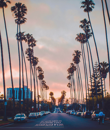
This cover called my attention because it’s very different from the other covers, this cover has an iconic photograph of LA palm trees. The palms trees show repetition along with the cars. It has the UCLA logo like a street sign, which I thought was pretty cool.
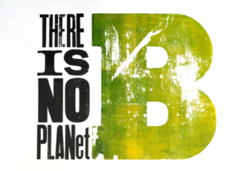
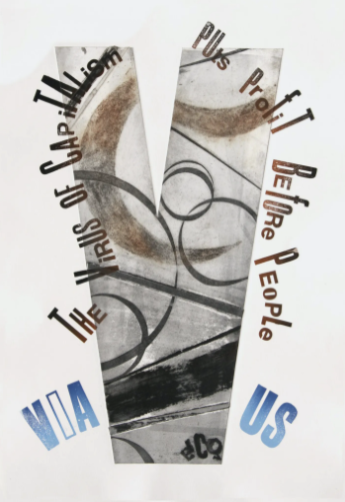
These are the top three poster that I liked. If I had to choose one, it would be the 1st one. I love how it’s telling the people that there’s not a planet b, and the words looks distressed in a way that they look sort of damage, like we are damaging our planet.
So, to answer one of the questions, what attracts my eye first? Well, something that attract my eye is the large capital letter b in the green color. There is use of repetition in the elements of the poster, such as the letters. I do believe this poster is effective, because I understand that our planet will no longer be survivable if we don’t take care of it.
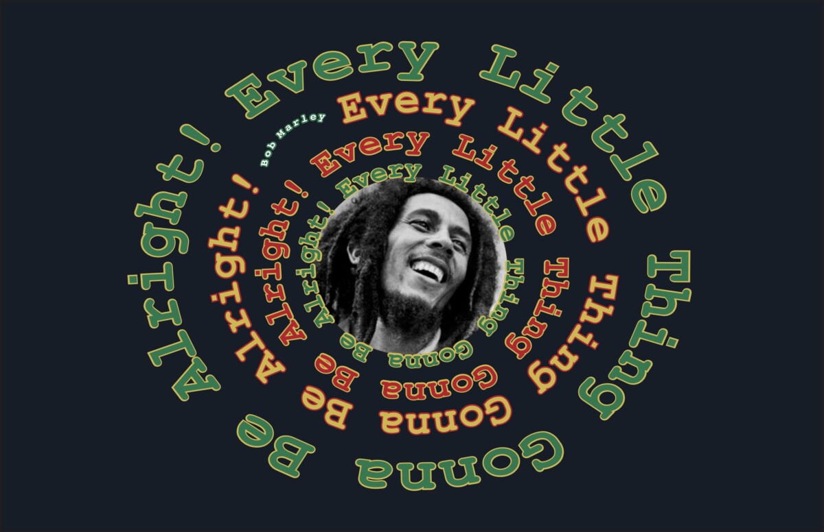
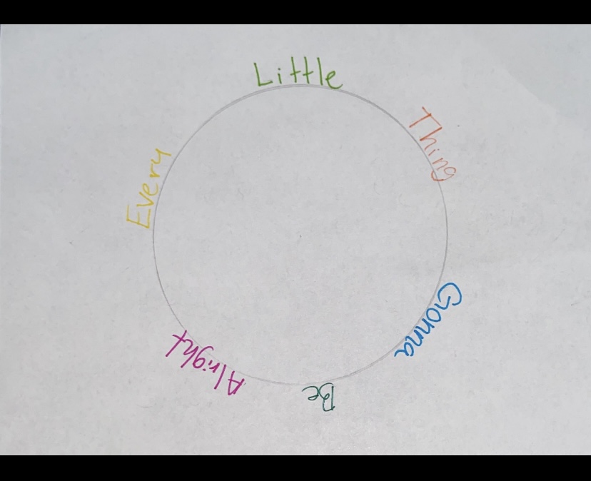
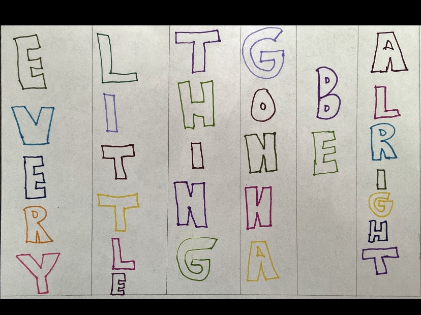
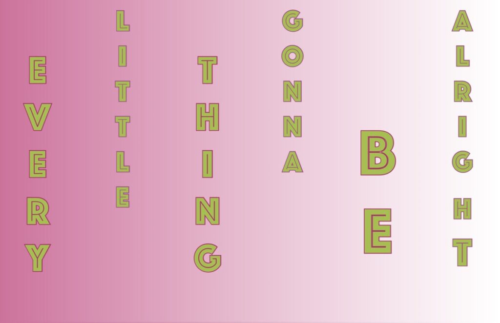
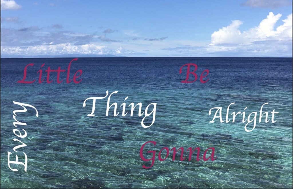
For my visual quote project, we had to choose a desired quote and then create some sketches. The quote I chose for this project was “Every little thing gonna be alright!” which are lyrics of a song called Three Little Birds by Bob Marley & The Wailers. The reason why I chose this quote is because it’s one of the songs that uplifts my mood instantly. Once we had an idea of what we wanted to do with the quote sketches, we move on to the next step, which is to do these three concepts in the computer.
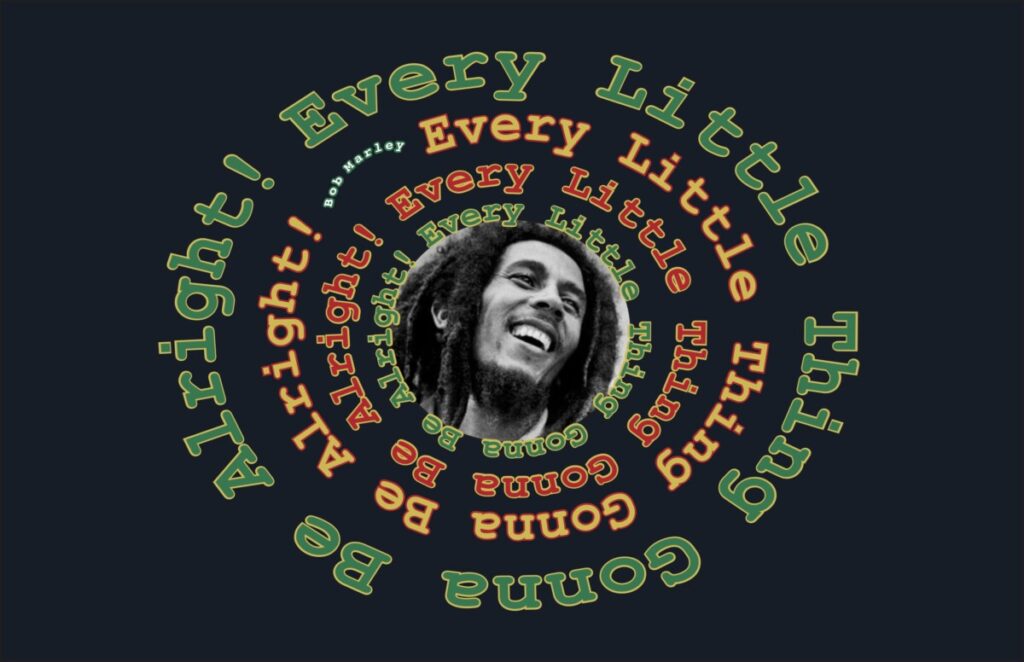
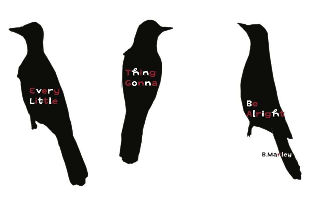
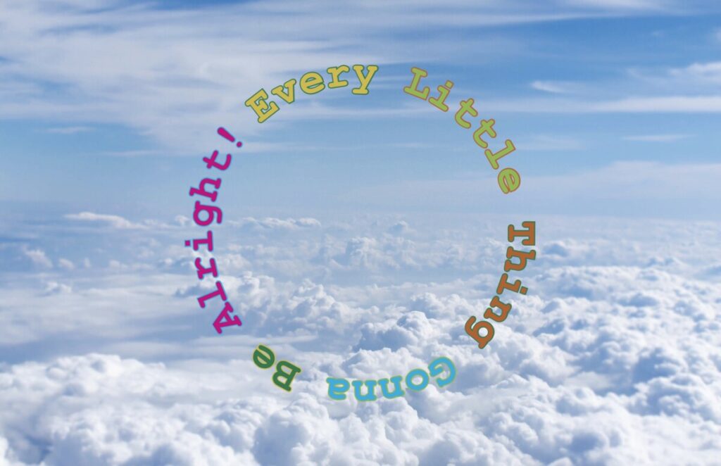
For my final quote concepts, I ended changing my ideas. Since the first 3 concepts were too simple, and not creative enough . I changed the colors, from light colors like light blue, pink to darker colors like dark blue, black red and such. I also played around with different typefaces. I added objects like birds, as you can see in the second concept and a photograph of Bob Marley in the center of the circular letters, as seen in the first concept.
For the first concept I used Bob Marley’s photo along with the quote going around it in colors that represent B. Marley such as red, yellow and green. For the second concept I used three birds to represent the tittle of the song Three Little Birds. For the third concept I kept it bit more simple, but I still like it, I like the colors and the typeface.
For my first 3 quote concepts, I kept it way too simple which is the reason why I ended up changing it to more interesting designs. I changed it but, I still feel like the sketches were somewhat followed. I don’t have a lot of experience using the Adobe CC programs, therefore at first I was not sure how I was going to create each concept. However, in the end I feel like I was able to create more interesting designs for each concept.
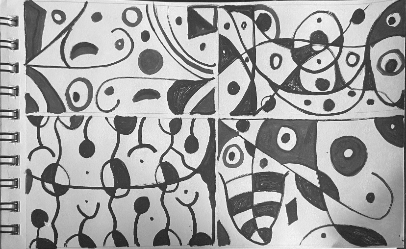
In project 1: part 1 we had to search for an artwork that was interesting for us while searching for it in online museum websites. After choosing one of the art pieces we had to draw lines and shapes we saw in the artwork. Moreover, after finishing drawing lines and shapes from the artwork we had to create our own piece of art with the lines and shapes. I was honestly surprise of the outcome of my work, I keep wondering how did I create my artwork from another artwork, and they look so much different, but somehow they connect with each other. For being my first project in this course I think I did fantastic. Also, it was really fun to create and using gouache paint for the first time was amazing.
Project #2: Gordon Parks
ThumbnailFinal Project
In the Gordon Parks project, we had to create an art piece based on and or inspired by Gordon Parks photographs. For this project we had to work with textures and values. I came up with many ways to create different textures such as using napkins to create my background, a very small detailed painting brush to create the hair and the brows and a medium round tip brush and flat brush to create the rest. It was very exiting to create different textures, Gordon Parks photography were truly an inspiration for this artwork and I feel like I portrayed that with my own piece.
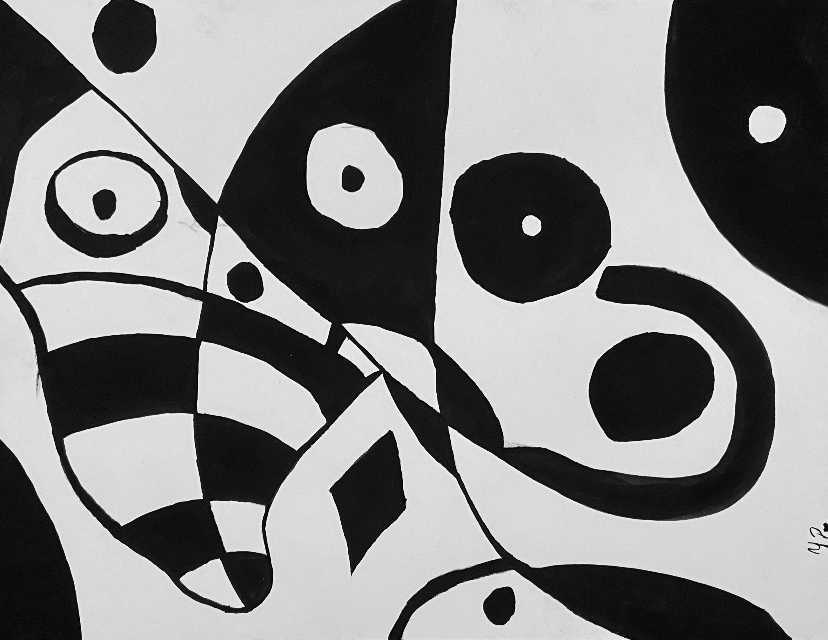
Project #1 part 2: Figure Ground
ThumbnailsThumbnailsFinal Project
In project 1 part 2, we had to come up with a design that had equal amount of negative and positive space. Both the positive and negative space had to influence one another in order to create a perceptional space. We needed to create an artwork that we couldn’t really tell which was the background and which was the figure. I feel like the artwork that I decided to create for this project was very simple yet very effective because I did equal parts of negative and positive space.
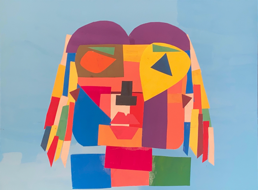
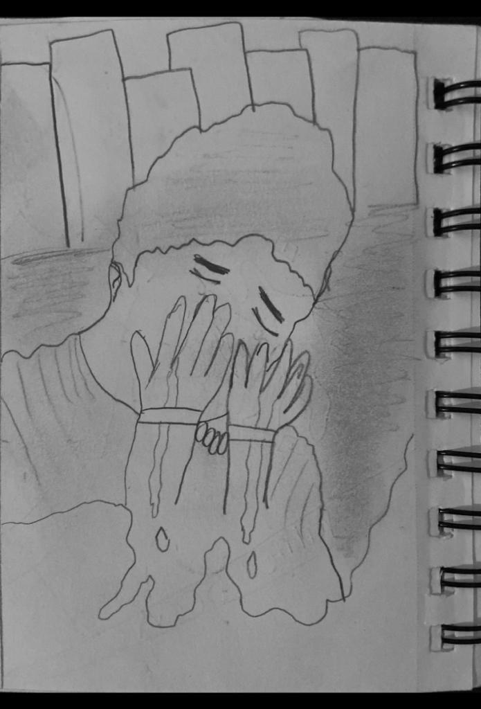
Project #5: Self-Portrait
ThumbnailFinal Project
This project might be my favorite piece that I created this semester. I was extremely surprised when I finished gluing this collage together. For this project we needed to create a self-portrait collage using warm and cool tones colors. I had so much fun creating this one, I love the colors and how they interact/connect with each other.
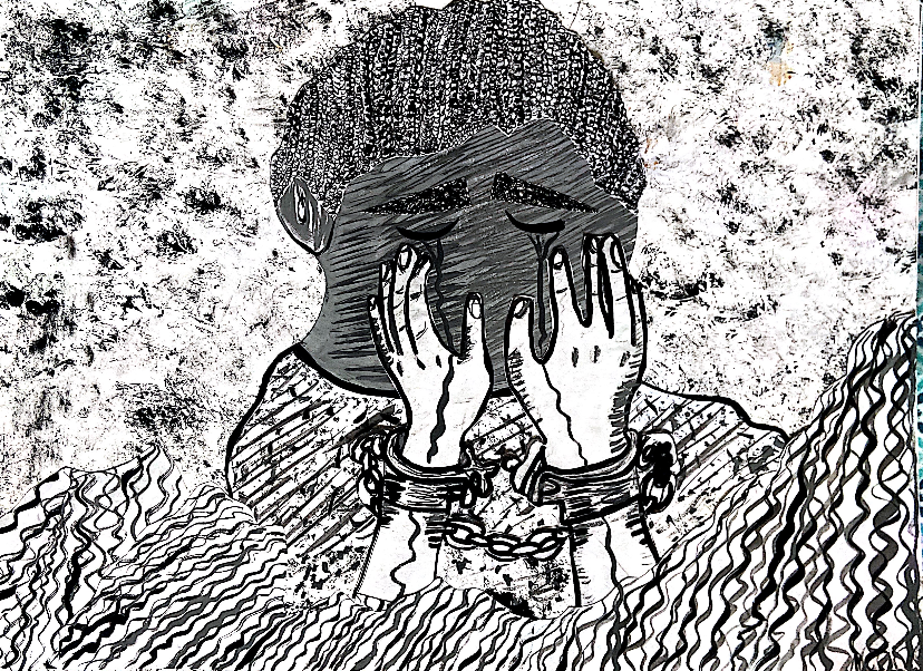
Project #6: Poem Pattern
PoemThumbnailsFinal Project
In this project, we had to search for a poem we liked and make the poem into an art piece. We had to choose keywords from the poem, associated with colors and lastly, we had to create a pattern design with it. I created my artwork with watercolor pencil, it was harder to create this piece by hand because a pattern needs repetition, and they needed to look equal in proportions and colors. Also painting this with water color was a challenge, because I probably had to paint this at least four time in order for the colors to pop. Even though, it was a bit of a challenge I had so much fun creating this pattern and I will really love to create many more patterns in the future.
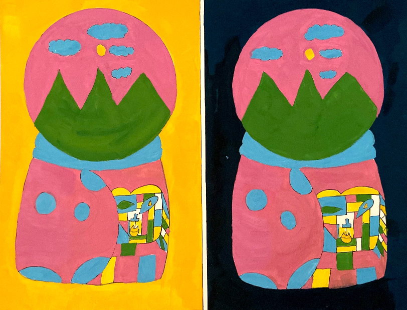
Project #6: Bezold Effect
Past Present FutureThumbnailFinal Project
For this particular project we had to choose something from our past, present and future and create a design. In this project we had to create a design twice side by side and change only the background color in order to see how the color of the background can make the other colors look different. I was fun to put my past, present and future into only one composition, at first I thought it was not going to work out. However, I decided to use the snow globe decoration as my main figure, and it all worked out. I enjoyed painting this artwork with different background colors.