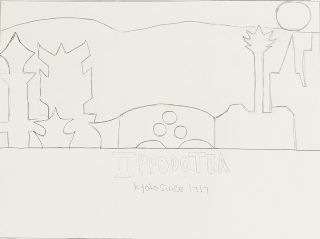
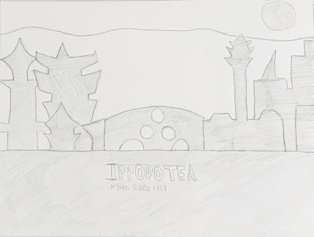
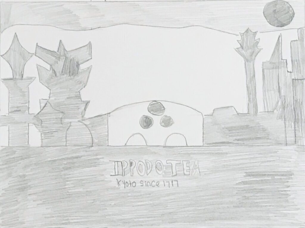

So these are my final pencil illustration with three different value studies. As I finalized my drawing, I decided to lower the mountains in the background so that the sun in the top right corner would have a bit more room and I moved the three circles of the Ippodo logo and put them on the bridge. I wanted a sense of negative space and the concept of this illustration is that Ippodo tea spans generation and what is old is pretty much new again…so it shows ancient Japan on one side and modern Japan on the other with the bridge connecting the new eras. I also did some value studies for these. The first one with the buildings lightly colored as well as the bottom where the text would be while leaving the background white to give it some sort of contrast. The second value study is slightly darker with the sky colored in, and I decided to leave the bridge white and instead color the circles in to see how it looked and give it a bit of a different dynamic. For the third one, I decided to completely flip what I shade and decided to shade in the mountains and moon and leave everything white and I guess the towers pop out a bit more.


Leave a Reply