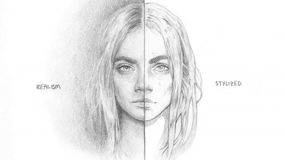
Looking at the comparison between realism and stylize does have different values of contrast. The artist Timothy Von Rueden, browser under the website of ‘Creative Bloq’, describes the function of the contrast and identifying its difference in terms of value, saturation, hue, etc. I personally prefer the stylized contrast illustration on the right side of the woman’s face because it gives a clear characteristic feature and it’s much neater than the realism. With little work of contrast on the artwork shows more patterns in the shape.


Leave a Reply