Hello professor wolley,
I did what you advised and took the bird and fan and moved it around in different ways to see what was best. i would like if you gave your opinion on which one i should use.
i wasn’t sure if i should fix the cut out area the bird left or leave that for inking that is why it is there in most of the concepts. that goes for almost all of them i was not really sure if i should complete the fan or just wait for the inking process.
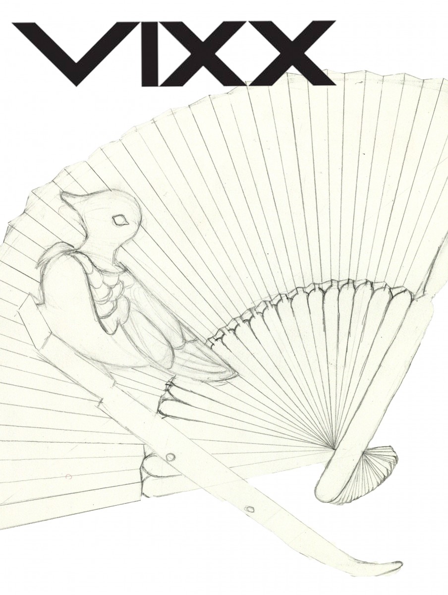
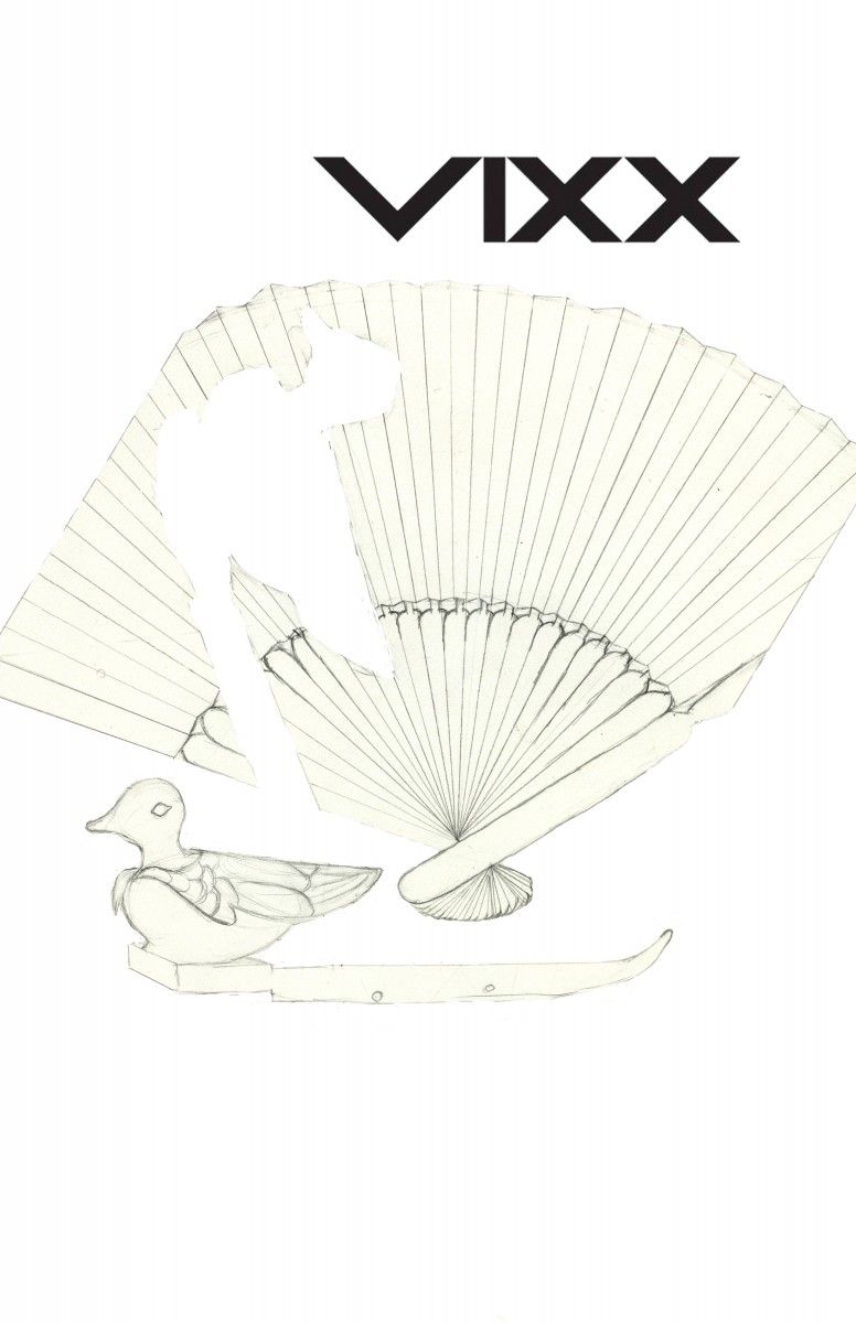
This is a close up version of the original idea
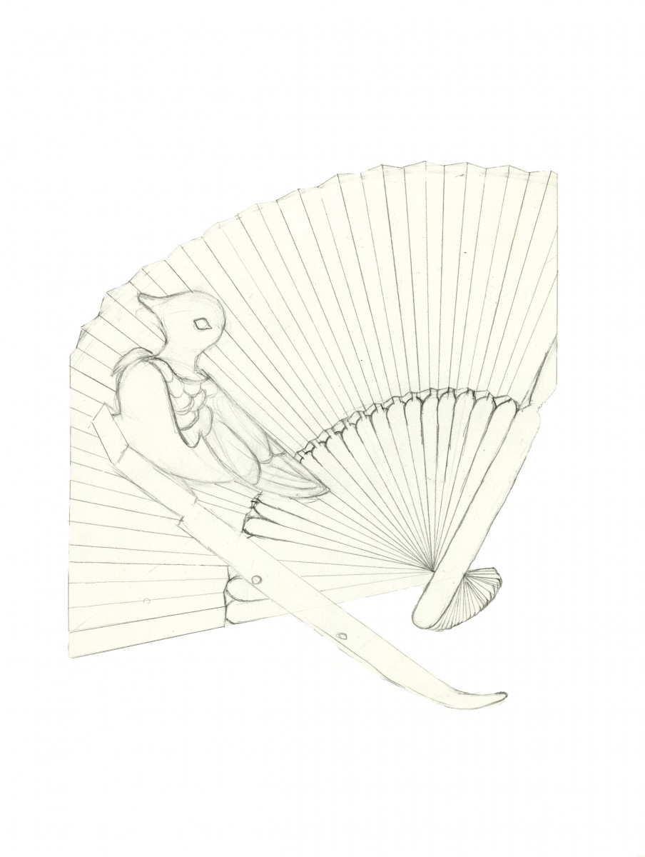
This is a smaller version i would complete more of the fan in this after it is printed.
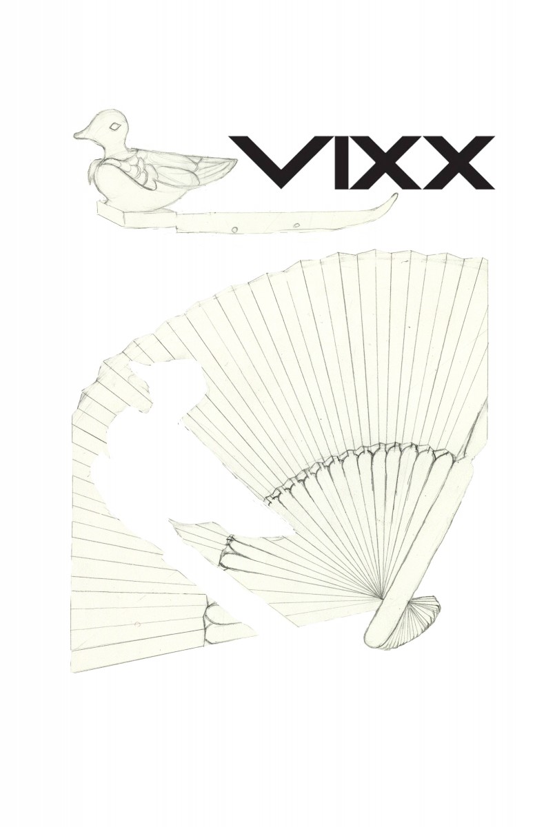
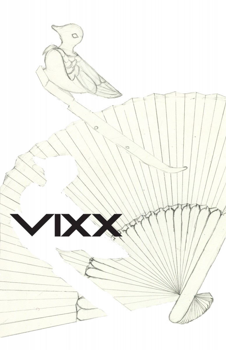
This is the one i feel i like the best because you can have the poster in two different directions and it would still be right side up
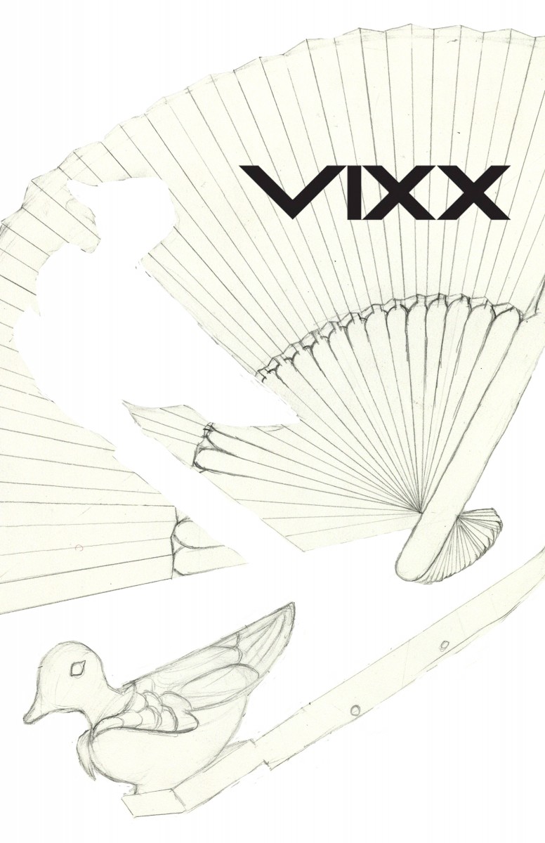
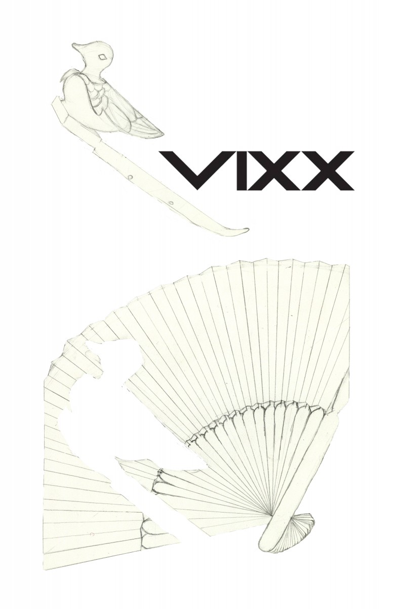
i also like this one that has the fan big with the bands logo and the bird separated and on the bottom.


Tricia out of these WONDERFUL designs I prefer the ORIGINAL and the Last one – I MIGHT like the upside doen one better if the bird was not upside down.
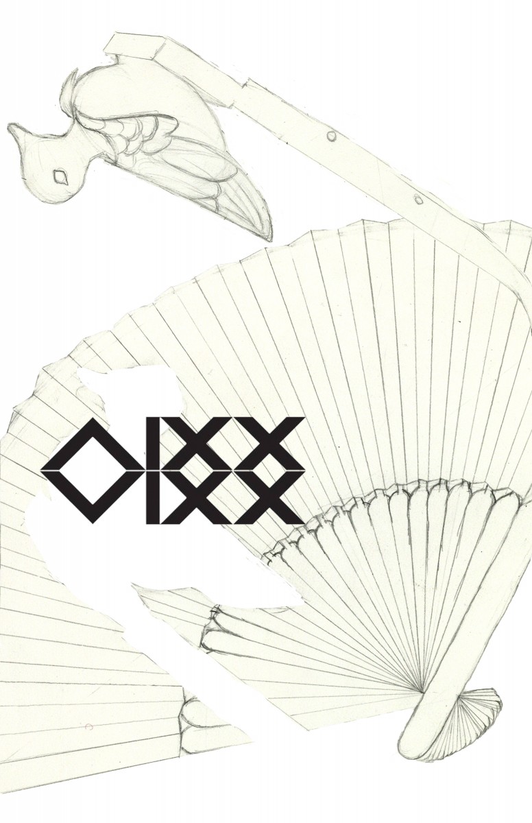
I really like the 2 logo idea you have in the reversable poster. KEEP THAT. Also the close up point of view in the first drawing is very dynamic. S