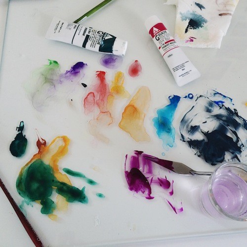
Watercolor is a flexible medium. It can also be applied directly over a pencil drawing, and can be used thinly as a glaze or opaquely like a traditional gouache. It can accept a variety of media layered on top of it too, such as colored pencil or ink. When dry and treated with a fixative it even allows the artist using it the flexibility of painting or glazing over previously painted areas without fear of disturbing those earlier layers.
GLAZE
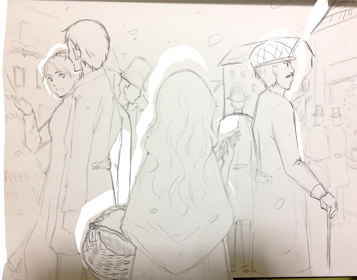
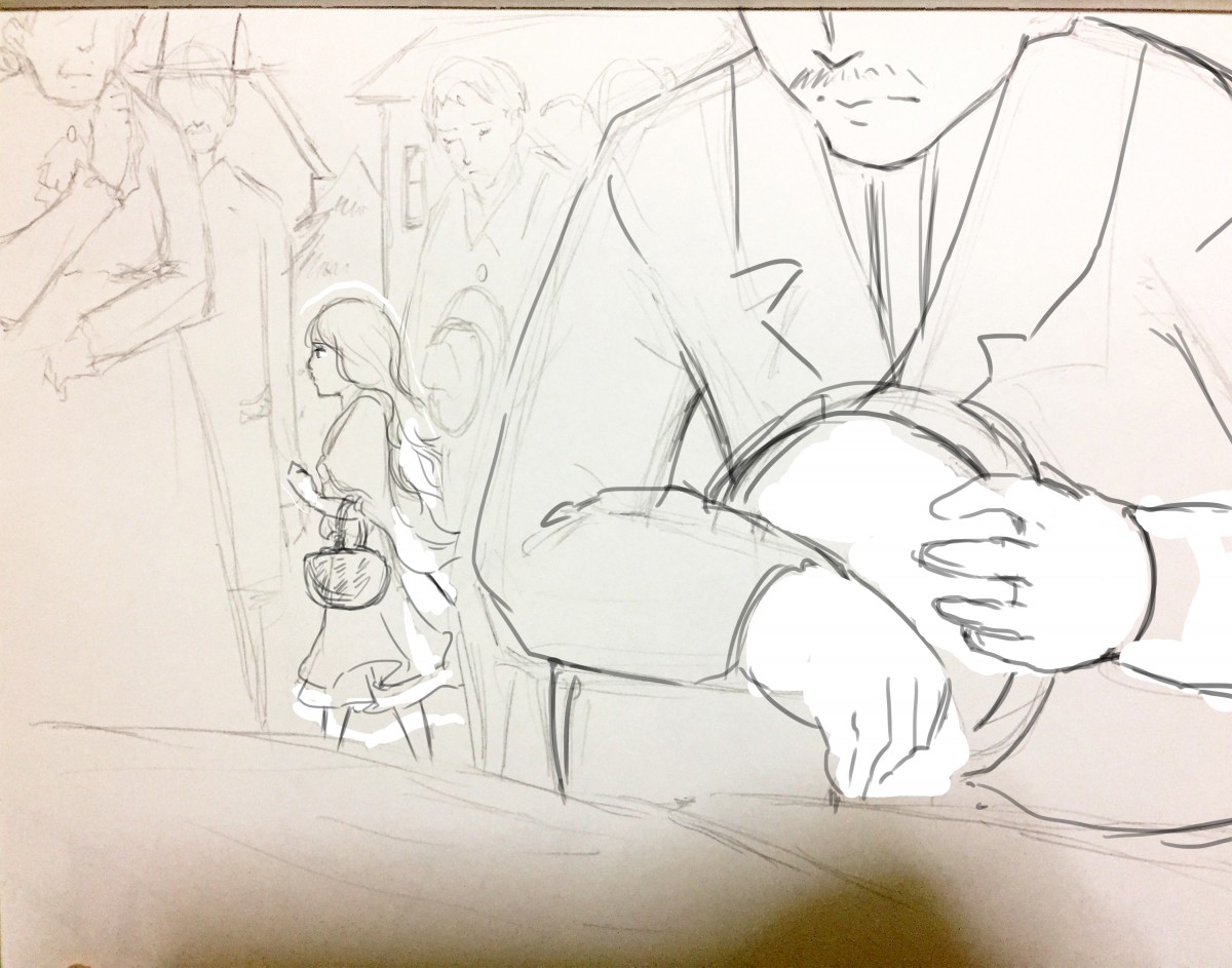
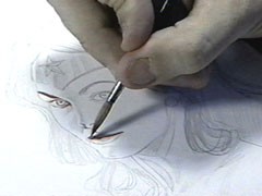
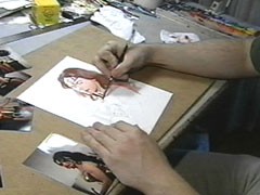
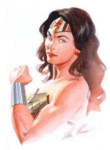
When using Watercolor as a glaze, dissolve a small amount of pigment in water until you achieve the transparency level you are looking for, just as you would when working in watercolor. You can use this technique as your first layer of color, directly over your pencils as shown here in this step-by-step creation of the Incredible Wonder Woman portrait by Alex Ross.
Alex Ross Step by Step
-
-
Glazing over Pencil
-
-
More layering of color
-
-
Final Art
As you can see, when in the right hands glazing is a very effective technique!
When glazing, remember:
- Each layer affects previous layers.
- Transparent layers of color add luminescence and depth.
- Glazing gently transitions areas from light to dark.
- Glazing will either dull or brighten previous layers.
- Analogous colors brighten.
- Complementary colors dull.
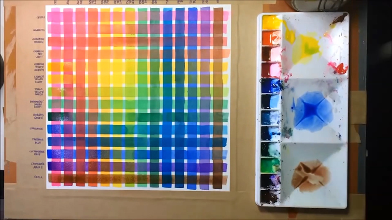
Helpful Tip
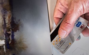
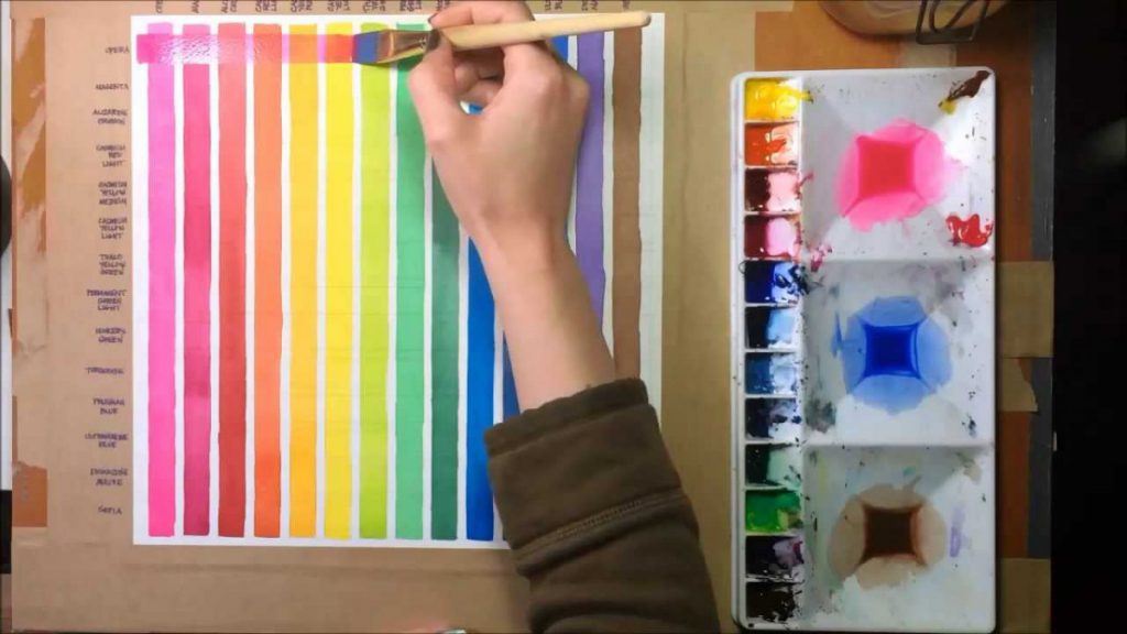
Try this: Make yourself a glazing guide by brushing a stripe of each of your colors as a glaze. Wait for it to dry (or use a hair dryer!). Then brush a second stripe of each color to form a grid. Don’t forget to label your colors for easy reference.
-
-
Step 2
-
-
Step 1
WATERCOLOR & PENCIL LAYERING TECHNIQUE
Once dry, the paint has a matte finish. This allows for additional techniques to be layered right on top. For example, an artist may choose to draw over the top with colored pencils. This technique is easy to see in this illustration of root vegetables by Lizzy Rockwell.
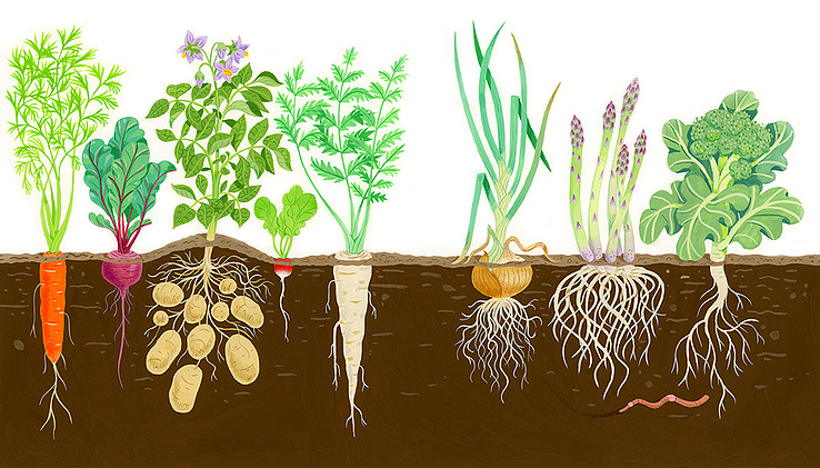 Lizzy Rockwell, illustration of root vegetables
After Rockwell traces her drawing onto the watercolor paper, she fills in, using the gouache as a flat, opaque medium. Afterward, shading and details are added with Berol Prismacolor colored pencil over the painted areas. It is particularly noticeable on the carrot, the radish, the tips of the asparagus and on the lines on the onion.
Here comic book legend Alex Ross, whose process we just looked at, combines Watercolor and Gouache (opaque watercolor) with pencil and India ink. His painterly style is unique in the realm of comics. Ross uses glazes of color over a pencil drawing, which in many places remains visible. Once dry, the blacks and the line work are finished off with a brush and ink.
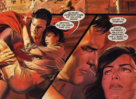
Alex Ross, illustration of Superman and Lois Lane
Helpful Tip
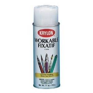
For the sake of permanency, a quick spray of fixative is recommended if you choose to use any of these layered techniques.
As you can see, you are about to begin working in a very flexible medium! These are by no means the only techniques to try, so feel free to experiment!
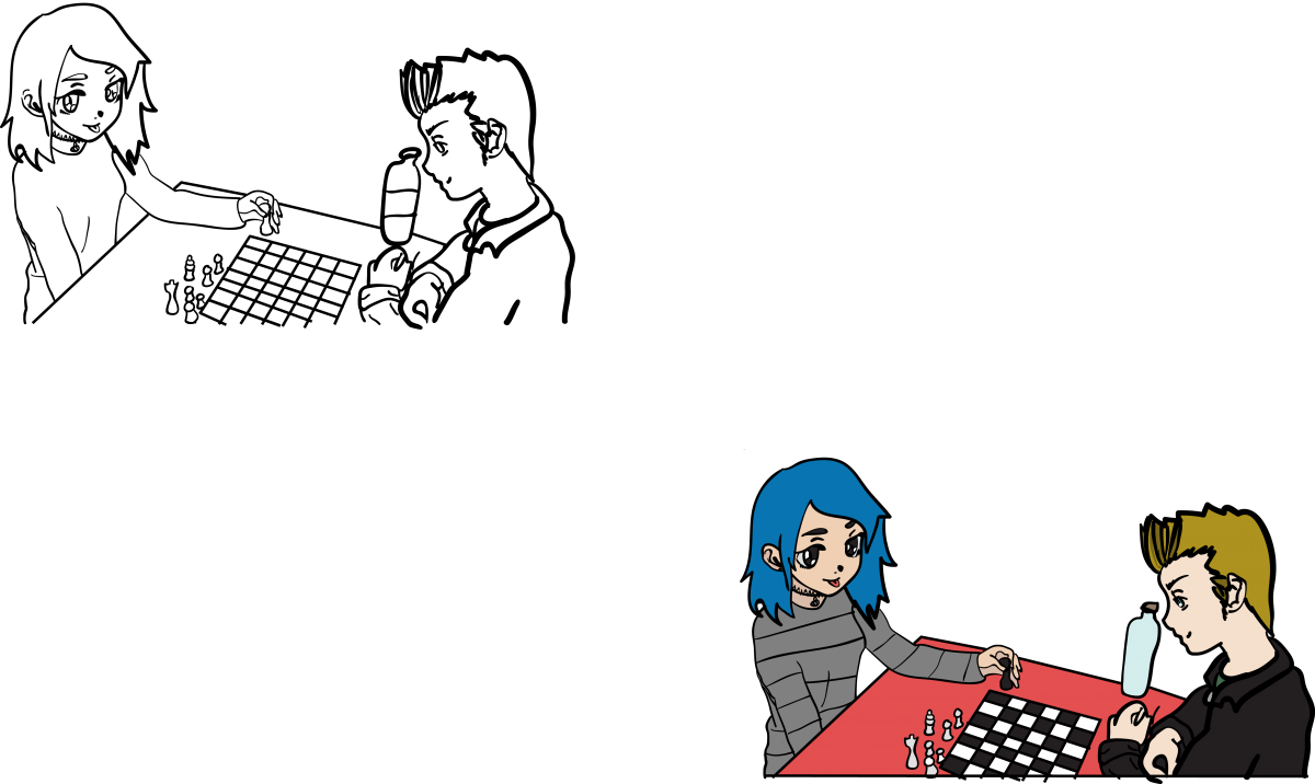
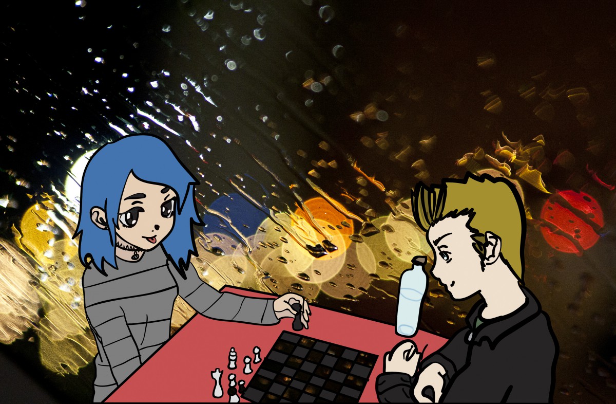
 concept sketch 2
 Original