All posts by Wesley

Bio

Hi, my name is Wesley De Jesus. My major is Communication Design. I choose this major because I want to go into game design. What inspired me to pursue this career choice is while I was growing up I played a lot of Video games and I was also really invested in the way characters were designed, how whole backgrounds were made, the animations for their move set. The scenery for games is also something that intrigued me a lot, how beautiful they can look. I remember seeing a background for a game that looked so real that I felt like it felt like I was right there. Now as an adult if I ever have extra money to buy the collector’s edition of games which usually contain art books or the separate art books themselves I would get them. I love looking at the concept art for them and I’ve always wanted to create games.

I’m taking this COMD 1112 because it is required and I want to get as much out of class as I can. My design process is spontaneous I can never really come up with things on the spot but they usually do come to me. I would be interested in collaborating in the future with big gaming companies like Sony or Square Enix or even smaller companies.

Transparency and Layering

Transparency

https://collection.cooperhewitt.org/objects/18704619/

https://collection.cooperhewitt.org/objects/68267775/

https://collection.cooperhewitt.org/objects/18731643/

Each of these does a good job of showing transparency. Your able to see past the object.


Layering

https://collection.cooperhewitt.org/objects/18730747/

https://collection.cooperhewitt.org/objects/18650815/

https://collection.cooperhewitt.org/objects/68743397/

All of these do a good job of showing layering because your actually able to see that each object within the art pieces are showing layering.

Podcast

What i though about this podcast is that color is based on a persons perception and that people would find anything to complain about on the internet.

End of the Semester Post

Throughout this semester I have learned about the different theories of color. And that there is  more to art than just design, color and painting. I have also learned that craftsmanship counts a lot as I’ve learned through my projects.

Design Journal # 14

Layering:

Source: dictionary.com

Image:

Formal- A thickness of some material laid on over a surface.

Informal- materials or Objects Layered on top of each other.

Transparency:

Source: dictionary.com

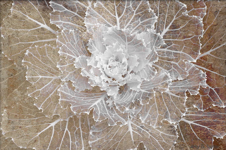
Image: https://fineartamerica.com/featured/transparency-amy-g-taylor.html

Formal- something transparent, especially a picture, design, or the like on glass or some translucent substance, made visible by light shining through from behind.

Informal-the clearness of an object.

Spatial Depth:

Source: essentialvermeer.com

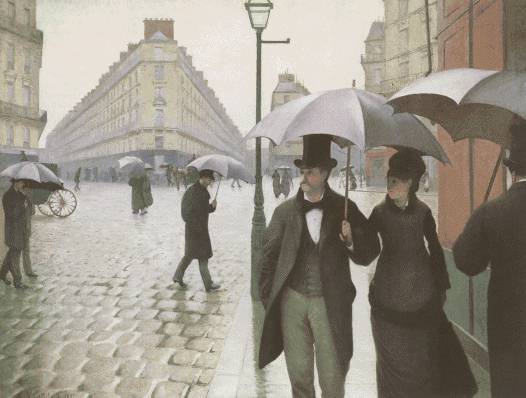
Image: https://jamesrcole.wordpress.com/2011/09/11/spatial-depth-sept-13-assignment/

Formal- spatial contrast by the use of illusionistic devices such as the placement of a large figure or object in the immediate foreground of a painting to increase the illusion of depth in the rest of picture.

Informal- making it so that the background is looks really far.

Contrast

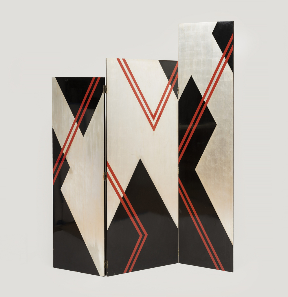
Three paneled screen. The left and right panels are attached to the center panel by hinges. Each panel is painted with an abstract zig-zag pattern in black and silver leaf, and red thin lines.

https://collection.cooperhewitt.org/objects/404536659/

What makes this a successful example of contrast is because of the fact that the colors are switching and also how the size of shape changes.


Painterly Effects

This is a strong example of contrast because the  of the colors being contrasting colors and how the shapes are contrasted by a black line.

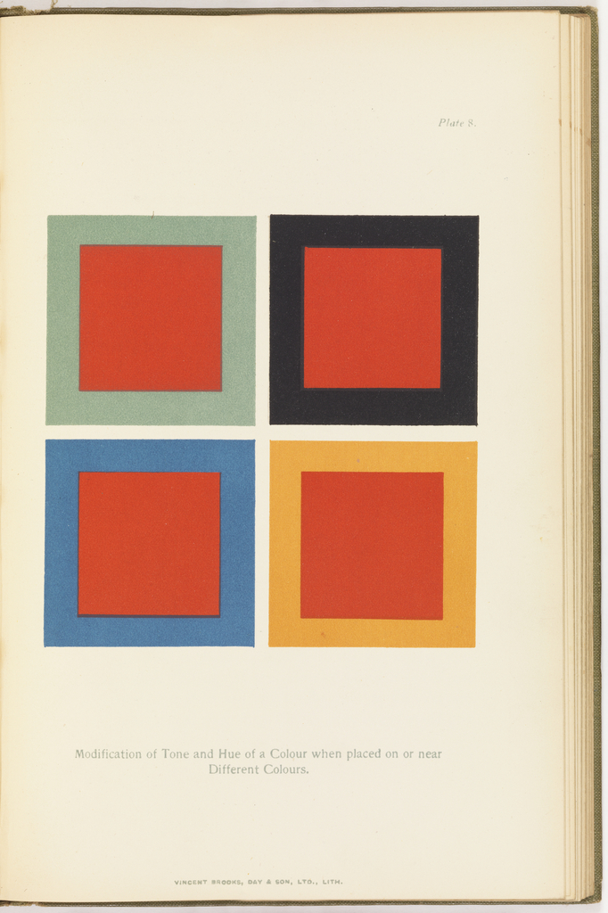
ND1488 .W259 1903

https://collection.cooperhewitt.org/objects/68802337/

This is a good example of color contrast. Reason why is because the colors contrast with each other really well.

Design Work Student

http://www.coroflot.com/YoshiniG/Portland-State-University-Clients#keyword=University design student work&sort_by=5&page_number=3

The reason why I like this students design is because of the wide range of colors. And how they overlap on top of each other as well as how they are all neon colors. I also like how the needle is holding onto the strings and that the needle is just one color.