Category Archives: Homework

Week 4, Class 1

Hello everyone! I missed you guys!

Classwork

InDesign

  • Multi-page documents: please use this template as i found a little mistake in the old one.
  • Page Panel
    • Master pages
    • Pagination
  •  Downloading and installing fonts
  • Well-crafted fonts vs. badly-crafted ones
  • Types of font files

Note: If you do want to grab a new font please download and install fonts from Font Squirrel or Lost Type Co-op. They are well drawn, legal, and usually pretty darn lovely.

Type Book: Assignment 2
Create a 5-page document. Each page should have 1 layout with specific characters of each of five families of type. Each page must display a sample of a font within a specific family, and list characteristics. See the Typebook, Exercise 2 handout for more details.

Homework

Finish Classwork

Study for Quiz 1

  • History of Letterforms
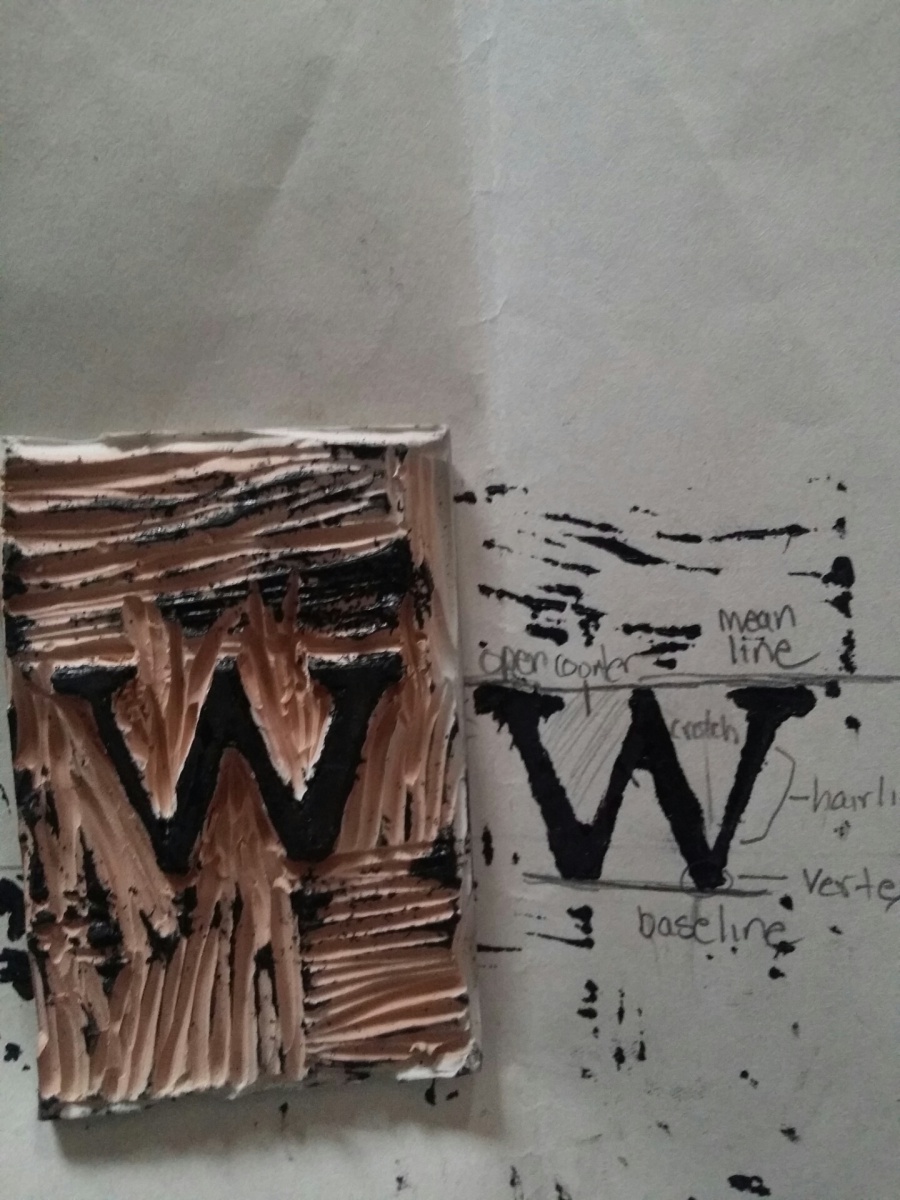
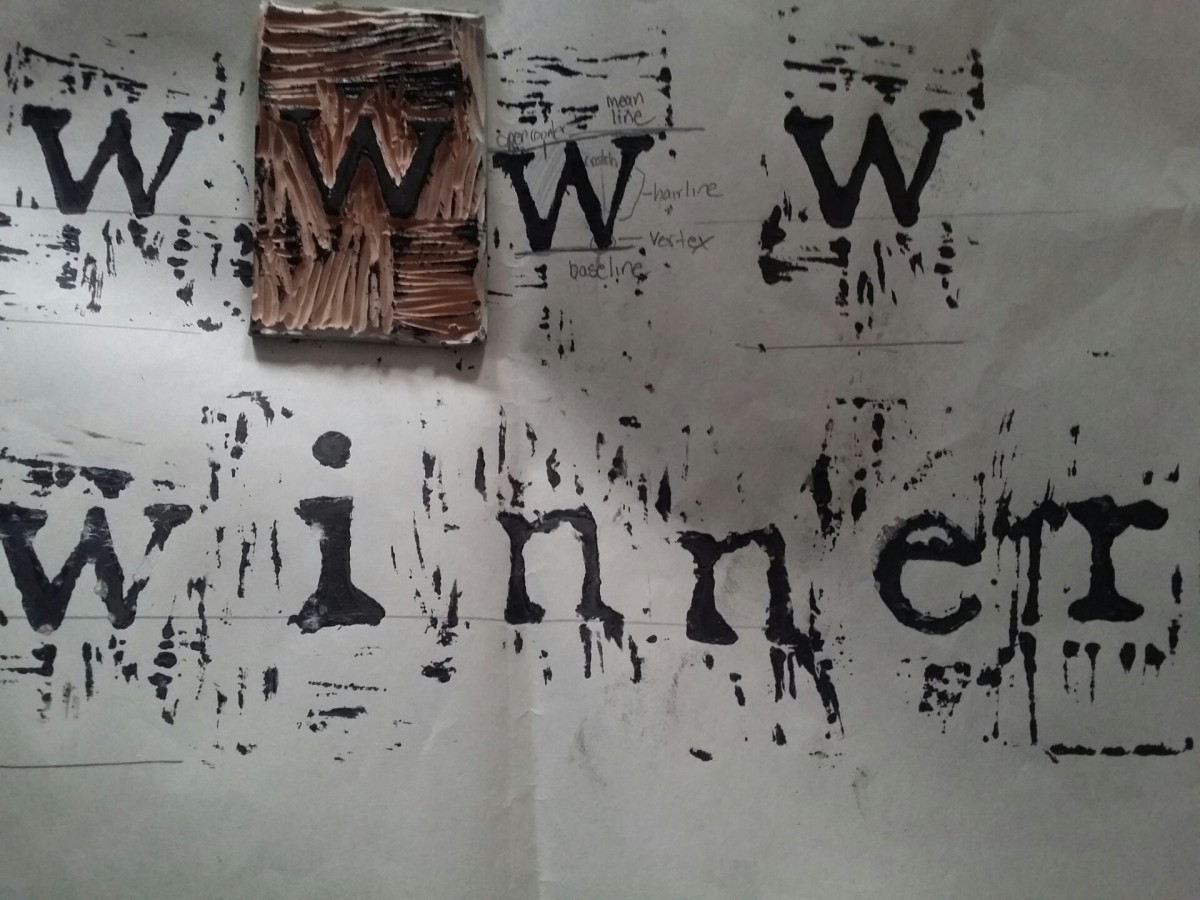
  • Typographical Anatomy
  • Drawing a Letterform
  • Kerning, Leading
  •  Five Families of Type

Relief Printing

My first time doing relief printing was bit of a challenge for me, but at the same time it was quite exciting. Being exposed to this kind of art was very eye opening. I was unable to identify ten different types of typographical anatomy with my letter, and was only able to find six. It was interesting to find out the different names for the terms and how similar some of the names are related to human body parts.2014-02-21 12.43.59

Again I repeat, this being my first time attempting relief printing it was a tough task.  I believe I could of done a lot better with the kerning. The spacing was to far apart and I was not able to get some of the letters on the baseline. I still had a lot of fun part taking in this and I feel like I have a better understanding of type and its anatomy. I find myself now more aware of how the type looks off and how it should look.2014-02-21 12.38.12

Week Three, Class Two

Let’s get back into the groove! Here’s a lovely video that will get us back into the mood for type:

Lecture:

Layout

  • Working on the Grid
  • Rules, strokes
  • Exploring InDesign: review
  • Guides, margins, and other layout aids
  • Project #1: The Type Book: Choose a performer, famous person, or fictional character about whom you will write your type book assignments. You will use this person’s name or text about them to tie the exercises together thematically.
    • How to create Type Book assignments:  
    • Type Book: Create a 1 page document which labels the following type components: baseline, meanline, capline, serif, counter, x-height, ascenders, descenders.

A note about the Typebook:
You need to collect all your assignments at the end of the semester to print the project out as a spiral bound book. I will have a sample today in class for you to see. You need to keep track of all the pages, and you need to turn them in on time.

Homework

Reading
Review The Five Families of Type

Journal: Due by Next Thursday

Find examples that use a typefaces that belong to each of the five families of type. In what scenario are they used? Put the printed examples together with paragraphs describing the family to which you think it belongs and why.

For example, find and identify a typeface that belongs to the Modern family. Describe what helped you classify it and why it may have been chosen for that particular layout.

Our class is cancelled today

Once again, to clarify:

I am not able to make it to school. Therefore, our class is cancelled. I have notified the office, but have not heard back, so I do not think there will even be an attendance sheet on the door. School has yet to be cancelled, but I am canceling our session for today as I cannot be there. We will be meeting tomorrow.

Journal Homework & the Weather

Hey there!

  1. As far as the CUNY system is concerned, we have class today. Absences will count the same as always, but seriously do not risk your lives if it gets too dangerous. Do the work, contact your professors, make every effort to keep up with your classes. If we do get cancelled, I can easily meet you on Skype to answer questions. Snow days are not breaks from doing the work, they are just safety precautions in terms of the commute.
  2. I am not getting many journal entries at all, nor have most of you completed them. Just to remind you, they are counted as a part of your grade, so step up! If you need help with anything, tell me in class. I am glad to help!


Week Two, Class Two

Today we PRINT!!!

Homework:

Journal: 

  • Take your best print of a single word, draw in and neatly label at least 10 parts of type anatomy. Scan it or take a good photo of it and post the results on Open Lab. Use the handout from last week as a reference.
  • Take your best and worst prints of stacked words and write a paragraph about why one works well and the other does not in terms of leading. Once again, take a picture and put it on your Open Lab site.

Typography in my Neighborhood

William Luperena

Being that I spend most of my time in or around City Tech, I consider this my neighborhood. The type in the neighborhood varies completely because of what this neighborhood consist of. Part of it is commercial because we have the Fulton mall, but then we also have court and school buildings. I have learned the type varies due to make up of the neighborhood. While walking through the Fulton mall area, I have seen all kinds of extravagant type. However, while walking by the court and school buildings they seem to be a little simpler. In addition, the colors of the type in the Fulton mall are much more vibrant than the colors of the court buildings, which are dull.

As far the type being well crafted, the school buildings and courts had type that was done professionally. I can say the same for the bigger stores in the Fulton mall such as Gap, H&M, Macy’s, and Footlocker. In addition, there are some fast food restaurants that have their type professionally done as well, such as Mc Donald’s, Burger King, and Wendy’s. However, when it comes to the mom and pop shops, their type looks not as skilled. With the mom and pop shops, some of the type looks like it was handmade. They also seem to have the same kind of type.

20140131_11172920140131_11111420140131_11194820140131_110812

Week Two

Classwork

Software introduction

  • Introduction to Font BookŸ
  • Introduction to Font Squirrel, the only approved source of downloadable free fonts
  • Introduction to InDesign

Text

  • Arial is a Font (Short Documentary)
  • ŸBounding boxes and their implications
  • ŸKerning

 InDesign

  • Ÿ Creating a new document
  • Ÿ Orientation and setup
  • Ÿ Rulers and measurement
  • Ÿ Controlling kerning digitally
  • Ÿ Bounding and text boxes

Printing in Class!

Relief Printing

  1. Carve and print at least 2 individual letters (I will give you the letters for you to transfer onto your  blocks). Work to make your letters  as crisp and clear as possible.
  2. Print single words, concentrating on kerning. Use each other’s letters and feel free to print nonsense words.

Homework

Reading

Journal

Take your best print of a single word, draw in and neatly label at  least 10 parts of type anatomy. Scan it or take a good photo of it and post the results on Open Lab. Use the handout from last week as a reference.

Typography In My Neighborhood

IMG_1322IMG_1325IMG_1323


For this assignment, we were asked to take pictures around our neighborhood of the various types of typography displayed on stores. The first picture is the sign on a building for a medical office.  The second shows a small candy store.  The final picture is of the corner store that everybody around where I live visits.  After analyzing the different kinds of fonts and sizes, I realized that my neighborhood is pretty bland compared to an area like Time Square where a plethora of large and lavishing signs resides.

The first clear observation is that none of the typography seems to be made from hand lettering.  It’s all printed, which takes out a lot of creativity and excitement, especially considering all of these use generic fonts.  The lettering is also placed on dull backgrounds, which doesn’t allow it to pop.  Ironically, I think this says a lot about my neighborhood.  I’ve lived here for ten years, and it’s always been very quiet and boring.  Nothing exciting has ever happened, and this kind of typography displays that.  It’s boring and dated, much like the area around me.