This advertisement I saw on the train really caught my eye. I really like how the designer added a gradient on the bottom of the watch, it gives it more depth, it does not look like a 2d flat image. I also like how they went with a sans serif type, it feels more inviting and friendly. However, I don’t love the image they choose for the background. It is a bit distracting and takes away from the watch, mainly because it is right in the middle ground, it almost seems like the runners are towering over the watch. I believe the it would have been a better idea to go with a different image. One where the runners are towards the back ground to give the arch more breathing space. 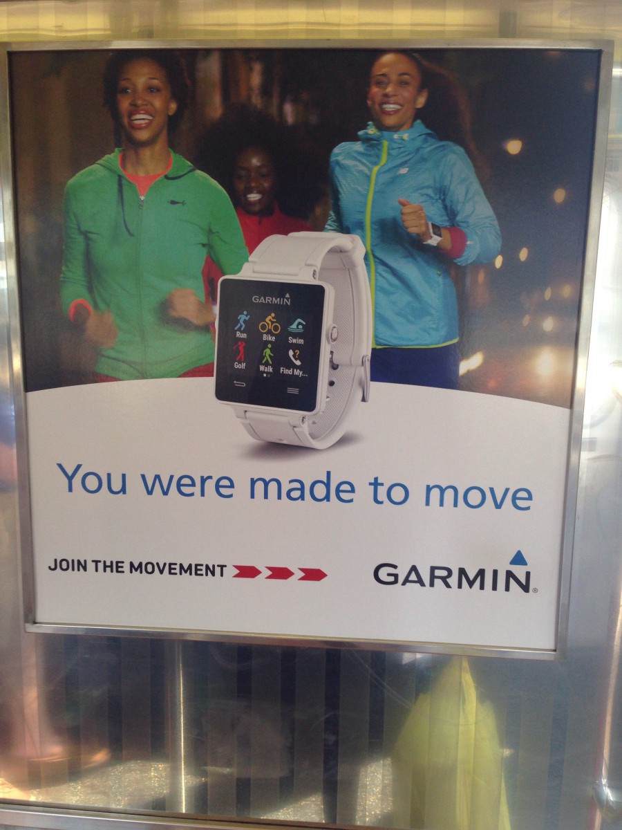

Blogroll
-
Recent Posts
Recent Comments
- NewBruno7 on The Copenhagen on Laight St.
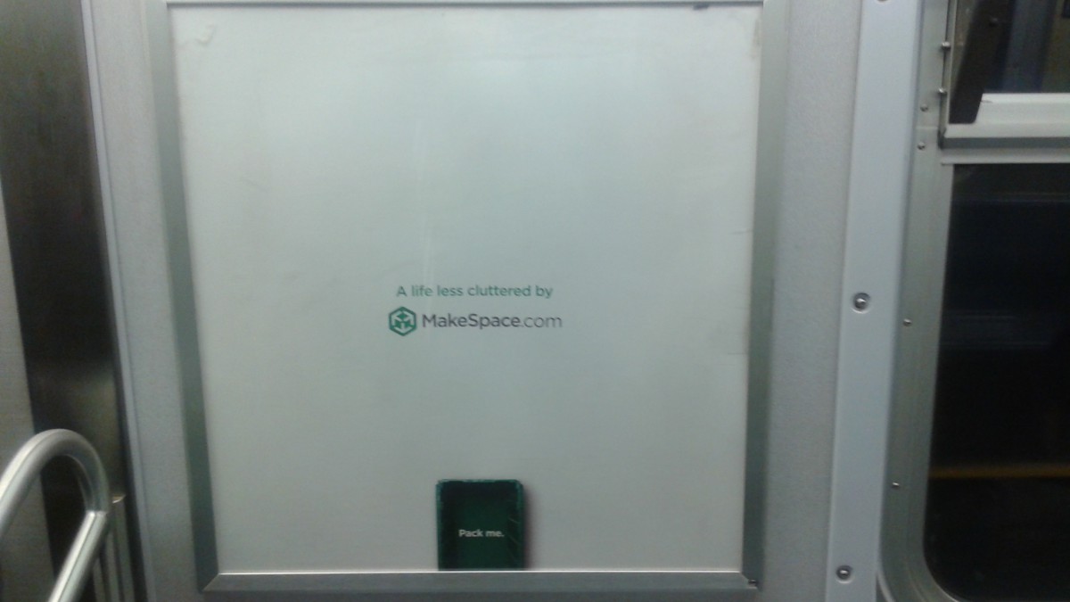
- dauly cuello on MakeSpace.com Poster
- Behzod Hamidov (Beka) on MakeSpace.com Poster
- Chris on styrofoam type
- bajanboy on MakeSpace.com Poster

