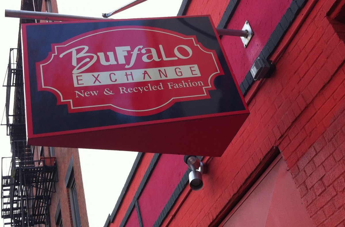
This is the logo of a used and vintage clothing store in the downtown Brooklyn area. It really caught my eye because of the way it breaks the rules of typography by using different typefaces to create one word. Despite that I feel it still manages to get the meaning across in a clean manner and it. I bet it must have been a bother to packaged the file in Indesign.


good find – this does indeed break every rule but does it so intentionally, it somehow works out!
definitely a thought outside the box.