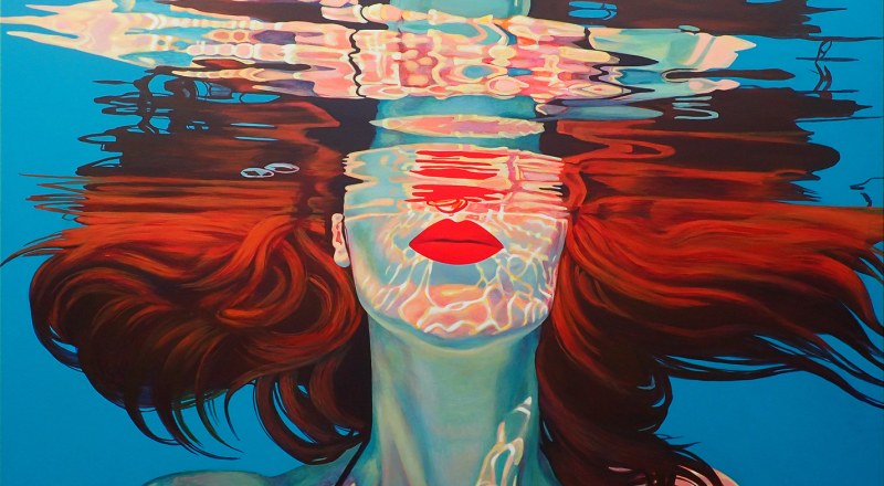
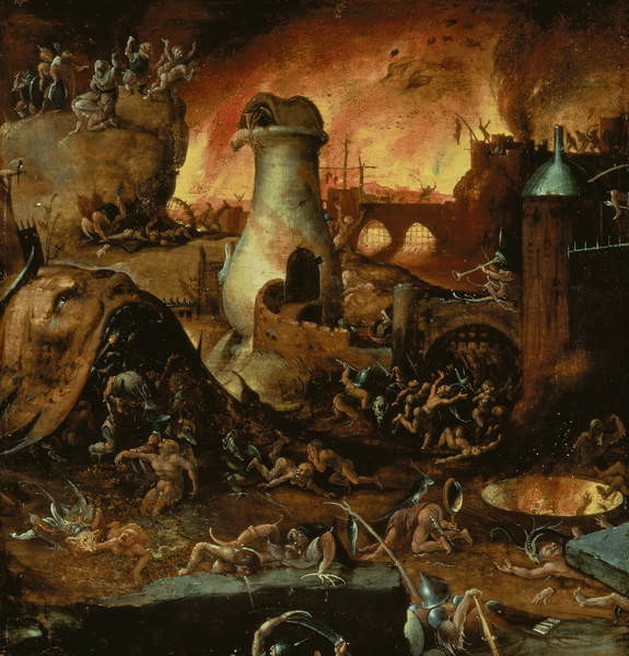
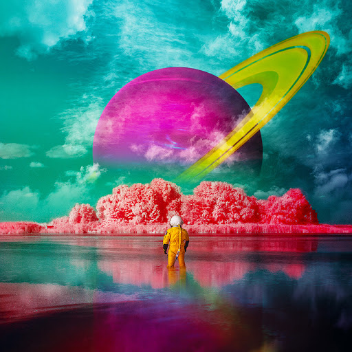
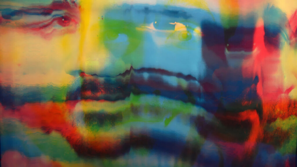
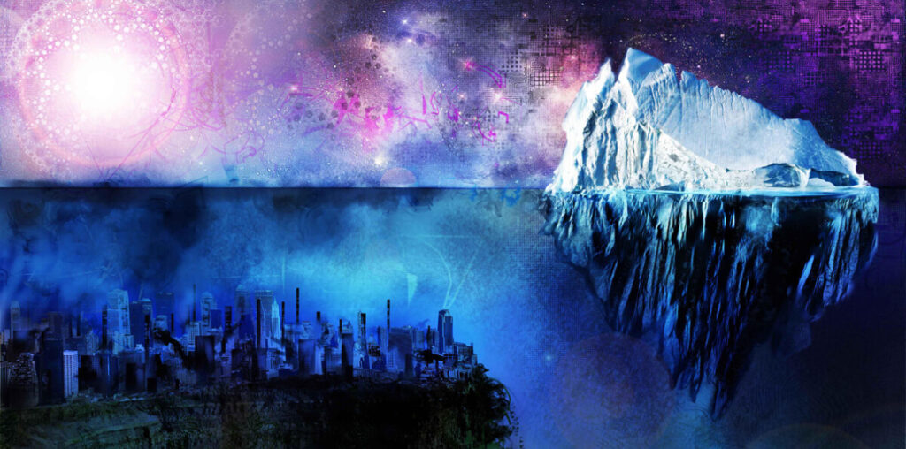
The FIRST IMAGE I found labeled under Fine Arts (1) was a portrayal of a woman who is almost submerged under water, except the top half of her head which is still afloat. The reason why I choose this image is because to me it represents a woman who despite all odds against her, she is still trying keep her head above the water. I also love how the artist focus on the fact that while she is still in water, she is a calm as a millpond. The SECOND IMAGE label under Fine Arts (2), was of a boy stranded in a dark place. The only detail which made him out was a brightly shown halo hovering around his head. This image caught my attention because in my opinion, it shows a lonely boy who seems not only lost but alone. Thus, leaving him venerable to the dark corners of the world. The only thing protecting him would be his faith in god giving the reason as to why the halo is his protection. In this life, having faith is having something to believe in. It is the only light that keep us out of darkness. The THIRD IMAGE labeled fine art (3) was unusual but interested at the same time. At first, I thought it was hell, HELL maybe it is, but then I notice the structures of some buildings and placements of some people. e.g. the giant head looking up with people coming out of it was a little weird. My best guess would be an out of controlled civilization where people are going chaotic, putting a huge burden on the once who are suffering or been suffering for a long time. What stood out to me about this image was how the artist went in details on the people and colors so when you examine the masterpiece, your mind is overtaken with confusion and curiosity. The first GRAPHIC DESIGN image which caught my attention was an image of a person in an astronaut suit, standing in what seems to be water, gazing at what he discovered. What I like about this image is the message I see behind it. The journey to discovery can happen on your own. No matter the distance, you travel, there is always a new reality waiting on the other side. The second GRAPHIC DESIGN image I thought was interesting was an image of a man’s face blurred so the viewer cannot tell where his actual face starts and where it ends. To make the image more interesting the artist decided to line his face off with different colors, so the viewer takes more interest in it. The reason why this image stood out to me is because every time you see different color on the mans face, its like seeing all side of the person at once. In this life, faces can be deceiving. You never know if the calmest person can turn out to be the most insane person yet. The Last GRAPHIC DESIGN image that caught my eye was an image of a city that seems to be below surface level. After noticing that huge ice block that’s half above and half below. It led me to believe that the city maybe underwater. More like the lost city of Atlantis. It might be a little funny if it was the Lost City of New York. After seeing this whole image, my first response was, “What 2020 global warming looks like”, but what stood out to me was the contrast between this seemingly huge ice block and an underwater city.
Marianna Trofimova | OL04 | Fall 2020
© 2024 Graphic Design Principles COMD 1100 OLO4
Theme by Anders Noren — Up ↑



Leave a Reply