Nestle logo

Nestle is the world’s largest food stuff company. Nestlé has over 2000 brands with a wide range of products across a number of markets, including coffee, bottled water, milkshakes and other beverages, breakfast cereals, infant foods, performance and healthcare nutrition, seasonings, soups and sauces, frozen and refrigerated foods, and pet food. Nestle was formed in 1905 by the merger of the Anglo-Swiss Milk Company, founded in 1866 by Henri Nestle and established in 1866 by brothers George Page,
Charles Page, and Farine Lactee Henri Nestle. Nestle set up its operations food processing industry in India, as a trading company. First it begin begins in 1866, with the foundation of the Anglo-Swiss Condensed Milk Company. Henri Nestlé develops a breakthrough infant food in 1867, and in 1905 the company he founded merges with Anglo-Swiss, to form what is now known as the Nestlé Group. During this period cities grow and railways and steamships bring down commodity costs, spurring international
trade in consumer goods. My paper will prove that Nestle logo has evolved over time along with the things they try to sell with it.
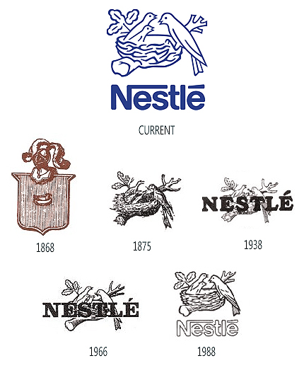
More than six decades later in 1938, the company’s name was introduced to the traditional nest insignia, making it a “combination mark”. Nestle changed its logo once again in 1966. Some minor graphic tweaks were made to the typeface and the nest mark was also simplified. The worm in the beak of the mother bird was removed from the Nestle logo in 1988. In addition, an extra fledgling was also added to the corporate identity, reflecting the company’s efforts to diversify its product line and target new
market opportunities. The logo also signified the modern family with two children. The current version of the Nestlé logo has been recently simplified, as an attempt to make it more contemporary and coherent. While the tree tends to depict an oak, the birds symbolize thrushes. The Nestlé logo incorporates a modified form of the classic Helvetica typeface.

The Nestle logo is often considered as one of the world’s most iconic and instantly recognizable logos. It has undergone several modifications over the years. Nonetheless, the logo still retains a touch of charm and modernity with a cutting-edge design style.
The earliest Nestle logo was unveiled in 1868 by Henri Nestle. It originated from the phrase “little nest”, the actual meaning of his name in his native German language. It was supposed to be an artistic conceptualization of his family crest. The looks like a knight on top of a sheild and a birds nest in the middle. The color and pattern is similar to that of a tree. After his retirement in 1875, the memorable nest emblem was trademarked in Vevey, Switzerland by the new owners of the Nestlé S.A. It is a mother feeding her babies in a birds nest in the colors black and white. More than six decades later in 1938, the company’s name was introduced to the traditional nest insignia, making it a “combination mark”. Now making a combination by putting the Quixo typeface with there previous bird nest logo. Nestle changed its logo once again in 1966. Some minor graphic tweaks were made to the typeface and the nest mark was also simplified.
The worm in the beak of the mother bird was removed from the Nestle logo in 1988. In addition, an extra fledgling was also added to the corporate identity, reflecting the company’s efforts to diversify its product line and target new market opportunities. The logo also signified the modern family with two children. The current version of the Nestlé logo has been recently simplified, as an attempt to make it more contemporary and coherent. While the tree tends to depict an oak, the birds symbolize thrushes. The current Nestlé logo mostly uses two colors: silver and blue and incorporates a modified form of the classic Helvetica typeface.
The phrase they use ‘Good Food, Good Life’ matches the logo which shows a mother bird feeding her young ones. The obvious symbolism here is that Nestlé is Swiss for “nest,” but the genius of the iconic logo was that it reinforced their foray into nurturing infant cereal products. The Nestlé nest became iconic and synonymous with nourishment and, as the company grew, that sense of purpose expanded. My paper will prove that Nestle logo has evolved over time along with the things they try to sell using the logo.


