Entry 14 – Farmers Pizza & Grill Board

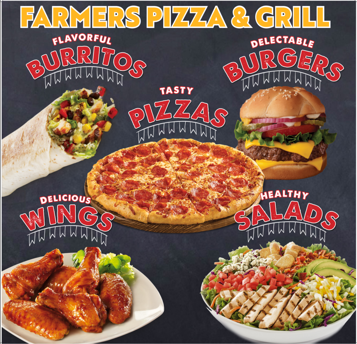
I had to make another display board for Farmer’s Pizza and Grill. On this board the client wanted pizza, Buffers, Wings, and Salads to be advertised. I first looked up some good pictures that I could use for the board. I also looked up some good extra words that I can include along with the heading for each type of food. I thought Embellishments were also a good addition, so a line with flags was also included under the headlines of each item.

At first, I made all of the footage spaced out but, Marla decided that it was best to make the pictures as big as possible along with their headlines to fill up the black space on the board. The pizza was of course added to the center because of the restaurant’s name. The pizza also kinda overlaps the burger which I thought was fine.

Entry 13

I was told to make some folder designs for a lab called Interscience Diagnostic. It was required that the folder had the website as well as the address for the lab and the phone number on the back of the folder.

I tried to experiment with some of the design ideas. I, of course, looked online for some good examples of lab folders and decided to go with the color blue for most of them. One design I made that I thought stood out was having the images on the front cover all diagonally placed like the image below. I personally like this the most and my supervisor Marla also thought this was one of the really good designs. out of the rest.

Favorite Design

Entry 12 – Creating Mail Postcards

I was put in charge of creating a postcard for a restaurant called ” EL Mill”. For the first page of the card, I was instructed to add a Mexican/style look to it and I was also told to showcase a new burrito bar there as well. This new bar had recently been created so they wanted that to be the focal point of the front of the postcard. A 2 dollar coupon was also offered to anyone who took the card to the El Mill Restaurant.

On the bottom of the postcard, I had to include some of the additional items that the restaurant offered. Since it is spring I also had to give the bottom of the card a spring feel which is why I added items like flowers, a rainbow, and the caption ” Hello Spring”. The restaurant also serves a signature Lavazza coffee so that was to be advertised in which I included that logo just below the middle image. Overall I like the colorfulness of the postcard and can say this was one of my favorite designs to do.