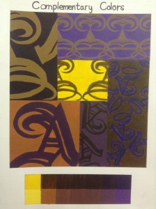
This assignment was one of my most favorite one. We took one letter and used different angles of it. I divided the page into six different boxes and made the letter bidder in some and smaller in the others. The point of this assignment is to use only two complementary colors for the whole painting. You mix the two complementary colors with each other to made the color dark. After you get the dark color you add white to get the tint colors. Value is a huge part of this assignment, you use high and low chroma. I learned that a color and be so much more then just that color. Using different hues of the two colors in the same box can really emphasis the letter.
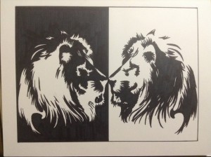
In this assignment we used organic shapes to make reflection images or symmetrical images. The design elements I used in this assignment was negative and positive space. The black color on the left side represents negative space which is the empty space surrounding the white and the white represents the positive space. Symmetrical balance is also used in the assignment to balance the visual properties on both sides of the center line. I learned an organic shapes can be more than just shapes.
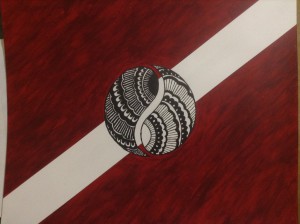
This is the most personal assignment of the whole semester, it is a personal flag that represents you. The red represents my favorite color and it is my birthstone color. The circle in the middle is a wist to the ying yung sign. I use a henna tattoo design inside the two shapes, which in related to my culture. It also represents the good and bad parts of my life. I used varieties of different elements in this assignment. I used negative and positive space, the red is the negative and the circle is the positive space. Using the red against the black and white in the middle, it emphasis the design.


