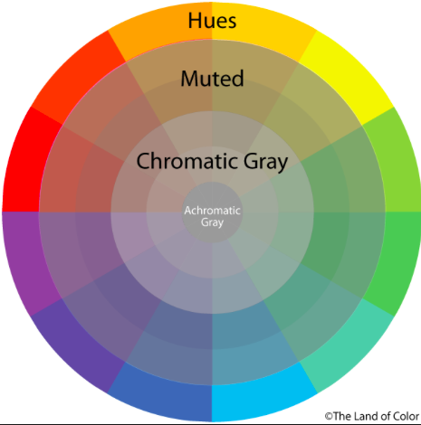
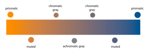
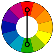
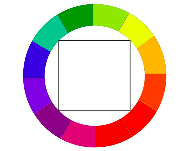
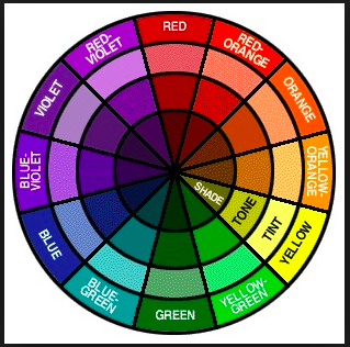
LOGO

This logo represents my childhood and the love that was given by my family. When I was born  my grandmother gave my nick name Twinkle because she thinks I came to their life like a shinning start. And I was the first daughter in the family may be because of that they called me twinkle by love. Even though everyone called me by Twinkle at home  but it was never put officially on my birth certificate.

Quote Post Cards

1. For the first one I have used Noteworthy as my face type. I think this face type matched with the picture. The background picture was from last years winter. I took the picture while I was taking an uber to my home. This quote means everyone wants to hear the truth but few can tolerate it; as everyone doesn’t have same level of tolerance.

2.For the second one I have used Menlo as a face type for this postcard. I used this type face because it is a san-serif and it is looking good with the picture. This picture is from summer 2016. I went to a trip with my family at Lake George. It was fun and this picture has one of the more lovable view that o saw during that trip. This quote means that truth hurts, no matter how much it is important it is to let someone know that truth even if it better for their future or the present it is eventually painful.

3. For the third post car baskerville is the one which I have used for this post card. The picture that I have used for this is the one that I took this picture when I went on a trip for a class this semester. This is a view of the central park from the Columbus Circle entrance. And this quote means that while lies may be easier to handle but honesty is the best policy. It doesn’t matter if you can keep a smile through the lies but that will be known as fake smiles; where as but staying as a loyal person you may hurt that person but you can actually bring a real smile if they chose to accept the truth.

Cooper Hewitt collection DJ #26

  • monochromaticn — only one color is used here along its shade
  • analogous — purple and blue, magenta and purple
  • complementary — red and green
  • triad — purple, green, red 
  • tetrad — green, blue, red and magenta

Design Journal #25

Monochromatic

formal — A Monochromatic Color Scheme is created by taking any oneof the twelve Hues from the Basic Color Wheel and repeating it in various Tints, Shades and Tones.

Source —http://color-wheel-artist.com/monochromatic-color.html

informal— when one color is used from the color wheel

Analogous 

formal– Analogous color schemes use colors that are next to each other on the color wheel. They usually match well and create serene and comfortable designs.

source– http://www.tigercolor.com/color-lab/color-theory/color-harmonies.htm

informal– any one of a group of related colors that are near each other on the color wheel.

Complementary 

formal– Colors that are opposite each other on the color wheel are considered to be complementary colors.

source– http://www.tigercolor.com/color-lab/color-theory/color-harmonies.htm

informal– the colors those are opposite of each other in the color wheel

Triad  

formal– a triadic color scheme uses colors that are evenly spaced around the color wheel.

source– http://www.tigercolor.com/color-lab/color-theory/color-harmonies.htm

informal– three defined colors from the color wheel

Tetrad 

formal– A four-hue color system that is balanced based on either a square or rectangle inscribed in the color wheel.

source– https://www.pinterest.com/pin/18718154679331677

informal– when four colors from the color wheel

Design Journal #24

Prismatic color

Formal- Prismatic colors are the colors that can be seen when white light goes through a prism.

Source- http://www.yourdictionary.com/prismatic-colors#21mLtK4ZEfZw1UWv.99

Informal- colors are visible when the lights are reflected.

Muted color

Formal- Muted colors are colors that are less intense.

Source- https://www.google.com/#q=muted+colors+definition

Informal- when two complimentary colors are mixed.

Achromatic gray

Formal- An achromatic gray is a gray color in which the red, green, and blue codes are exactly equal.

Source- https://en.wikipedia.org/wiki/Shades_of_gray

Informal- complimentary colors are exactly gray.

Chromatic gray

Formal- A chromatic gray is a gray color in which the red, green, and blue codes are not exactly equal, but are close to each other, which is what makes it a shade of gray

Source- https://en.wikipedia.org/wiki/Shades_of_gray

Informal- complimentary colors are close to gray but not exactly the same.

Additive color

Formal-Additive color mixing begins with black and ends with white; as more color is added, the result is lighter and tends to white.

Source- http://www.worqx.com/color/color_systems.htm

Informal-when the primary colors are mixed it turns white.

Subtractive color

Formal-Subtractive color mixing means that one begins with white and ends with black; as one adds color, the result gets darker and tends to black.

Source- http://www.worqx.com/color/color_systems.htm

Informal- when the primary colors are mixed it turns black.

Bezold effect

Formal- Bezold Effect, also referred to as the “assimilation effect,” is an optical illusion where a color’s hue or value is affected by the color or colors surrounding it.

Source- http://www.newworldencyclopedia.org/entry/Bezold_Effec

Informal- color is valued in differently with different color.

Color interaction

Formal-Color Interaction. pertains to the idea that color perception is dependent on color relationships. Simultaneous contrast. can be defined as the way colors interact and affect each other.

Source- https://quizlet.com/31644219/color-interaction-flash-cards

Informal- relationship between colors.

About color article (DJ#24)

In this article it tells us that pink is the safest color to wear now under the law  in New York. The advocates said was meant to attract more women and girls to a sport dominated by men. I think pink is a color that anyone can wear it without hesitation.


Design Journal #23

Josef Albers

Josef Albers was born March 19, 1888, Ger.—died March 25, 1976,  painter, poet, sculptor, teacher, and theoretician of art, important as an innovator of such styles as Colour Field painting and Op art. He was an American-German artist best known for his iconic color square paintings—the Homage to the Square series, which he began in 1950—as well as for his major contributions to color theory.

Source– https://www.britannica.com/biography/Josef-Alber

Johannes Itten

Johannes Itten was born in 11 November 1888 and died in 25 March 1967 was a Swiss expressionistpainter, designer, teacher, writer and theorist associated with the Bauhaus(Staatliches Bauhaus) school. Together with German-American painter Lyonel Feininger and German sculptor Gerhard Marcks, under the direction of German architect Walter Gropius, Itten was part of the core of the Weimar Bauhaus.Johannes Itten was one of the first people to define and identify strategies for successful color combinations. Through his research he devised seven methodologies for coordinating colors utilizing the hue’s contrasting properties. These contrasts add other variations with respect to the intensity of the respective hues; i.e. contrasts may be obtained due to light, moderate, or dark value.

Source– https://en.wikipedia.org/wiki/Johannes_Itte

 Albert Munsell

Albert Munsell was an artist and professor. At Massachusetts Normal Art School, he taught students about color composition. In 1905, he published A Color Notation, which outlined his color theory. He went on to publish Atlas of the Color Solid and The Munsell Book of Color, both of which elaborated on his system of color. Albert Munsell’s color theory is a system of color comprised of three main components: hue, value, and chroma. The system can be drawn like a cylinder that has circles that ripple outward at various degree measurements.

Source– http://study.com/academy/lesson/albert-munsells-color-theory.htm

Design Journal #22

Color wheel

Formal– A color wheel (also referred to as a color circle) is a visual representation of colors arranged according to their chromatic relationship. Begin a color wheel by positioning primary hues equidistant from one another, then create a bridge between primaries using secondary and tertiary colors.

Source– http://www.worqx.com/color/color_wheel.ht

Informal– a circle with different colored sectors used to show the relationship between colors.
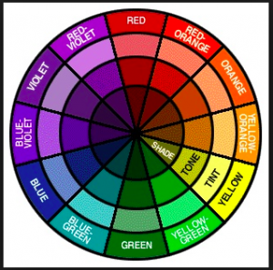
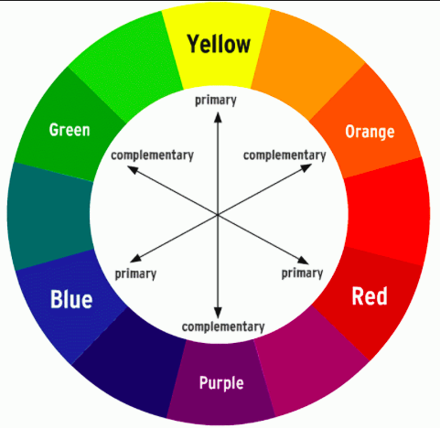
 Primary triad

Formal– Is so called because, theoretically, all other colors can be mixed from it. It is composed of red, yellow, and blue, which are equidistant from each other on the color wheel.

Source– http://www.flashcardmachine.com/art-vocab1.htm

Informal– when three primary colors are used

Secondary triad

Formal–In subtractive color, orange, green, and violet. They are called secondary because each can be made by combining two primaries.

Source– http://www.flashcardmachine.com/art-vocab1.ht

Informal– when secondary colors are used
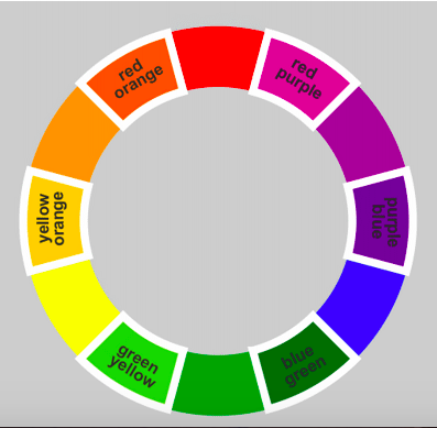
Tertiary hues

Formal– Are the  combination of a primary color with a secondary color.

Source– http://www.flashcardmachine.com/art-vocab1.ht

Informal- primary and secondary color mixture

CMYK

Formal– The CMYK color model (process color, four color) is a subtractive color model, used in color printing, and is also used to describe the printing process itself. CMYK refers to the four inks used in some color printing: cyan, magenta, yellow and key (black).

Source– https://www.google.com/?client=safari&channel=iphone_bm#channel=iphone_bm&q=cmyk+definition

Informal– when three colors are combined and 4th one is produced. Cyan, Magenta, Yellow and black (key)
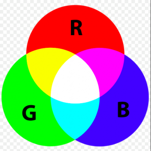
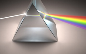
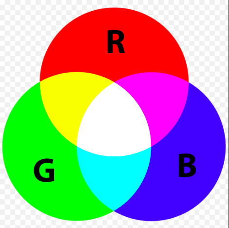
RGB

Formal– RGB (red, green, and blue) refers to a system for representing the colors to be used on a computer display. Red, green, and blue can be combined in various proportions to obtain any color in the visible spectrum.

Source– https://www.google.com/?client=safari&channel=iphone_bm#channel=iphone_bm&q=rgb+definition

Informal– representing red green and blue