There are certain brands that were recently called out because of the racial or ethnic stereotypes they used to create their brand identity. Examples like Uncle Ben’s to Aunt Jemima’s that create a stir of rage, that these brand logos need to be changed. It’s really interesting how it took so many years till this point to make a decision to change the iconic logos that we already knew. One in particular that I focused on was Land O’ Lakes and why they decided to change their logo from the American Woman illustration to a simple typographic logo. I’ll be discussing the linguistic messages, the denotative and connotative aspects, to the audience that they intended to have. The artist who was behind the logo and their intention.
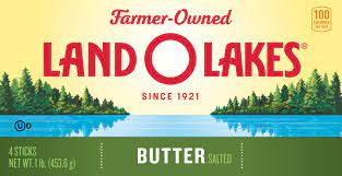
The linguistic message would be the name of the product, “ Land O’ Lakes” Since it’s in the color red, it stands out. It gives the viewer a sense of who this brand is. It also explains what year this brand was made and it’s farm raised. The coded iconic messages would be that the butter is natural and great for cooking in modern household kitchens. The denotative aspect is that the viewer sees the woman in the middle, which immediately catches your eyes. You can also see that the woman is dressed in an Ojibwe buck dress. It shows that this brand has originated in a specific area where indigenous people lived. The connotative aspect would be as you look more, you see the woman is holding a box of butter. Then surrounding her in the background is a lake and greenery.
The Native American girl emblem was first made by Arthur C. Hanson. It shows the woman kneeling down by the lake with a box of butter. Towards the Mid 1940’s the company entrusted Patrick DesJarlait to redesign it. He placed the woman in the center of the box and she’s holding the butter close to her chest. Detailed embroidery on the buckskin dress as shown with ornaments from the Ojibwe tribe. Later on Hason added more details where the background was a special area which was the reservation that Native Americans can recognize when they see it. Their intended audience are young people, especially millennial women. According to an essay, “ Land O’ Lakes Brings Butter Back” Since it was trusted by baby boomers, they weren’t as popular with the new generation. So they started to create more products with butter like olive oil and sea salt. Even created stick butter that goes with the modern serving size in modern kitchen and cooks.
Land O’ Lakes is a brand where people can enjoy their rich, sweet and tasty butter. The intended audience would identify with this brand because it’s a brand that takes pride in how natural their products are and their proud historic background. The impact that the advertisement had on Native Americans, from what Rober, Patrick’s grandson has said, “many Ojibwe people shared their perspective of Mia…giving the previous generation a sense of almost empowerment to see a Native woman… It gave them a sense of cultural pride,”” (There’s another story behind the land o’ lakes butter bar.) Which was interesting because now many Native American expressed their thoughts on taking out the logo from Land O’ Lakes, without realizing that this was made by a Native American Man.
I’ll be honest. Others will disagree about this but this is my opinion. When researching brands that have a racist or ethnic stereotype, Land O’ Lakes caught my eye. Ever since I was a child, I thought this logo was beautiful. Now, thinking about it and the situation. I have mixed feelings about it. I understand in some cases why people find it offensive, but at the same time I don’t get it. Especially since this logo was redrawn by a native American artist. Where he was able to capture the beauty of the Native woman in the logo and draw a deeper connection with the Ojibwe and the environment. It’s not like he made a racist caricature of the woman. I feel like if people understood the story behind the logo, maybe they would have a change of heart. And People should really learn the terms racism and stereotypical tropes, in order for them to say whatever they need to express their concerns with. Honestly, I feel that they should’ve kept the logo because it gives a sense of what the meaning behind the company brand is and what they’re about. They even made sure to create the appropriate outfit for the woman because this brand was in a specific area in Minnesota where a group of Ojibwe tribe lives in. If the company owner had a history of being racist or prejudiced towards Native Americans by all means they should take it down, but if it’s the complete opposite, then leave it. I can understand if they pulled a Cream & Wheat Illustration where the Advertisement included the “coon caricature” or anti black imagery.
All in all, It’s understandable why Native Americans would want the logo to be changed. To save themselves from getting any more backlash they decided to change their iconic logo to a more simple typographic logo. The messages that were conveyed give the audience a sense of how natural and creamy their butters were. It was a brand that was proud of their history. This brand was made by a group of farmers who wanted to share their product with the rest of the nation.
Work Cited
Banka, Neha. “Explained: Why a US Butter Company’s Logo Became a US Social Media Trend.” The Indian Express, 28 Apr. 2020, https://indianexpress.com/article/explained/land-olakes-us-butter-company-logo-6382969/.
Dragseth, Kevin. “Is the Land O’lakes Maiden a Racist Trope or Symbol of Native Pride?” TPT Originals, TPT Originals, 10 Dec. 2021, https://www.tptoriginals.org/is-the-land-olakes-maiden-a-racist-trope-or-symbol-of-native-pride/.
Heimerman, Emily. “Where Did the Land O’lakes Logo Come from?” Historically Speaking, 17 Apr. 2020, https://vugradhistory.wordpress.com/2018/11/22/where-did-the-land-olakes-logo-come-from/.
Public Relations of Society Of America. Land o’Lakes Brings Butter Back. 1 Jan. 2013, http://cite.nwmissouri.edu/ic/29-460/2013_SilverAnvils/Land_O_Lakes_Brings_Butter_Back.pdf.


Recent Comments