Graphic Design Theory: Readings From the Field, Princeton Architectural Press, 2009
Find 2 examples of the work of postmodern graphic designers from the 1980s.
Deconstruct the work. Explain which visual elements are associated with postmodernism of the 1980s and why.
What does the author mean by “Typography as discourse”?
What does the author mean when she states that “…no longer are there one-way statements from designers. The layering of content, as opposed to New Wave’s formal layering of collage elements, is the key to this exchange. Objective communication is enhanced by deferred meanings, hidden stories, and alternative interpretations”
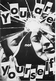
One of the works I have chosen is “You are not yourself” by Barbara Krugar. She used the words in the image and made it look like it was slips of pieces of paper that are floating around the image. The artwork could fall in Postmodern since the style of the type can be really messy looking and different from normal. The image itself seems distorted as well since it’s a mirror breaking into pieces.
This “Vintage armchair” from the 1980s also has a postmodern design feel to it. It has a normal look to it as what a chair can be, but with a few touches to it, that makes it seem really artistic and diverse. Postmodernism is all about breaking what is normal and modern and trying to come up with new ideas and concepts. It’s like new art that radiates new looks that many people have not seen or done before. New art to look at and enjoy or even use. This was a way that people in the 1980s wanted to be able to venture out and investigate.
I think Typography as Discourse can be seen as new and creative, it can be creative with no boundaries that can stop you. You can act against what is deemed normal.
#1
#2|
#3
https://carissacncs1.blogspot.com/2016/08/further-research-about-typography-in.html
Vintage armchair, postmodern design, 1980s (galerie-parallele.com)


Recent Comments