Jan Tschichold, “The Principles of the New Typography” pg35-38, Karl Gerstner, Designing Programmes pg55-61, Joseph Muller-Brockman, “Grid and Design Philosophy” pg62-63 from Graphic Design Theory: Readings From the Field by Helen Armstrong.
Questions
Here are the questions to which you should respond in your reading response:
- How do each of these designers/authors think you should approach design?
- Include an example of contemporary typography/layout that embodies each of these three design systems or philosophies. And explain why
Response
Designers and authors think you should approach each design with the most practical sense possible while maintaining to be visually pleasing. Designers have to be able to make their designs be clear and understandable to a wide audience. They need to be able to follow certain rules set by the client or rules in general with the arrangement of the text or hierarchy or other terms relating to that. Page 58 of “Designing Programmes” by Kar Gerstner put it best when he said, “The more exact and complete these criteria are, the more creative the work becomes”. So why designing with typography is something that should be seen with no restrictions there is some practical use of rules that need to be followed.
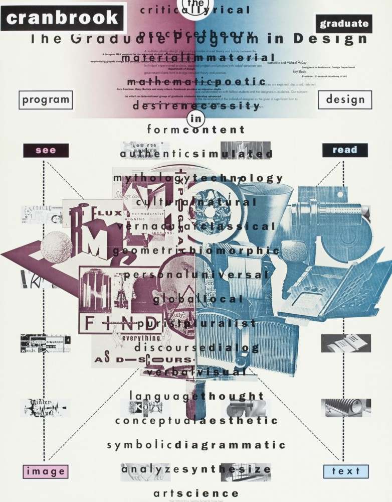
The Graduate Program in Design, 1989
The example I chose here is an Offset lithograph done by Kathrine McCoy in 1989 created for the design school Cranbrook Academy. The point of this design was to show students what they would be studying if they attend this academy and she decided to use that topic in her design with typography. This is meant to be read top to bottom listing out all the different subjects while having them overlaid with images about the same topics. There is a dynamic of both red and blue separating ideology between words the words like “read” and “see”, which then make your eyes follow down to the other words of “image” and “text”. It could be seen as somewhat cluttered but she used all the space available without making it unable to read and so she knew the boundaries of the criteria along with a basic font that fits the style of her design.


Recent Comments