Jan Tschichold, “The Principles of the New Typography” pg35-38, Karl Gerstner, Designing Programmes pg55-61, Joseph Muller-Brockman, “Grid and Design Philosophy” pg62-63 from Graphic Design Theory: Readings From the Field by Helen Armstrong.
Questions / Prompts
- How do each of these designers/authors think you should approach design?
- Include an example of contemporary typography/layout that embodies each of these three design systems or philosophies. And explain why!
Responses
These designers/authors think that we should approach design by knowing the design principles and the importance of the theories. They expect us to approach design with the values of neutrality, objectivity, and rationality. Using legible type with clarity and fewer distractions within the design. Utilizing the tools such as size and weight, arrangement of lines, and color to distinguish hierarchy and the importance within the text. They want us to focus on the various forms of designs that could be created with typography and what can be communicated with typography.
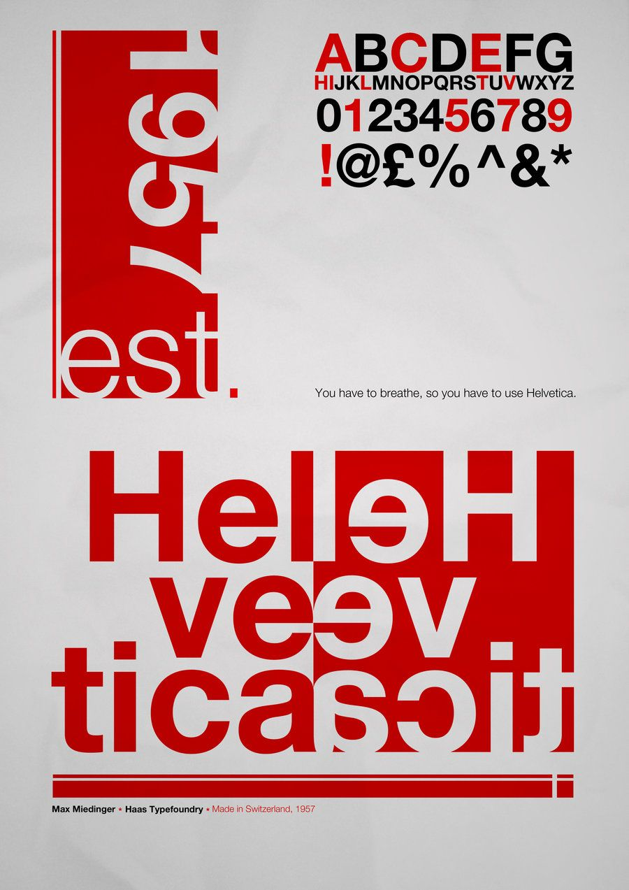
Helvetica Story Poster, Max Miedinger, 1957
Helvetica Story Poster created by Max Miedinger in 1957 embodies each of these design systems and philosophies. The poster tells a story using five different typeface sizes to distinguish the hierarchy throughout the text on the poster. The design is composed using the grid system. The Helvetica san serif typeface is clear and visible, also aligned to the grid, with no ornaments crowding the white space. There is an asymmetrical form with the typography, line arrangements, and the combined red and black letters. The reading direction and spacing vary within the poster as you have combined components of Helvetica, left to right with the right to left. There is also the year which is from top to bottom combined with est. from left to right. We can clearly see the bottom of the page is the focal point of the design. It is where Miedinger wants us to start with and the middle is where we’ll end up with the message of the story being communicated.
Annotations
- Reference Image: Jan Tschichold, Josef Müller-BrockMann
- Reprasing: Clarity is the beauty of the New Typography, The New Typography is expressive type that is used to communicate, emhasis, and organize legible text that make sense when read, There is no absolute solution to a problem, the possibilites are endless, It is the responsibility of the typographer to use clear and visible type. Using size and weight, arrangement of lines, use of color to distinguish hierachy and the importance and communicate the idea within the text.
- Definitions: Ferven, Fascism, Meager


Recent Comments