Fall 2017 | COMD1100_LC08 | Prof. Spevack

Tag: Phase 2: Define (Page 1 of 3)

Value-Added Portraits: Phase 2

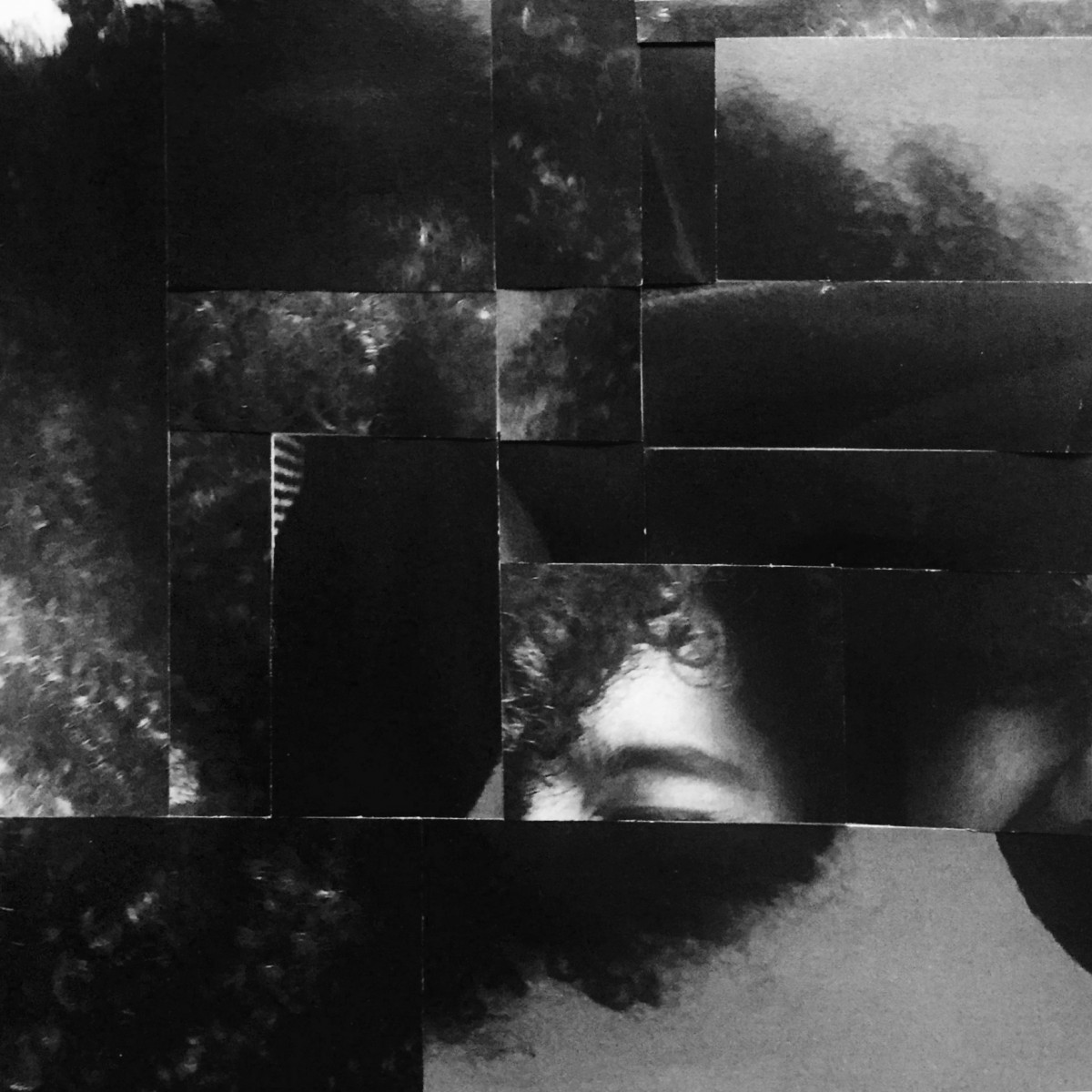
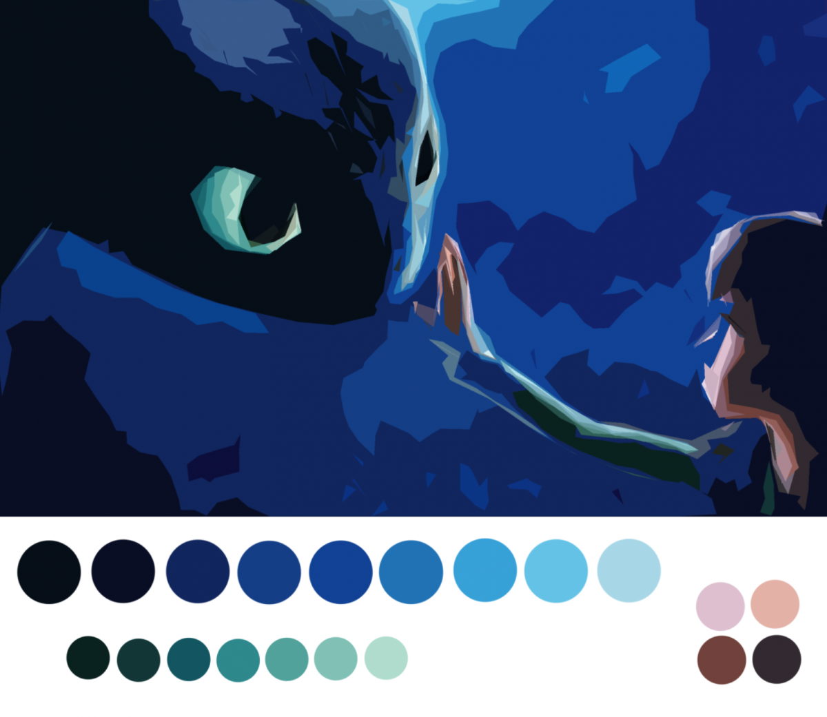
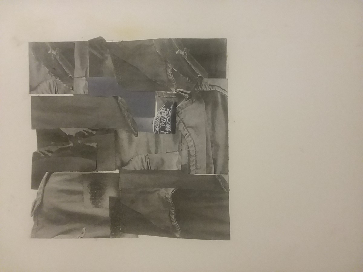
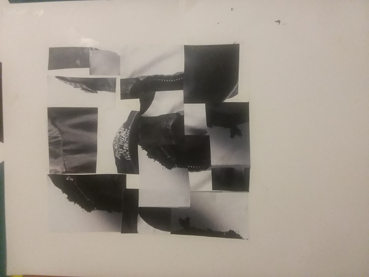
I chose to have the eyebrow as the focus of the piece because it had a very high light when compared to the rest of the image that is full of dark tones and black. I tried to unify the image by the texture of my hair that you see in multiple areas around the piece. The piece has a broad range because of the small high light/white moments, but the image is very low key because it is mostly composed of dark tones and black.

Time spent: 1 hour 30 mins

Saturation Studies: Phase 2

This was probably the project I learned the most from over the course of the semester. I’m very new to painting and it was my first time using colors in a study in which I was mixing them for myself and not just getting them off a palette I found online. My favorite one to work on was the muted palette because there was a such a diversity of color. I liked to see how by adding red blue and white I got lavender, then adding that lavender to a bright orange, made from yellow and red, made a softer orange-brown color. I experimented by adding a little more of this or a little more of that, creating different shades and tints and jumping around the color wheel. The chromatic grays were also a fun one for me because it was my first time seeing how by adding colors from different ends of the color wheel you were able to create these really dark and desaturated colors. It gave me a new perspective on how colors mix with each other. The prismatic one was a little uneventful because it was just taking colors straight from the bottle but it was great to compare it to the muted palette to visually see the difference between a very bright prismatic hue and a more muted one.

Time spent: 4 hours

Project 6 Phase 2: Color Harmony

Color Proportion Inventory

How to Train Your Dragon is one of my favorite movies and this was one of the first the promotional stills when the movie came out in 2010. Despite the movie have breathtaking scenery and stills, I chose this image because it had a strong dominant color and a strong subdominant color and various accent colors that complimented the image very well. I started off with filtering the image to take out details and just leave me with color and it left me with this image:

From this I was able to focus on the colors and from there created a palette.

I chose to study out the tints and shades and proportion the circles according to how much of it there was on the image. I then took the colors and set them up in the bar format to create the final inventory.

Time spent: 1 hour 30 mins

Color Harmony: Phase 2

For my largely worded color box, I used volume 3 of Death Note from my bookcase.

Proportial Color Inventory

From this graphic novel, I captured every color I could find in even the closest details, but for my color box I used the 5 most definite colors. From this phase of the project, I went on a whirlwind of “color finding”and created three more pieces (below). I REALLY enjoyed this phase of the project because it gave me a reason to take all my books off the shelves and admire, and capture, the artwork and colors as if they were all brand new. From this step of the project, I learned, and brainstormed, the use of colors I’ve already seen in future artwork; I will DEFINITELY be using all these new colors in future projects!!

Hours worked: more than 1, less than 2

Color Harmony: Phase 2

Using the template provided I created a proportional color inventory. I found a great photo online that gave me progression of tint, and shade. Using my eye to focus on all the colors I saw and to measure out the hues to its closest ratio. The photo gives off cool hues of blues, and lavendar. There is also a warm side created with the orange hues progressing into a fuchsia pink hue.  The dominant color is the blue, and the sub dominant color is the pink. There is shade outlines the outside and make of the body.  With saturated blues and pinks, making a tint around the focal point (the body) The accent color is the saturated blue on the left, with many shades of blue.

Urban Artifacts:Phase 2

Obvious Figure/Ground Sketch

Ambiguous Figure/Ground Sketch

These are the sketches for the previous Pictures I didn’t use ink on them, since they’re in my sketchbook. I changed the design of the obvious figure/ground initial picture because I thought it’d better emphasize the figure.


Color Interaction Pairings: Phase 2


« Older posts